Behr On Location M570-3
Contentsshow +hide -
| Code: | M570-3 |
| Name: | On Location |
| Brand: | Behr |
What color is Behr On Location?
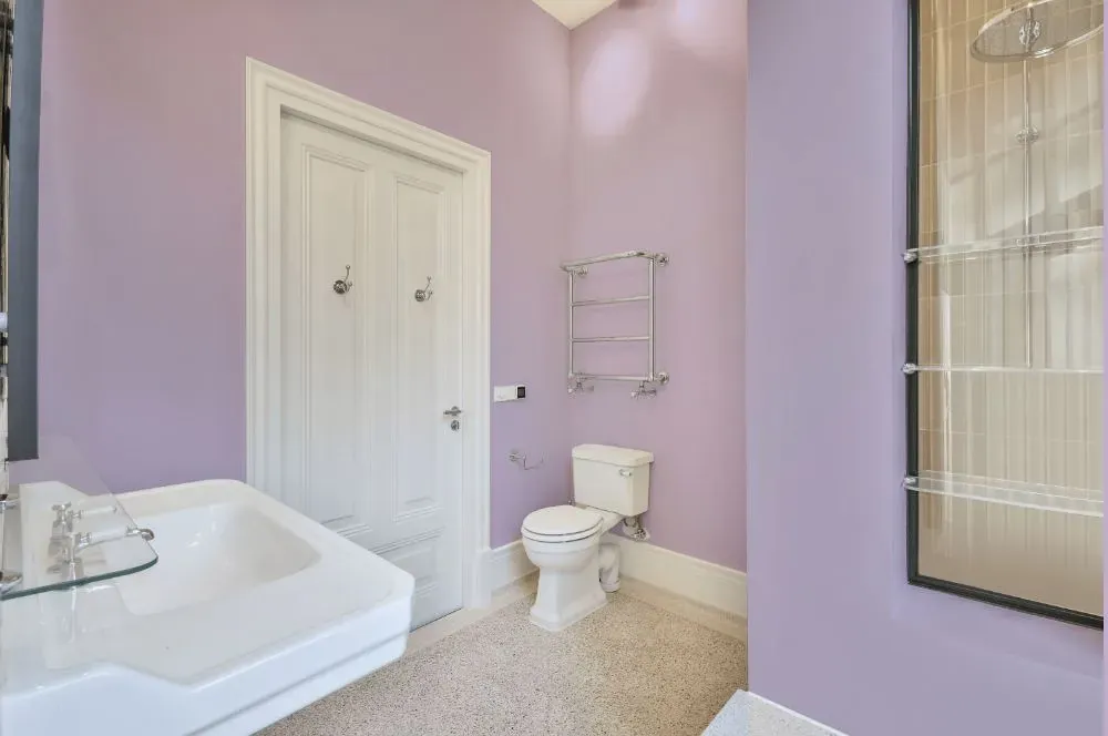
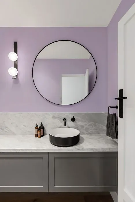
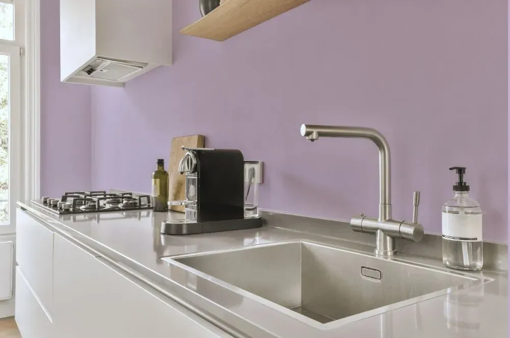
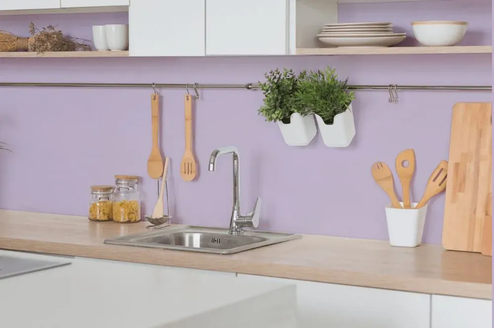
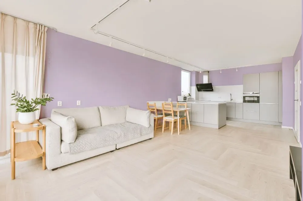
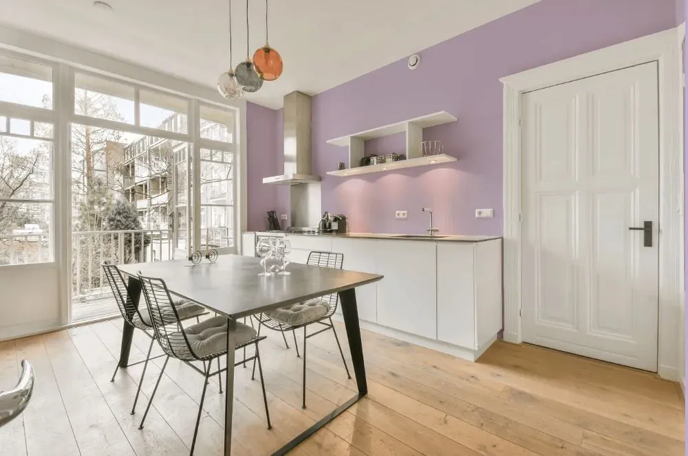
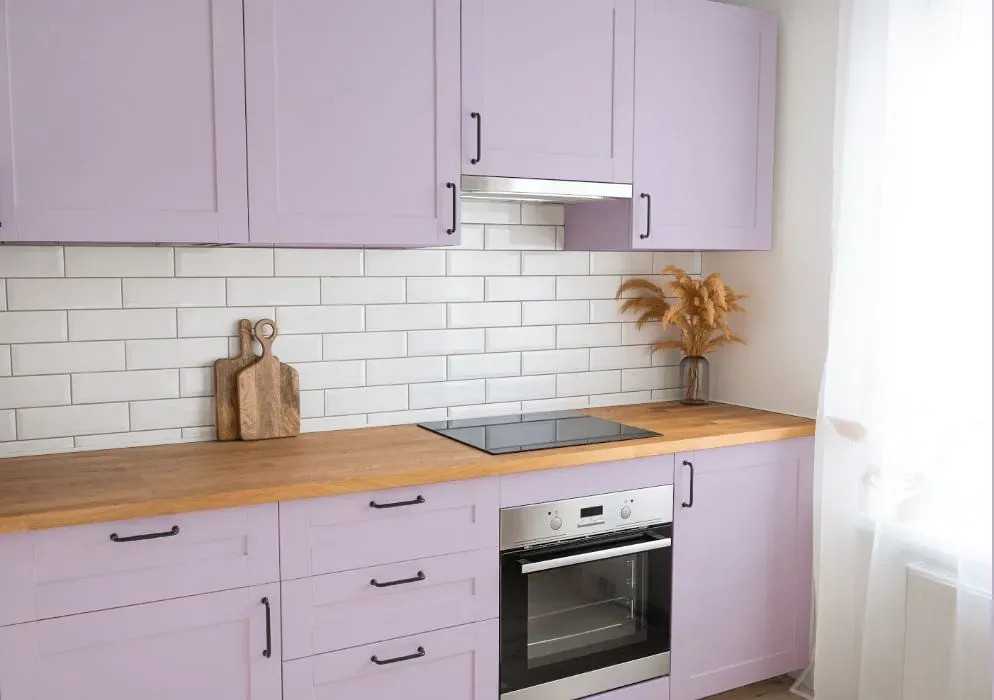
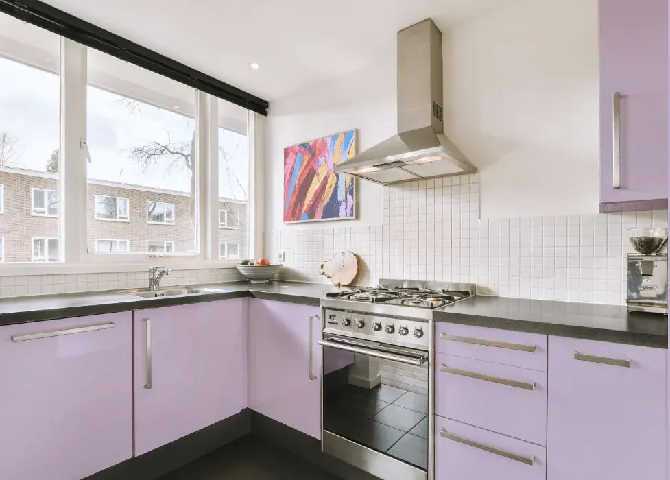
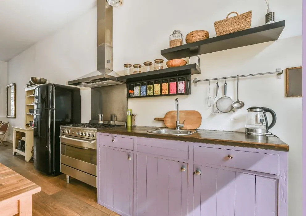
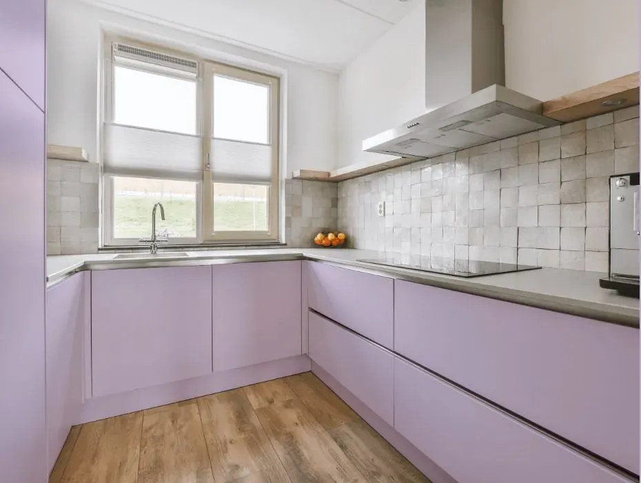
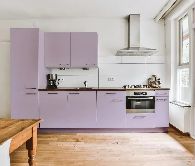
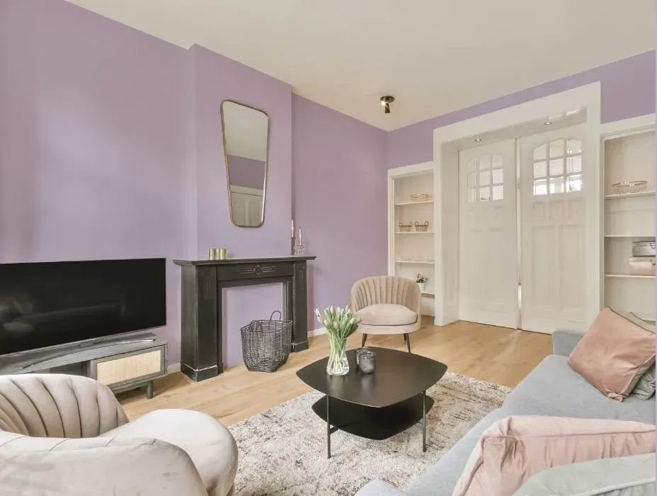
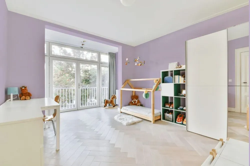
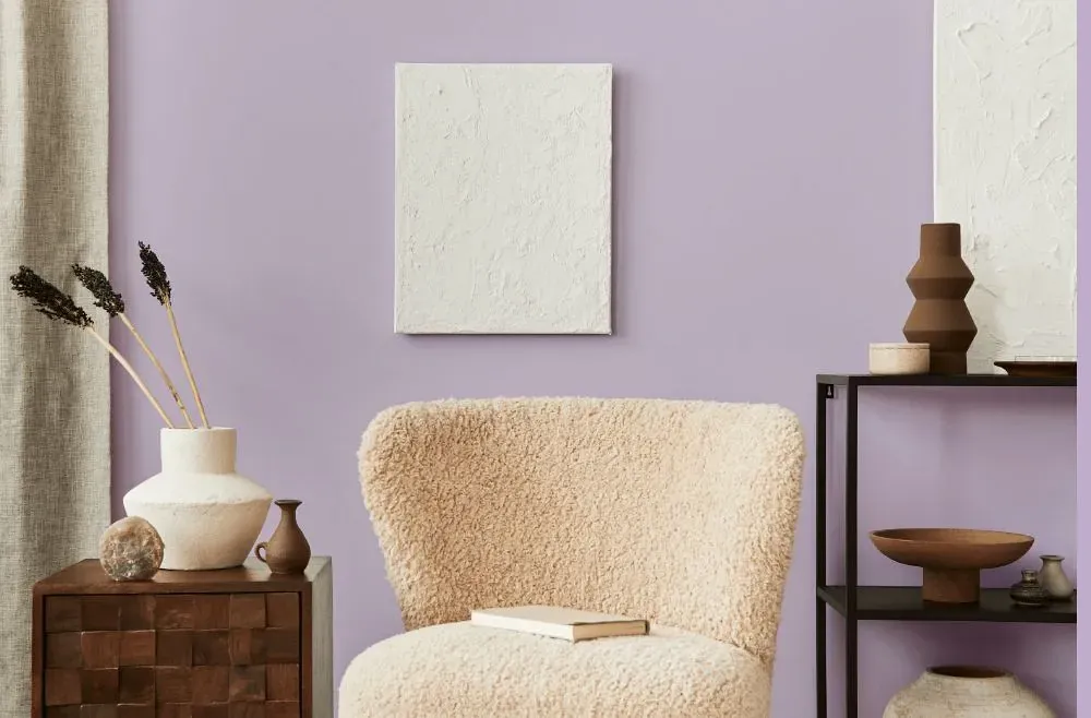
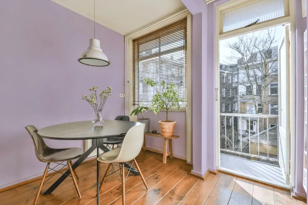
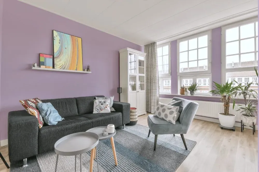
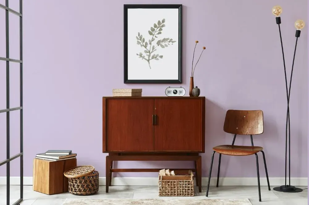
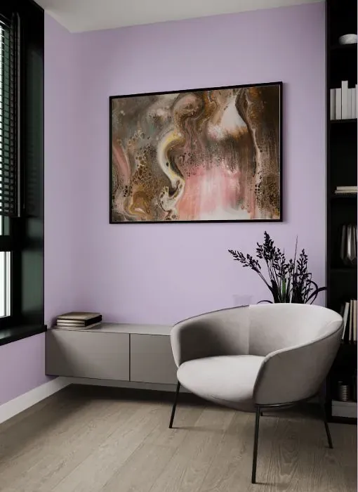
Welcome to the serene beauty of Behr On Location (M570-3), a soft and inviting neutral tone that exudes warmth. This versatile hue effortlessly blends earthy undertones with a hint of sophistication, making it an ideal choice for living rooms, bedrooms, and home offices. On Location's (M570-3) soothing presence creates a comforting ambiance, perfect for relaxing after a long day or sparking creativity in your workspace. Embrace the timeless charm of this color in your home and transform any space into a sanctuary of tranquility and elegance.
Loading...
LRV of On Location
On Location has an LRV of 60.75% and refers to Light colors that reflect most of the incident light. Why LRV is important?

Light Reflectance Value measures the amount of visible and usable light that reflects from a painted surface.
Simply put, the higher the LRV of a paint color, the brighter the room you will get.
The scale goes from 0% (absolute black, absorbing all light) to 100% (pure white, reflecting all light).
Act like a pro: When choosing paint with an LRV of 60.75%, pay attention to your bulbs' brightness. Light brightness is measured in lumens. The lower the paint's LRV, the higher lumen level you need. Every square foot of room needs at least 40 lumens. That means for a 200 ft2 living room you'll need about 8000 lumens of light – e.g., eight 1000 lm bulbs.
Color codes
We have collected almost every possible color code you could ever need.
Not sure what the difference between HEX and RGB is? We break down color models in plain language. Understanding color models
| Format | Code |
|---|---|
| HEX | #d4c6dc |
| RGB Decimal | 212, 198, 220 |
| RGB Percent | 83.14%, 77.65%, 86.27% |
| HSV | Hue: 278° Saturation: 10.0% Value: 86.27% |
| HSL | hsl(278, 24, 82) |
| CMYK | Cyan: 3.64 Magenta: 10.0 Yellow: 0.0 Key: 13.73 |
| YIQ | Y: 204.694 I: 1.273 Q: 9.808 |
| XYZ | X: 60.261 Y: 59.553 Z: 76.011 |
| CIE Lab | L:81.594 a:8.872 b:-9.153 |
| CIE Luv | L:81.594 u:6.533 v:-15.624 |
| Decimal | 13944540 |
| Hunter Lab | 77.17, 4.338, -4.38 |