Behr Spring Frost P420-1
| Code: | P420-1 |
| Name: | Spring Frost |
| Brand: | Behr |
What color is Behr Spring Frost?
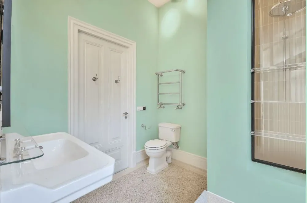
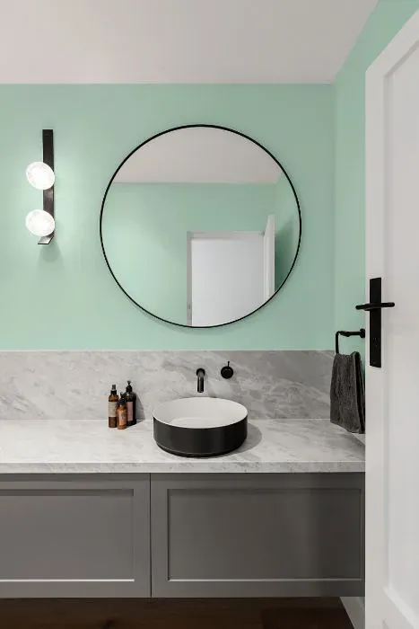
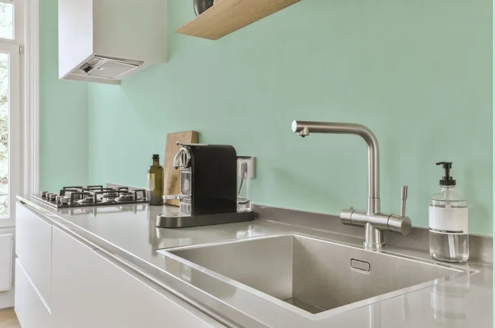
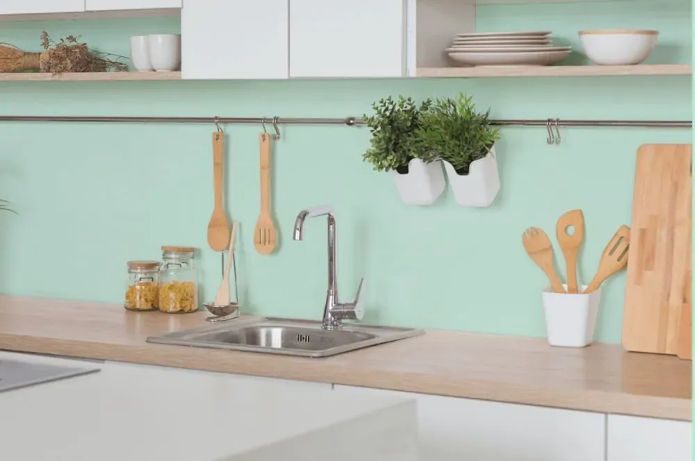
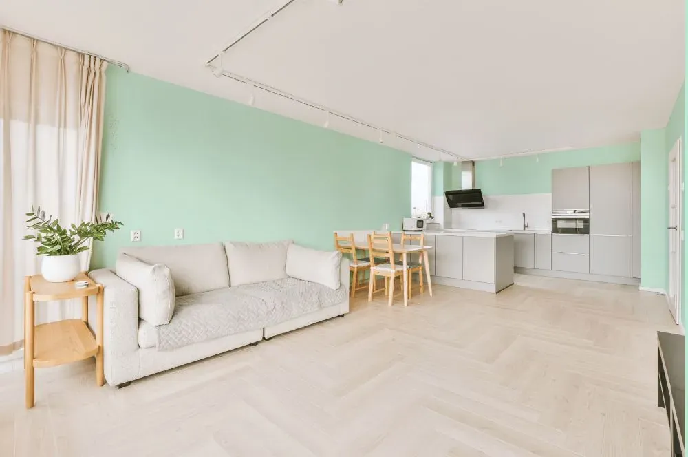
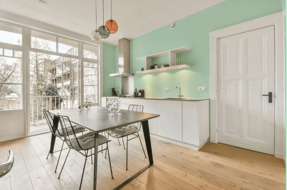
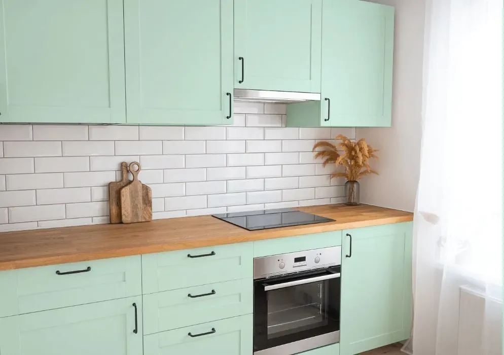
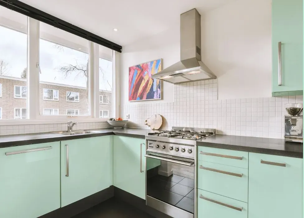
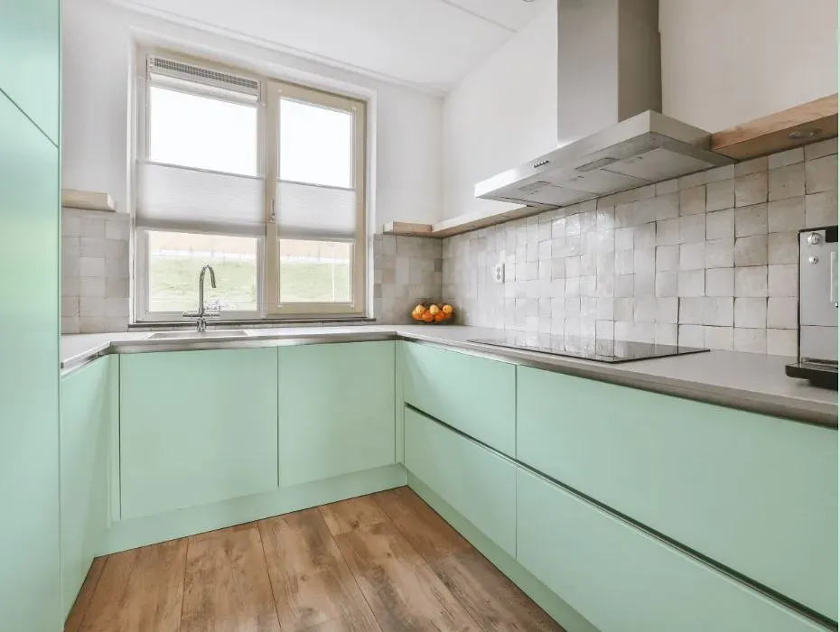
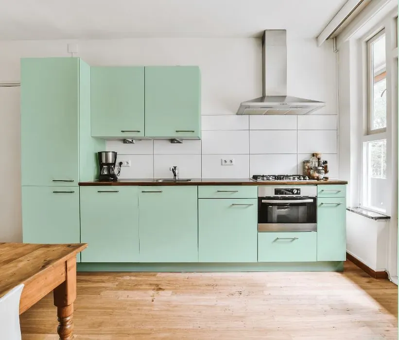
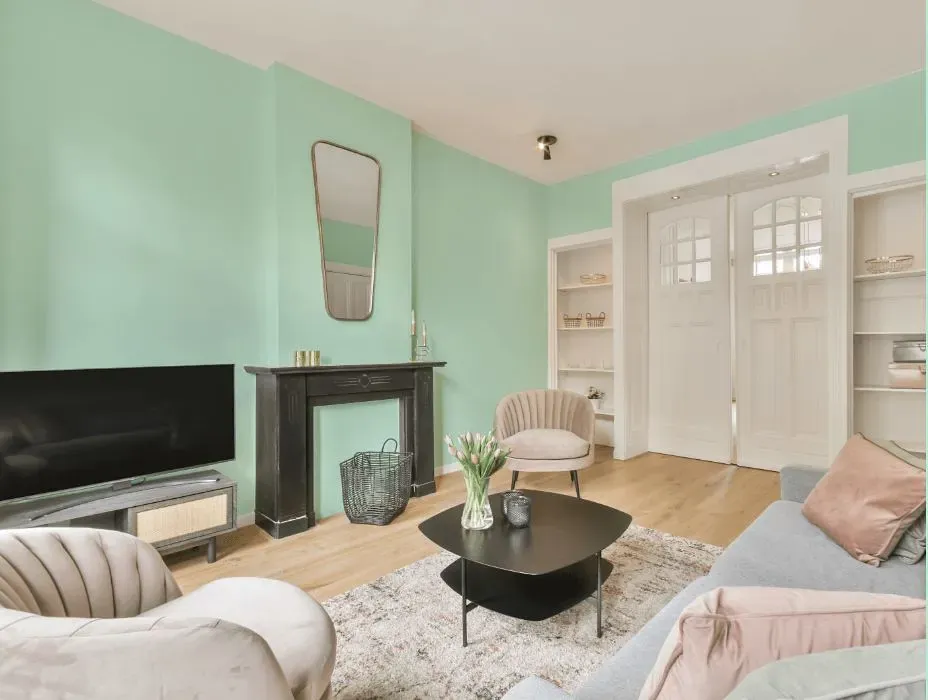
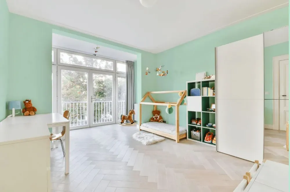
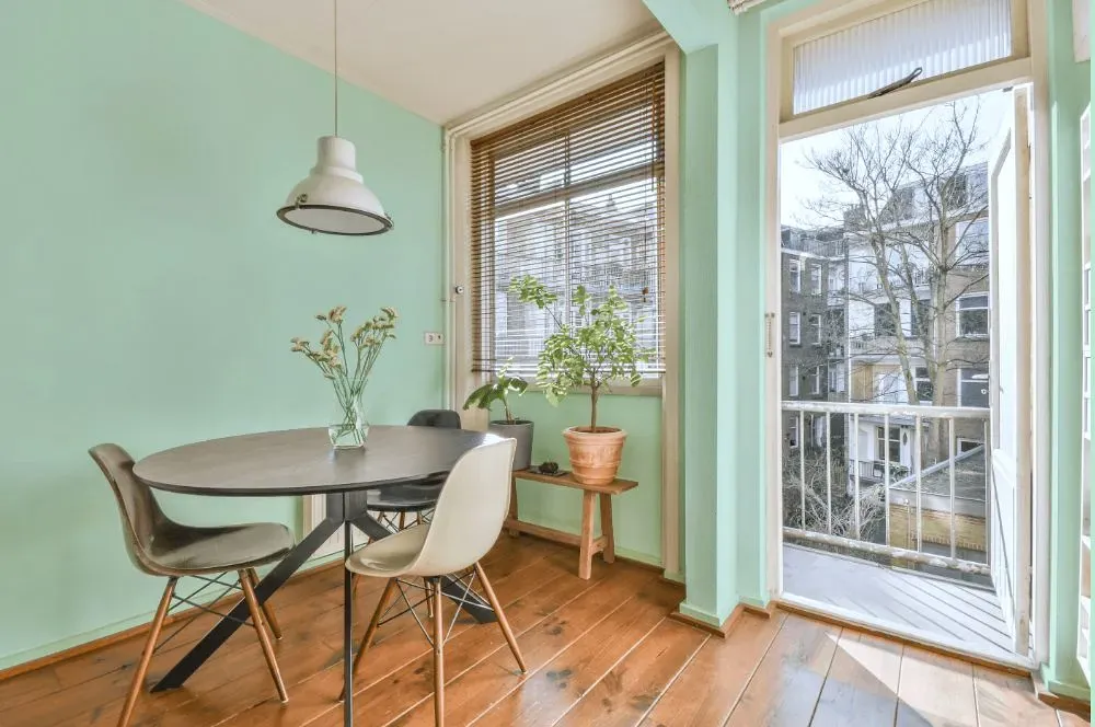
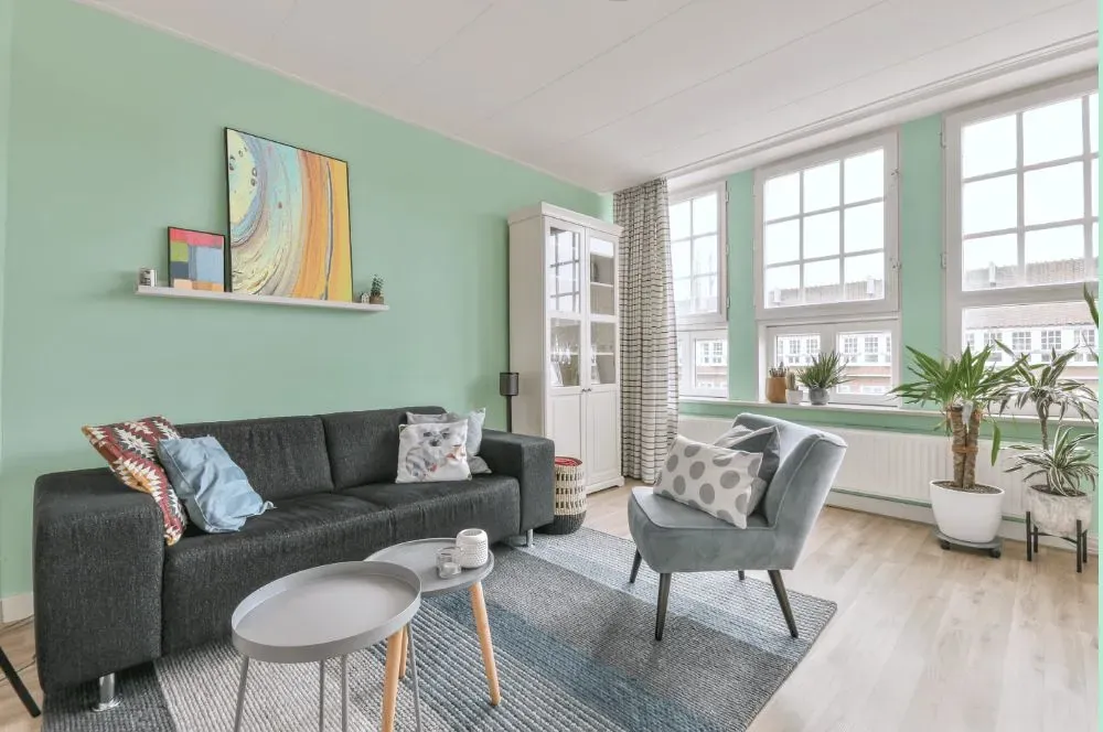
Refreshing and soothing, Spring Frost P420-1 brings a sense of tranquility to any space it graces. This delicate shade pairs beautifully with crisp whites to create a clean and airy atmosphere. For a more dramatic look, complement Spring Frost with deep greys or navy blues to add depth and contrast to your room. Whether used as the main hue or as an accent, this versatile color adds a touch of understated elegance to any interior design scheme.
Behr Spring Frost reviews
View the photos of real spaces painted with this that were not included in specific categories.Close-ups, painted furniture, storages and dressers, hallways, stairs and ceilings.
Try before you buy

100% accurate
reusable paint samples
Peel, stick,
and repeat
Twice painted
with real paint
Next day
delivery
What are Behr Spring Frost undertones?
The undertone of Spring Frost can be accurately described as a Green hue, as is apparent from the color space provided. By isolating the pure hue and eliminating any tints, tones, and shades, we were able to precisely determine its undertone. This approach has proven to be more accurate than traditional methods of defining undertones on a white background, which are now considered outdated.
HEX value
HEX value:
#D1F0E1
RGB code:
209, 240, 225
Is Behr Spring Frost P420-1 cool or warm?
With a hue of 151° thisGreenrefers cool paint shade according to HSL (Hue, Saturation, Lightness) on the color wheel.
P420-1 Spring Frost HSL code: 151, 51%, 88%
Hue - degree on a color wheel from 0 to 360. 0 is red, 120 is green, and 240 is blue.
Saturation is expressed as a percentage. At 0%, it appears as a shade of grey, and at 100%, it is in full color..
Lightness is also a percentage value. 0% is black, and 100% is white.
- Cooler hues have a calm and relaxation effect
- Cool green shades bring a refreshing and tranquil vibe to a space, making it feel rejuvenating and connected to nature, ideal for bathrooms, bedrooms, and living rooms.
- Light, soft colors like pastel blues and greens make a room feel fresh and open. They're great for bathrooms, nurseries, and kitchens, creating a calm and inviting atmosphere. Just avoid using these colors in north-facing rooms, as they might feel too cold.
Act like a pro: Mixing warm and cool shades is a must have to get harmonius interior. Add accents that contrast with the primary color to create visual balance. If your walls are a warm color, don’t forget to add accent in cold colors (furniture, art, décor). A good practice is too use a complementary color scheme.
How light temperature affects Spring Frost
Natural Lighting. During the day, natural light shifts from about 2000 K at sunrise/sunset to 5500–6500 K at noon.
In addition, natural‑light temperature depends on its direction:
| Direction of sunlight | Visible temp. | Hue | Duration |
|---|---|---|---|
| North | Cool | Bluish | All day |
| East | Warm | Yellow | Before noon |
| West | Warm | Orange‑red | After noon |
| South | Warm | Orange‑yellow | All day |
Artificial Lighting. When choosing bulbs, pay attention to their color‑temperature (Kelvins).
Use the slider to see how this Green shade looks under different lighting:


4000K
Coordinating colors.
Colors that go with Behr Spring Frost:
Monochromatic color scheme
This scheme consists of various shades, tints, and tones of a single color. While it offers a perfect combination of hues, without accent décor it may become monotonous.
Darker shades
P420-1
Spring Frost
Complementary color scheme
This color scheme is a combination of two shades that are opposite each other on the color wheel. The high contrast between these colors creates a vibrant and dynamic visual effect. For the color Spring Frost with a green hue, complementary colors are those with a red hue close to 331, such as Behr Garden Plum and Mystic Fairy.
LRV of Spring Frost
Spring Frost has an LRV of 78.29% and refers to Off‑White colors that reflect a lot of light. Why LRV is important?
Light Reflectance Value measures the amount of visible and usable light that reflects from a painted surface.
Simply put, the higher the LRV of a paint color, the brighter the room you will get.
The scale goes from 0% (absolute black, absorbing all light) to 100% (pure white, reflecting all light).
Act like a pro: When choosing paint with an LRV of 78.29%, pay attention to your bulbs' brightness. Light brightness is measured in lumens. The lower the paint's LRV, the higher lumen level you need. Every square foot of room needs at least 40 lumens. That means for a 200 ft2 living room you’ll need about 8000 lumens of light – e.g., eight 1000 lm bulbs.
Color codes
We have collected almost every possible color code you could ever need. To copy the code, just click the icon to the right of it.
| Format | Code | |
|---|---|---|
| HEX | #d1f0e1 | |
| RGB Decimal | 209, 240, 225 | |
| RGB Percent | 81.96%, 94.12%, 88.24% | |
| HSV | Hue: 151° Saturation: 12.92% Value: 94.12% | |
| HSL | hsl(151, 51, 88) | |
| CMYK | Cyan: 12.92 Magenta: 0.0 Yellow: 6.25 Key: 5.88 | |
| YIQ | Y: 229.021 I: -13.653 Q: -11.226 | |
| XYZ | X: 71.041 Y: 81.31 Z: 83.165 | |
| CIE Lab | L:92.27 a:-12.919 b:3.852 | |
| CIE Luv | L:92.27 u:-16.002 v:8.15 | |
| Decimal | 13758689 | |
| Hunter Lab | 90.172, -17.173, 8.438 |


