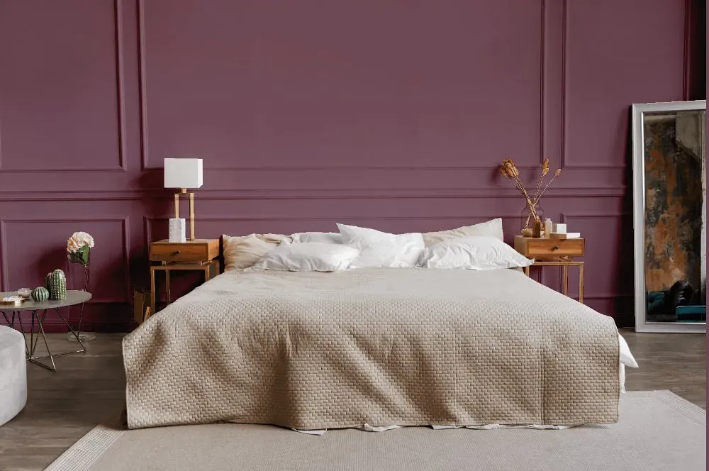
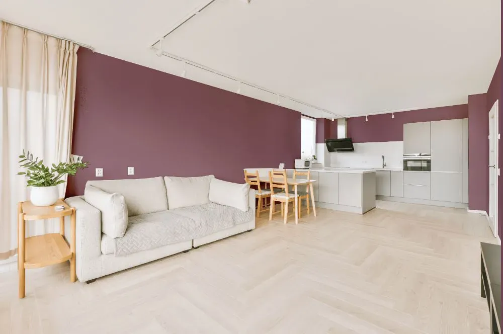
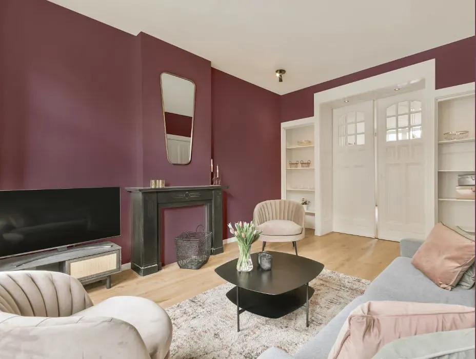
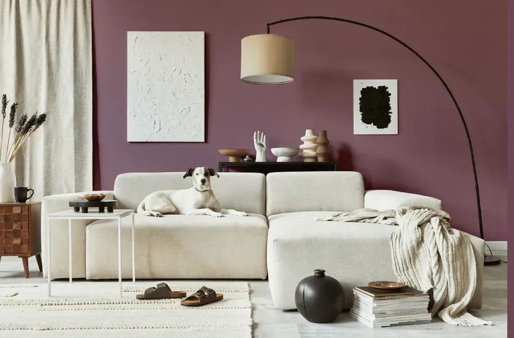
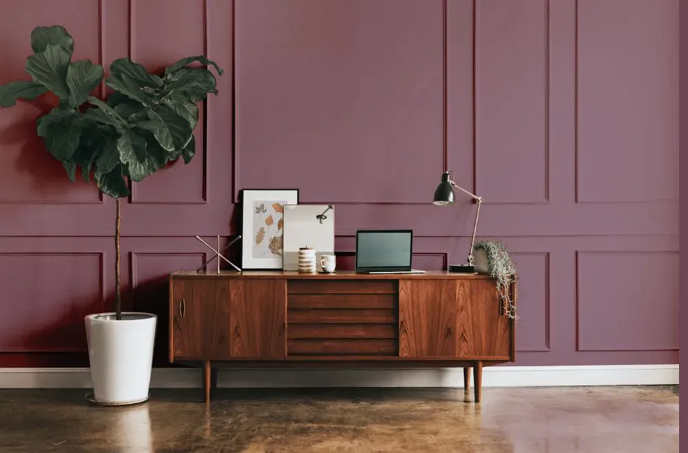
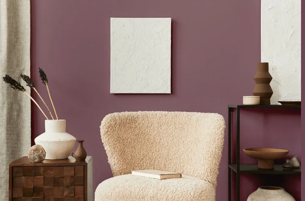
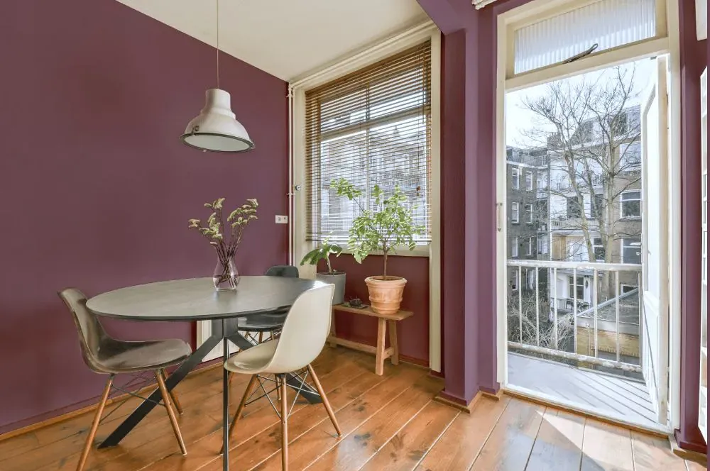
Benjamin Moore Aplomb AF-625
Contentsshow +hide -
- Aplomb for bedroom (1 photo)
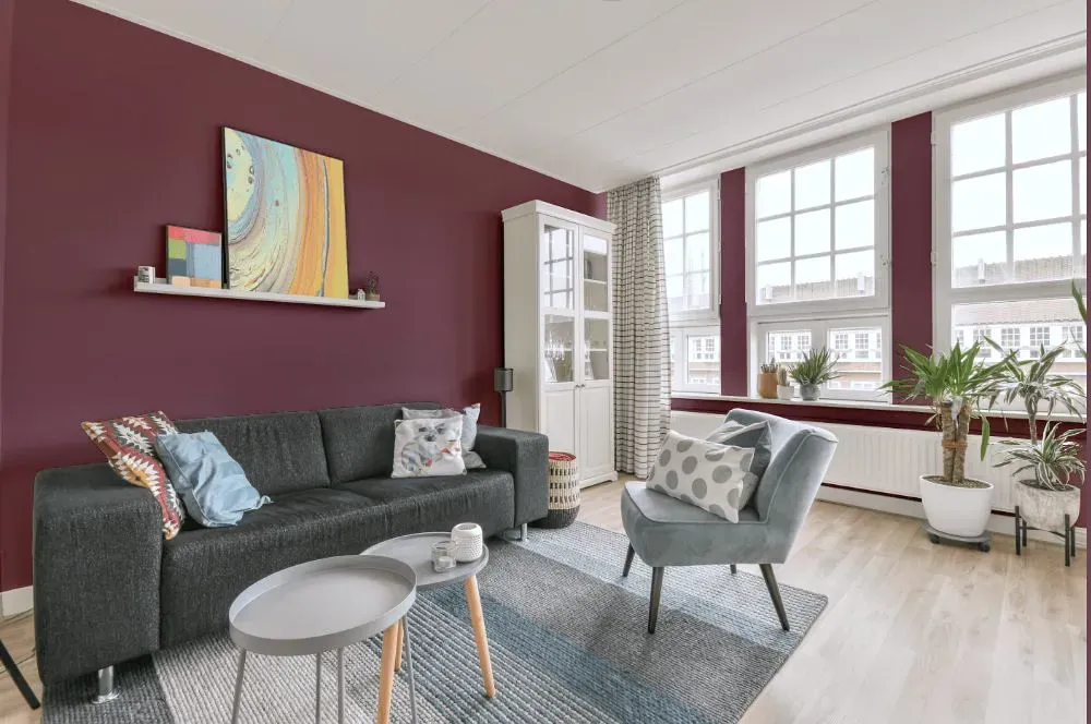
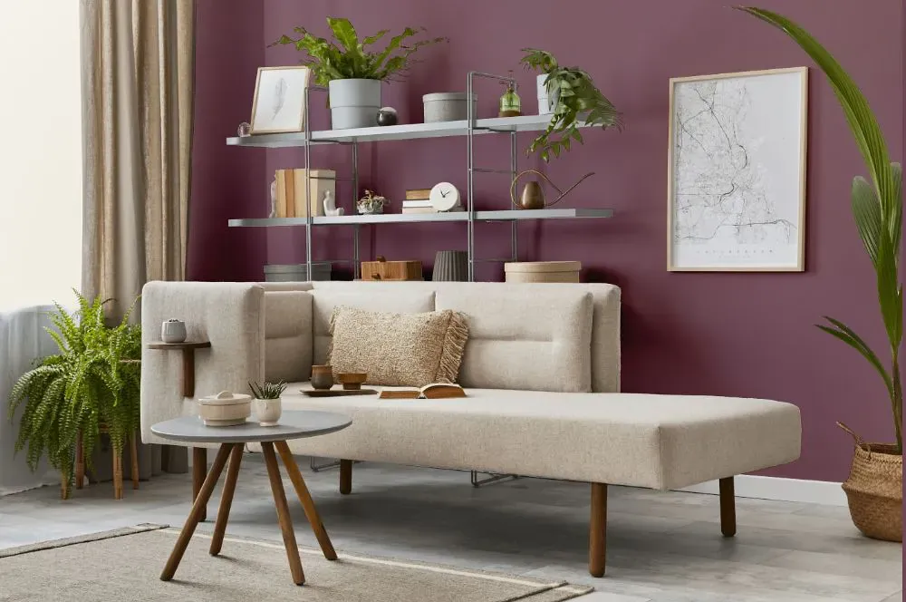
- Aplomb for living room (7 photos)
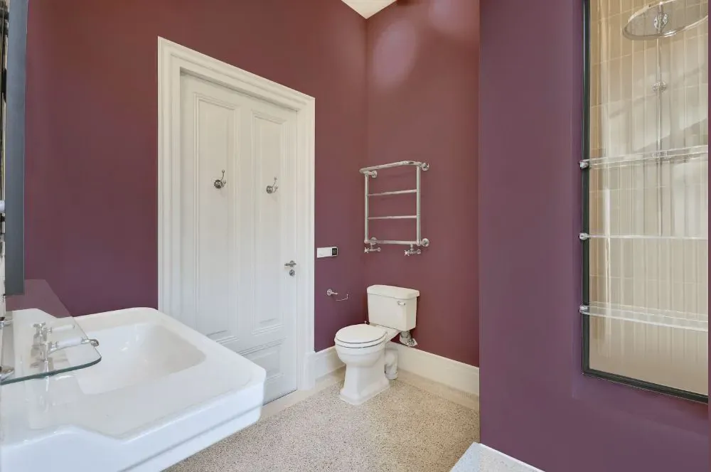
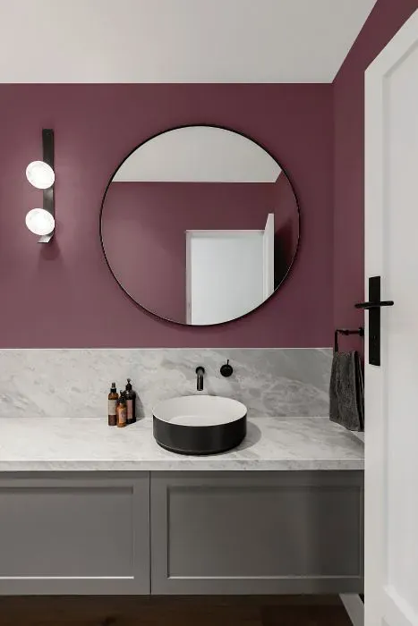
- Benjamin Moore Aplomb for bathroom (2 photos)
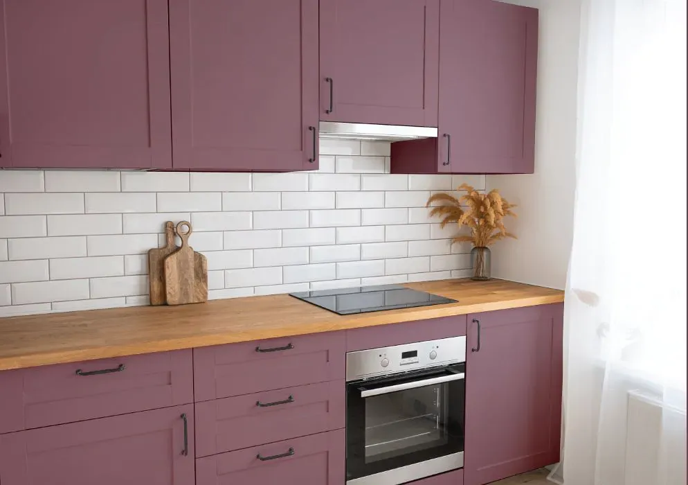
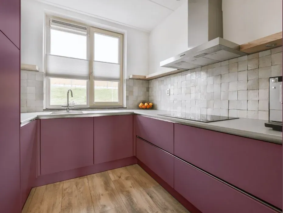
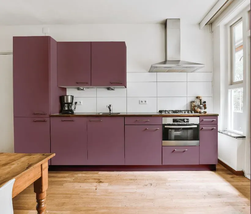
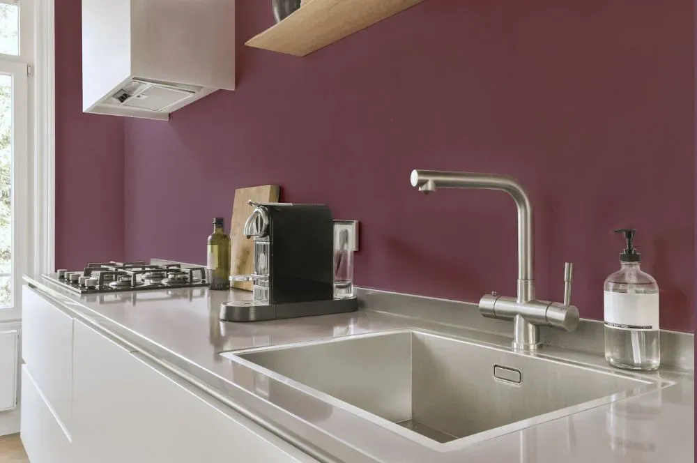
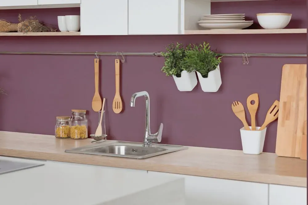
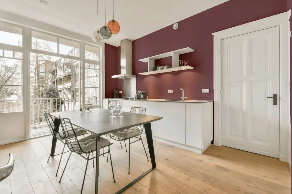
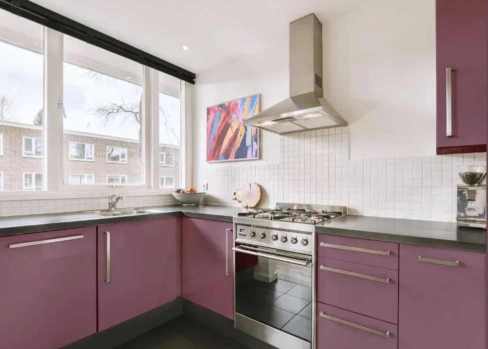
- Benjamin Moore AF-625 on kitchen cabinets (4 photos)
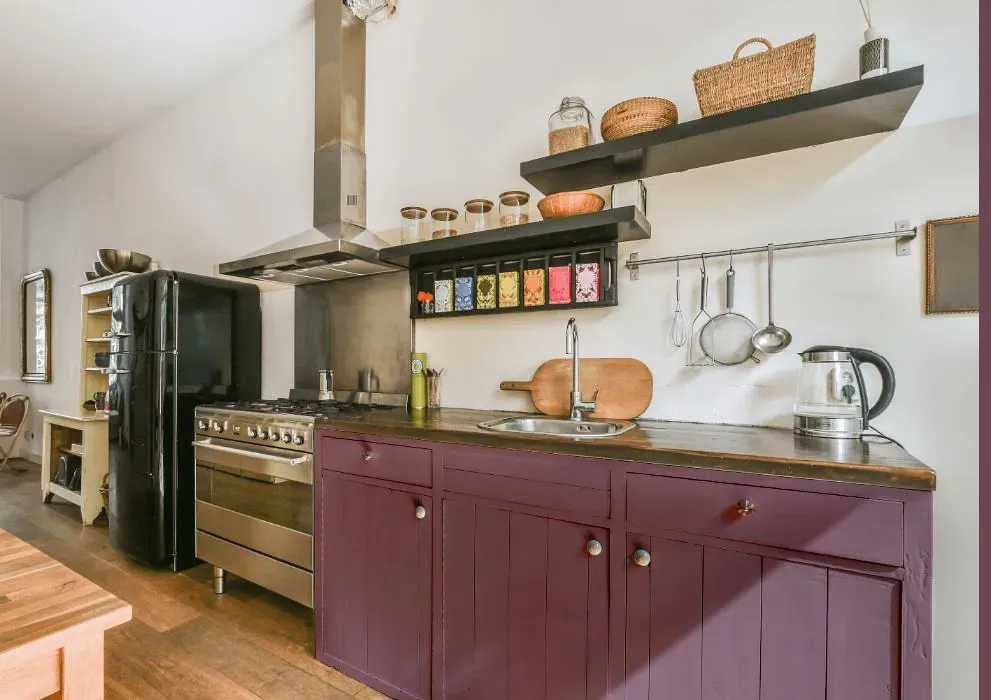
- Benjamin Moore Aplomb reviews (9 photos)
- What are Benjamin Moore Aplomb undertones?
- Is Aplomb AF-625 cool or warm?
- How light temperature affects on Aplomb
- Monochromatic color scheme
- Complementary color scheme
- Color comparison and matching
- LRV of Aplomb AF-625
- Color codes
- Color equivalents
| Official page: | Aplomb AF-625 |
| Code: | AF-625 |
| Name: | Aplomb |
| Brand: | Benjamin Moore |
What color is Benjamin Moore Aplomb?
Embrace a sense of tranquility and sophistication with Benjamin Moore AF-625 Aplomb. This understated gray with subtle blue undertones exudes a calming and timeless aesthetic, making it perfect for any space. Pair Aplomb with warm neutrals like Benjamin Moore OC-23 Classic Gray or soft pastels such as Benjamin Moore 2108-60 Healing Aloe for a harmonious and elegant look. Elevate the ambiance by complementing Aplomb with accents in deep navy blues or rich charcoal grays to create a striking contrast that exudes modern appeal. Experience a touch of elegance and serenity with Benjamin Moore AF-625 Aplomb - the perfect choice for a sophisticated and inviting space.
LRV of Aplomb
Aplomb has an LRV of 20.61% and refers to Medium colors that reflect a lot of light. Why LRV is important?

Light Reflectance Value measures the amount of visible and usable light that reflects from a painted surface.
Simply put, the higher the LRV of a paint color, the brighter the room you will get.
The scale goes from 0% (absolute black, absorbing all light) to 100% (pure white, reflecting all light).
Act like a pro: When choosing paint with an LRV of 20.61%, pay attention to your bulbs' brightness. Light brightness is measured in lumens. The lower the paint's LRV, the higher lumen level you need. Every square foot of room needs at least 40 lumens. That means for a 200 ft2 living room you'll need about 8000 lumens of light – e.g., eight 1000 lm bulbs.
Color codes
We have collected almost every possible color code you could ever need.
| Format | Code |
|---|---|
| HEX | #94717D |
| RGB Decimal | 148, 113, 125 |
| RGB Percent | 58.04%, 44.31%, 49.02% |
| HSV | Hue: 339° Saturation: 23.65% Value: 58.04% |
| HSL | hsl(339, 14, 51) |
| CMYK | Cyan: 0.0 Magenta: 23.65 Yellow: 15.54 Key: 41.96 |
| YIQ | Y: 124.833 I: 17.0 Q: 11.138 |
| XYZ | X: 21.819 Y: 19.588 Z: 22.028 |
| CIE Lab | L:51.368 a:15.774 b:-1.258 |
| CIE Luv | L:51.368 u:20.569 v:-4.345 |
| Decimal | 9728381 |
| Hunter Lab | 44.258, 10.549, 1.471 |


