Benjamin Moore Apparition 860
Contentsshow +hide -
| Official page: | Apparition 860 |
| Code: | 860 |
| Name: | Apparition |
| Brand: | Benjamin Moore |
What color is Benjamin Moore Apparition?
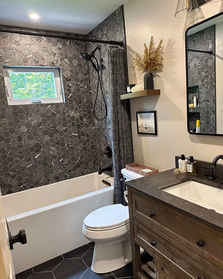
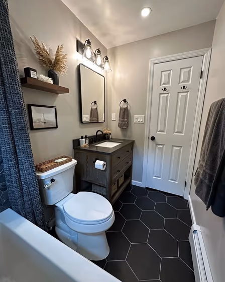
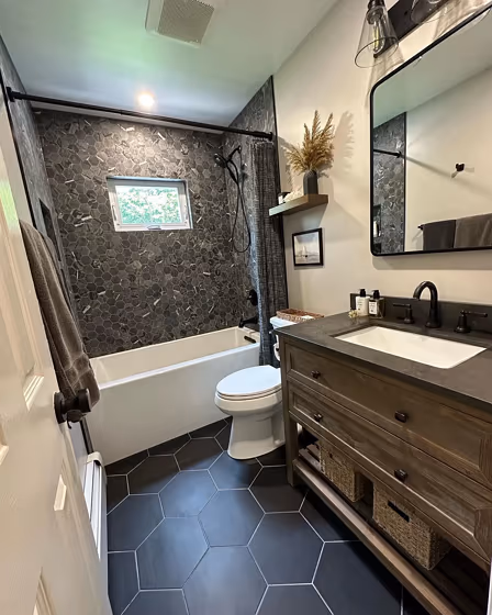
Step into a world of tranquility with Benjamin Moore's 860 Apparition. This soft and soothing hue effortlessly transforms any room into a serene sanctuary, inviting you to unwind and relax. Whether used in the bedroom for a calming retreat or in the living room to create a peaceful atmosphere, Apparition complements a variety of interior styles. Its subtle warmth adds a touch of elegance to spaces, making it a perfect choice for those seeking a timeless and sophisticated look. Embrace the beauty of Benjamin Moore 860 Apparition and infuse your home with a sense of harmony and refinement.
Loading...
LRV of Apparition
Apparition has an LRV of 57.29% and refers to Light colors that reflect most of the incident light. Why LRV is important?

Light Reflectance Value measures the amount of visible and usable light that reflects from a painted surface.
Simply put, the higher the LRV of a paint color, the brighter the room you will get.
The scale goes from 0% (absolute black, absorbing all light) to 100% (pure white, reflecting all light).
Act like a pro: When choosing paint with an LRV of 57.29%, pay attention to your bulbs' brightness. Light brightness is measured in lumens. The lower the paint's LRV, the higher lumen level you need. Every square foot of room needs at least 40 lumens. That means for a 200 ft2 living room you'll need about 8000 lumens of light – e.g., eight 1000 lm bulbs.
Color codes
We have collected almost every possible color code you could ever need.
Not sure what the difference between HEX and RGB is? We break down color models in plain language. Understanding color models
| Format | Code |
|---|---|
| HEX | #CCC8BE |
| RGB Decimal | 204, 200, 190 |
| RGB Percent | 80.00%, 78.43%, 74.51% |
| HSV | Hue: 43° Saturation: 6.86% Value: 80.0% |
| HSL | hsl(43, 12, 77) |
| CMYK | Cyan: 0.0 Magenta: 1.96 Yellow: 6.86 Key: 20.0 |
| YIQ | Y: 200.056 I: 5.597 Q: -2.266 |
| XYZ | X: 54.848 Y: 57.864 Z: 56.981 |
| CIE Lab | L:80.663 a:-0.378 b:5.49 |
| CIE Luv | L:80.663 u:2.882 v:8.181 |
| Decimal | 13420734 |
| Hunter Lab | 76.068, -4.414, 8.835 |