Benjamin Moore Chatsworth Cream / CC-220 / Wheat Sheaf / 225
Contentsshow +hide -
- Benjamin Moore Chatsworth Cream reviews (2 photos)
- What are Benjamin Moore Chatsworth Cream undertones?
- Is Chatsworth Cream 225 cool or warm?
- How light temperature affects on Chatsworth Cream
- Monochromatic color scheme
- Complementary color scheme
- Color comparison and matching
- LRV of Chatsworth Cream 225
- Color codes
- Color equivalents
| Official page: | Chatsworth Cream 225 |
| Code: | 225 |
| Name: | Chatsworth Cream |
| Brand: | Benjamin Moore |
What color is Benjamin Moore Chatsworth Cream?
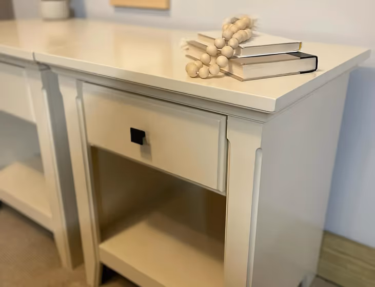
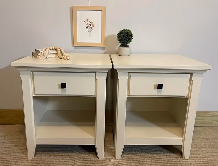
Benjamin Moore 225, also known as Chatsworth Cream, exudes a warm and inviting ambiance with its soft and subtle tones. This color harmonizes beautifully with rich earth tones, such as olive green and terracotta. Complementing it with accents in deep navy blue or charcoal gray can add a sophisticated touch to the space. Additionally, pairing it with metallic finishes like brass or copper can enhance its elegance and create a timeless aesthetic in any room.
Loading...
LRV of Chatsworth Cream
Chatsworth Cream has an LRV of 76.35% and refers to Off‑White colors that reflect a lot of light. Why LRV is important?

Light Reflectance Value measures the amount of visible and usable light that reflects from a painted surface.
Simply put, the higher the LRV of a paint color, the brighter the room you will get.
The scale goes from 0% (absolute black, absorbing all light) to 100% (pure white, reflecting all light).
Act like a pro: When choosing paint with an LRV of 76.35%, pay attention to your bulbs' brightness. Light brightness is measured in lumens. The lower the paint's LRV, the higher lumen level you need. Every square foot of room needs at least 40 lumens. That means for a 200 ft2 living room you'll need about 8000 lumens of light – e.g., eight 1000 lm bulbs.
Color codes
We have collected almost every possible color code you could ever need.
Not sure what the difference between HEX and RGB is? We break down color models in plain language. Understanding color models
| Format | Code |
|---|---|
| HEX | #EDE5CE |
| RGB Decimal | 237, 229, 206 |
| RGB Percent | 92.94%, 89.80%, 80.78% |
| HSV | Hue: 45° Saturation: 13.08% Value: 92.94% |
| HSL | hsl(45, 46, 87) |
| CMYK | Cyan: 0.0 Magenta: 3.38 Yellow: 13.08 Key: 7.06 |
| YIQ | Y: 228.77 I: 12.158 Q: -5.465 |
| XYZ | X: 74.083 Y: 78.5 Z: 69.625 |
| CIE Lab | L:91.008 a:-1.093 b:12.191 |
| CIE Luv | L:91.008 u:5.99 v:18.239 |
| Decimal | 15590862 |
| Hunter Lab | 88.6, -5.798, 15.428 |