Benjamin Moore Perspective CSP-5
Contentsshow +hide -
| Official page: | Perspective CSP-5 |
| Code: | CSP-5 |
| Name: | Perspective |
| Brand: | Benjamin Moore |
What color is Benjamin Moore Perspective?
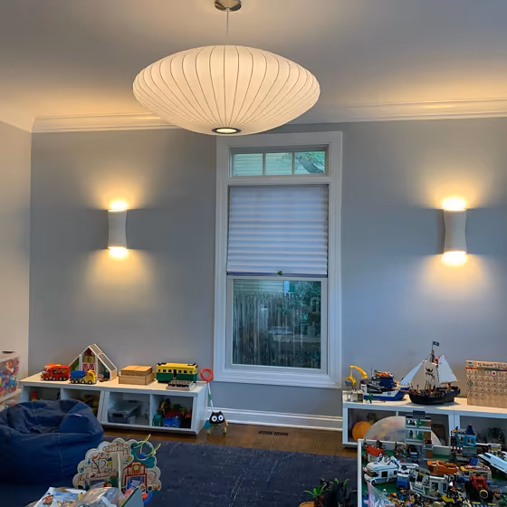
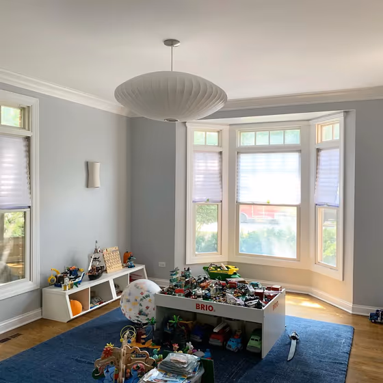
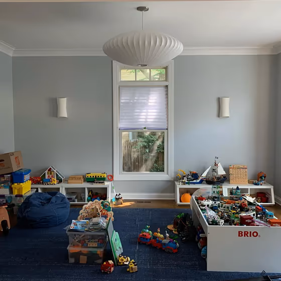
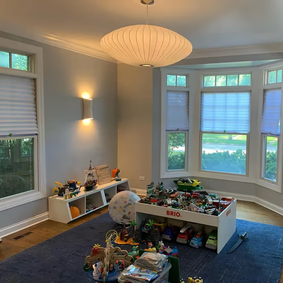
Step into a space of tranquility with Benjamin Moore CSP-5 Perspective. This soothing pale gray with subtle blue undertones creates a harmonious atmosphere perfect for modern interiors. Pair Perspective with crisp whites and soft blues for a fresh and airy feel, or add warmth with touches of natural wood and soft blush pinks. This versatile color effortlessly complements both cool and warm tones, making it an ideal choice for any room in your home. Elevate your interior design with the calming allure of Perspective.
Loading...
LRV of Perspective
Perspective has an LRV of 60.22% and refers to Light colors that reflect most of the incident light. Why LRV is important?

Light Reflectance Value measures the amount of visible and usable light that reflects from a painted surface.
Simply put, the higher the LRV of a paint color, the brighter the room you will get.
The scale goes from 0% (absolute black, absorbing all light) to 100% (pure white, reflecting all light).
Act like a pro: When choosing paint with an LRV of 60.22%, pay attention to your bulbs' brightness. Light brightness is measured in lumens. The lower the paint's LRV, the higher lumen level you need. Every square foot of room needs at least 40 lumens. That means for a 200 ft2 living room you'll need about 8000 lumens of light – e.g., eight 1000 lm bulbs.
Color codes
We have collected almost every possible color code you could ever need.
Not sure what the difference between HEX and RGB is? We break down color models in plain language. Understanding color models
| Format | Code |
|---|---|
| HEX | #CBCDCA |
| RGB Decimal | 203, 205, 202 |
| RGB Percent | 79.61%, 80.39%, 79.22% |
| HSV | Hue: 100° Saturation: 1.46% Value: 80.39% |
| HSL | hsl(100, 3, 80) |
| CMYK | Cyan: 0.98 Magenta: 0.0 Yellow: 1.46 Key: 19.61 |
| YIQ | Y: 204.06 I: -0.228 Q: -1.357 |
| XYZ | X: 57.118 Y: 60.623 Z: 64.554 |
| CIE Lab | L:82.176 a:-1.234 b:1.253 |
| CIE Luv | L:82.176 u:-0.965 v:2.099 |
| Decimal | 13356490 |
| Hunter Lab | 77.861, -5.311, 5.346 |