Benjamin Moore Philadelphia Cream HC-30
Contentsshow +hide -
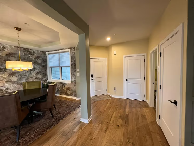
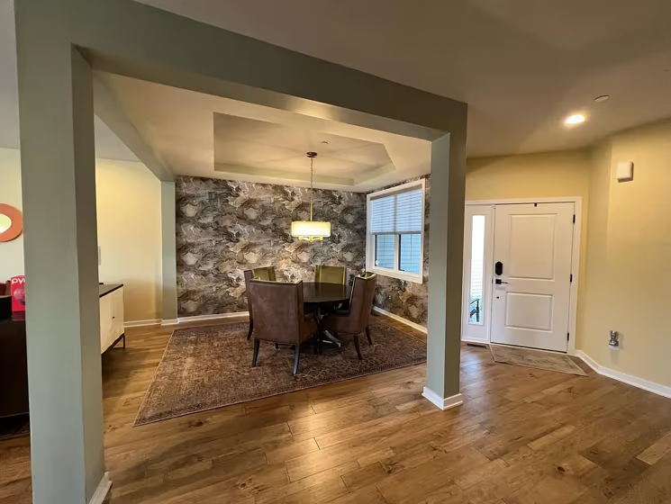
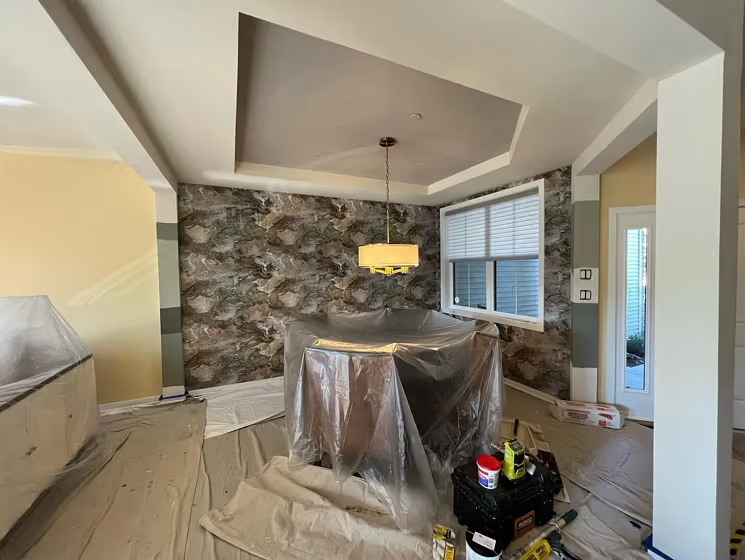
- Philadelphia Cream for living room (3 photos)
- Benjamin Moore Philadelphia Cream reviews (3 photos)
- What are Benjamin Moore Philadelphia Cream undertones?
- Is Philadelphia Cream HC-30 cool or warm?
- How light temperature affects on Philadelphia Cream
- Monochromatic color scheme
- Complementary color scheme
- Color comparison and matching
- LRV of Philadelphia Cream HC-30
- Color codes
- Color equivalents
| Official page: | Philadelphia Cream HC-30 |
| Code: | HC-30 |
| Name: | Philadelphia Cream |
| Brand: | Benjamin Moore |
What color is Benjamin Moore Philadelphia Cream?
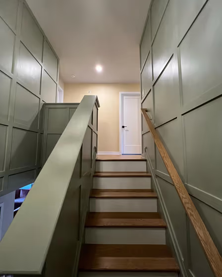
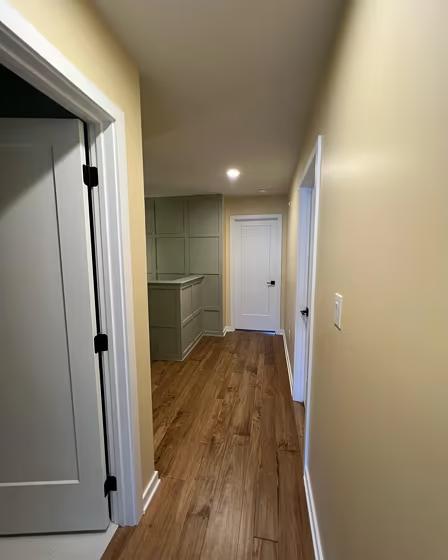
Welcome to a world of warmth and elegance with Benjamin Moore HC-30 Philadelphia Yellow. This beautiful shade exudes a timeless charm that is perfect for creating a cozy atmosphere in your living room. Pair it with rich wooden furniture and accents for a classic look that never goes out of style. In the dining room, HC-30 adds a touch of sophistication, making every meal a special occasion. Transform your bedroom into a serene retreat with Philadelphia Cream walls, enveloping you in a sense of tranquility and comfort. Embrace the subtle beauty of this versatile color throughout your home for a sense of refined luxury in every room.
Loading...
LRV of Philadelphia Cream
Philadelphia Cream has an LRV of 69.12% and refers to Light colors that reflect most of the incident light. Why LRV is important?

Light Reflectance Value measures the amount of visible and usable light that reflects from a painted surface.
Simply put, the higher the LRV of a paint color, the brighter the room you will get.
The scale goes from 0% (absolute black, absorbing all light) to 100% (pure white, reflecting all light).
Act like a pro: When choosing paint with an LRV of 69.12%, pay attention to your bulbs' brightness. Light brightness is measured in lumens. The lower the paint's LRV, the higher lumen level you need. Every square foot of room needs at least 40 lumens. That means for a 200 ft2 living room you'll need about 8000 lumens of light – e.g., eight 1000 lm bulbs.
Color codes
We have collected almost every possible color code you could ever need.
Not sure what the difference between HEX and RGB is? We break down color models in plain language. Understanding color models
| Format | Code |
|---|---|
| HEX | #EDDDB7 |
| RGB Decimal | 237, 221, 183 |
| RGB Percent | 92.94%, 86.67%, 71.76% |
| HSV | Hue: 42° Saturation: 22.78% Value: 92.94% |
| HSL | hsl(42, 60, 82) |
| CMYK | Cyan: 0.0 Magenta: 6.75 Yellow: 22.78 Key: 7.06 |
| YIQ | Y: 221.452 I: 21.745 Q: -8.441 |
| XYZ | X: 69.328 Y: 73.138 Z: 55.252 |
| CIE Lab | L:88.513 a:-0.405 b:20.672 |
| CIE Luv | L:88.513 u:11.885 v:29.667 |
| Decimal | 15588791 |
| Hunter Lab | 85.521, -4.959, 21.559 |