Benjamin Moore Piano Concerto 1445
Contentsshow +hide -
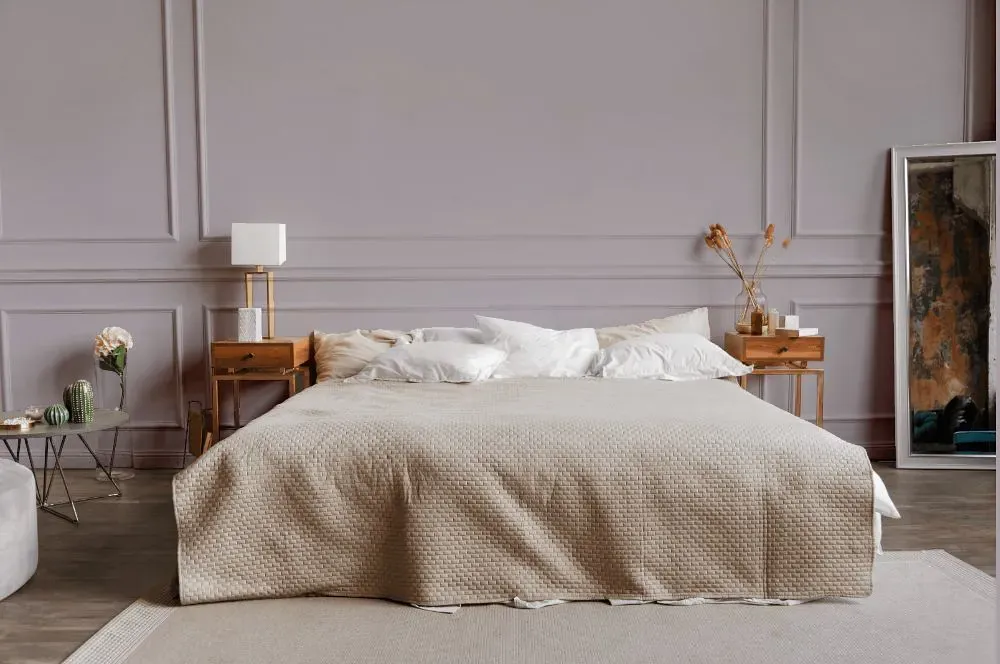
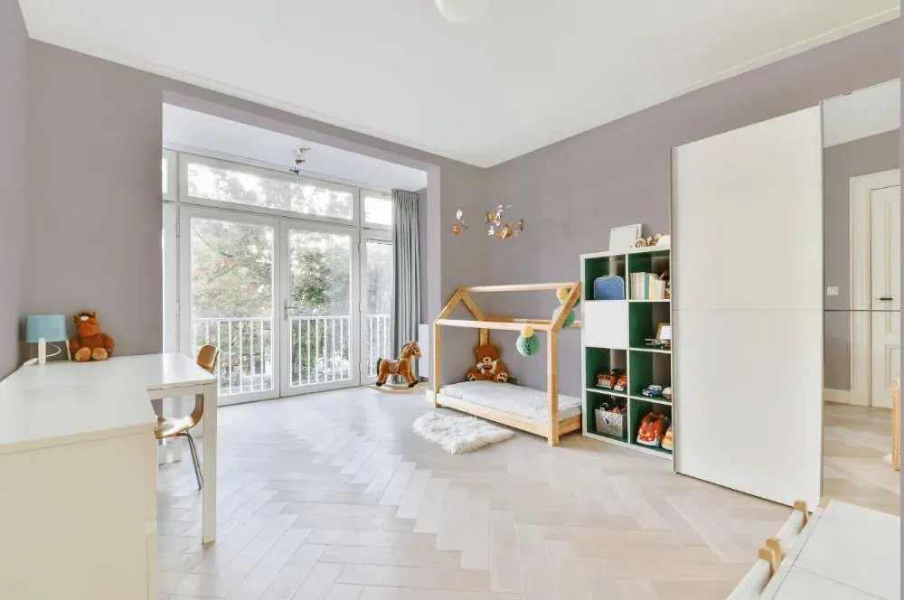
- Piano Concerto for bedroom (1 photo)
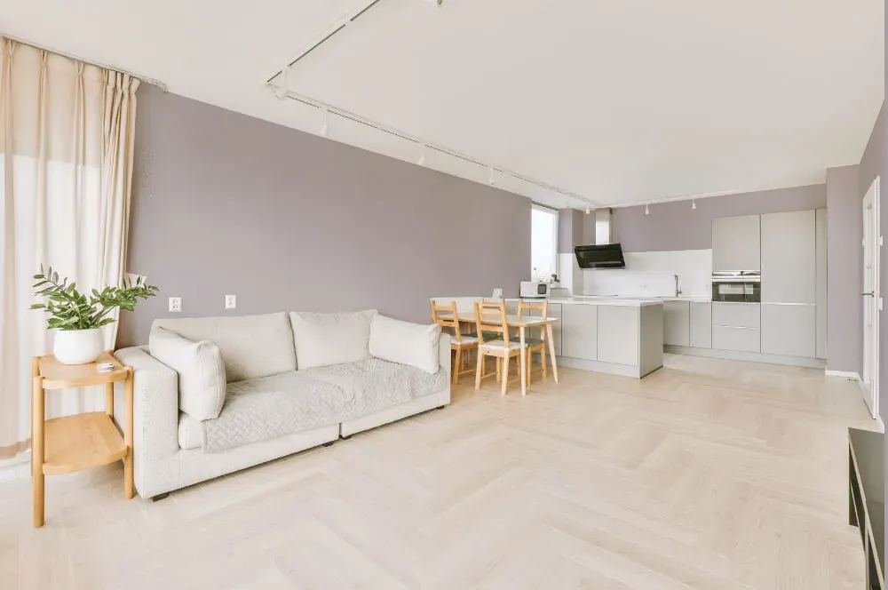
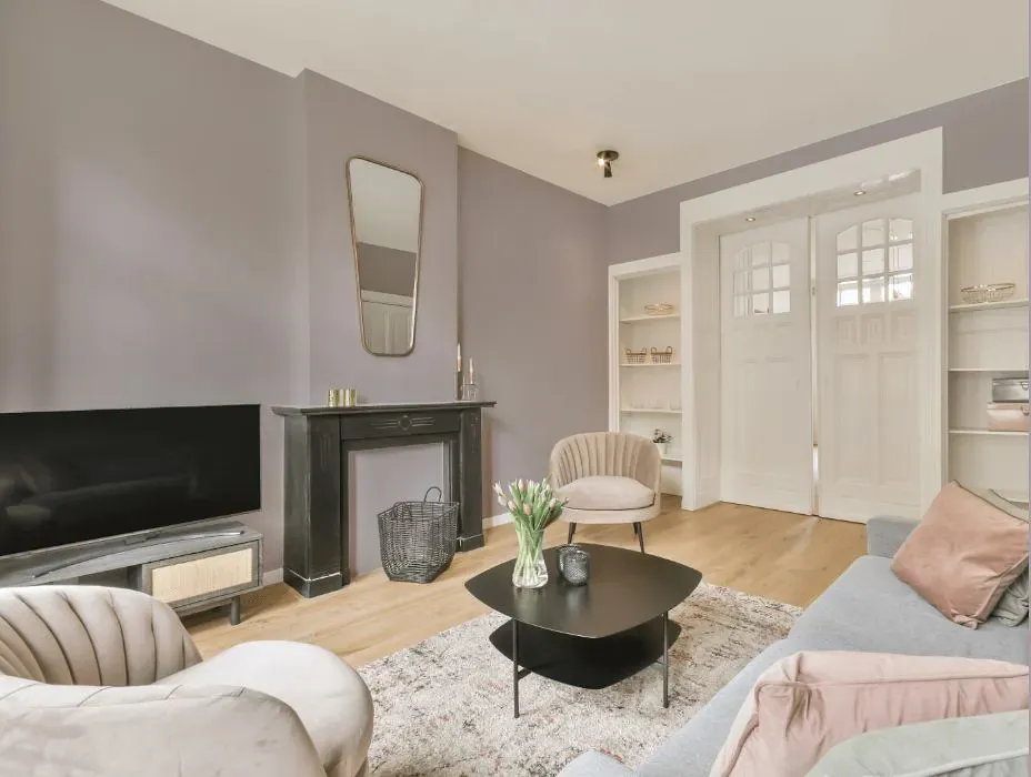
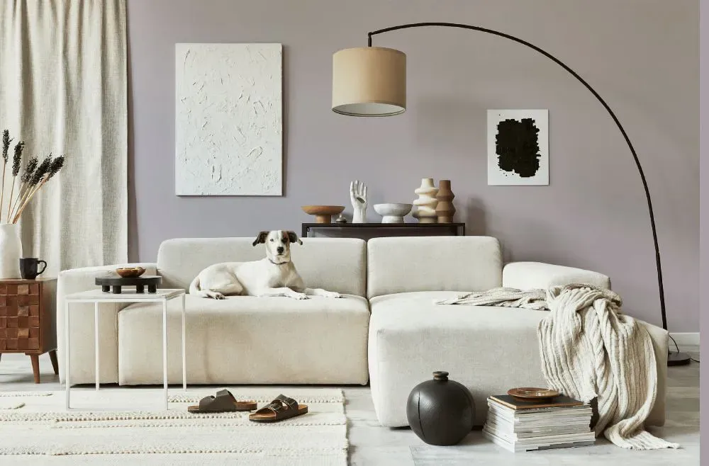
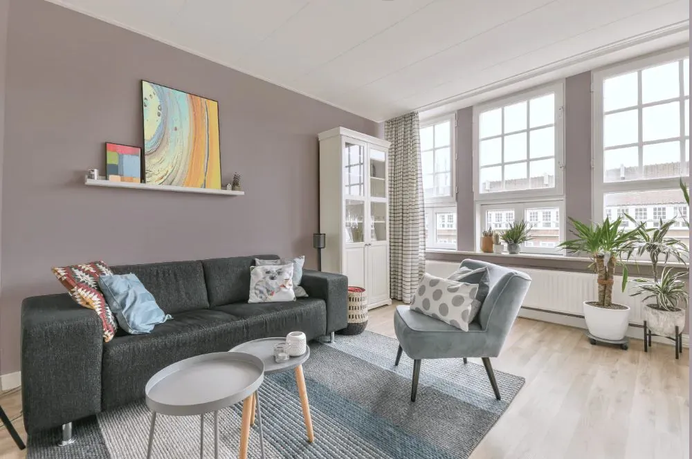
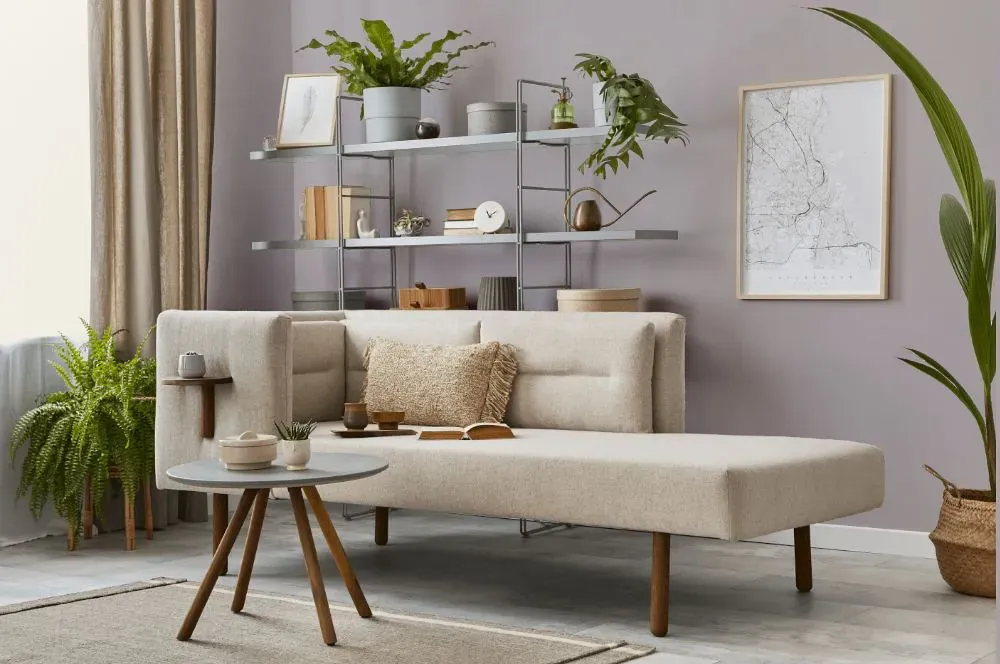
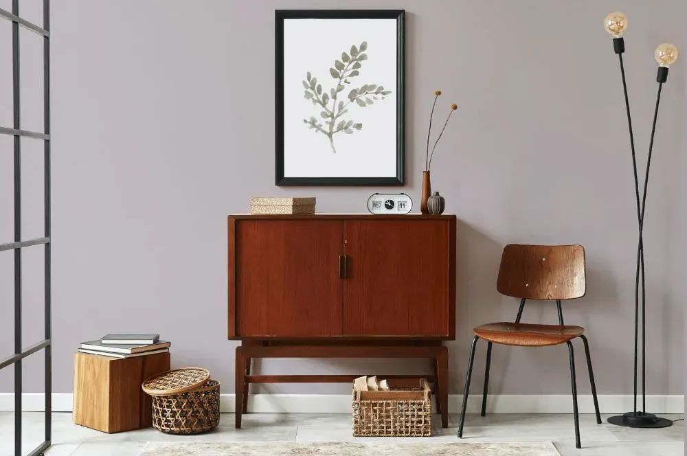
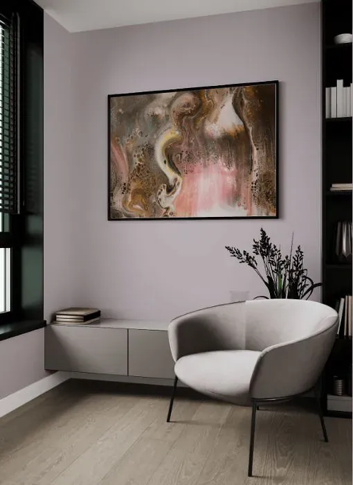
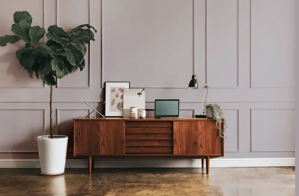
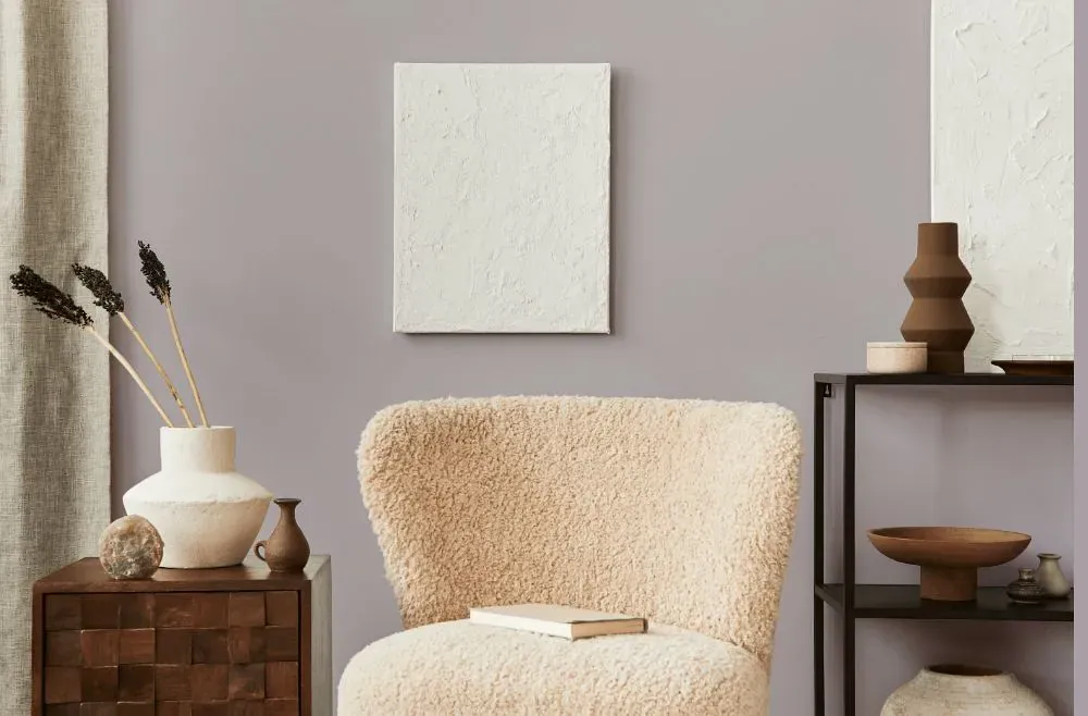
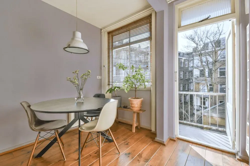
- Piano Concerto for living room (7 photos)
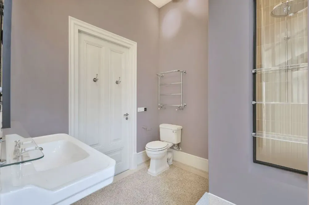
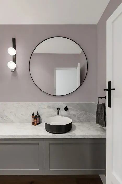
- Benjamin Moore Piano Concerto for bathroom (2 photos)
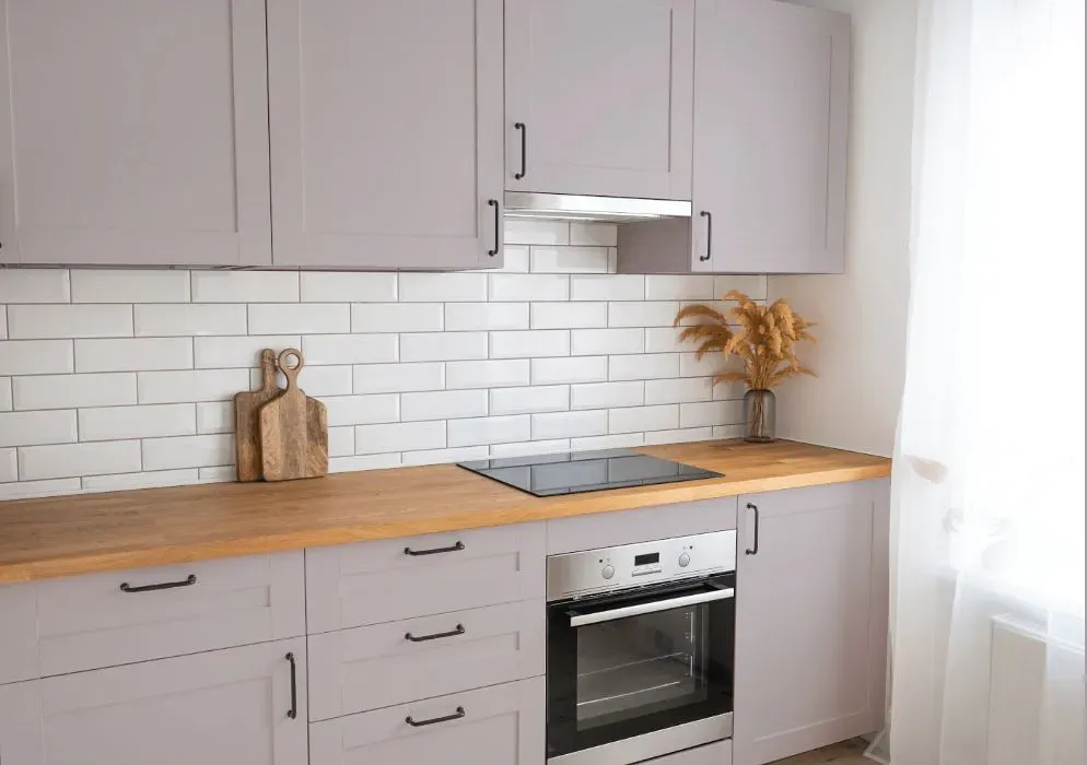
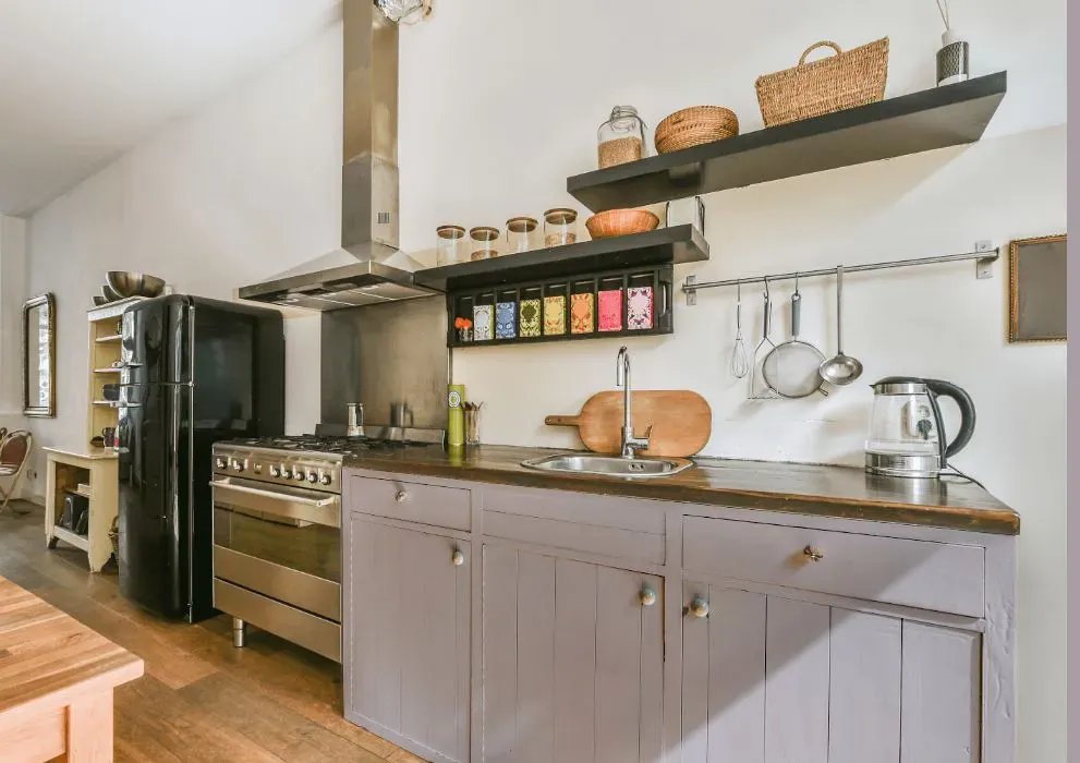
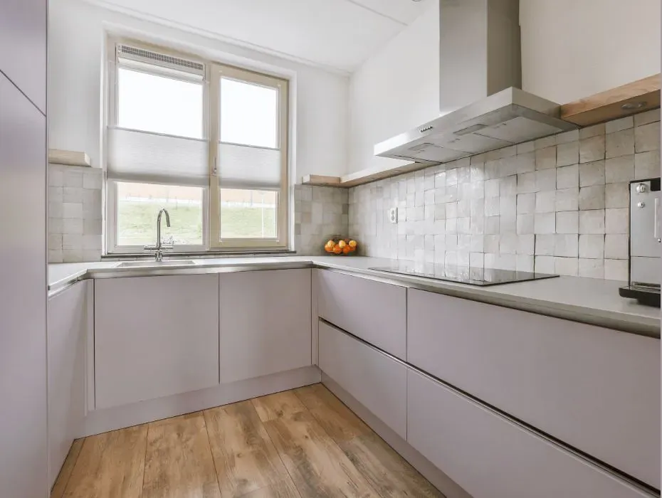
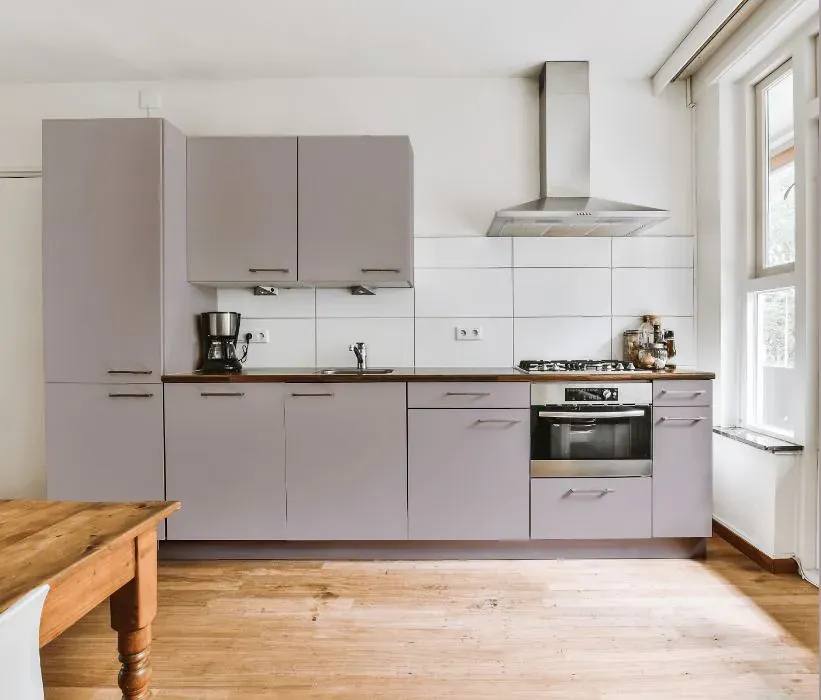
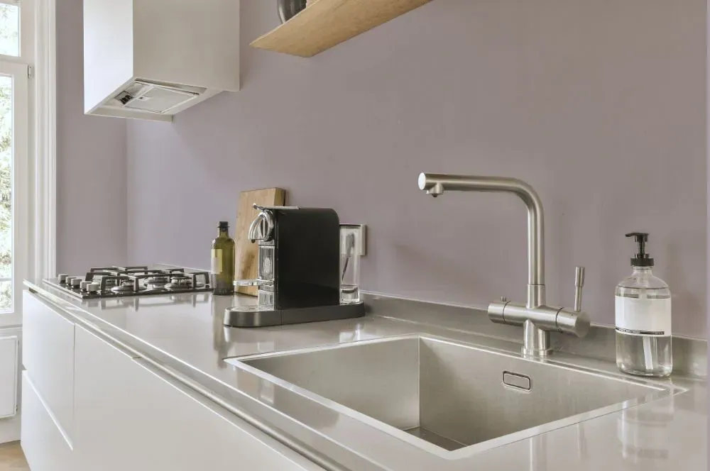
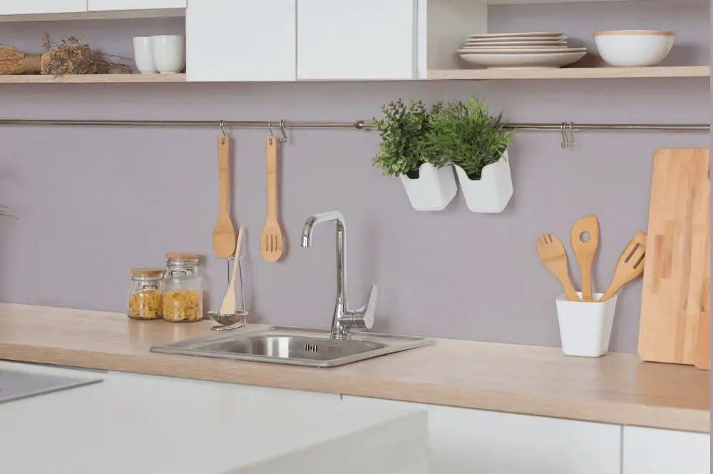
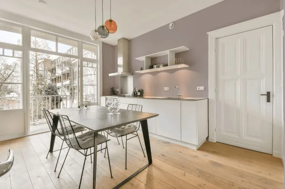
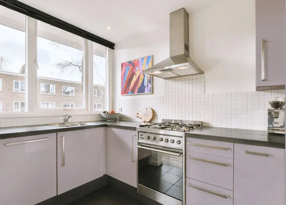
- Benjamin Moore 1445 on kitchen cabinets (4 photos)
- Benjamin Moore Piano Concerto reviews (9 photos)
- What are Benjamin Moore Piano Concerto undertones?
- Is Piano Concerto 1445 cool or warm?
- How light temperature affects on Piano Concerto
- Monochromatic color scheme
- Complementary color scheme
- Color comparison and matching
- LRV of Piano Concerto 1445
- Color codes
- Color equivalents
| Official page: | Piano Concerto 1445 |
| Code: | 1445 |
| Name: | Piano Concerto |
| Brand: | Benjamin Moore |
What color is Benjamin Moore Piano Concerto?
Step into a room painted in Benjamin Moore 1445 Piano Concerto and instantly feel transported to a sophisticated and elegant space. The deep richness of this color, reminiscent of a beautiful concerto, adds a touch of drama and depth to any room it graces. It pairs beautifully with a variety of styles, from traditional to modern, creating a timeless and chic atmosphere. Ideal for grand living rooms, cozy libraries, or luxurious bedrooms, Piano Concerto exudes a sense of warmth and refinement that will leave a lasting impression on all who enter. Elevate your interior design with this captivating hue that harmonizes effortlessly with both classic and contemporary decor.
Loading...
LRV of Piano Concerto
Piano Concerto has an LRV of 51.12% and refers to Light Medium colors that reflect half of the incident light. Why LRV is important?

Light Reflectance Value measures the amount of visible and usable light that reflects from a painted surface.
Simply put, the higher the LRV of a paint color, the brighter the room you will get.
The scale goes from 0% (absolute black, absorbing all light) to 100% (pure white, reflecting all light).
Act like a pro: When choosing paint with an LRV of 51.12%, pay attention to your bulbs' brightness. Light brightness is measured in lumens. The lower the paint's LRV, the higher lumen level you need. Every square foot of room needs at least 40 lumens. That means for a 200 ft2 living room you'll need about 8000 lumens of light – e.g., eight 1000 lm bulbs.
Color codes
We have collected almost every possible color code you could ever need.
Not sure what the difference between HEX and RGB is? We break down color models in plain language. Understanding color models
| Format | Code |
|---|---|
| HEX | #C4BCC0 |
| RGB Decimal | 196, 188, 192 |
| RGB Percent | 76.86%, 73.73%, 75.29% |
| HSV | Hue: 330° Saturation: 4.08% Value: 76.86% |
| HSL | hsl(330, 6, 75) |
| CMYK | Cyan: 0.0 Magenta: 4.08 Yellow: 2.04 Key: 23.14 |
| YIQ | Y: 190.848 I: 3.482 Q: 2.937 |
| XYZ | X: 50.26 Y: 51.508 Z: 57.149 |
| CIE Lab | L:76.986 a:3.526 b:-1.009 |
| CIE Luv | L:76.986 u:4.352 v:-2.121 |
| Decimal | 12893376 |
| Hunter Lab | 71.769, -0.591, 3.026 |