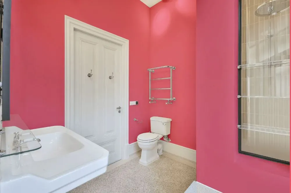
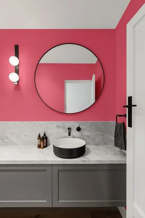
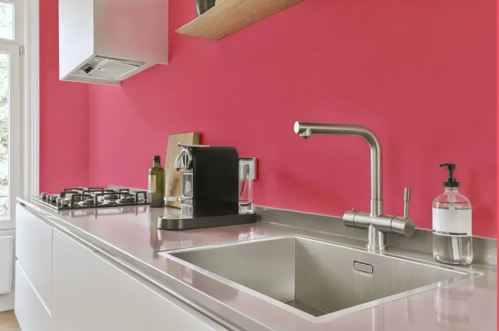
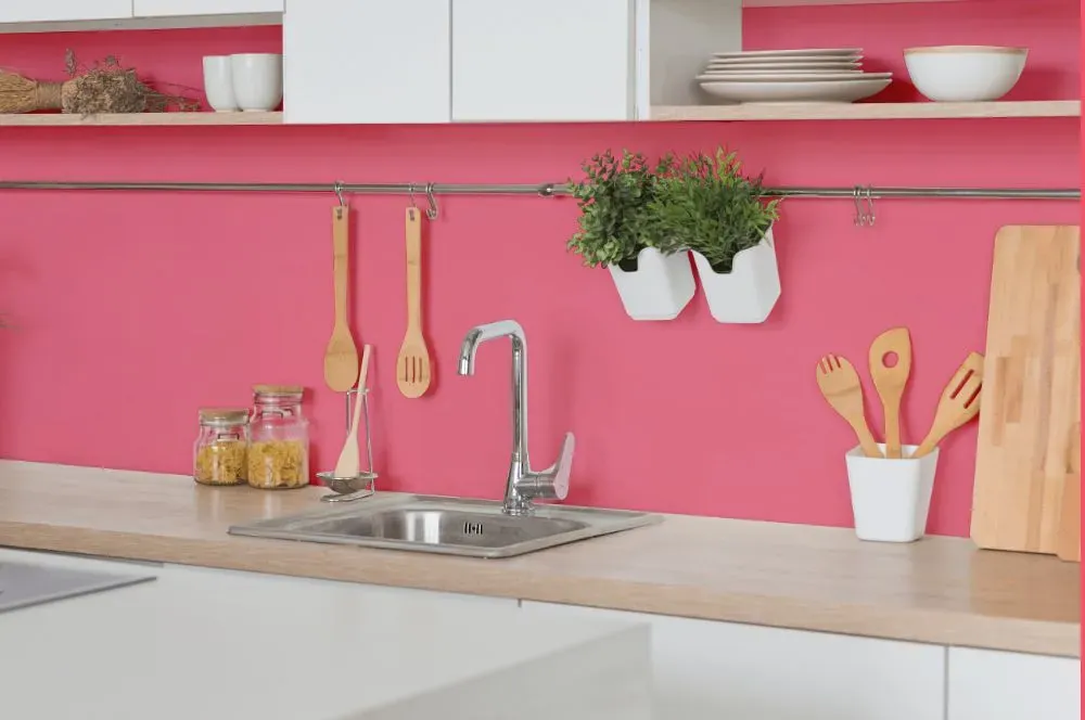
Benjamin Moore Pink Popsicle 2001-40
Contentsshow +hide -
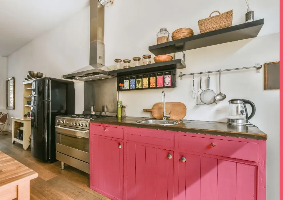
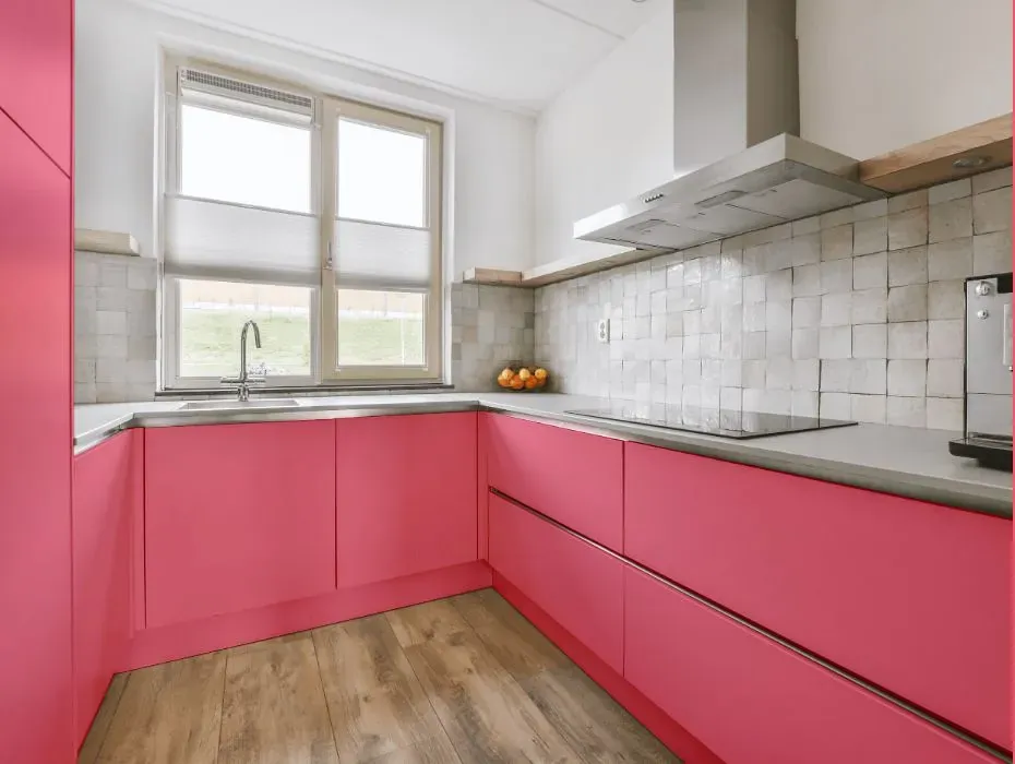
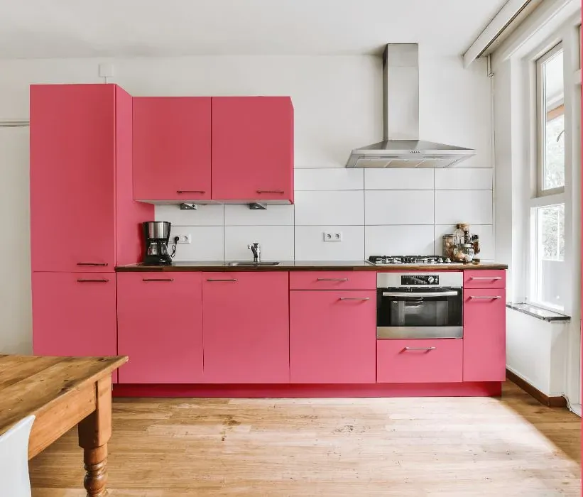
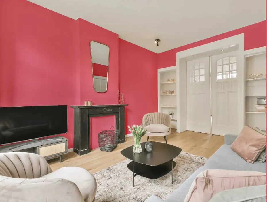
- Benjamin Moore Pink Popsicle reviews (23 photos)
- What are Benjamin Moore Pink Popsicle undertones?
- Is Pink Popsicle 2001-40 cool or warm?
- How light temperature affects on Pink Popsicle
- Monochromatic color scheme
- Complementary color scheme
- Color comparison and matching
- LRV of Pink Popsicle 2001-40
- Color codes
- Color equivalents
| Official page: | Pink Popsicle 2001-40 |
| Code: | 2001-40 |
| Name: | Pink Popsicle |
| Brand: | Benjamin Moore |
What color is Benjamin Moore Pink Popsicle?
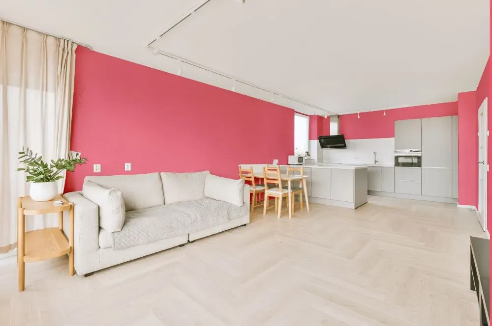
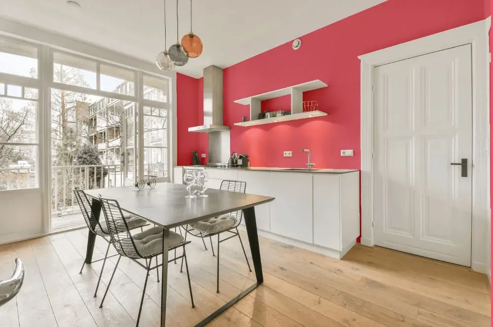
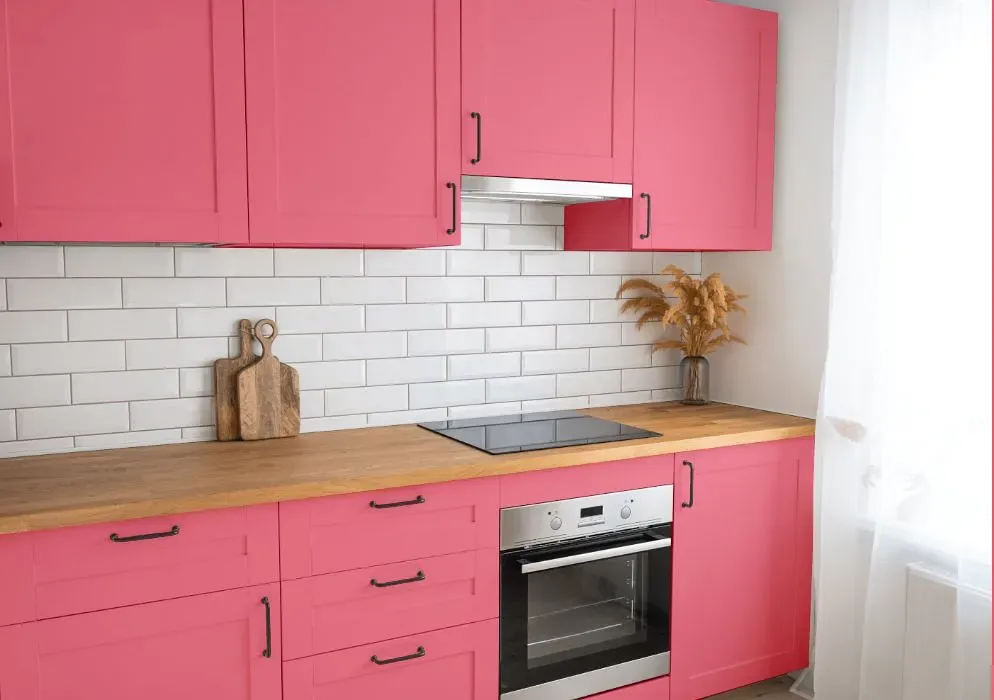
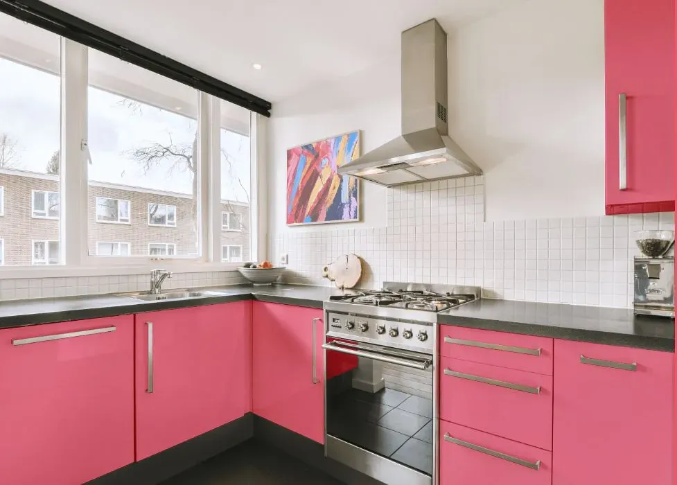
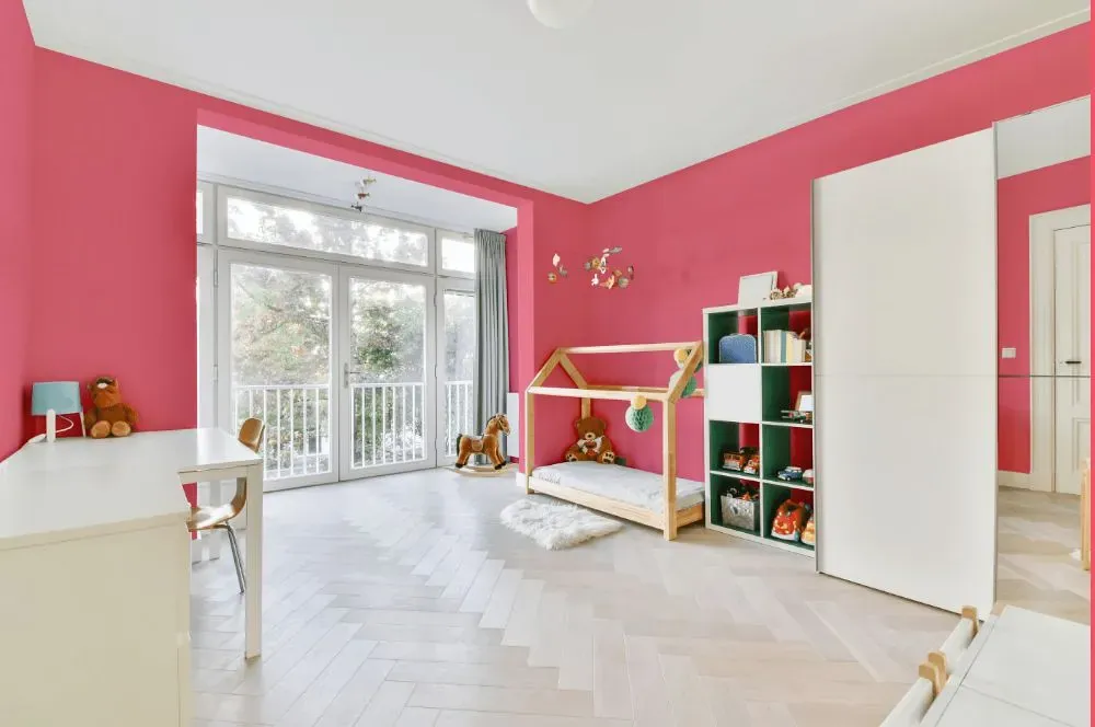
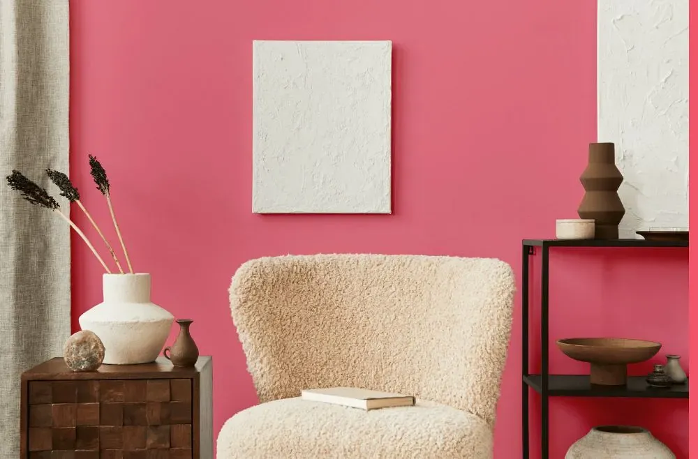
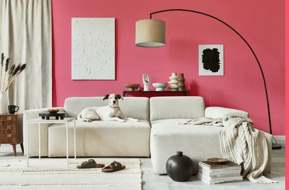
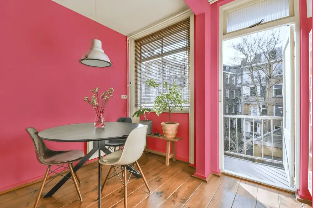
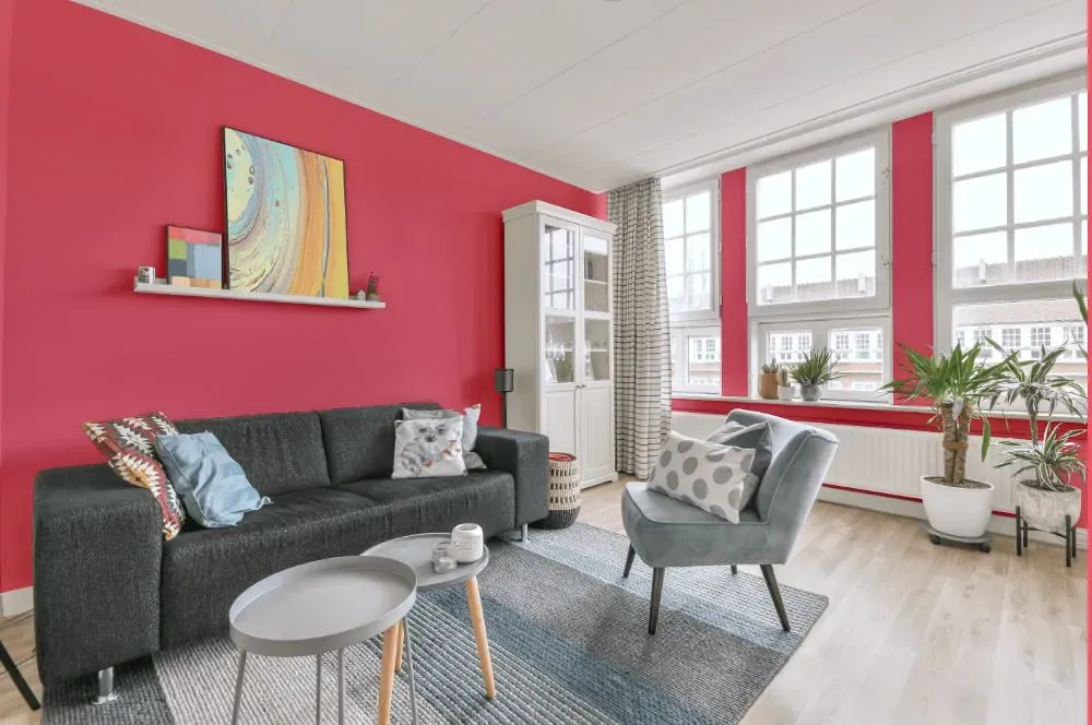
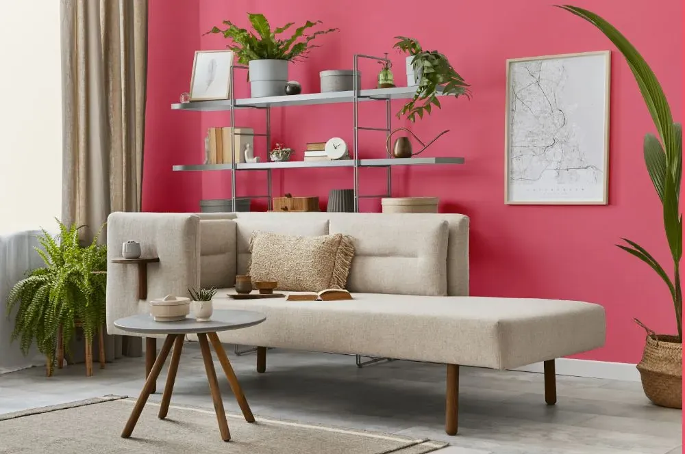
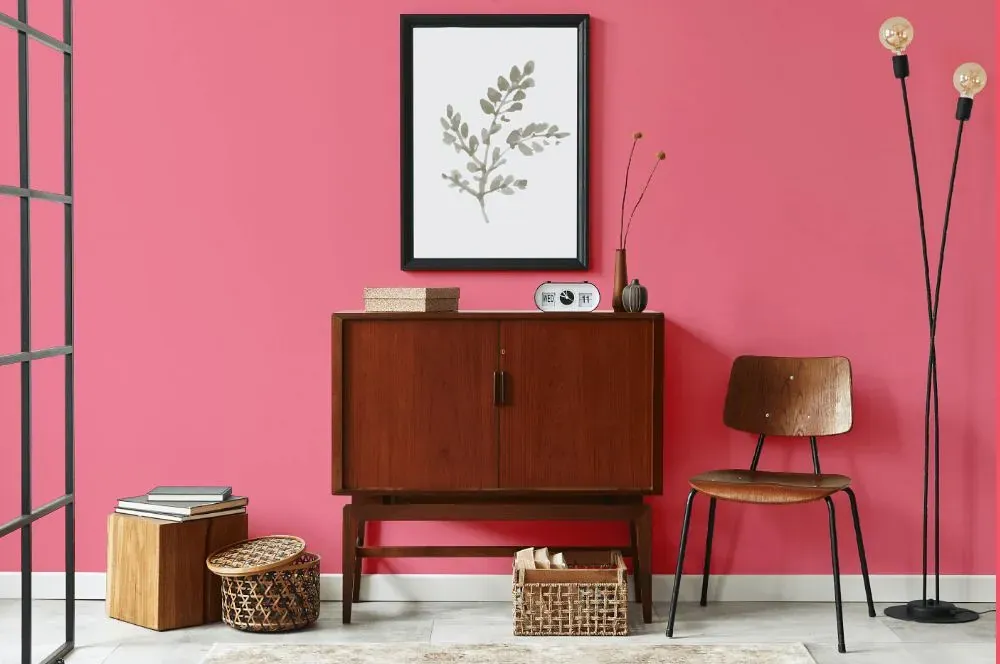
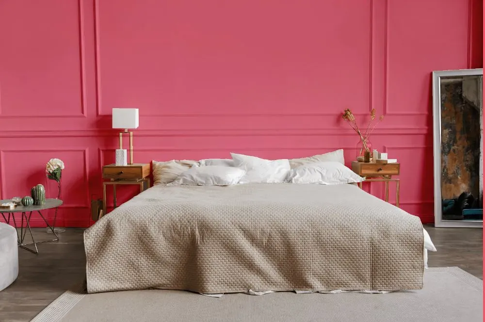
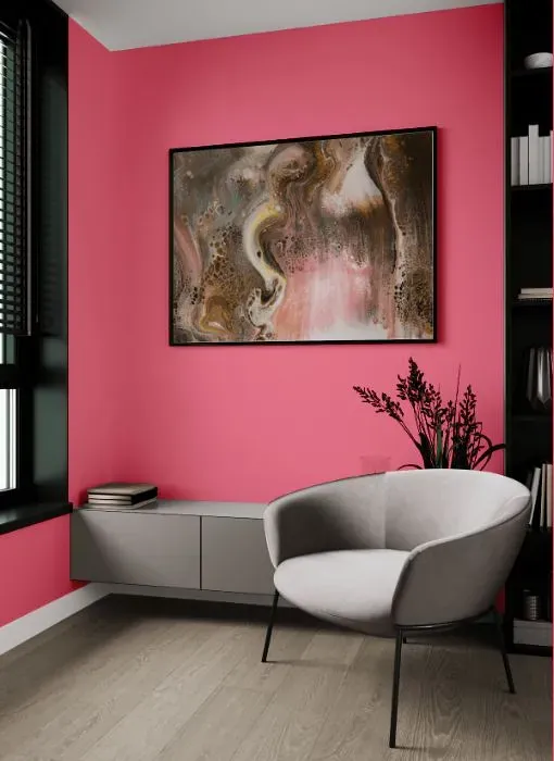
Benjamin Moore 2001-40 Pink Popsicle is a playful and vibrant hue that adds a pop of color to any space. This cheerful pink pairs beautifully with soft neutrals like off-white and light gray to create a calming and balanced look. For a more bold and dynamic combination, try pairing Pink Popsicle with deep navy blue or emerald green for a striking contrast. Whether used as an accent wall or in smaller decor pieces, this versatile shade is sure to brighten up any room with its contemporary flair. Explore the endless possibilities of Benjamin Moore's Pink Popsicle to create a space that is both stylish and inviting.
Loading...
LRV of Pink Popsicle
Pink Popsicle has an LRV of 36.98% and refers to Medium colors that reflect a lot of light. Why LRV is important?

Light Reflectance Value measures the amount of visible and usable light that reflects from a painted surface.
Simply put, the higher the LRV of a paint color, the brighter the room you will get.
The scale goes from 0% (absolute black, absorbing all light) to 100% (pure white, reflecting all light).
Act like a pro: When choosing paint with an LRV of 36.98%, pay attention to your bulbs' brightness. Light brightness is measured in lumens. The lower the paint's LRV, the higher lumen level you need. Every square foot of room needs at least 40 lumens. That means for a 200 ft2 living room you'll need about 8000 lumens of light – e.g., eight 1000 lm bulbs.
Color codes
We have collected almost every possible color code you could ever need.
Not sure what the difference between HEX and RGB is? We break down color models in plain language. Understanding color models
| Format | Code |
|---|---|
| HEX | #F57E92 |
| RGB Decimal | 245, 126, 146 |
| RGB Percent | 96.08%, 49.41%, 57.25% |
| HSV | Hue: 350° Saturation: 48.57% Value: 96.08% |
| HSL | hsl(350, 86, 73) |
| CMYK | Cyan: 0.0 Magenta: 48.57 Yellow: 40.41 Key: 3.92 |
| YIQ | Y: 163.861 I: 64.485 Q: 31.397 |
| XYZ | X: 50.308 Y: 36.414 Z: 31.566 |
| CIE Lab | L:66.835 a:47.405 b:10.452 |
| CIE Luv | L:66.835 u:81.051 v:5.035 |
| Decimal | 16088722 |
| Hunter Lab | 60.344, 43.209, 11.227 |