Benjamin Moore Providence Blue / AC-24 / Charlotte Slate / 1636
Contentsshow +hide -
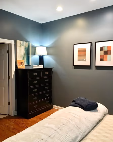
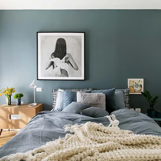
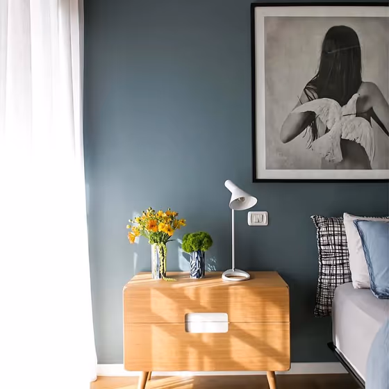
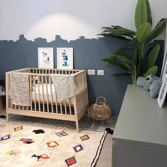
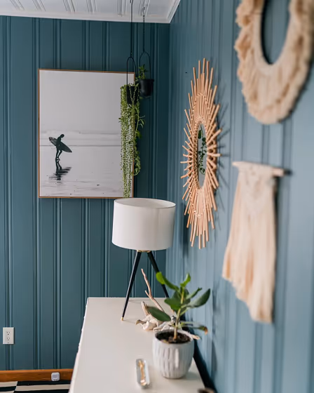
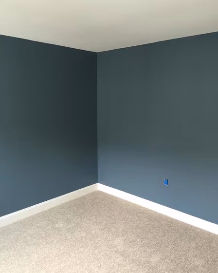
- Providence Blue for bedroom (3 photos)
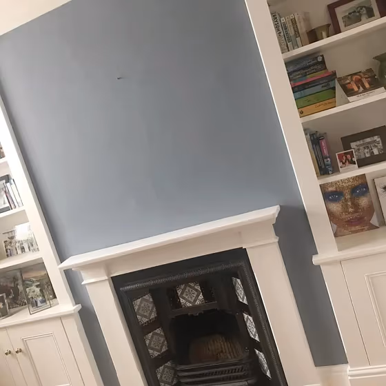
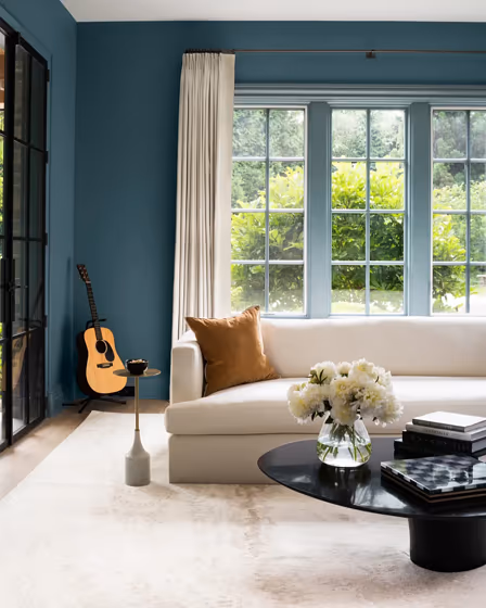
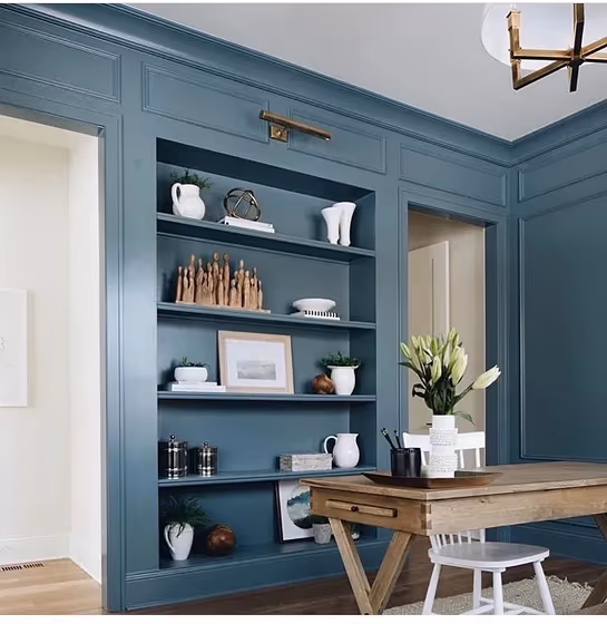
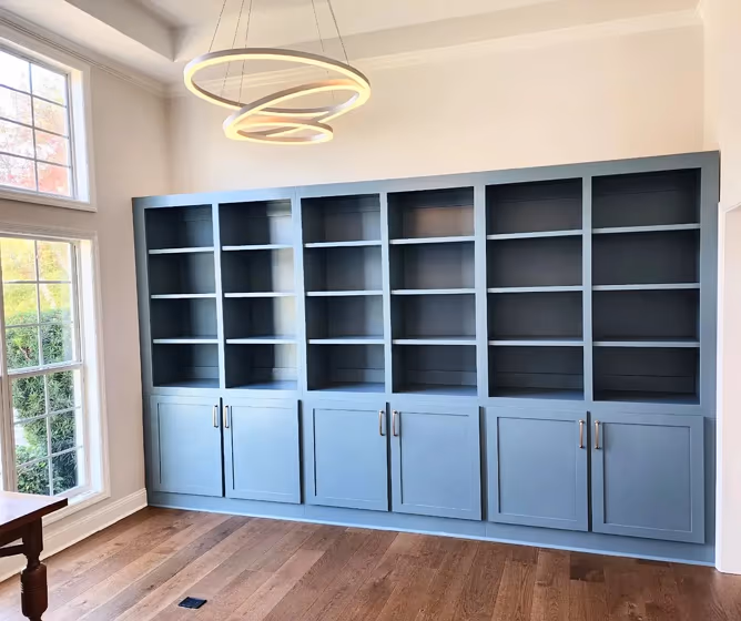
- Providence Blue for living room (2 photos)
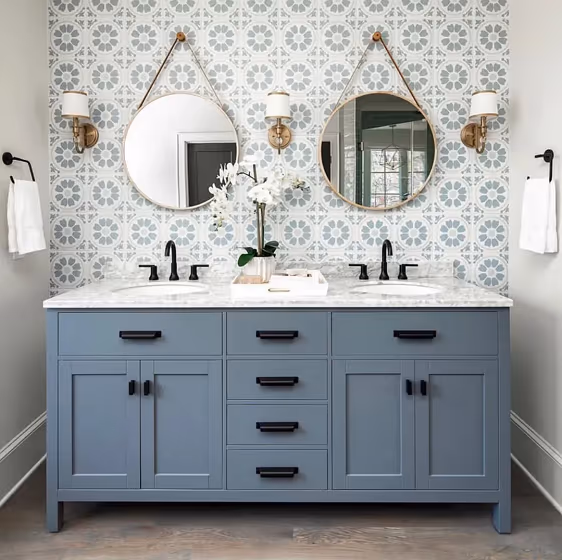
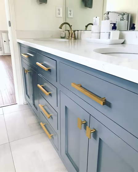
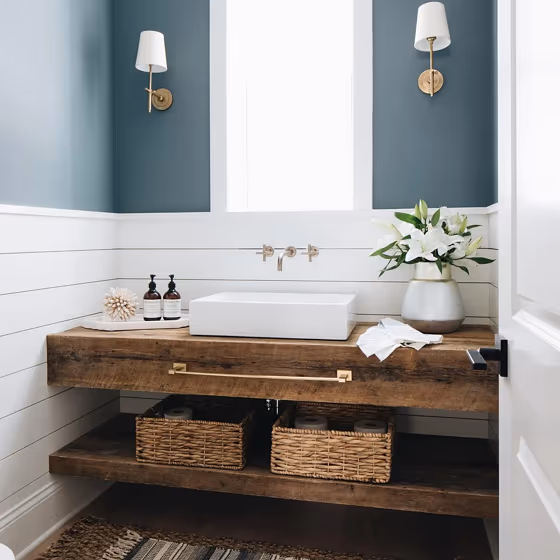
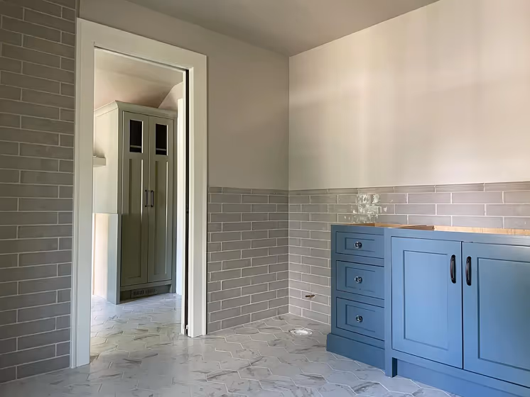
- Benjamin Moore Providence Blue for bathroom (3 photos)
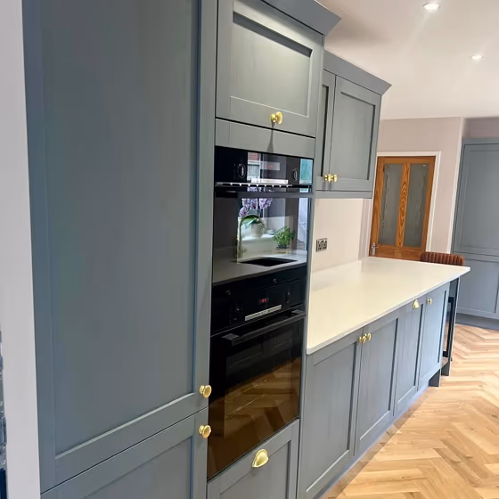
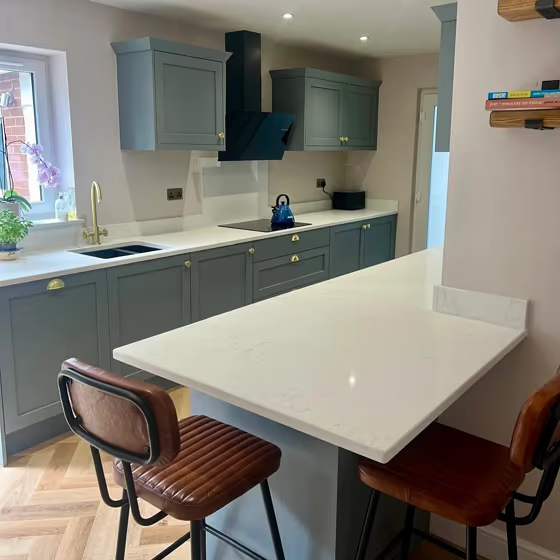
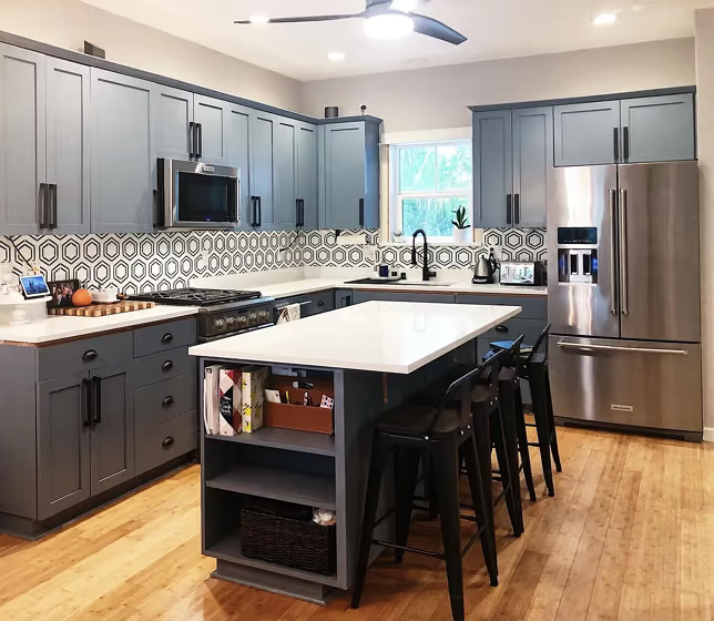
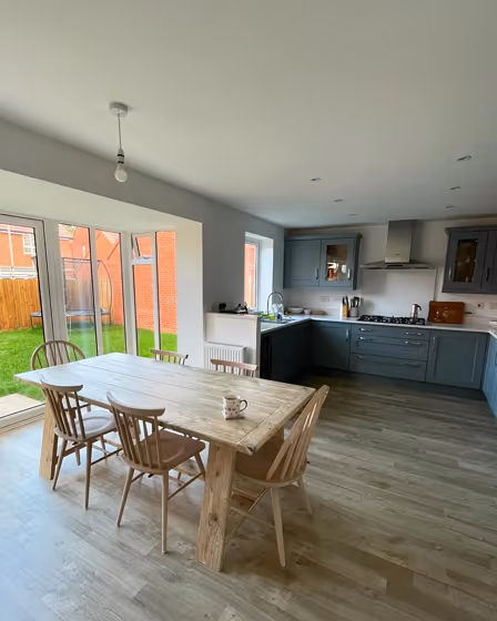
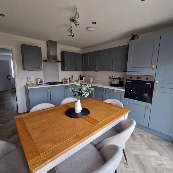
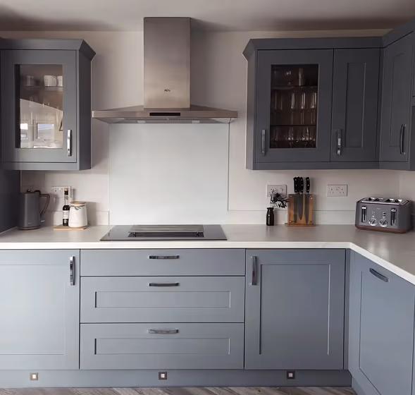
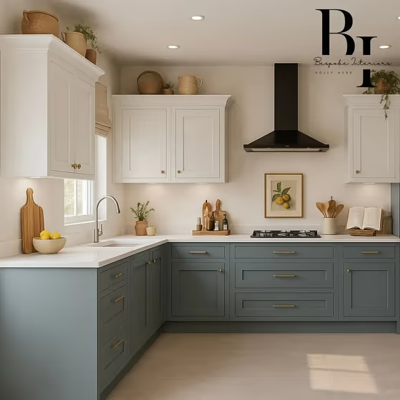
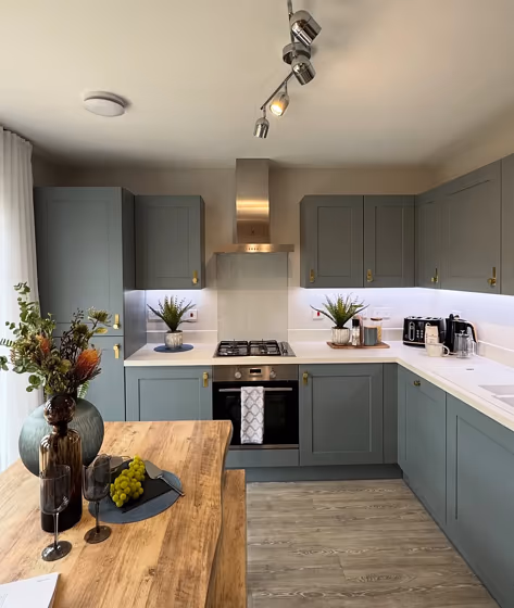
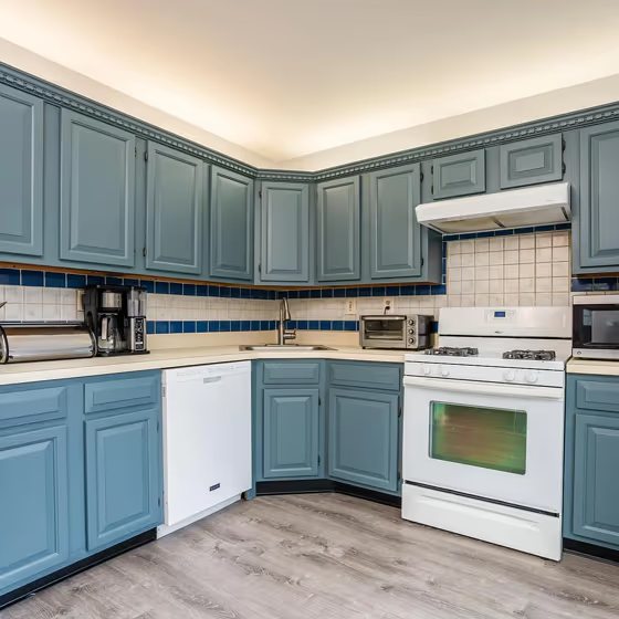
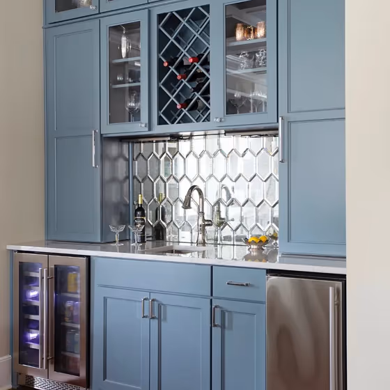
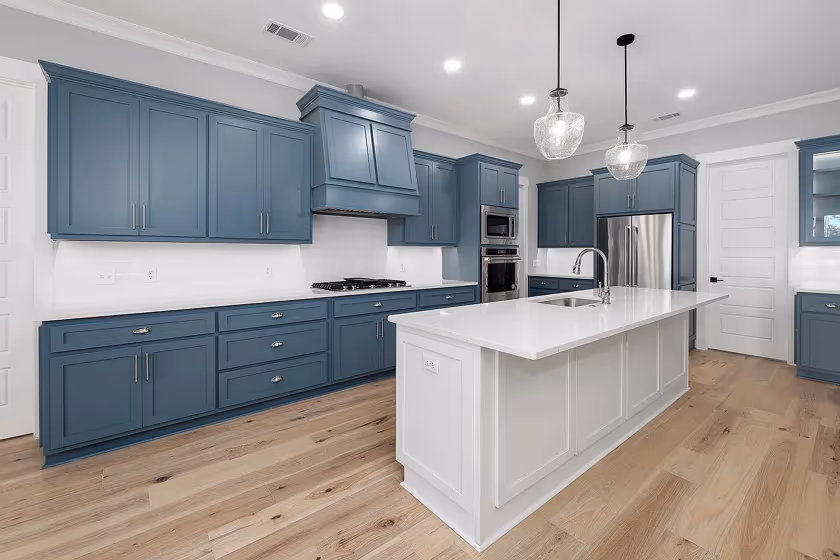
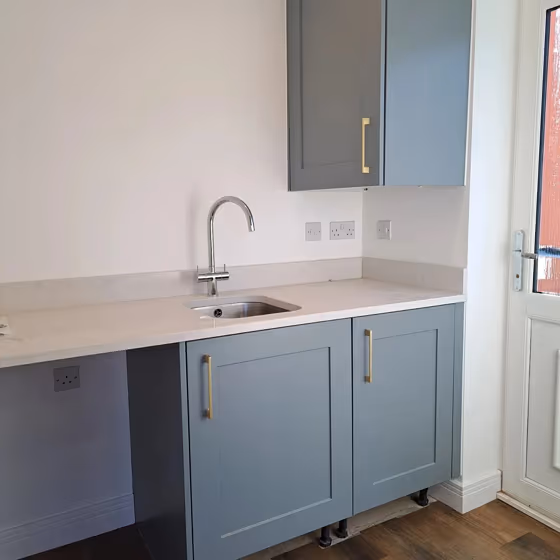
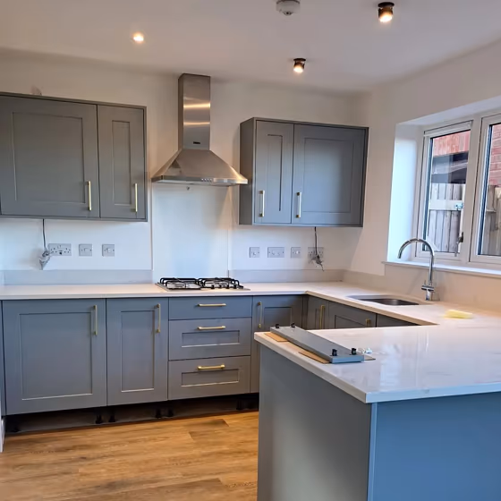
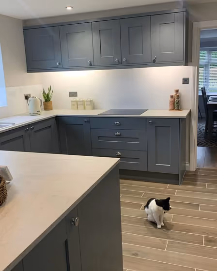
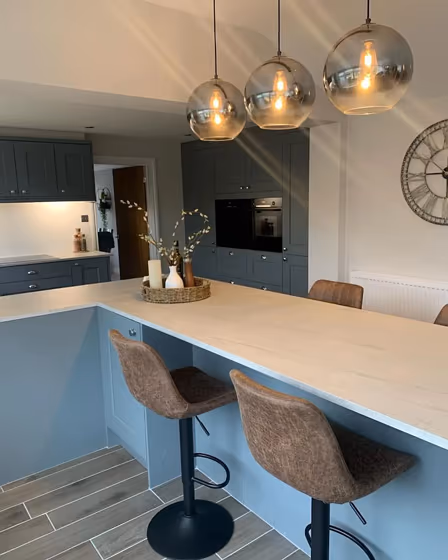
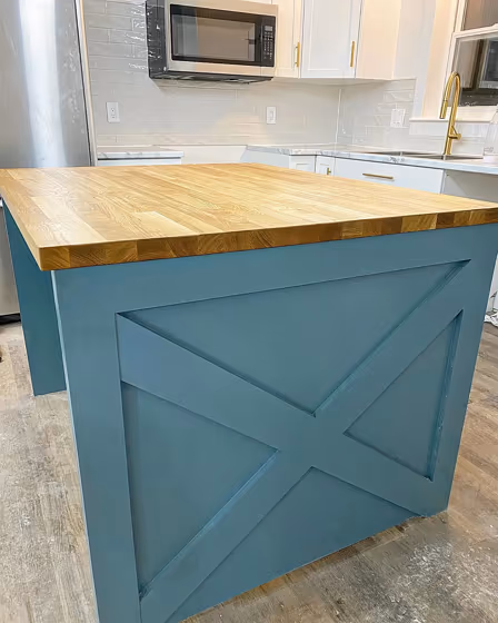
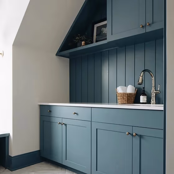
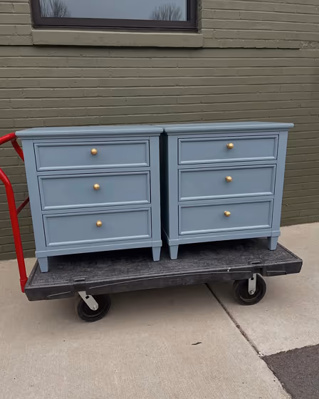
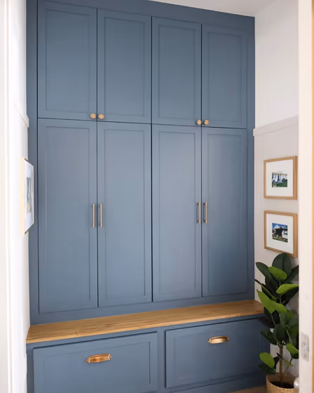
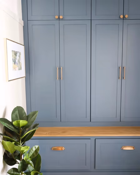
- Benjamin Moore 1636 on kitchen cabinets (17 photos)
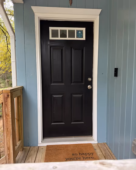
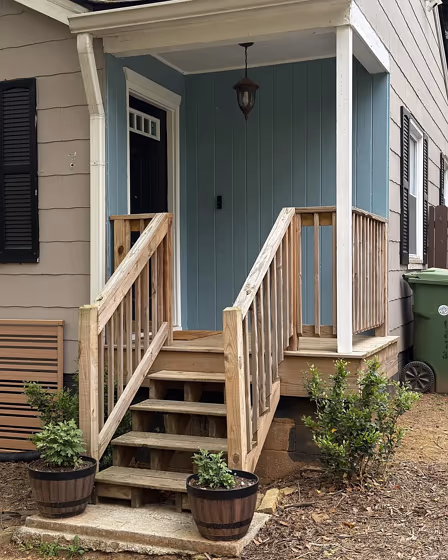
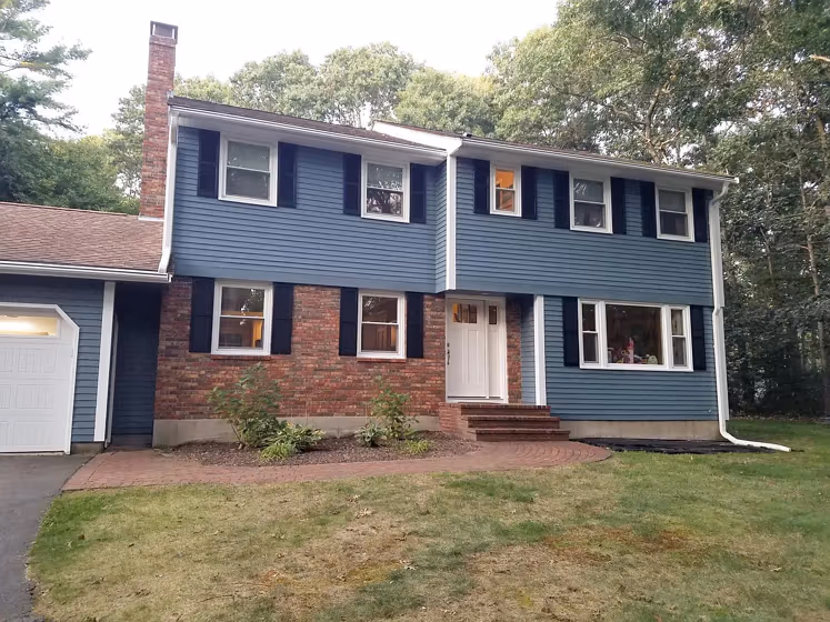
- Providence Blue for exterior (4 photos)
- Benjamin Moore Providence Blue reviews (14 photos)
- What are Benjamin Moore Providence Blue undertones?
- Is Providence Blue 1636 cool or warm?
- How light temperature affects on Providence Blue
- Monochromatic color scheme
- Complementary color scheme
- Color comparison and matching
- LRV of Providence Blue 1636
- Color codes
- Color equivalents
| Official page: | Providence Blue 1636 |
| Code: | 1636 |
| Name: | Providence Blue |
| Brand: | Benjamin Moore |
What color is Benjamin Moore Providence Blue?
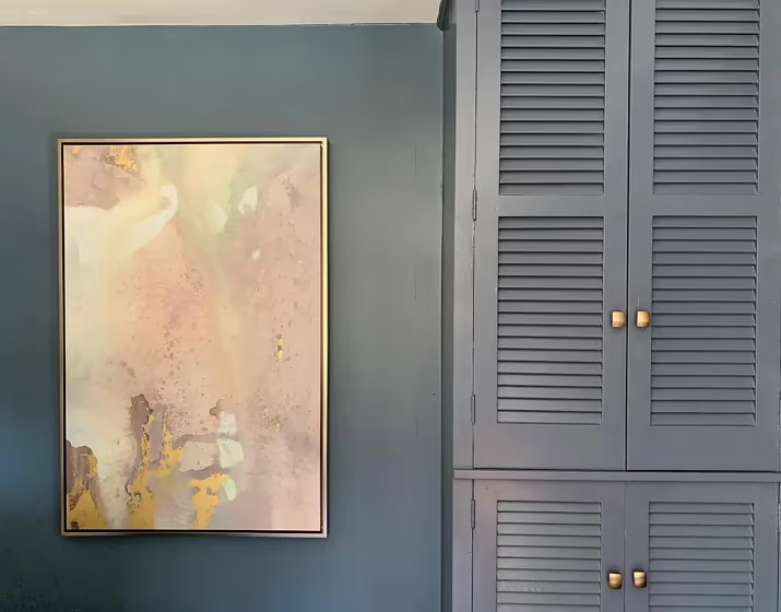
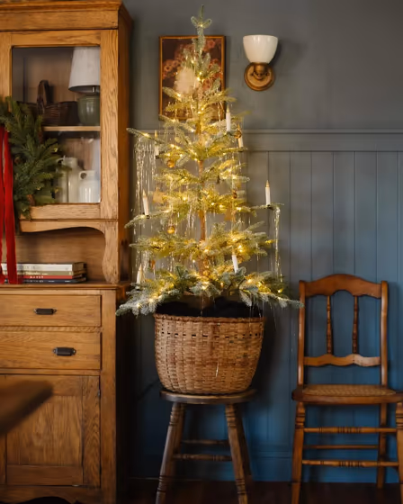
Benjamin Moore 1636 Providence Blue lends a sense of calm and sophistication to any space. This warm, rich tone creates a welcoming ambiance, perfect for both traditional and modern interiors. Pair it with crisp white trim for a classic look, or with soft neutrals like Benjamin Moore 2112-60 Cedar Key for a more contemporary feel. This versatile color works well with a variety of decor styles and can easily be incorporated into any room in your home.
Loading...
LRV of Providence Blue
Providence Blue has an LRV of 19.23% and refers to Medium Dark which means that this color reflects very little light. Why LRV is important?

Light Reflectance Value measures the amount of visible and usable light that reflects from a painted surface.
Simply put, the higher the LRV of a paint color, the brighter the room you will get.
The scale goes from 0% (absolute black, absorbing all light) to 100% (pure white, reflecting all light).
Act like a pro: When choosing paint with an LRV of 19.23%, pay attention to your bulbs' brightness. Light brightness is measured in lumens. The lower the paint's LRV, the higher lumen level you need. Every square foot of room needs at least 40 lumens. That means for a 200 ft2 living room you'll need about 8000 lumens of light – e.g., eight 1000 lm bulbs.
Color codes
We have collected almost every possible color code you could ever need.
Not sure what the difference between HEX and RGB is? We break down color models in plain language. Understanding color models
| Format | Code |
|---|---|
| HEX | #66797F |
| RGB Decimal | 102, 121, 127 |
| RGB Percent | 40.00%, 47.45%, 49.80% |
| HSV | Hue: 194° Saturation: 19.69% Value: 49.8% |
| HSL | hsl(194, 11, 45) |
| CMYK | Cyan: 19.69 Magenta: 4.72 Yellow: 0.0 Key: 50.2 |
| YIQ | Y: 116.003 I: -13.25 Q: -2.152 |
| XYZ | X: 16.146 Y: 18.031 Z: 22.703 |
| CIE Lab | L:49.534 a:-5.558 b:-5.606 |
| CIE Luv | L:49.534 u:-10.154 v:-6.986 |
| Decimal | 6715775 |
| Hunter Lab | 42.463, -6.438, -1.974 |