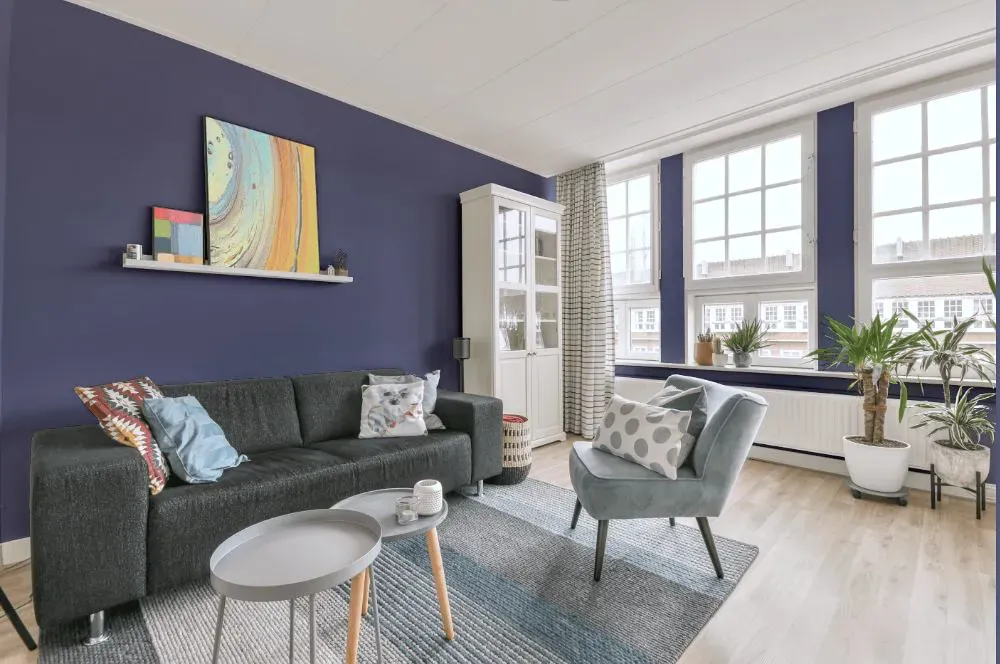
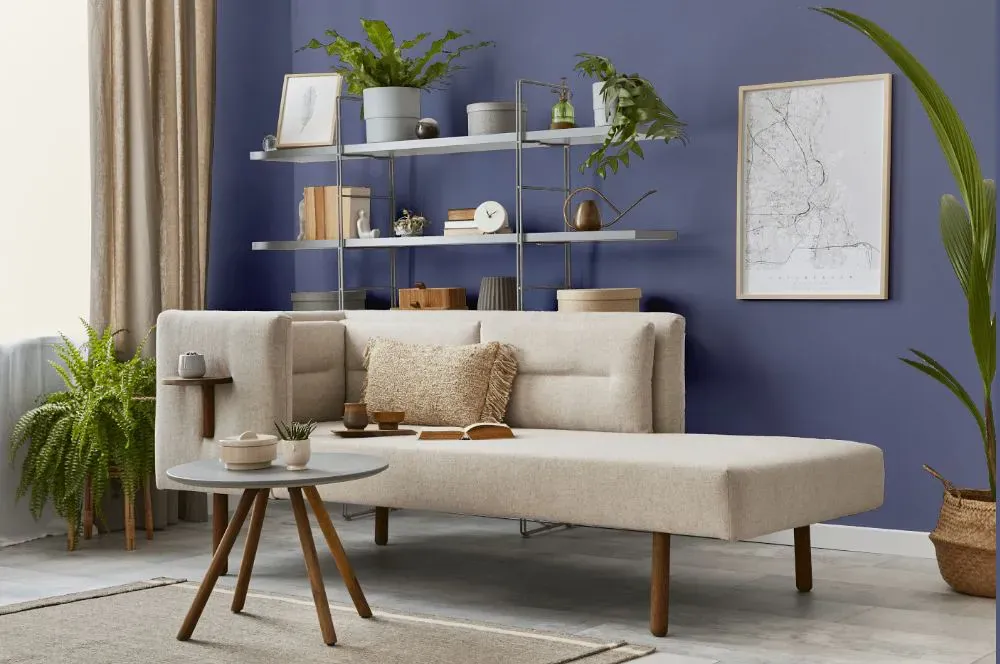
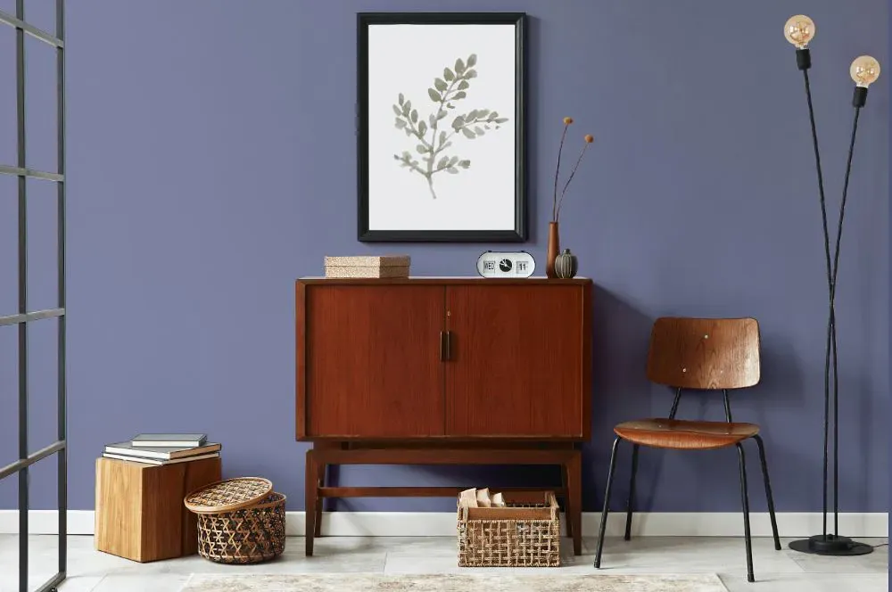
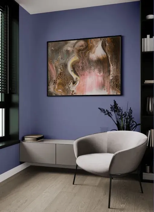
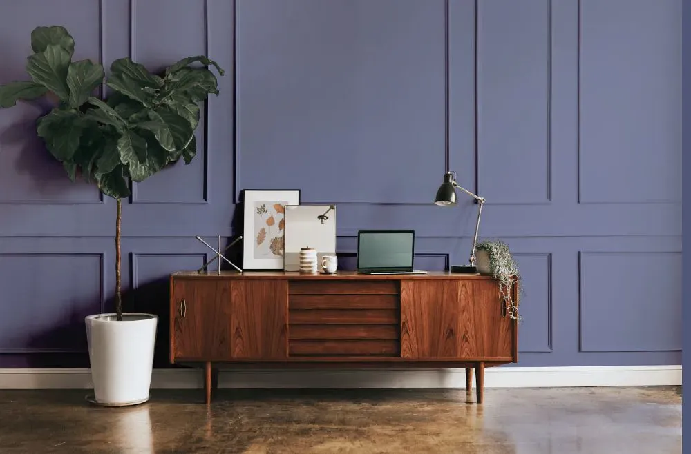
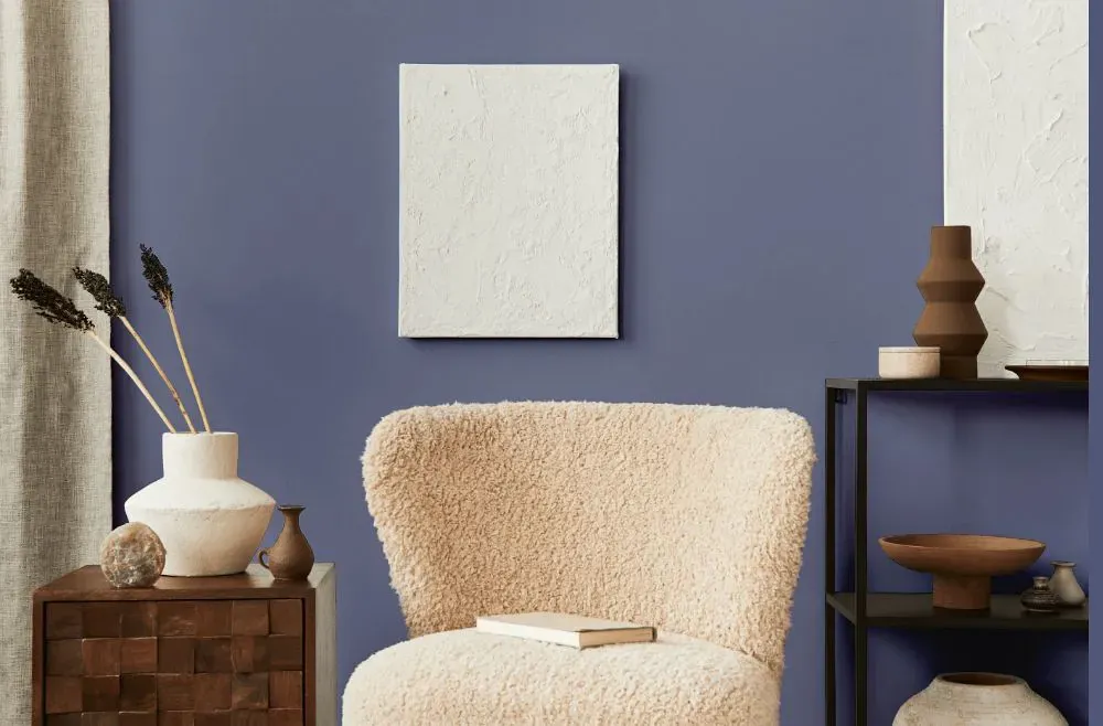
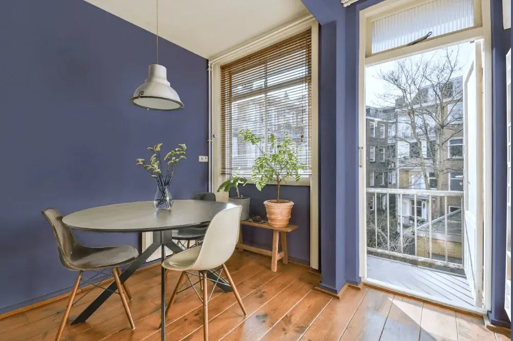
Benjamin Moore Queen's Wreath 1426
Contentsshow +hide -
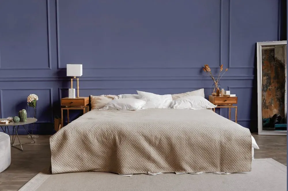
- Queen's Wreath for bedroom (1 photo)
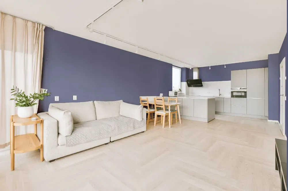
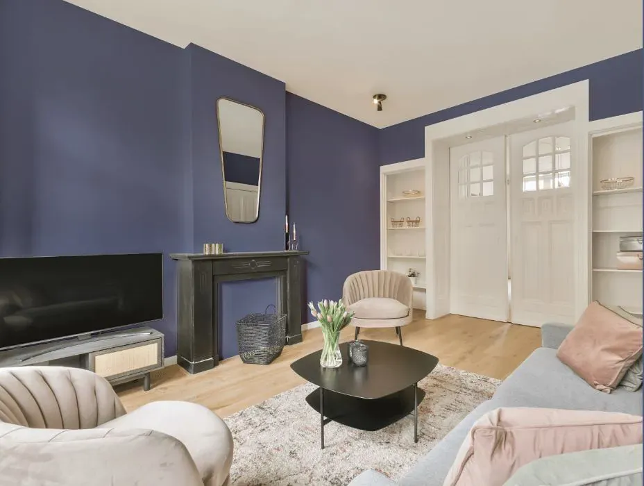
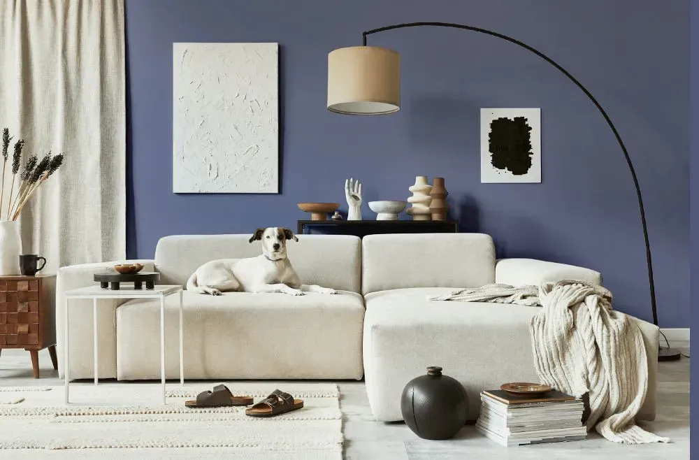
- Queen's Wreath for living room (7 photos)
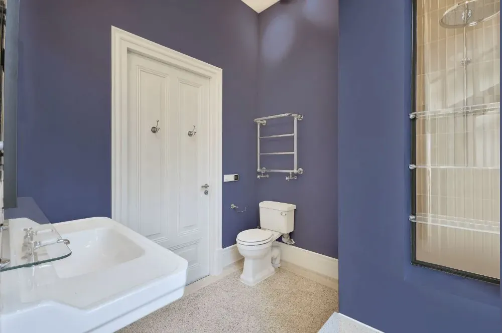
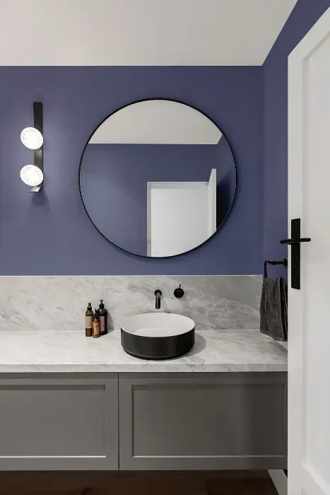
- Benjamin Moore Queen's Wreath for bathroom (2 photos)
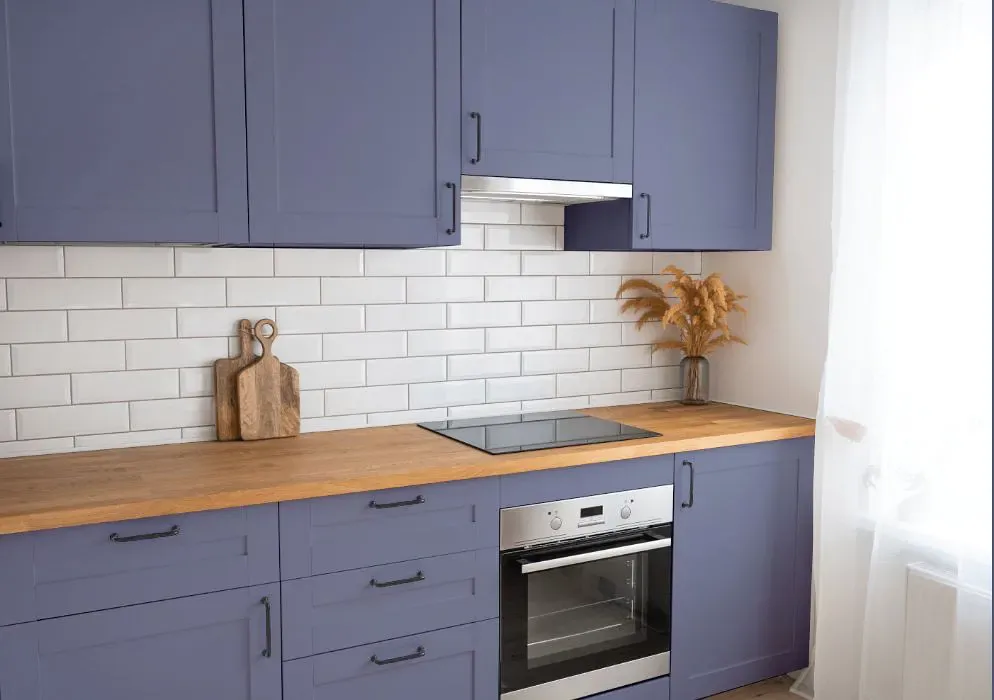
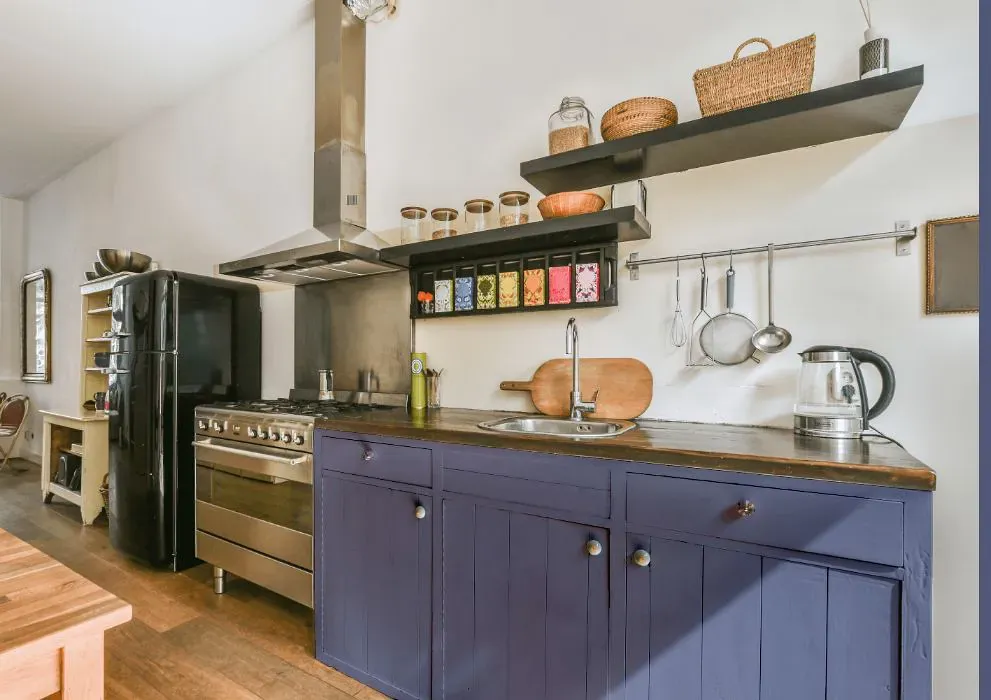
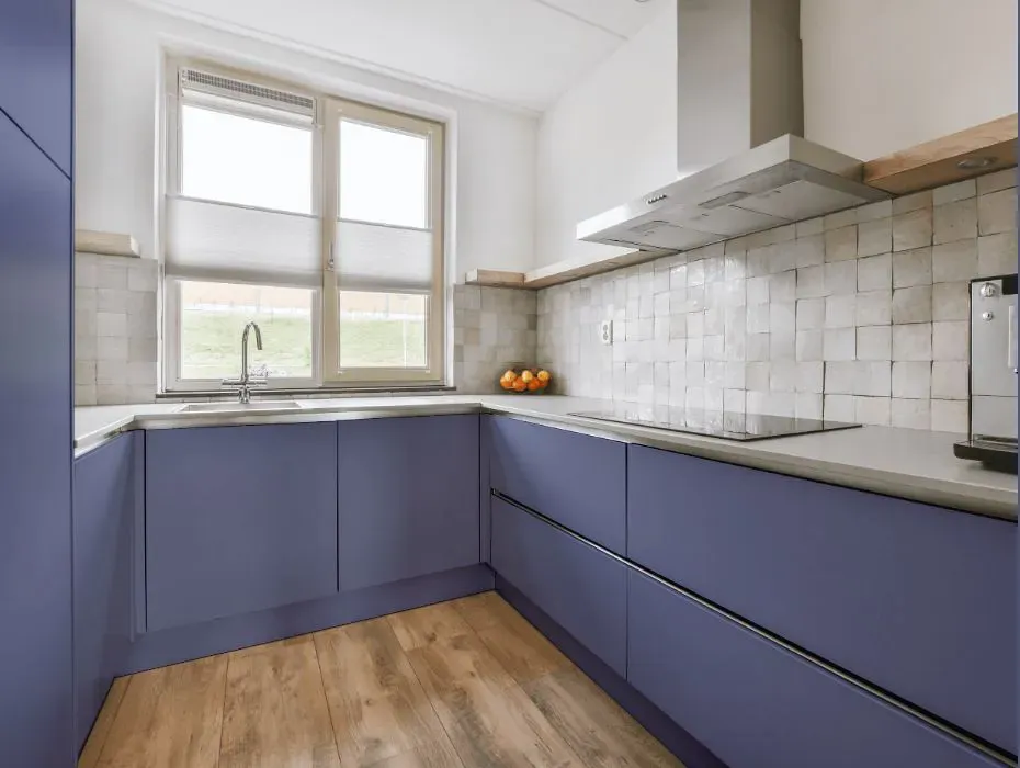
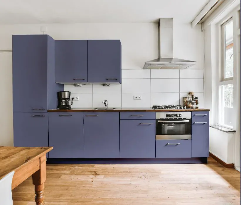
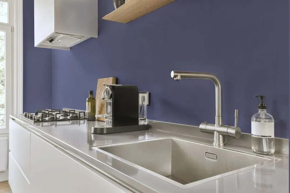
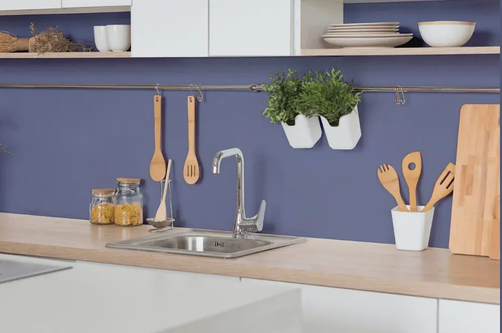
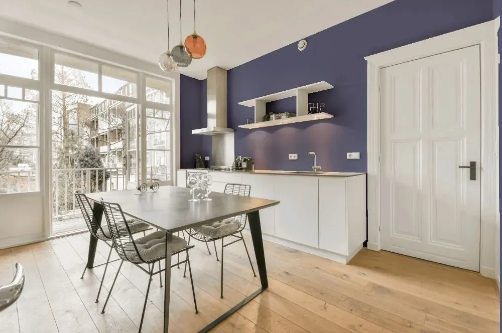
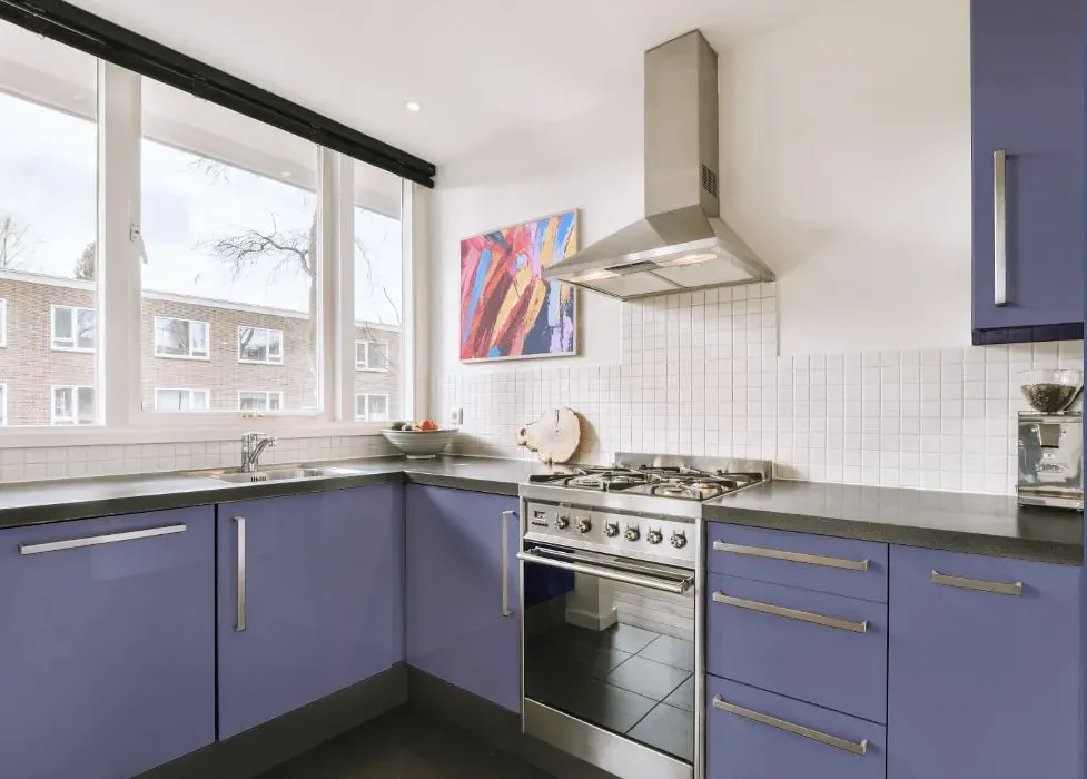
- Benjamin Moore 1426 on kitchen cabinets (4 photos)
- Benjamin Moore Queen's Wreath reviews (9 photos)
- What are Benjamin Moore Queen's Wreath undertones?
- Is Queen's Wreath 1426 cool or warm?
- How light temperature affects on Queen's Wreath
- Monochromatic color scheme
- Complementary color scheme
- Color comparison and matching
- LRV of Queen's Wreath 1426
- Color codes
- Color equivalents
| Official page: | Queen's Wreath 1426 |
| Code: | 1426 |
| Name: | Queen's Wreath |
| Brand: | Benjamin Moore |
What color is Benjamin Moore Queen's Wreath?
Embrace the rich elegance of Benjamin Moore 1426 Queen's Wreath in your space. This deep and luxurious shade adds a sense of sophistication and depth to any room. Queen's Wreath pairs beautifully with crisp whites for a classic look, or with soft neutrals to create a cozy and inviting atmosphere. For a daring and modern twist, consider combining Queen's Wreath with jewel tones like Benjamin Moore 2063-20 Patriot Blue or subtle greens like Benjamin Moore 2143-40 Dill Pickle. Whether used as a statement wall color or as an accent, Queen's Wreath brings a regal touch to your home decor. Experience the timeless beauty of Queen's Wreath and elevate your space with its captivating allure.
LRV of Queen's Wreath
Queen's Wreath has an LRV of 23.8% and refers to Medium colors that reflect a lot of light. Why LRV is important?

Light Reflectance Value measures the amount of visible and usable light that reflects from a painted surface.
Simply put, the higher the LRV of a paint color, the brighter the room you will get.
The scale goes from 0% (absolute black, absorbing all light) to 100% (pure white, reflecting all light).
Act like a pro: When choosing paint with an LRV of 23.8%, pay attention to your bulbs' brightness. Light brightness is measured in lumens. The lower the paint's LRV, the higher lumen level you need. Every square foot of room needs at least 40 lumens. That means for a 200 ft2 living room you'll need about 8000 lumens of light – e.g., eight 1000 lm bulbs.
Color codes
We have collected almost every possible color code you could ever need.
| Format | Code |
|---|---|
| HEX | #7C819D |
| RGB Decimal | 124, 129, 157 |
| RGB Percent | 48.63%, 50.59%, 61.57% |
| HSV | Hue: 231° Saturation: 21.02% Value: 61.57% |
| HSL | hsl(231, 14, 55) |
| CMYK | Cyan: 21.02 Magenta: 17.83 Yellow: 0.0 Key: 38.43 |
| YIQ | Y: 130.697 I: -11.977 Q: 7.656 |
| XYZ | X: 22.246 Y: 22.419 Z: 35.044 |
| CIE Lab | L:54.469 a:4.39 b:-15.563 |
| CIE Luv | L:54.469 u:-4.196 v:-23.486 |
| Decimal | 8159645 |
| Hunter Lab | 47.349, 1.004, -10.738 |


