Benjamin Moore White Opulence / 879 / Opulence / OC-69
Contentsshow +hide -
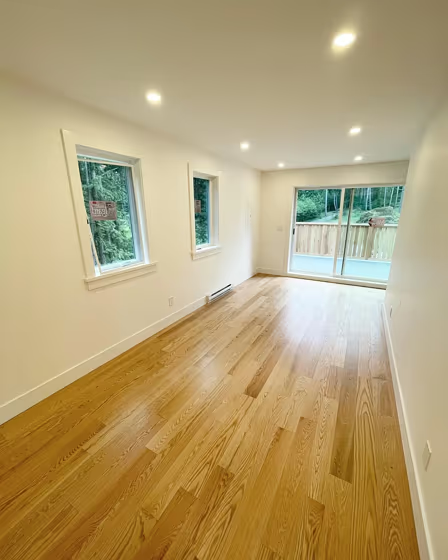
- White Opulence for bedroom (4 photos)
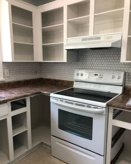
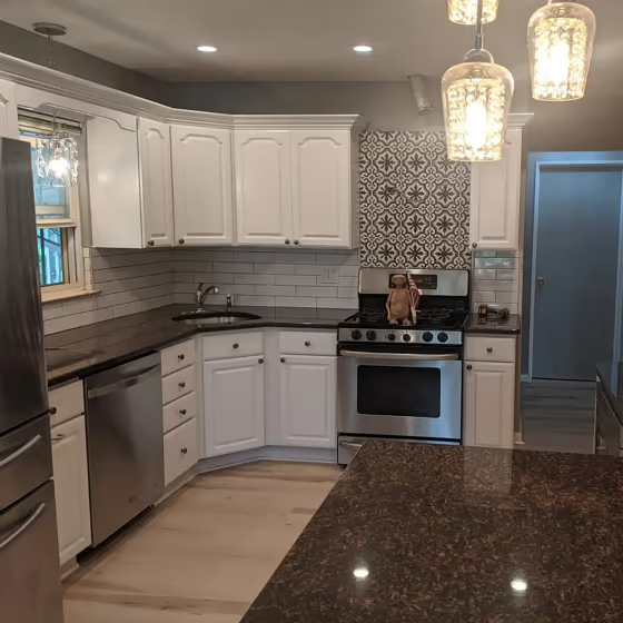
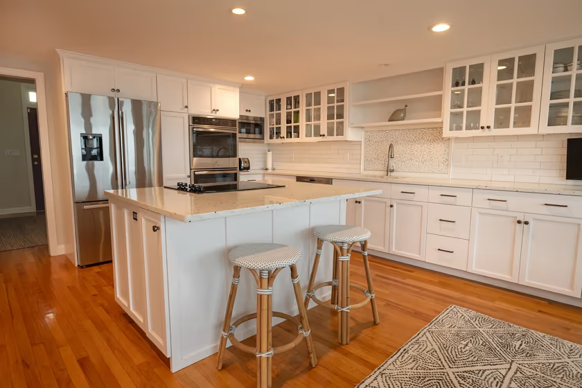
- Benjamin Moore OC-69 on kitchen cabinets (4 photos)
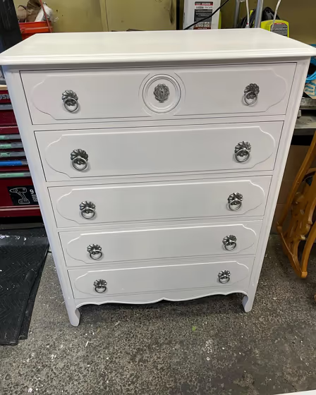
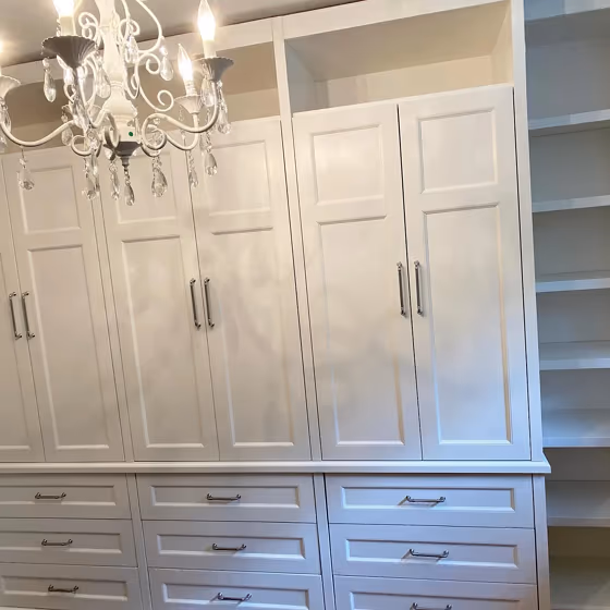
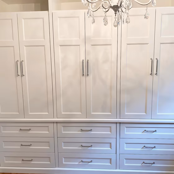
- Benjamin Moore White Opulence reviews (10 photos)
- What are Benjamin Moore White Opulence undertones?
- Is White Opulence OC-69 cool or warm?
- How light temperature affects on White Opulence
- Monochromatic color scheme
- Complementary color scheme
- Color comparison and matching
- LRV of White Opulence OC-69
- Color codes
- Color equivalents
| Official page: | White Opulence OC-69 |
| Code: | OC-69 |
| Name: | White Opulence |
| Brand: | Benjamin Moore |
What color is Benjamin Moore White Opulence?
The timeless, elegant *White Opulence* by Benjamin Moore, with its soft, creamy tones, serves as a versatile backdrop in any space. This neutral shade pairs harmoniously with deep navy blues and charcoal grays to create a sophisticated contrast. For a lighter, more airy feel, consider combining *White Opulence* with soft blush pinks or muted sage greens. Its warmth and subtle undertones make it a perfect choice for creating a serene atmosphere in any room.
Loading...
LRV of White Opulence
White Opulence has an LRV of 87.67% and refers to White colors that reflect almost all light. Why LRV is important?

Light Reflectance Value measures the amount of visible and usable light that reflects from a painted surface.
Simply put, the higher the LRV of a paint color, the brighter the room you will get.
The scale goes from 0% (absolute black, absorbing all light) to 100% (pure white, reflecting all light).
Act like a pro: When choosing paint with an LRV of 87.67%, pay attention to your bulbs' brightness. Light brightness is measured in lumens. The lower the paint's LRV, the higher lumen level you need. Every square foot of room needs at least 40 lumens. That means for a 200 ft2 living room you'll need about 8000 lumens of light – e.g., eight 1000 lm bulbs.
Color codes
We have collected almost every possible color code you could ever need.
Not sure what the difference between HEX and RGB is? We break down color models in plain language. Understanding color models
| Format | Code |
|---|---|
| HEX | #F5F2ED |
| RGB Decimal | 245, 242, 237 |
| RGB Percent | 96.08%, 94.90%, 92.94% |
| HSV | Hue: 37° Saturation: 3.27% Value: 96.08% |
| HSL | hsl(37, 29, 95) |
| CMYK | Cyan: 0.0 Magenta: 1.22 Yellow: 3.27 Key: 3.92 |
| YIQ | Y: 242.327 I: 3.394 Q: -0.921 |
| XYZ | X: 84.691 Y: 89.031 Z: 92.821 |
| CIE Lab | L:95.594 a:0.131 b:2.765 |
| CIE Luv | L:95.594 u:1.981 v:4.21 |
| Decimal | 16118509 |
| Hunter Lab | 94.356, -4.909, 7.724 |