

Farrow and Ball Brassica 271
Contentsshow +hide -
- Brassica for bedroom (7 photos)
- Brassica for living room (10 photos)
- Farrow and Ball Brassica for bathroom (3 photos)
- Farrow and Ball 271 on kitchen cabinets (1 photo)
- Brassica for exterior (3 photos)
- Farrow and Ball Brassica reviews (5 photos)
- What are Farrow and Ball Brassica undertones?
- Is Brassica 271 cool or warm?
- How light temperature affects on Brassica
- Complementary color scheme
- Color comparison and matching
- LRV of Brassica 271
- Color codes
- Color equivalents
| Official page: | Brassica 271 |
| Code: | 271 |
| Name: | Brassica |
| Brand: | Farrow and Ball |
What color is Farrow and Ball Brassica?
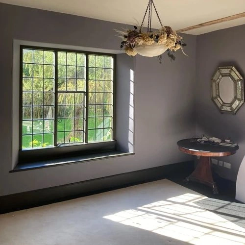
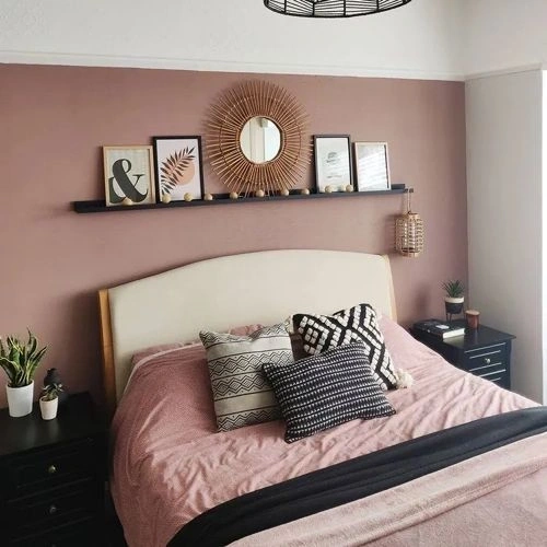
Farrow and Ball Brassica 271 is a muted greyed plum with a soft mauve cast, sitting at a comfortable mid-depth rather than reading overly dark or sugary. Its low saturation gives the color a restrained, slightly smoky appearance, with the violet tones becoming clearer in balanced daylight. In dimmer rooms, Brassica can settle into a deeper purple-grey, so it is especially effective where a little visual weight is welcome. Try it on bedroom walls, a dining room, or painted cabinetry alongside warm white trim, pale oak, brushed brass, and charcoal accents. For a quieter scheme, pair this shade with soft mushroom neutrals and textured linen rather than bright, high-contrast colors.
Brassica for bedroom (7 photos)
We’ve hand-picked a beautiful collection of photos of this amazing purple shade used in real bedrooms. Take a look and imagine how this wonderful warm mid-tone paint color could transform your own bedroom space.
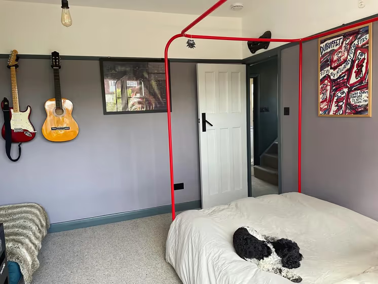
@thenowhitehouse
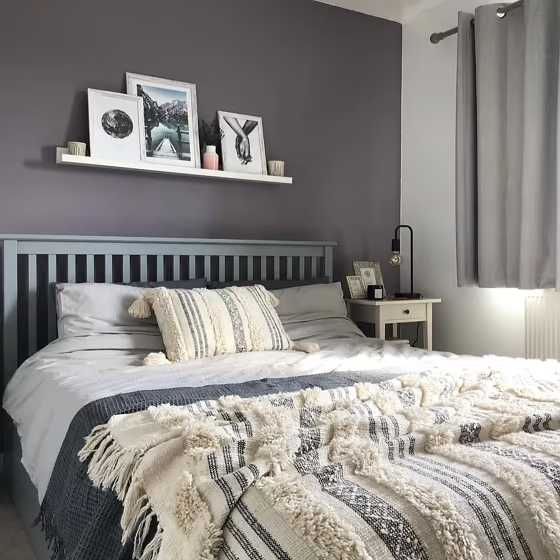
@the.pig.sty
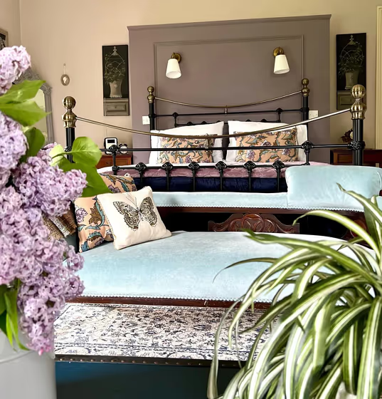
@donaguile
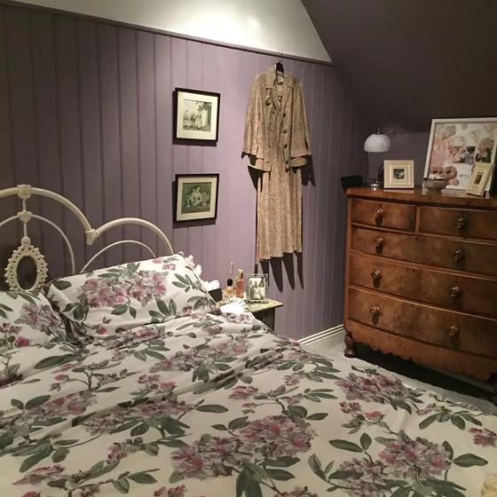
@artyfartyfurnitureuk
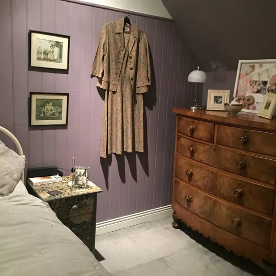
@artyfartyfurnitureuk
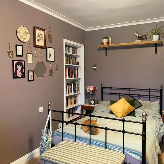
@glasgowadamsreno
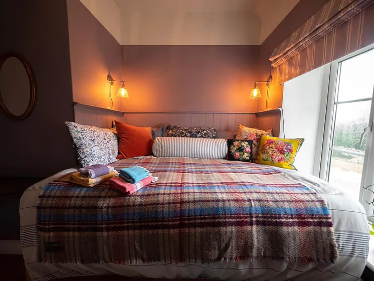
@sawcliffemanor
Brassica for living room (10 photos)
Check out this stunning mid-tone color used in real living rooms. Explore how this purple shade can create a unique space
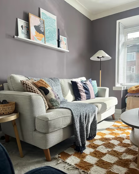
@deeshousetohome
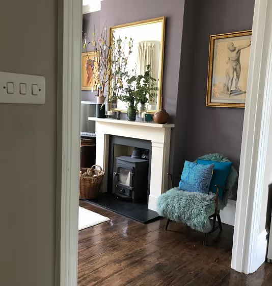
@established25atelier
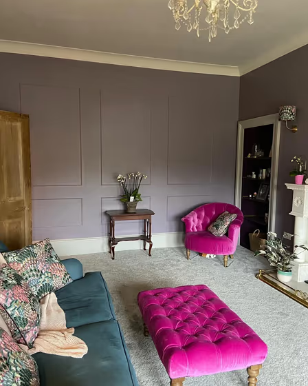
@manse_rd_makeover
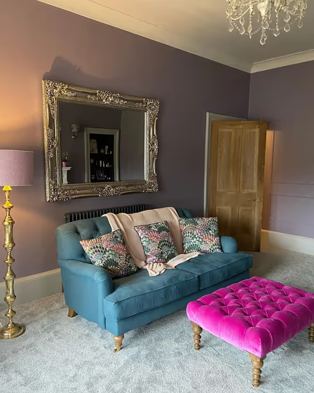
@manse_rd_makeover
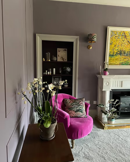
@manse_rd_makeover
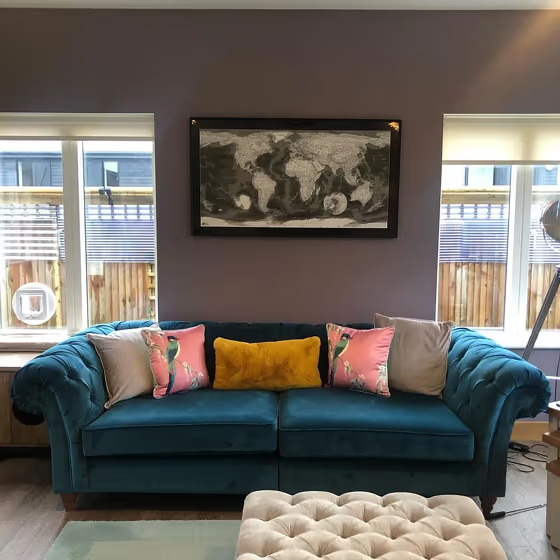
@annewhiteside
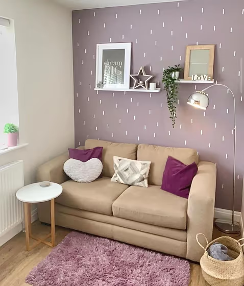
@hepscotthousereno
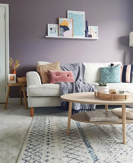
@deeshousetohome
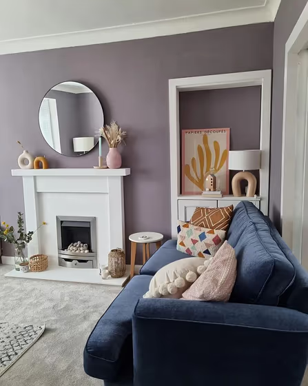
@deeshousetohome
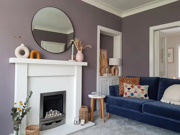
@deeshousetohome
Farrow and Ball 271 for bathroom (3 photos)
Looking for inspiration for your dream bathroom renovation project? These beautiful handpicked photos will show you this delightfully warm mid-tone purple real bathrooms.
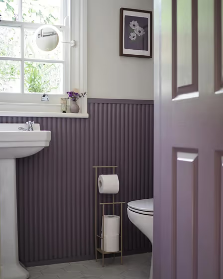
@melanielissackinteriors
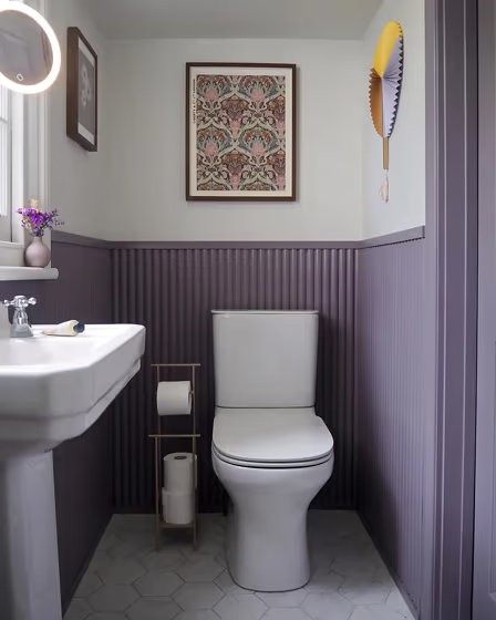
@melanielissackinteriors
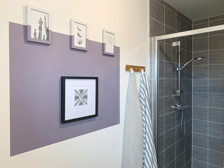
@bloomsandbricks
Farrow and Ball 271 on kitchen cabinets
Want a stylish kitchen? View real-life photo examples of this fascinating warm purple hue is paired with backsplashes, countertops, and hardware.
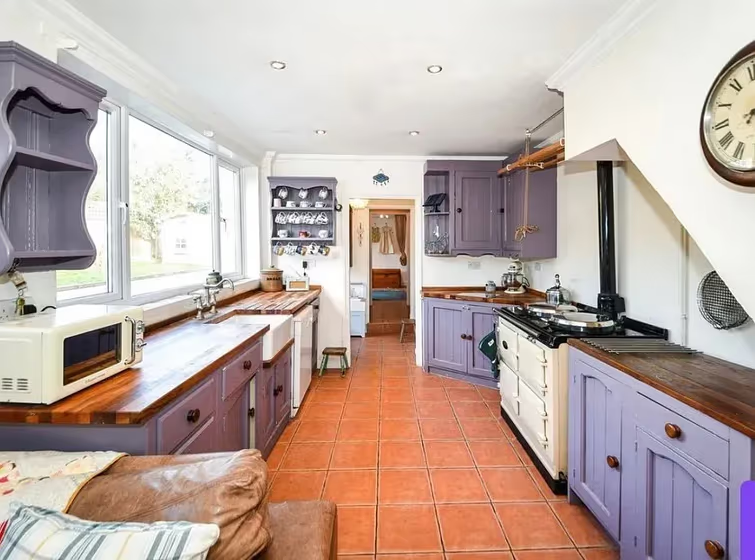
@meg_huckstep
Brassica for exterior (3 photos)
Looking for a fresh new look for your house exterior or starting from skretch? We’ve collected pictures of real-life homes that have been painted with this warm purple hue. Find inspiration for your house’s exterior, front doors, gates, shutters, frames or windows.
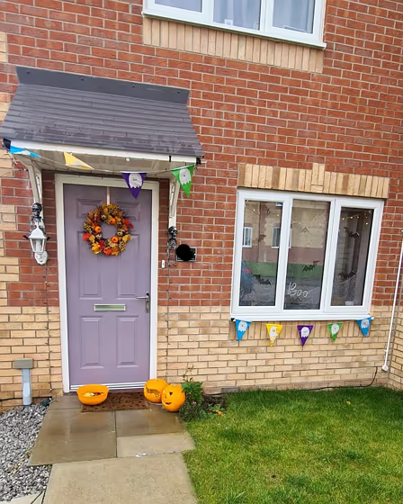
@mycosycork32
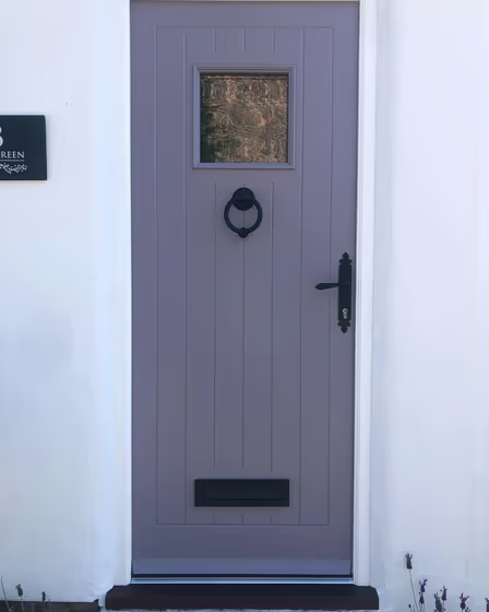
@quirky_stylecottage
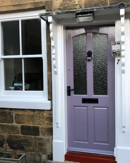
@lockerka1
Farrow and Ball Brassica reviews (5 photos)
View the photos of real spaces painted with this purple that were not included in specific categories. Close-ups, painted furniture, storages and dressers, hallways, stairs and ceilings.
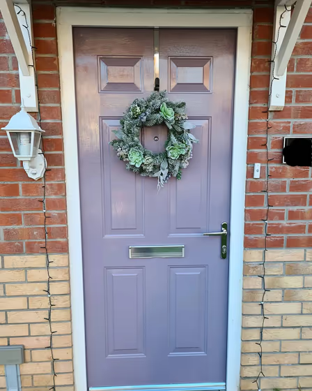
@mycosycork32
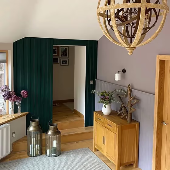
@thistlesteading
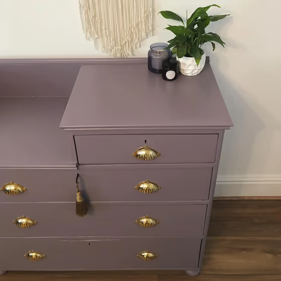
@woodmeadow_designs
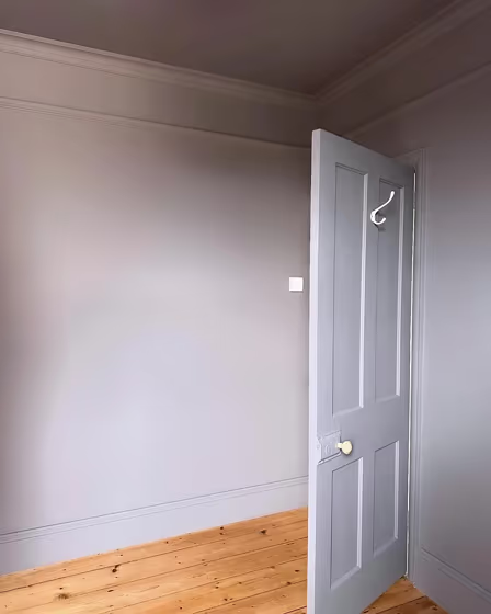
@cornwallvictorianhome
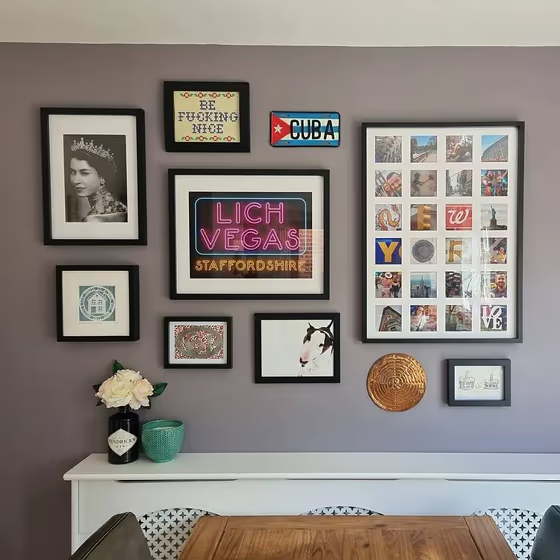
@livinginlichfield
Try before you buy

100% accurate
reusable paint samples

Peel, stick,
and repeat
Twice painted
with real paint

Next day
delivery
What are Farrow and Ball Brassica undertones?
Brassica is a midtone, very muted lavender-leaning grey with a soft pinkish-purple cast rather than a bright violet look. The supplied digital color shows only a subtle, low-confidence pink bias, so its undertone may read differently depending on the room and surrounding colors. Farrow & Ball describes it as having rich lavender tones that appear greyer in darker areas, which fits its visibly subdued purple-grey main family. Warm artificial light may bring out more of its muted rosy warmth, while cool daylight can make the grey-lavender side appear more noticeable.
Manufacturer information used in this description: official color page.
HEX value:
RGB code:
141, 128, 137
Is Farrow and Ball Brassica cool or warm?
warm
cool
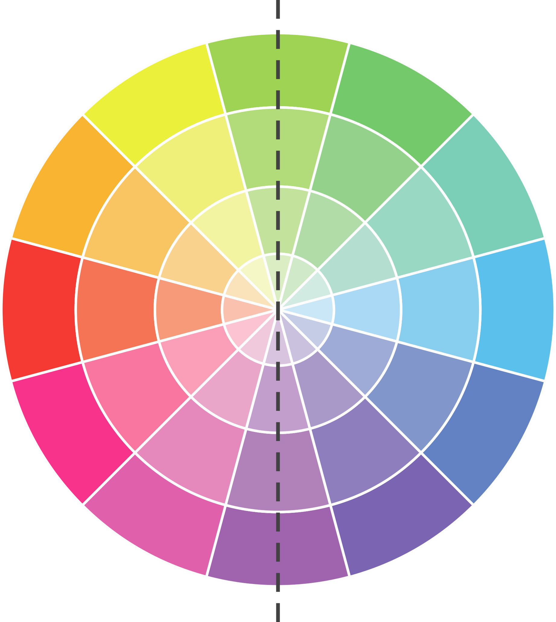
With a hue of 318°, this Purple leans warm, but it is close to neutral and can read cooler in some light.
271 Brassica HSL code: 318, 5%, 53%
Hue - degree on a color wheel from 0 to 360. 0 is red, 120 is green, and 240 is blue.
Saturation is expressed as a percentage. At 0%, it appears as a shade of grey, and at 100%, it is in full color.
Lightness is also a percentage value. 0% is black, and 100% is white.
How light temperature affects Brassica
Natural Lighting. During the day, natural light shifts from about 2000 K at sunrise/sunset to 5500–6500 K at noon.
In addition, natural-light temperature depends on its direction:
| Direction of sunlight | Visible temp. | Hue | Duration |
|---|---|---|---|
| North | Cool | Bluish | All day |
| East | Warm | Yellow | Before noon |
| West | Warm | Orange-red | After noon |
| South | Warm | Orange-yellow | All day |
Artificial Lighting. When choosing bulbs, pay attention to their color temperature in Kelvins.
Use the slider to see how this Purple shade looks under different lighting:
Coordinating colors.
Colors that go with Farrow and Ball Brassica:
Complementary color scheme
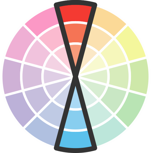
This color scheme is a combination of two shades that are opposite each other on the color wheel. The high contrast between these colors creates a vibrant and dynamic visual effect. For the color Brassica with a purple hue, complementary colors are those with a yellow hue close to 138, such as Farrow and Ball Douter and Chappell Green.







LRV of Brassica
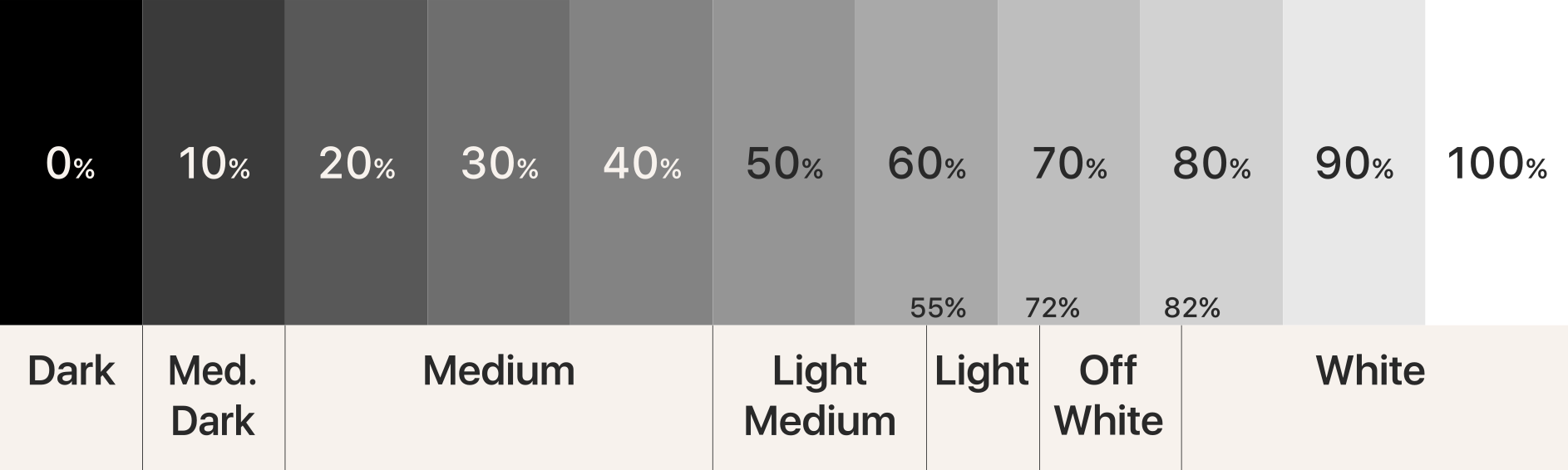
Brassica has an LRV of 23.6% and refers to Medium colors that reflect a lot of light. Why LRV is important?
Light Reflectance Value measures the amount of visible and usable light that reflects from a painted surface.
Simply put, the higher the LRV of a paint color, the brighter the room you will get.
The scale goes from 0% (absolute black, absorbing all light) to 100% (pure white, reflecting all light).
Act like a pro: When choosing paint with an LRV of 23.6%, pay attention to your bulbs' brightness. Light brightness is measured in lumens. The lower the paint's LRV, the higher lumen level you need. Every square foot of room needs at least 40 lumens. That means for a 200 ft2 living room you'll need about 8000 lumens of light – e.g., eight 1000 lm bulbs.
Color codes
We have collected almost every possible color code you could ever need.
Not sure what the difference between HEX and RGB is? We break down color models in plain language. Understanding color models
| Format | Code |
|---|---|
| HEX | #8d8089 |
| RGB Decimal | 141, 128, 137 |
| RGB Percent | 55.29%, 50.20%, 53.73% |
| HSV | Hue: 318° Saturation: 9.22% Value: 55.29% |
| HSL | hsl(318, 5.39, 52.75) |
| CMYK | Cyan: 0.0 Magenta: 9.22 Yellow: 2.84 Key: 44.71 |
| YIQ | Y: 132.913 I: 4.855 Q: 5.551 |
| XYZ | X: 23.218 Y: 22.907 Z: 26.859 |
| CIE Lab | L:54.977 a:6.625 b:-3.057 |
| CIE Luv | L:54.977 u:6.961 v:-5.382 |
| Decimal | 9273481 |
| Hunter Lab | 47.862, 2.834, 0.231 |

Color equivalents
10RR 24/061
Mercury Shower 2
Dulux

70RR 24/096
Soft Cinnebar 2
Dulux
RAL 4009
Pastel violet
RAL Classic


3377
Slate Lavender
Jotun

50RB 20/091
Twilight Cinders 2
Dulux
30RR 22/031
Wistful Mauve
Dulux
70RB 31/090
Mellow Heather 2
Dulux
10YR 28/072
Heart Wood
Dulux

30RR 30/103
Soft Montelimar 2
Dulux
30RR 19/068
Palladian Plum
Dulux

V425
Heather
Tikkurila

250
Arquerite
Little Greene
70RB 18/117
Mellow Heather 1
Dulux
Cocoa Powder
Dulux
90RR 31/100
Oyster Cove 2
Dulux
30RB 33/103
Violet Surprise 2
Dulux
294
Sulking Room Pink
Farrow and Ball
00NN 25/000
Urban Obsession
Dulux
