Tikkurila Desert V463
| Code: | V463 |
| Name: | Desert |
| Brand: | Tikkurila |
What color is Tikkurila Desert?
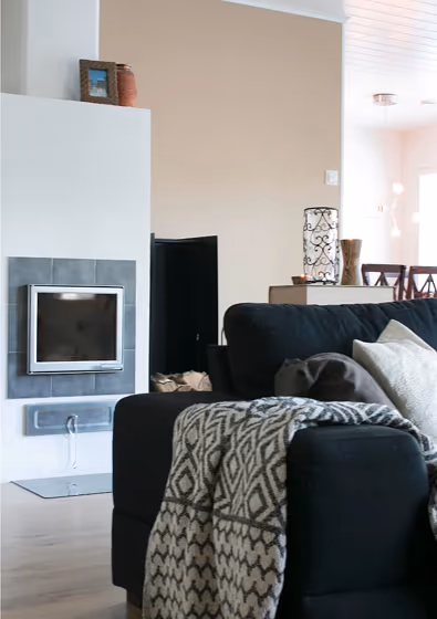
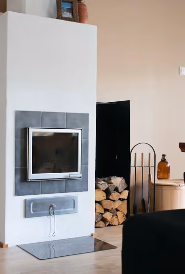
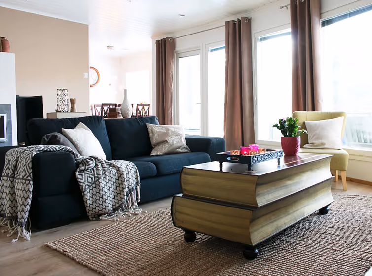
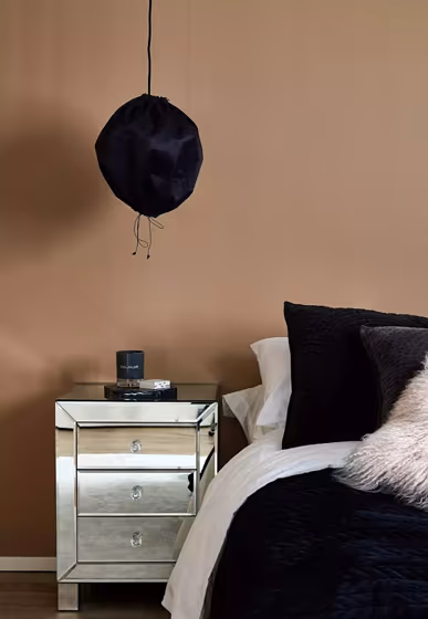
V463 Desert infuses a warm, earthy vibe into any space, adding a touch of sophistication and coziness. This versatile shade pairs beautifully with a range of neutral tones like Vanilla Sky (Y354) and Silky White (G460), creating a harmonious and inviting atmosphere. When combined with accent colors such as Ocean Blue (G354) or Forest Green (Y451), V463 Desert can bring a sense of balance and depth to the overall decor scheme, making it an ideal choice for a modern and elegant interior design palette.
Tikkurila Desert reviews
View the photos of real spaces painted with this that were not included in specific categories.Close-ups, painted furniture, storages and dressers, hallways, stairs and ceilings.
Try before you buy

100% accurate
reusable paint samples
Peel, stick,
and repeat
Twice painted
with real paint
Next day
delivery
What are Tikkurila Desert undertones?
The undertone of Desert can be accurately described as a Red hue, as is apparent from the color space provided. By isolating the pure hue and eliminating any tints, tones, and shades, we were able to precisely determine its undertone. This approach has proven to be more accurate than traditional methods of defining undertones on a white background, which are now considered outdated.
HEX value
HEX value:
#BB9E82
RGB code:
187, 158, 130
Is Tikkurila Desert V463 cool or warm?
With a hue of 29° thisBeigerefers warm paint shade according to HSL (Hue, Saturation, Lightness) on the color wheel.
V463 Desert HSL code: 29, 30%, 62%
Hue - degree on a color wheel from 0 to 360. 0 is red, 120 is green, and 240 is blue.
Saturation is expressed as a percentage. At 0%, it appears as a shade of grey, and at 100%, it is in full color..
Lightness is also a percentage value. 0% is black, and 100% is white.
- Warm colors are ideal for kitchens, living rooms or bathrooms
- Warmer hues make larger spaces feel more inviting
- Warm beige shades create a cozy and inviting atmosphere, making any room feel comfortable and welcoming, perfect for living rooms, bedrooms, and hallways.
- Warm mid-tone shades like terracotta and warm beige create a cozy and inviting atmosphere in living rooms, bedrooms, and kitchens. They can brighten up spaces without being too overwhelming. However, it's best to avoid using these shades in very sunny rooms, as they can become too intense.
Act like a pro: Mixing warm and cool shades is a must have to get harmonius interior. Add accents that contrast with the primary color to create visual balance. If your walls are a warm color, don’t forget to add accent in cold colors (furniture, art, décor). A good practice is too use a complementary color scheme.
How light temperature affects Desert
Natural Lighting. During the day, natural light shifts from about 2000 K at sunrise/sunset to 5500–6500 K at noon.
In addition, natural‑light temperature depends on its direction:
| Direction of sunlight | Visible temp. | Hue | Duration |
|---|---|---|---|
| North | Cool | Bluish | All day |
| East | Warm | Yellow | Before noon |
| West | Warm | Orange‑red | After noon |
| South | Warm | Orange‑yellow | All day |
Artificial Lighting. When choosing bulbs, pay attention to their color‑temperature (Kelvins).
Use the slider to see how this Beige shade looks under different lighting:


4000K
Coordinating colors.
Colors that go with Tikkurila Desert:
Monochromatic color scheme
This scheme consists of various shades, tints, and tones of a single color. While it offers a perfect combination of hues, without accent décor it may become monotonous.
Lighter shades
V463
Desert
Complementary color scheme
This color scheme is a combination of two shades that are opposite each other on the color wheel. The high contrast between these colors creates a vibrant and dynamic visual effect. For the color Desert with a red hue, complementary colors are those with a green hue close to 209, such as Tikkurila .
V463
Desert
LRV of Desert
Desert has an LRV of 37% and refers to Medium colors that reflect a lot of light. Why LRV is important?
Light Reflectance Value measures the amount of visible and usable light that reflects from a painted surface.
Simply put, the higher the LRV of a paint color, the brighter the room you will get.
The scale goes from 0% (absolute black, absorbing all light) to 100% (pure white, reflecting all light).
Act like a pro: When choosing paint with an LRV of 37%, pay attention to your bulbs' brightness. Light brightness is measured in lumens. The lower the paint's LRV, the higher lumen level you need. Every square foot of room needs at least 40 lumens. That means for a 200 ft2 living room you’ll need about 8000 lumens of light – e.g., eight 1000 lm bulbs.
Color codes
We have collected almost every possible color code you could ever need. To copy the code, just click the icon to the right of it.
| Format | Code | |
|---|---|---|
| HEX | #BB9E82 | |
| RGB Decimal | 187, 158, 130 | |
| RGB Percent | 73.33%, 61.96%, 50.98% | |
| HSV | Hue: 29° Saturation: 30.48% Value: 73.33% | |
| HSL | hsl(29, 30, 62) | |
| CMYK | Cyan: 0.0 Magenta: 15.51 Yellow: 30.48 Key: 26.67 | |
| YIQ | Y: 163.479 I: 26.279 Q: -2.579 | |
| XYZ | X: 36.75 Y: 36.632 Z: 26.248 | |
| CIE Lab | L:67.0 a:6.5 b:18.63 | |
| CIE Luv | L:67.0 u:20.227 v:23.912 | |
| Decimal | 12295810 | |
| Hunter Lab | 60.524, 2.467, 16.654 |
Color equivalents
12074
Peachy
Jotun

Caramel Cream
Dulux
00YY 37/221
Summer Pecan 2
Dulux
12120
Desert Pink
Jotun

1632
Rock Sugar
Jotun
20YY 38/225
Labrador Sands 2
Dulux
90YR 41/179
Soft Almond 3
Dulux
12084
Dusky Peach
Jotun

Malted Caramel
Dulux
12085
Rural
Jotun

20YY 41/165
Caramel Sand 2
Dulux
Muted Gold
Dulux
V466
Lama
Tikkurila

10YY 44/215
Caramel Blush 2
Dulux
10683
Cashmere
Jotun

30YY 36/185
Salisbury Stones 2
Dulux
20047
Blushing Peach
Jotun


