Farrow and Ball Preferenced Red 297
Contentsshow +hide -
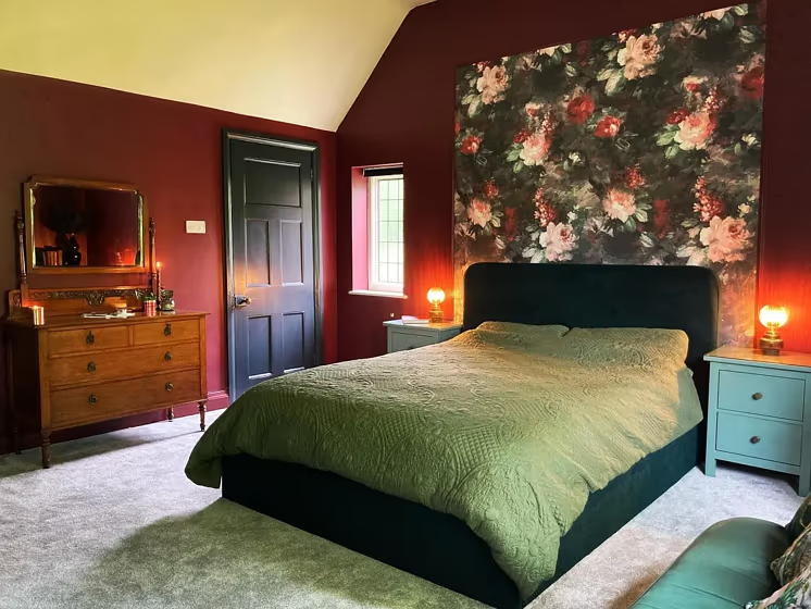
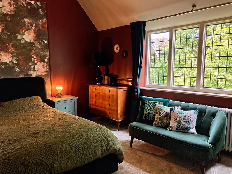
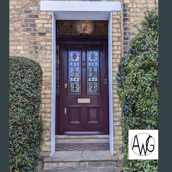
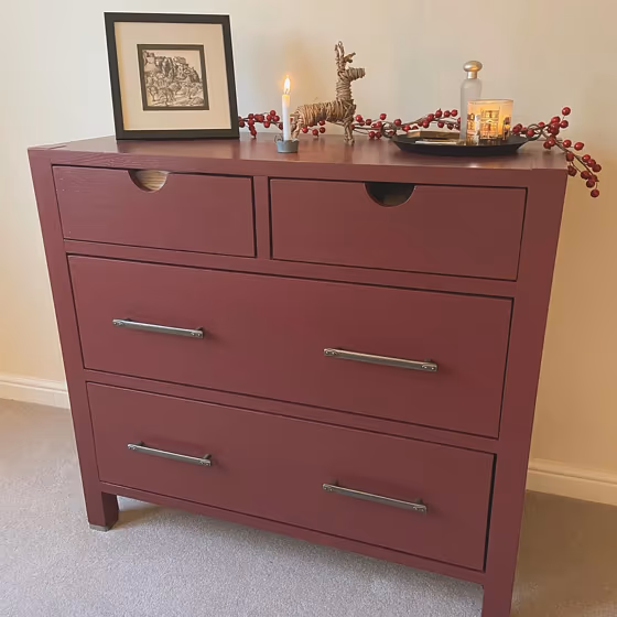
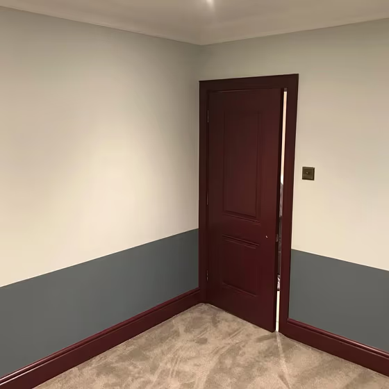
- Preferenced Red for bedroom (3 photos)
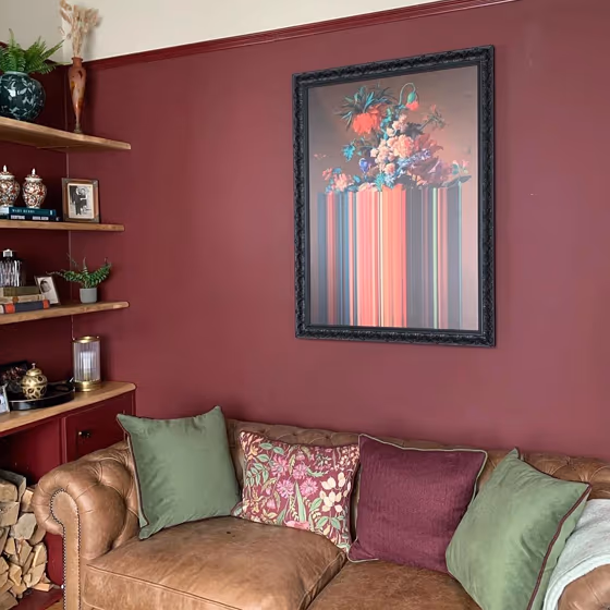
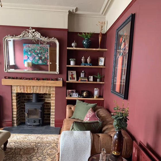
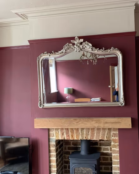
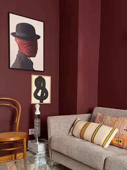
- Preferenced Red for living room (5 photos)
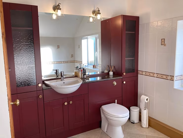
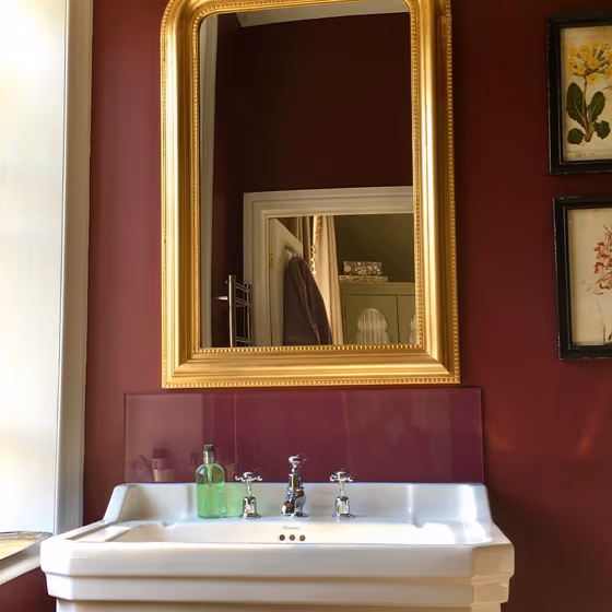
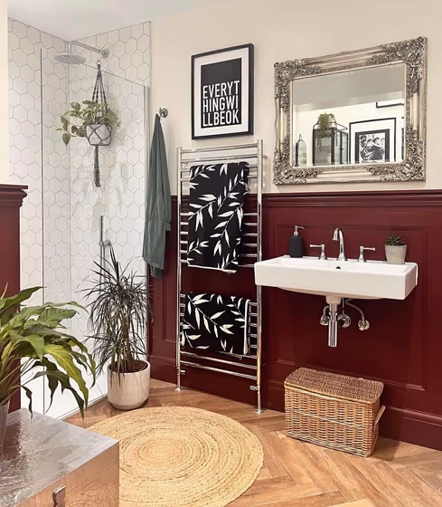
- Farrow and Ball Preferenced Red for bathroom (3 photos)
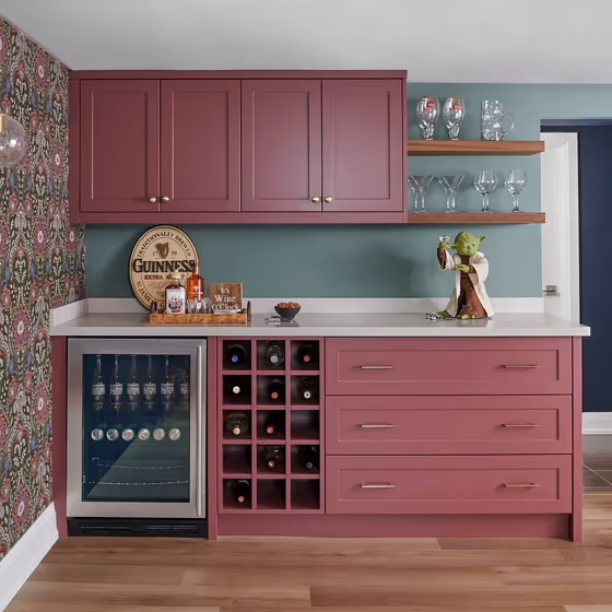
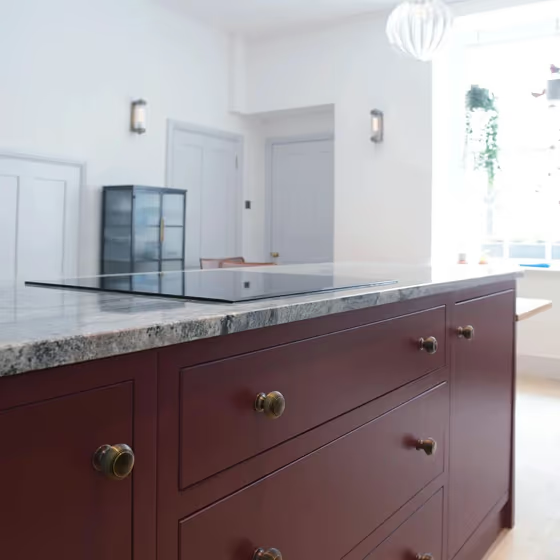
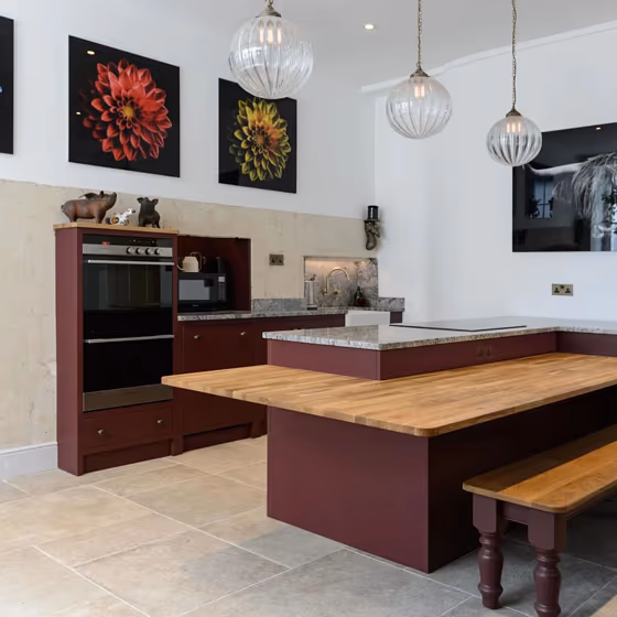
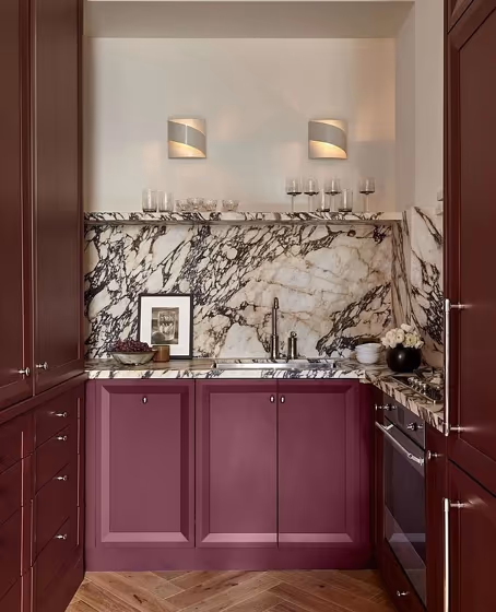
- Farrow and Ball 297 on kitchen cabinets (5 photos)
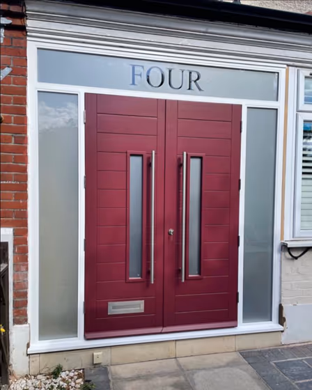
- Preferenced Red for exterior (2 photos)
- Farrow and Ball Preferenced Red reviews (10 photos)
- What are Farrow and Ball Preferenced Red undertones?
- Is Preferenced Red 297 cool or warm?
- How light temperature affects on Preferenced Red
- Monochromatic color scheme
- Complementary color scheme
- Color comparison and matching
- LRV of Preferenced Red 297
- Color codes
- Color equivalents
| Official page: | Preferenced Red 297 |
| Code: | 297 |
| Name: | Preferenced Red |
| Brand: | Farrow and Ball |
What color is Farrow and Ball Preferenced Red?
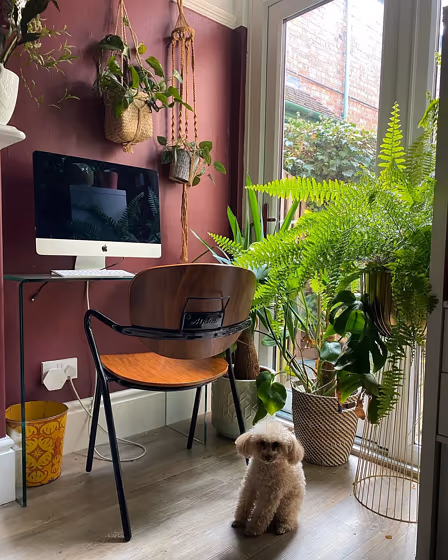
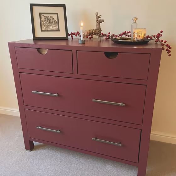
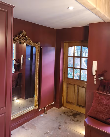
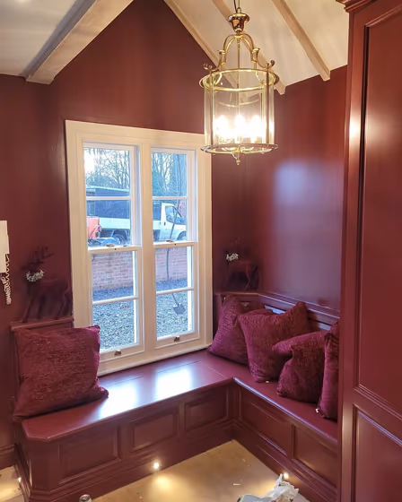
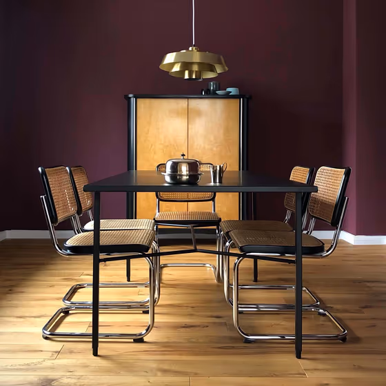
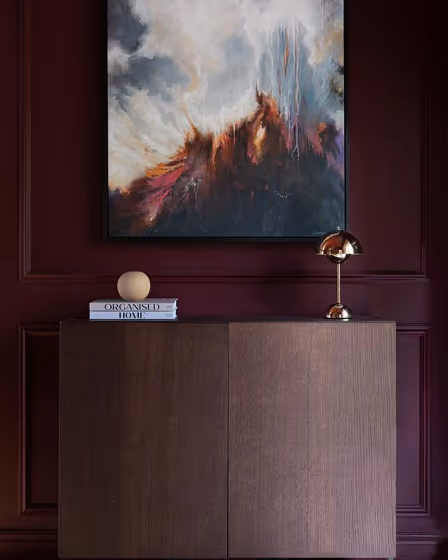
Farrow and Ball's Preference Red is a deep, rich, and luxurious paint color that adds a touch of opulence to any space. It is a perfect choice for creating a focal point in a room, as it commands attention and creates a warm and inviting atmosphere. This color works particularly well in dining rooms and living rooms, where it can create a sense of intimacy and elegance. Its depth and richness also make it an excellent choice for accent walls, particularly when paired with more neutral tones such as Farrow and Ball's Cornforth White or Ammonite.
Loading...
LRV of Preferenced Red
Preferenced Red has an LRV of 8.2% and refers to Dark colors which means that this color almost does not reflect light. Why LRV is important?

Light Reflectance Value measures the amount of visible and usable light that reflects from a painted surface.
Simply put, the higher the LRV of a paint color, the brighter the room you will get.
The scale goes from 0% (absolute black, absorbing all light) to 100% (pure white, reflecting all light).
Act like a pro: When choosing paint with an LRV of 8.2%, pay attention to your bulbs' brightness. Light brightness is measured in lumens. The lower the paint's LRV, the higher lumen level you need. Every square foot of room needs at least 40 lumens. That means for a 200 ft2 living room you'll need about 8000 lumens of light – e.g., eight 1000 lm bulbs.
Color codes
We have collected almost every possible color code you could ever need.
Not sure what the difference between HEX and RGB is? We break down color models in plain language. Understanding color models
| Format | Code |
|---|---|
| HEX | #6d4247 |
| RGB Decimal | 109, 66, 71 |
| RGB Percent | 42.75%, 25.88%, 27.84% |
| HSV | Hue: 353° Saturation: 39.45% Value: 42.75% |
| HSL | hsl(353, 25, 34) |
| CMYK | Cyan: 0.0 Magenta: 39.45 Yellow: 34.86 Key: 57.25 |
| YIQ | Y: 79.427 I: 24.017 Q: 10.652 |
| XYZ | X: 9.392 Y: 7.603 Z: 6.932 |
| CIE Lab | L:33.143 a:19.341 b:4.867 |
| CIE Luv | L:33.143 u:26.984 v:2.62 |
| Decimal | 7160391 |
| Hunter Lab | 27.574, 12.547, 4.396 |