Farrow and Ball Rangwali 296
Contentsshow +hide -
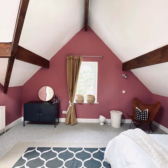
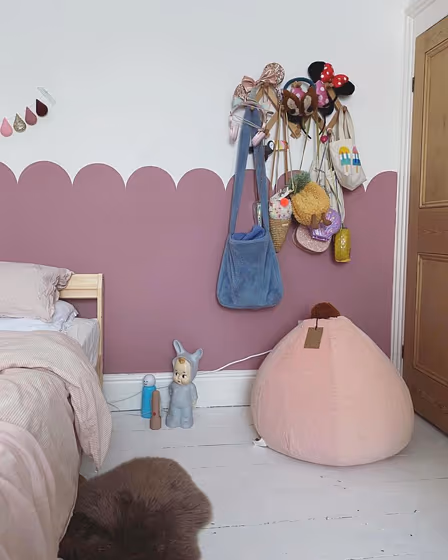
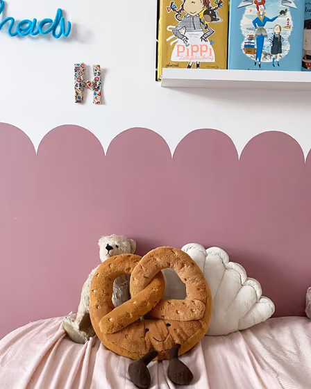
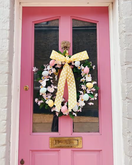
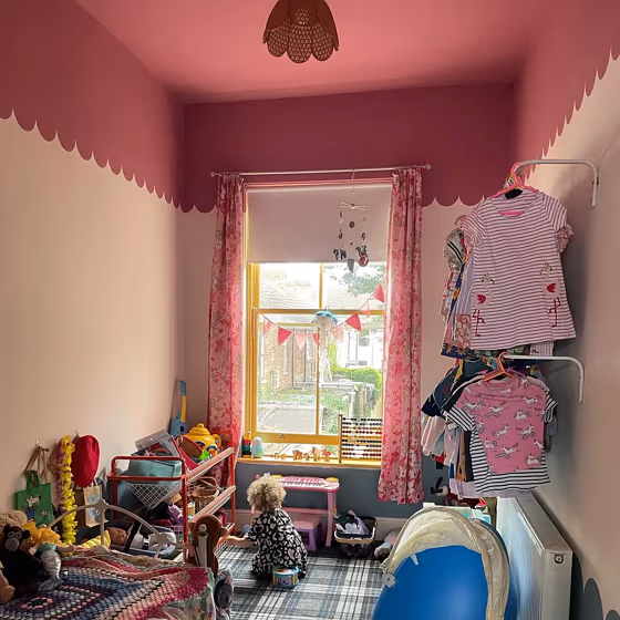
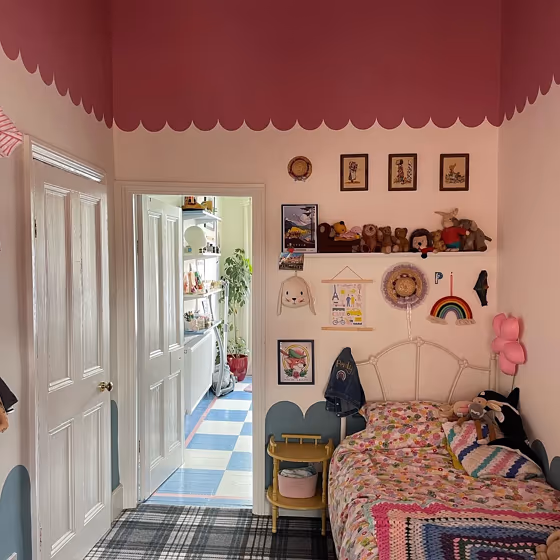
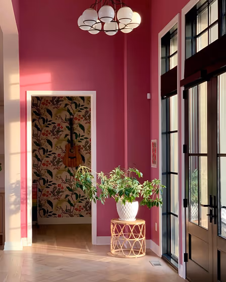
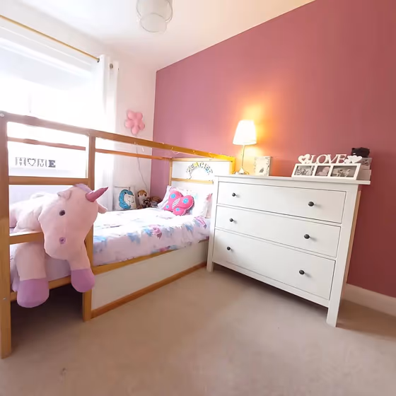
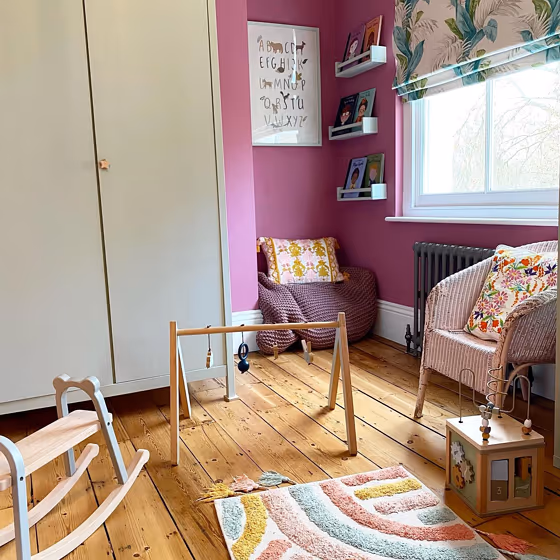
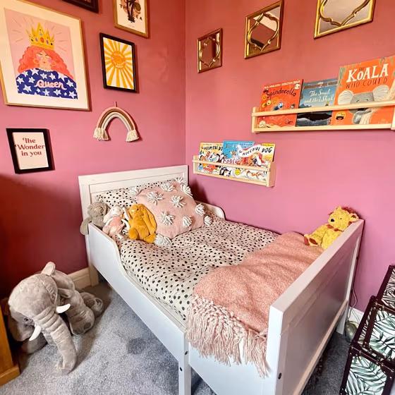
- Rangwali for bedroom (3 photos)
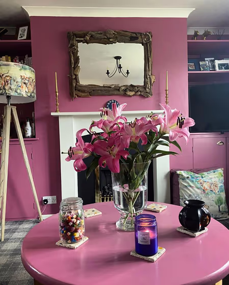
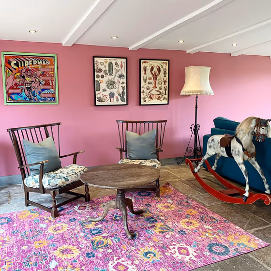
- Rangwali for living room (2 photos)
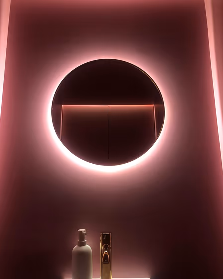
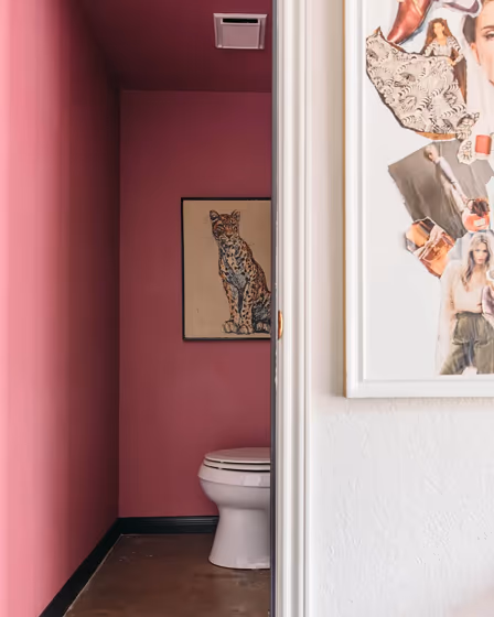
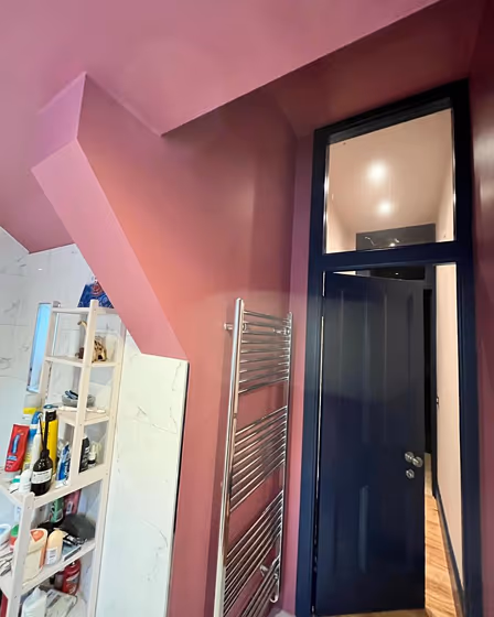
- Farrow and Ball Rangwali for bathroom (2 photos)
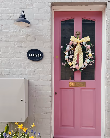
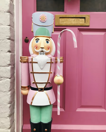
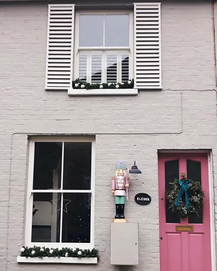
- Rangwali for exterior (4 photos)
- Farrow and Ball Rangwali reviews (10 photos)
- What are Farrow and Ball Rangwali undertones?
- Is Rangwali 296 cool or warm?
- How light temperature affects on Rangwali
- Complementary color scheme
- Color comparison and matching
- LRV of Rangwali 296
- Color codes
- Color equivalents
| Official page: | Rangwali 296 |
| Code: | 296 |
| Name: | Rangwali |
| Brand: | Farrow and Ball |
What color is Farrow and Ball Rangwali?
Rangwali 296 is a pale pink color. This color can be used as an accent color to create contrast or as a backdrop to highlight other elements in the space. As a result of the muted violet note, Rangwali 296 has subtle warmth and is ideal for add interest to classic schemes. It is possible to pair with a green-based white for a timeless finish.
The nearest colors to 296 are RAL Effect RAL 490-5 and RAL Effect RAL 520-4, which are also muted pink colors.
Loading...
LRV of Rangwali
Rangwali has an LRV of 28.51% and refers to Medium colors that reflect a lot of light. Why LRV is important?

Light Reflectance Value measures the amount of visible and usable light that reflects from a painted surface.
Simply put, the higher the LRV of a paint color, the brighter the room you will get.
The scale goes from 0% (absolute black, absorbing all light) to 100% (pure white, reflecting all light).
Act like a pro: When choosing paint with an LRV of 28.51%, pay attention to your bulbs' brightness. Light brightness is measured in lumens. The lower the paint's LRV, the higher lumen level you need. Every square foot of room needs at least 40 lumens. That means for a 200 ft2 living room you'll need about 8000 lumens of light – e.g., eight 1000 lm bulbs.
Color codes
We have collected almost every possible color code you could ever need.
Not sure what the difference between HEX and RGB is? We break down color models in plain language. Understanding color models
| Format | Code |
|---|---|
| HEX | #bf7a8f |
| RGB Decimal | 191, 122, 143 |
| RGB Percent | 74.90%, 47.84%, 56.08% |
| HSV | Hue: 342° Saturation: 36.13% Value: 74.9% |
| HSL | hsl(342, 35, 61) |
| CMYK | Cyan: 0.0 Magenta: 36.13 Yellow: 25.13 Key: 25.1 |
| YIQ | Y: 145.025 I: 34.369 Q: 21.131 |
| XYZ | X: 33.404 Y: 26.981 Z: 29.428 |
| CIE Lab | L:58.956 a:29.76 b:-0.074 |
| CIE Luv | L:58.956 u:42.911 v:-5.394 |
| Decimal | 12548751 |
| Hunter Lab | 51.943, 23.89, 2.77 |