Farrow and Ball Salt CC5
Contentsshow +hide -
| Code: | CC5 |
| Name: | Salt |
| Brand: | Farrow and Ball |
| Collections: | California Collection |
What color is Farrow and Ball Salt?
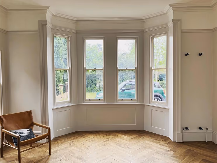
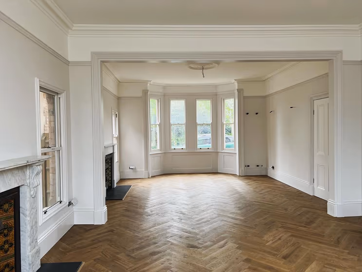
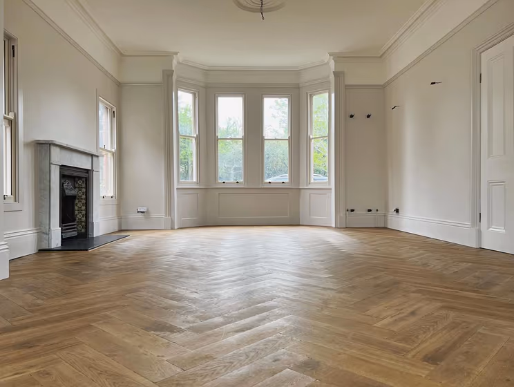
Farrow and Ball's Salt is a soft and warm off-white color with a slight yellow undertone. It is a versatile color that works well in a variety of spaces, especially those with plenty of natural light. Salt is an excellent option for creating a relaxed, calming atmosphere in a room, and it pairs well with both cool and warm accent colors. It also complements natural materials such as wood, stone, and wicker, making it a popular choice for beachy and coastal-inspired interiors.
Loading...
LRV of Salt
Salt has an LRV of 77.69% and refers to Off‑White colors that reflect a lot of light. Why LRV is important?

Light Reflectance Value measures the amount of visible and usable light that reflects from a painted surface.
Simply put, the higher the LRV of a paint color, the brighter the room you will get.
The scale goes from 0% (absolute black, absorbing all light) to 100% (pure white, reflecting all light).
Act like a pro: When choosing paint with an LRV of 77.69%, pay attention to your bulbs' brightness. Light brightness is measured in lumens. The lower the paint's LRV, the higher lumen level you need. Every square foot of room needs at least 40 lumens. That means for a 200 ft2 living room you'll need about 8000 lumens of light – e.g., eight 1000 lm bulbs.
Color codes
We have collected almost every possible color code you could ever need.
Not sure what the difference between HEX and RGB is? We break down color models in plain language. Understanding color models
| Format | Code |
|---|---|
| HEX | #e6e4e1 |
| RGB Decimal | 230, 228, 225 |
| RGB Percent | 90.20%, 89.41%, 88.24% |
| HSV | Hue: 36° Saturation: 2.17% Value: 90.2% |
| HSL | hsl(36, 9, 89) |
| CMYK | Cyan: 0.0 Magenta: 0.87 Yellow: 2.17 Key: 9.8 |
| YIQ | Y: 228.256 I: 2.156 Q: -0.511 |
| XYZ | X: 73.964 Y: 77.746 Z: 82.324 |
| CIE Lab | L:90.664 a:0.142 b:1.702 |
| CIE Luv | L:90.664 u:1.302 v:2.568 |
| Decimal | 15131873 |
| Hunter Lab | 88.174, -4.571, 6.365 |