Farrow and Ball Stoke CC7
| Code: | CC7 |
| Name: | Stoke |
| Brand: | Farrow and Ball |
| Collections: | California Collection |
What color is Farrow and Ball Stoke?
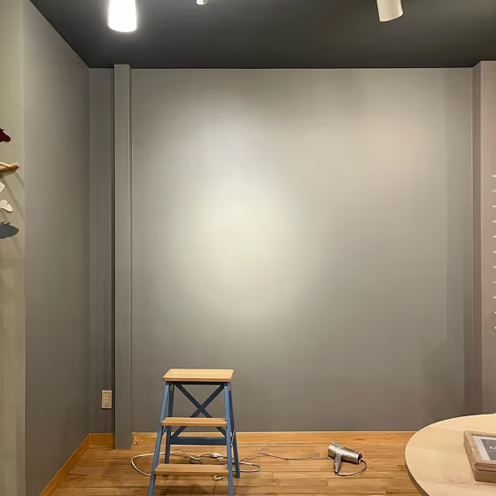
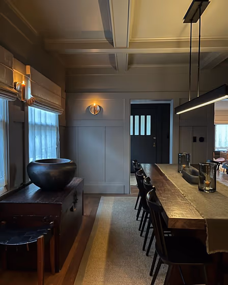
The charming hue Stoke from Farrow and Ball (CC7) is a sophisticated choice for interiors. This warm and inviting color pairs beautifully with soft neutrals like cream and taupe, creating a cozy and elegant atmosphere. Complement Stoke (CC7) with accents in dusty rose or olive green for a rich and harmonious color palette. The versatility of Stoke ensures it can be used in various interior styles, from traditional to modern, making it a timeless choice for any space.
Farrow and Ball Stoke reviews
View the photos of real spaces painted with this that were not included in specific categories.Close-ups, painted furniture, storages and dressers, hallways, stairs and ceilings.
Try before you buy

100% accurate
reusable paint samples
Peel, stick,
and repeat
Twice painted
with real paint
Next day
delivery
What are Farrow and Ball Stoke undertones?
The undertone of Stoke can be accurately described as a Red hue, as is apparent from the color space provided. By isolating the pure hue and eliminating any tints, tones, and shades, we were able to precisely determine its undertone. This approach has proven to be more accurate than traditional methods of defining undertones on a white background, which are now considered outdated.
HEX value
HEX value:
#93908A
RGB code:
147, 144, 138
Is Farrow and Ball Stoke CC7 cool or warm?
With a hue of 40° thisGreyrefers warm paint shade according to HSL (Hue, Saturation, Lightness) on the color wheel.
CC7 Stoke HSL code: 40, 4%, 56%
Hue - degree on a color wheel from 0 to 360. 0 is red, 120 is green, and 240 is blue.
Saturation is expressed as a percentage. At 0%, it appears as a shade of grey, and at 100%, it is in full color..
Lightness is also a percentage value. 0% is black, and 100% is white.
- Warm colors are ideal for kitchens, living rooms or bathrooms
- Warmer hues make larger spaces feel more inviting
- Warm grey shades are versatile and provide a neutral canvas for your interior design. They seamlessly complement any style, whether it's Victorian, Scandinavian, or Modern.
- Warm mid-tone shades like terracotta and warm beige create a cozy and inviting atmosphere in living rooms, bedrooms, and kitchens. They can brighten up spaces without being too overwhelming. However, it's best to avoid using these shades in very sunny rooms, as they can become too intense.
Act like a pro: Mixing warm and cool shades is a must have to get harmonius interior. Add accents that contrast with the primary color to create visual balance. If your walls are a warm color, don’t forget to add accent in cold colors (furniture, art, décor). A good practice is too use a complementary color scheme.
How light temperature affects Stoke
Natural Lighting. During the day, natural light shifts from about 2000 K at sunrise/sunset to 5500–6500 K at noon.
In addition, natural‑light temperature depends on its direction:
| Direction of sunlight | Visible temp. | Hue | Duration |
|---|---|---|---|
| North | Cool | Bluish | All day |
| East | Warm | Yellow | Before noon |
| West | Warm | Orange‑red | After noon |
| South | Warm | Orange‑yellow | All day |
Artificial Lighting. When choosing bulbs, pay attention to their color‑temperature (Kelvins).
Use the slider to see how this Grey shade looks under different lighting:


4000K
Coordinating colors.
Colors that go with Farrow and Ball Stoke:
Monochromatic color scheme
This scheme consists of various shades, tints, and tones of a single color. While it offers a perfect combination of hues, without accent décor it may become monotonous.
Lighter shades
CC7
Stoke
Complementary color scheme
This color scheme is a combination of two shades that are opposite each other on the color wheel. The high contrast between these colors creates a vibrant and dynamic visual effect. For the color Stoke with a orange hue, complementary colors are those with a blue hue close to 220, such as Farrow and Ball Wine Dark and Stiffkey Blue.
LRV of Stoke
Stoke has an LRV of 28.16% and refers to Medium colors that reflect a lot of light. Why LRV is important?
Light Reflectance Value measures the amount of visible and usable light that reflects from a painted surface.
Simply put, the higher the LRV of a paint color, the brighter the room you will get.
The scale goes from 0% (absolute black, absorbing all light) to 100% (pure white, reflecting all light).
Act like a pro: When choosing paint with an LRV of 28.16%, pay attention to your bulbs' brightness. Light brightness is measured in lumens. The lower the paint's LRV, the higher lumen level you need. Every square foot of room needs at least 40 lumens. That means for a 200 ft2 living room you’ll need about 8000 lumens of light – e.g., eight 1000 lm bulbs.
Color codes
We have collected almost every possible color code you could ever need. To copy the code, just click the icon to the right of it.
| Format | Code | |
|---|---|---|
| HEX | #93908a | |
| RGB Decimal | 147, 144, 138 | |
| RGB Percent | 57.65%, 56.47%, 54.12% | |
| HSV | Hue: 40° Saturation: 6.12% Value: 57.65% | |
| HSL | hsl(40, 4, 56) | |
| CMYK | Cyan: 0.0 Magenta: 2.04 Yellow: 6.12 Key: 42.35 | |
| YIQ | Y: 144.213 I: 3.716 Q: -1.233 | |
| XYZ | X: 26.592 Y: 27.985 Z: 28.039 | |
| CIE Lab | L:59.875 a:-0.026 b:3.577 | |
| CIE Luv | L:59.875 u:2.083 v:5.018 | |
| Decimal | 9670794 | |
| Hunter Lab | 52.901, -2.847, 5.605 |
Color equivalents
RAL 7030
Stone grey
RAL Classic

272
Plummet
Farrow and Ball

1352
Form
Jotun

00NN 31/000
Deep Fossil
Dulux

Woven Nest
Dulux
46YY 33/057
Grey Taupe
Dulux
RAL 7036
Platinum grey
RAL Classic

Woodland Trail
Dulux
114
Mid Lead Colour
Little Greene

117
Lead Colour
Little Greene

10429
Discrete
Jotun

91YY 31/059
Flint Arrow
Dulux

Storm Clearing
Dulux
S486
Vulcanite
Tikkurila

8094
Silver Tone
Jotun

276
Mole's Breath
Farrow and Ball

RAL 7042
Traffic grey A
RAL Classic

RAL 9007
Grey aluminium
RAL Classic


