Little Greene Aquamarine - Light 283
Contentsshow +hide -
| Official page: | Aquamarine - Light 283 |
| Code: | 283 |
| Name: | Aquamarine - Light |
| Brand: | Little Greene |
| Collections: | Colour Scales |
What color is Little Greene Aquamarine - Light?
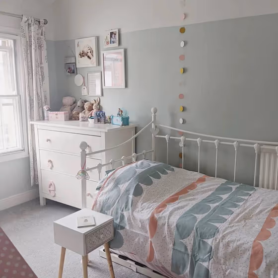
Elevate your space with the serene charm of Aquamarine-Light (Little Greene 283). This soft and soothing hue effortlessly adds a touch of tranquility to any room. Pair Aquamarine-Light with crisp white accents to create a fresh and airy ambiance, or combine it with warm neutrals like Sand (Little Greene 014) for a cozy, inviting feel. For a modern twist, complement Aquamarine-Light with accents in Classic Grey (Little Greene 155) to achieve a sophisticated and elegant look. Embrace the versatility of Aquamarine-Light to transform your space into a haven of relaxation and style.
Loading...
Color codes
We have collected almost every possible color code you could ever need.
Not sure what the difference between HEX and RGB is? We break down color models in plain language. Understanding color models
| Format | Code |
|---|---|
| HEX | #DBE9DF |
| RGB Decimal | 219, 233, 223 |
| RGB Percent | 85.88%, 91.37%, 87.45% |
| HSV | Hue: 137° Saturation: 6.01% Value: 91.37% |
| HSL | hsl(137, 24, 89) |
| CMYK | Cyan: 6.01 Magenta: 0.0 Yellow: 4.29 Key: 8.63 |
| YIQ | Y: 227.674 I: -5.129 Q: -6.074 |
| XYZ | X: 71.668 Y: 78.665 Z: 81.2 |
| CIE Lab | L:91.083 a:-6.471 b:3.256 |
| CIE Luv | L:91.083 u:-7.243 v:6.104 |
| Decimal | 14412255 |
| Hunter Lab | 88.693, -10.978, 7.804 |