Little Greene Attic II 144
Contentsshow +hide -
| Official page: | Attic II 144 |
| Code: | 144 |
| Name: | Attic II |
| Brand: | Little Greene |
| Collections: | Stone |
What color is Little Greene Attic II?
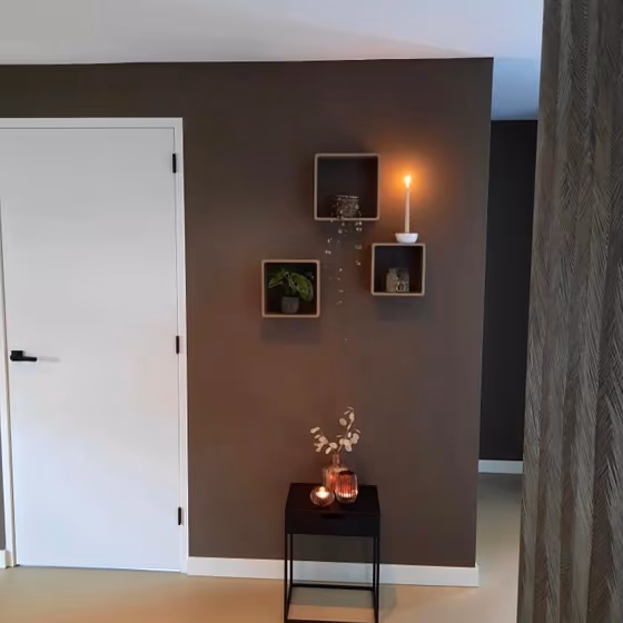
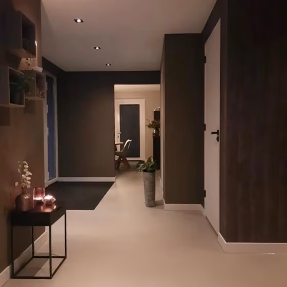
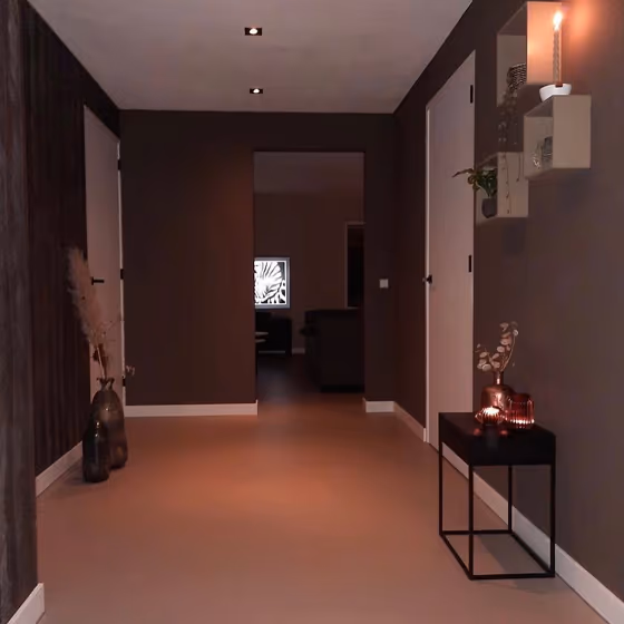
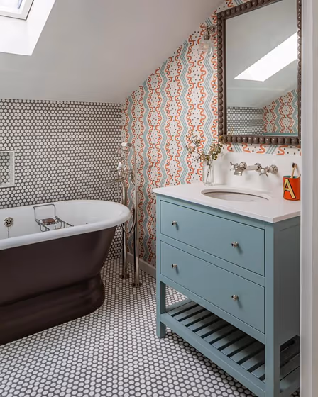
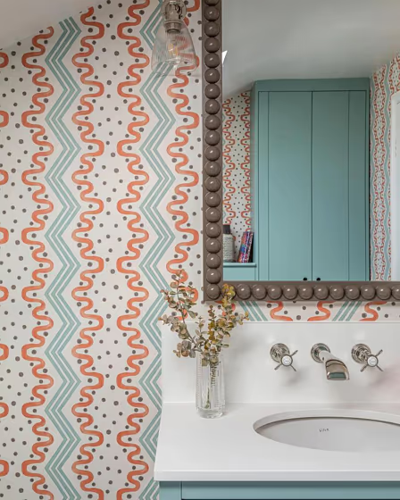
The hue of Little Greene's 144 Attic II is reminiscent of subtle clouds at dusk, a perfect blend of warmth and coolness. This color pairs beautifully with soft blush tones, creating a harmonious and sophisticated atmosphere. For a modern look, consider complementing 144 Attic II with accents in a crisp white or a deep navy blue. The versatility of this hue allows for endless possibilities in creating a timeless and elegant space.
Loading...
LRV of Attic II
Attic II has an LRV of 8.93% and refers to Dark colors which means that this color almost does not reflect light. Why LRV is important?

Light Reflectance Value measures the amount of visible and usable light that reflects from a painted surface.
Simply put, the higher the LRV of a paint color, the brighter the room you will get.
The scale goes from 0% (absolute black, absorbing all light) to 100% (pure white, reflecting all light).
Act like a pro: When choosing paint with an LRV of 8.93%, pay attention to your bulbs' brightness. Light brightness is measured in lumens. The lower the paint's LRV, the higher lumen level you need. Every square foot of room needs at least 40 lumens. That means for a 200 ft2 living room you'll need about 8000 lumens of light – e.g., eight 1000 lm bulbs.
Color codes
We have collected almost every possible color code you could ever need.
Not sure what the difference between HEX and RGB is? We break down color models in plain language. Understanding color models
| Format | Code |
|---|---|
| HEX | #5a5247 |
| RGB Decimal | 90, 82, 71 |
| RGB Percent | 35.29%, 32.16%, 27.84% |
| HSV | Hue: 35° Saturation: 21.11% Value: 35.29% |
| HSL | hsl(35, 12, 32) |
| CMYK | Cyan: 0.0 Magenta: 8.89 Yellow: 21.11 Key: 64.71 |
| YIQ | Y: 83.138 I: 8.302 Q: -1.731 |
| XYZ | X: 8.371 Y: 8.663 Z: 7.191 |
| CIE Lab | L:35.328 a:1.217 b:7.655 |
| CIE Luv | L:35.328 u:5.315 v:8.865 |
| Decimal | 5919303 |
| Hunter Lab | 29.434, -0.743, 6.119 |