Little Greene Hellebore 275
Contentsshow +hide -
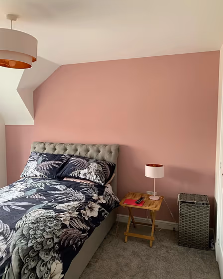
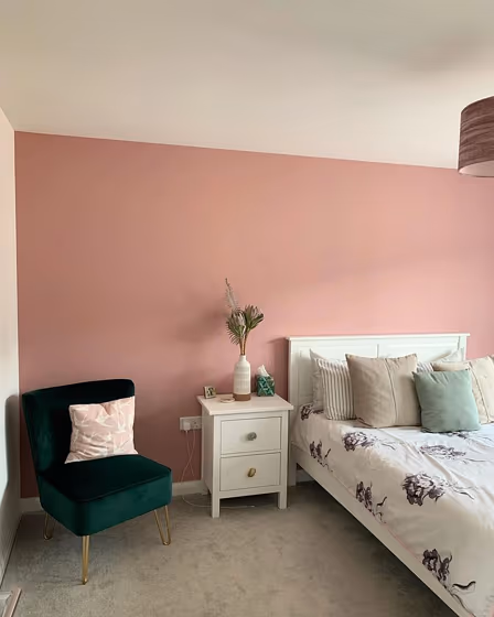
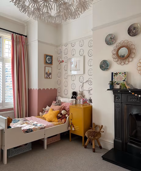
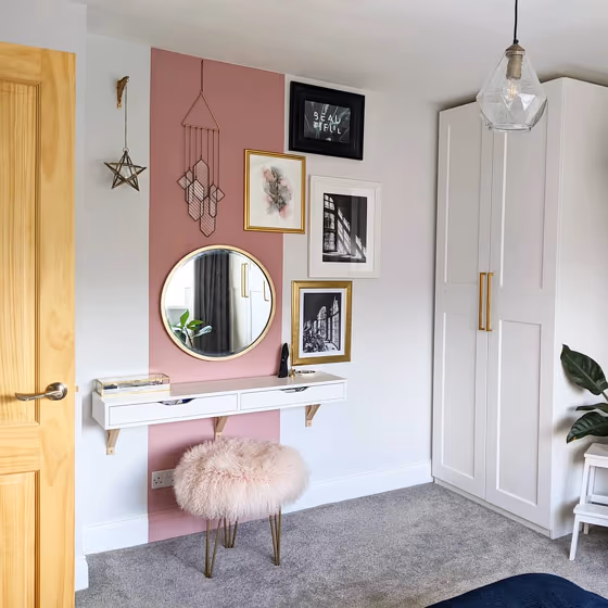
- Hellebore for bedroom (3 photos)
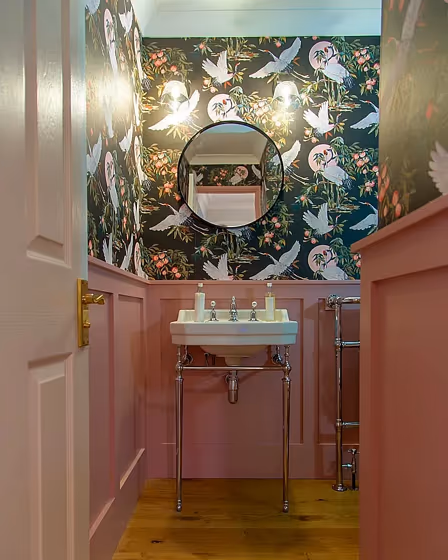
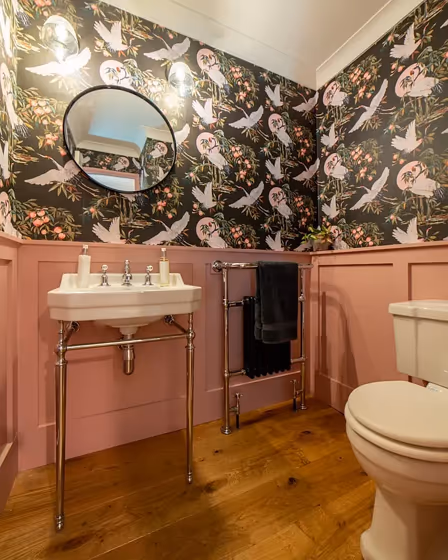
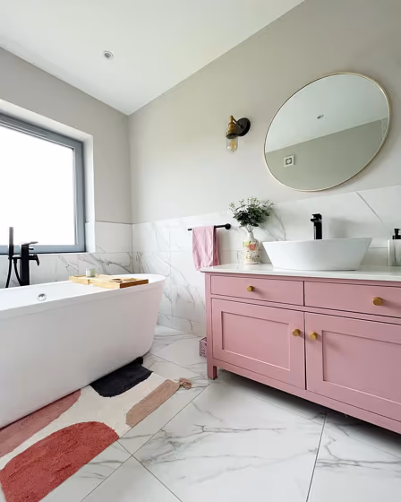
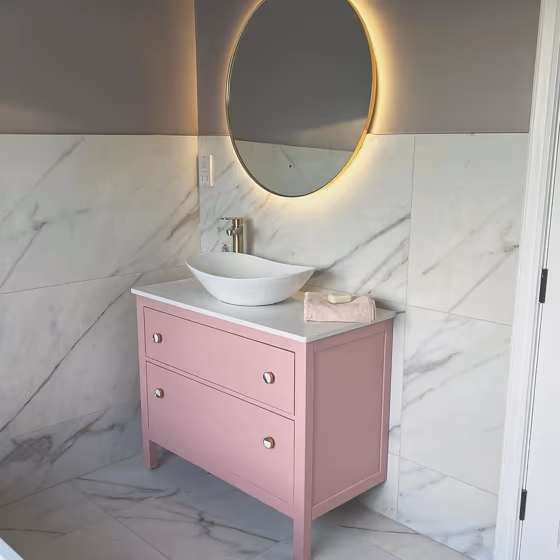
- Little Greene Hellebore for bathroom (2 photos)
- Little Greene Hellebore reviews (9 photos)
- What are Little Greene Hellebore undertones?
- Is Hellebore 275 cool or warm?
- How light temperature affects on Hellebore
- Complementary color scheme
- Color comparison and matching
- Color codes
- Color equivalents
| Official page: | Hellebore 275 |
| Code: | 275 |
| Name: | Hellebore |
| Brand: | Little Greene |
| Collections: | Colours of England |
What color is Little Greene Hellebore?
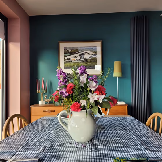
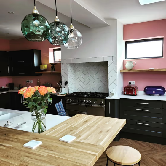
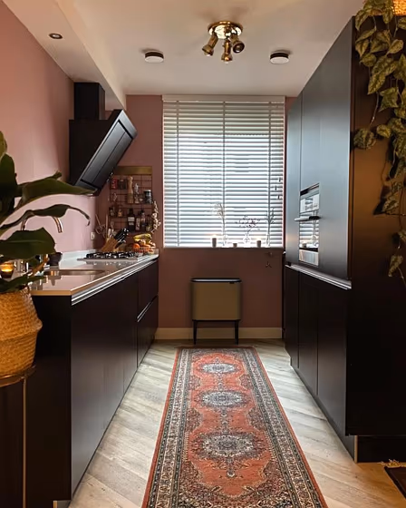
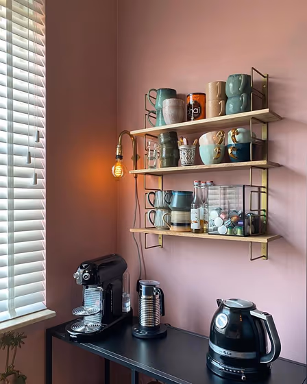
Hellebore is a dusky pink paint, providing the right level of prominence and refinement for any room. As a result of the muted violet note, Hellebore has subtle warmth and is ideal for add interest to classic schemes. A balanced pink combination is possible with the use of Carmine and Pink Slip on panelling. It is possible to pair with a green-based white for a timeless finish.
Loading...
Color codes
We have collected almost every possible color code you could ever need.
Not sure what the difference between HEX and RGB is? We break down color models in plain language. Understanding color models
| Format | Code |
|---|---|
| HEX | #c8a5a3 |
| RGB Decimal | 200, 165, 163 |
| RGB Percent | 78.43%, 64.71%, 63.92% |
| HSV | Hue: 3° Saturation: 18.5% Value: 78.43% |
| HSL | hsl(3, 25, 71) |
| CMYK | Cyan: 0.0 Magenta: 17.5 Yellow: 18.5 Key: 21.57 |
| YIQ | Y: 175.237 I: 21.499 Q: 6.781 |
| XYZ | X: 43.885 Y: 41.835 Z: 40.404 |
| CIE Lab | L:70.757 a:12.498 b:5.862 |
| CIE Luv | L:70.757 u:21.732 v:6.154 |
| Decimal | 13149603 |
| Hunter Lab | 64.68, 7.92, 8.24 |