Little Greene Invisible Green 56
Contentsshow +hide -
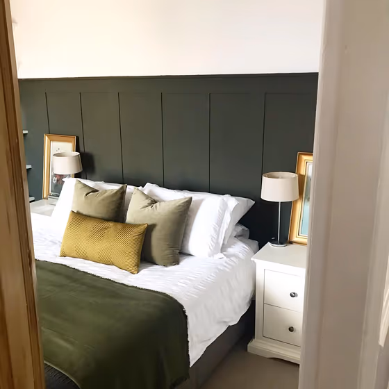
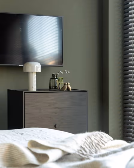
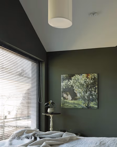
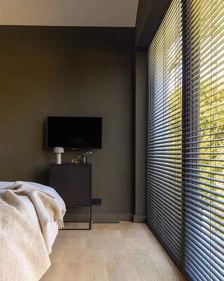
- Invisible Green for bedroom (4 photos)
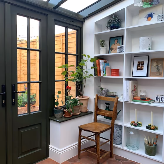
- Invisible Green for living room (2 photos)
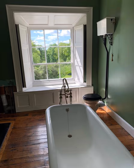
- Little Greene Invisible Green for bathroom (3 photos)
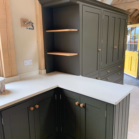
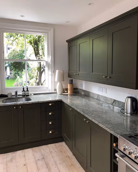
- Little Greene 56 on kitchen cabinets (2 photos)
- Little Greene Invisible Green reviews (1 photo)
- What are Little Greene Invisible Green undertones?
- Is Invisible Green 56 cool or warm?
- How light temperature affects on Invisible Green
- Complementary color scheme
- Color comparison and matching
- Color codes
- Color equivalents
| Official page: | Invisible Green 56 |
| Code: | 56 |
| Name: | Invisible Green |
| Brand: | Little Greene |
| Collections: | Colours of England, Green |
What color is Little Greene Invisible Green?
Made popular by the landscape gardener Humphry Repton who recommended it for fencing and railings so that they would blend better with the background vegetation. Invisible Green is a deep shade that is reminiscent of the outdoors, bringing calm to your interior.
Loading...
Color codes
We have collected almost every possible color code you could ever need.
Not sure what the difference between HEX and RGB is? We break down color models in plain language. Understanding color models
| Format | Code |
|---|---|
| HEX | #2f2b14 |
| RGB Decimal | 47, 43, 20 |
| RGB Percent | 18.43%, 16.86%, 7.84% |
| HSV | Hue: 51° Saturation: 57.45% Value: 18.43% |
| HSL | hsl(51, 40, 13) |
| CMYK | Cyan: 0.0 Magenta: 8.51 Yellow: 57.45 Key: 81.57 |
| YIQ | Y: 41.574 I: 9.775 Q: -6.311 |
| XYZ | X: 2.162 Y: 2.383 Z: 1.008 |
| CIE Lab | L:17.38 a:-2.197 b:15.561 |
| CIE Luv | L:17.38 u:3.054 v:12.572 |
| Decimal | 3091220 |
| Hunter Lab | 15.436, -2.006, 6.935 |