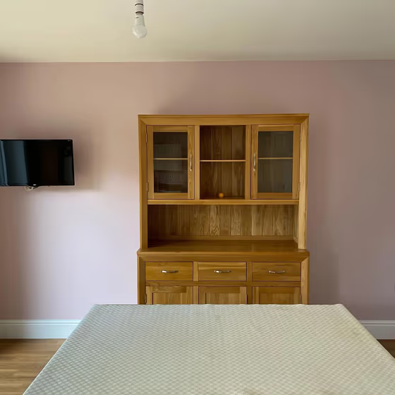
Little Greene Pink Slip 220
Official page: | Pink Slip 220 |
Code: | 220 |
Name: | Pink Slip |
Brand: | Little Greene |
Collections: | Colours of England |
What color is Little Greene Pink Slip?
Transform your space with the timeless elegance of Little Greene 220 Pink Slip. This soft and sophisticated hue adds a touch of warmth and tranquility to any room. Pair Pink Slip with complementary shades such as Little Greene 195 Bone China for a harmonious and understated look, or create a chic contrast by combining it with Little Greene 282 Lead Colour. Whether you're aiming for a classic or modern aesthetic, Little Greene 220 Pink Slip is the perfect choice to elevate your interior design.
Little Greene Pink Slip reviews
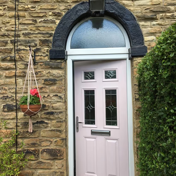
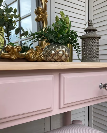
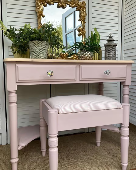
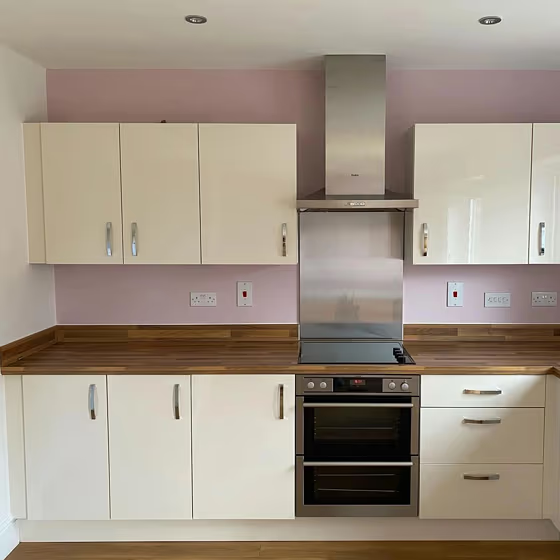
View the photos of real spaces painted with this that were not included in specific categories.Close-ups, painted furniture, storages and dressers, hallways, stairs and ceilings.
What are Little Greene Pink Slip undertones?
The undertone of Pink Slip can be accurately described as a Red hue, as is apparent from the color space provided. By isolating the pure hue and eliminating any tints, tones, and shades, we were able to precisely determine its undertone. This approach has proven to be more accurate than traditional methods of defining undertones on a white background, which are now considered outdated.
HEX value
HEX value:
#ECD2CB
RGB code:
236, 210, 203
Is Little Greene Pink Slip 220 cool or warm?
With a hue of 13° this Pink refers warm paint shade according to HSL (Hue, Saturation, Lightness) on the color wheel.
220 Pink Slip HSL code: 13, 46%, 86%
Hue - degree on a color wheel from 0 to 360. 0 is red, 120 is green, and 240 is blue.
Saturation is expressed as a percentage. At 0%, it appears as a shade of grey, and at 100%, it is in full color..
Lightness is also a percentage value. 0% is black, and 100% is white.
- Warm colors are ideal for kitchens, living rooms or bathrooms
- Warmer hues make larger spaces feel more inviting
- Warm pink shades offer a cheerful and inviting ambiance, making spaces feel cozy and vibrant, perfect for bedrooms, living rooms, and creative spaces.
- To prevent a space from feeling too monotonous, consider pairing warm light shades with richer tones like deep greens or browns, or adding textures through fabrics and furnishings. Avoid using them in rooms with limited natural light, as they may appear too dull or yellowish
Act like a pro: Mixing warm and cool shades is a must have to get harmonius interior. Add accents that contrast with the primary color to create visual balance. If your walls are a warm color, don’t forget to add accent in cold colors (furniture, art, décor). A good practice is too use a complementary color scheme.
Coordinating colors.
Colors that go with Little Greene Pink Slip:
Complementary color scheme
This color scheme is a combination of two shades that are opposite each other on the color wheel. The high contrast between these colors creates a vibrant and dynamic visual effect.
220
Pink Slip