Little Greene Portland Stone - Dark 157
Contentsshow +hide -
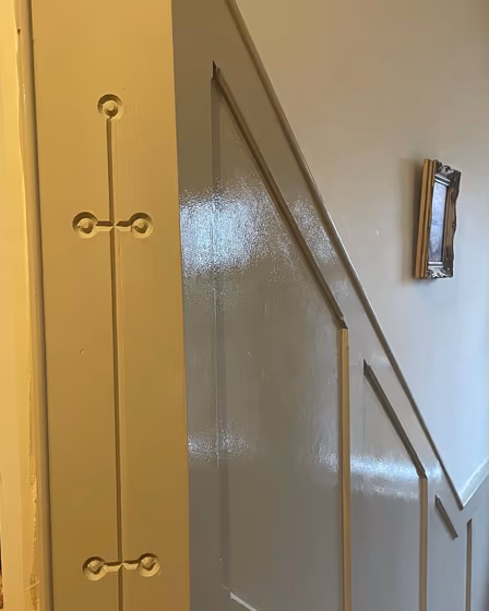
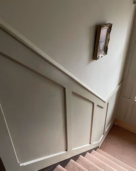
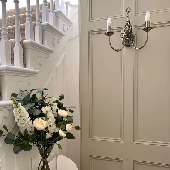
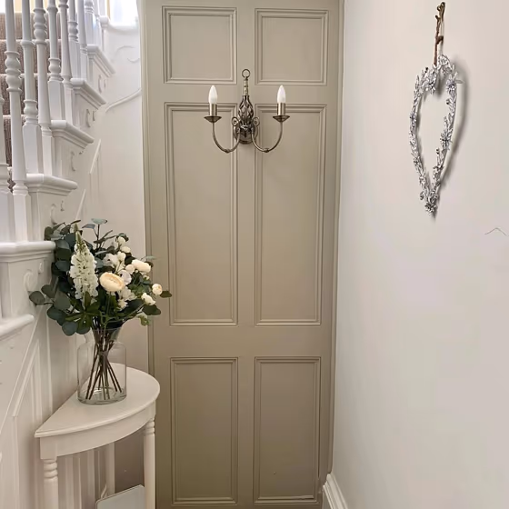
- Little Greene Portland Stone - Dark reviews (4 photos)
- What are Little Greene Portland Stone - Dark undertones?
- Is Portland Stone - Dark 157 cool or warm?
- How light temperature affects on Portland Stone - Dark
- Monochromatic color scheme
- Complementary color scheme
- Color comparison and matching
- LRV of Portland Stone - Dark 157
- Color codes
- Color equivalents
| Official page: | Portland Stone - Dark 157 |
| Code: | 157 |
| Name: | Portland Stone - Dark |
| Brand: | Little Greene |
| Collections: | Stone |
What color is Little Greene Portland Stone - Dark?
What color is Little Greene Portland Stone Dark?
Little Greene Portland Stone - Dark is a versatile and sophisticated shade of grey. It has a warm undertone which makes it a popular choice for both modern and traditional interiors. The color is reminiscent of the natural stone found in the Portland area of Dorset in the UK. Its subtle depth and complexity mean that it can be used as a neutral backdrop or as a feature color, depending on the style of the room. Overall, Little Greene Portland Stone - Dark is a timeless and elegant color that can complement a wide range of design schemes.
What color goes well with Portland Stone Dark?
Portland Stone Dark is a versatile shade of grey that can be paired with a wide range of colors. For a classic and sophisticated look, you can pair it with other neutral colors such as white ( Little Greene Flint ), beige ( Little Greene Portland Stone - Light or Joanna) or cream ( Little Greene Clay Pale ). These colors can create a clean and airy feel to your space while complementing the warmth and depth of Portland Stone - Dark.
Alternatively, you can add a pop of color by combining Portland Stone - Dark with bold shades like navy blue Little Greene Dock Blue, forest green Little Green Olive Colour or mustard yellow Little Greene Yellow-Pink. These colors create a striking contrast that can add depth and interest to your room.
How to use Portland Stone Dark?
You can pair Portland Stone Dark with metallic accents such as brass or copper. These colors can add a touch of glamour and elegance to your space while complementing the warm undertones of the grey. Overall, the color combinations you choose will depend on your personal style and the overall look you are trying to achieve.
Loading...
LRV of Portland Stone - Dark
Portland Stone - Dark has an LRV of 32.55% and refers to Medium colors that reflect a lot of light. Why LRV is important?

Light Reflectance Value measures the amount of visible and usable light that reflects from a painted surface.
Simply put, the higher the LRV of a paint color, the brighter the room you will get.
The scale goes from 0% (absolute black, absorbing all light) to 100% (pure white, reflecting all light).
Act like a pro: When choosing paint with an LRV of 32.55%, pay attention to your bulbs' brightness. Light brightness is measured in lumens. The lower the paint's LRV, the higher lumen level you need. Every square foot of room needs at least 40 lumens. That means for a 200 ft2 living room you'll need about 8000 lumens of light – e.g., eight 1000 lm bulbs.
Color codes
We have collected almost every possible color code you could ever need.
Not sure what the difference between HEX and RGB is? We break down color models in plain language. Understanding color models
| Format | Code |
|---|---|
| HEX | #a29c7c |
| RGB Decimal | 162, 156, 124 |
| RGB Percent | 63.53%, 61.18%, 48.63% |
| HSV | Hue: 51° Saturation: 23.46% Value: 63.53% |
| HSL | hsl(51, 17, 56) |
| CMYK | Cyan: 0.0 Magenta: 3.7 Yellow: 23.46 Key: 36.47 |
| YIQ | Y: 154.146 I: 13.858 Q: -8.689 |
| XYZ | X: 30.427 Y: 32.914 Z: 23.814 |
| CIE Lab | L:64.091 a:-3.183 b:17.589 |
| CIE Luv | L:64.091 u:5.423 v:24.196 |
| Decimal | 10656892 |
| Hunter Lab | 57.371, -5.732, 15.549 |