Little Greene Whitening 41

Official page:Whitening 41
Code:41
Name:Whitening
Brand:Little Greene
Collections:Colours of England

What color is Little Greene Whitening?

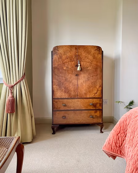
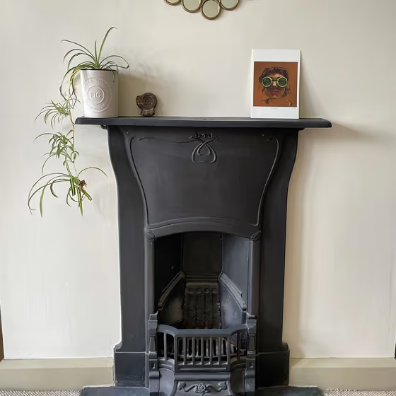
Little Greene 41 Whitening is a soft, delicate hue that brings a sense of calm to any space. This versatile color pairs effortlessly with neutral tones like sand and taupe, creating a soothing and serene atmosphere. For a more striking contrast, consider combining 41 Whitening with deep navy or charcoal for a modern and sophisticated look. The subtle undertones of gray in this color make it an excellent choice for creating a timeless and elegant interior. Whether used as a main wall color or in accents, Little Greene 41 Whitening adds a touch of understated beauty to any room.

Little Greene Whitening reviews

Little Greene Whitening 41 wall paint
@bird_in_the_north
Little Greene Whitening 41 wall paint
@bird_in_the_north
Little Greene Whitening 41 wall paint
@bird_in_the_north
Little Greene Whitening 41 wall paint
@bird_in_the_north
Little Greene Whitening 41 wall paint
@bird_in_the_north
Little Greene Whitening 41 wall paint
@bird_in_the_north

View the photos of real spaces painted with this that were not included in specific categories.Close-ups, painted furniture, storages and dressers, hallways, stairs and ceilings.

What are Little Greene Whitening undertones?

The undertone of Whitening can be accurately described as a Yellow hue, as is apparent from the color space provided. By isolating the pure hue and eliminating any tints, tones, and shades, we were able to precisely determine its undertone. This approach has proven to be more accurate than traditional methods of defining undertones on a white background, which are now considered outdated.

R
G
B

HEX value

HEX value:

#F4F2E5

RGB code:

244, 242, 229

Is Little Greene Whitening 41 cool or warm?

warm
Color wheel
cool

With a hue of 52° this Beige refers warm paint shade according to HSL (Hue, Saturation, Lightness) on the color wheel.

41 Whitening HSL code: 52, 41%, 93%

Hue - degree on a color wheel from 0 to 360. 0 is red, 120 is green, and 240 is blue.
Saturation is expressed as a percentage. At 0%, it appears as a shade of grey, and at 100%, it is in full color..
Lightness is also a percentage value. 0% is black, and 100% is white.

  • Warm colors are ideal for kitchens, living rooms or bathrooms
  • Warmer hues make larger spaces feel more inviting
  • Warm beige shades create a cozy and inviting atmosphere, making any room feel comfortable and welcoming, perfect for living rooms, bedrooms, and hallways.
  • To prevent a space from feeling too monotonous, consider pairing warm light shades with richer tones like deep greens or browns, or adding textures through fabrics and furnishings. Avoid using them in rooms with limited natural light, as they may appear too dull or yellowish

Act like a pro: Mixing warm and cool shades is a must have to get harmonius interior. Add accents that contrast with the primary color to create visual balance. If your walls are a warm color, don’t forget to add accent in cold colors (furniture, art, décor). A good practice is too use a complementary color scheme.

Compare Whitening to any other colors

Compare colors
arrow