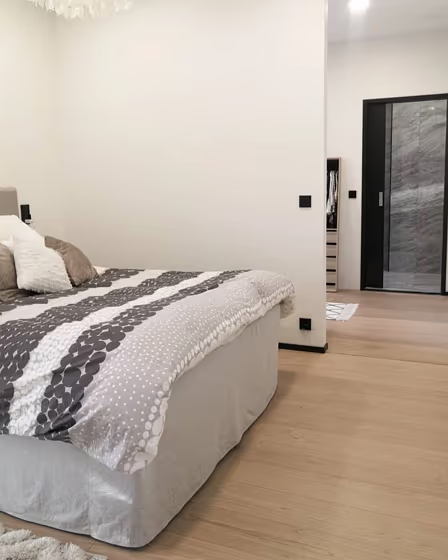
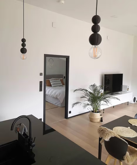
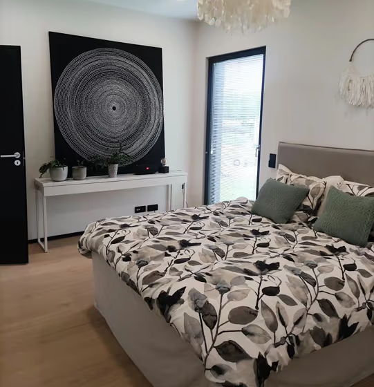
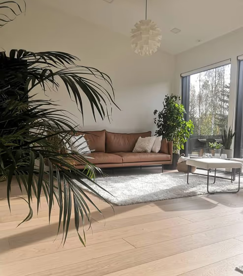
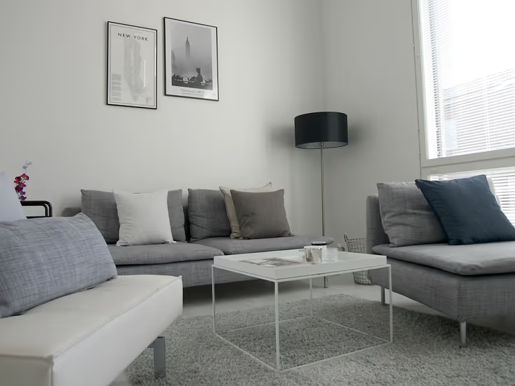
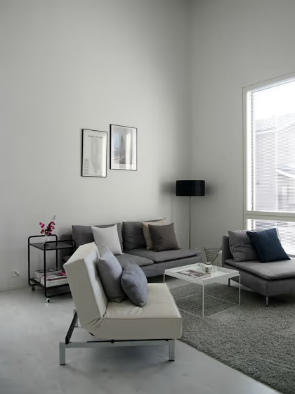
Tikkurila Paper F497
Contentsshow +hide -
| Code: | F497 |
| Name: | Paper |
| Brand: | Tikkurila |
What color is Tikkurila Paper?
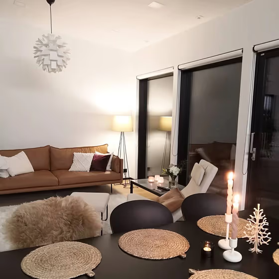
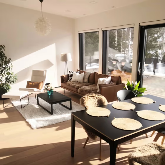
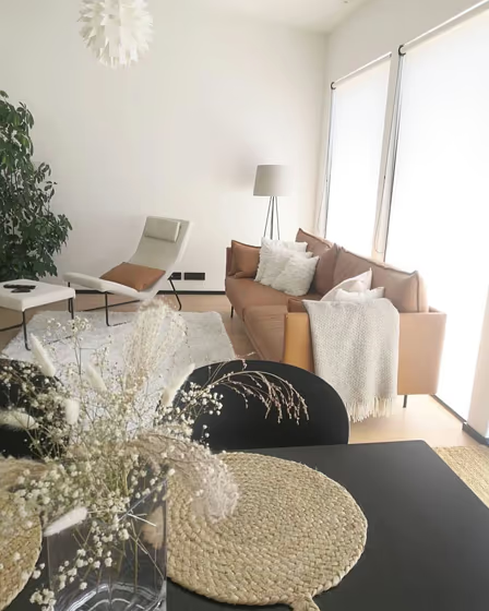
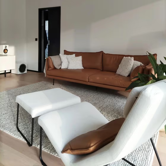
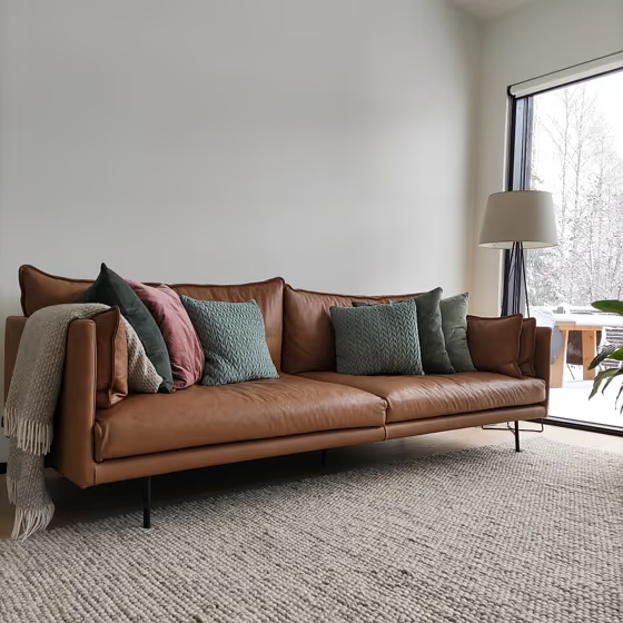
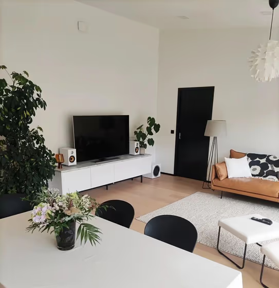
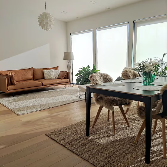
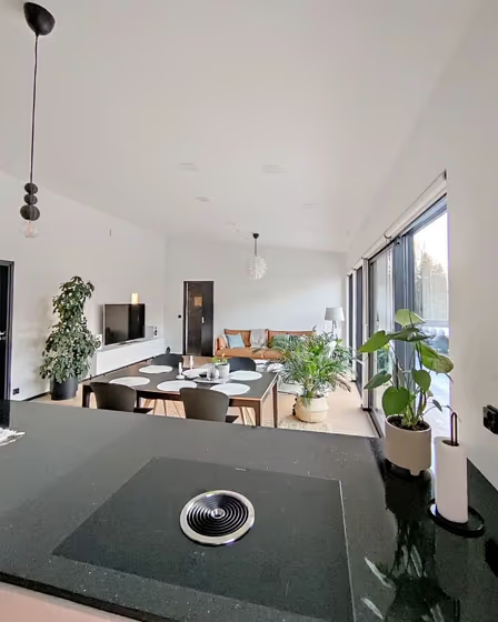
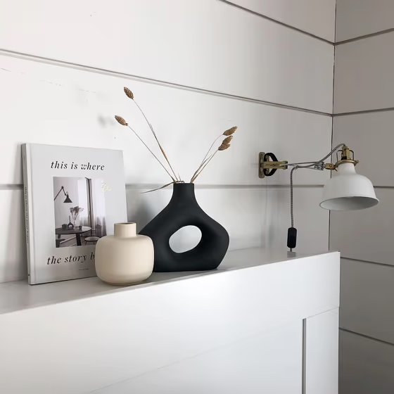
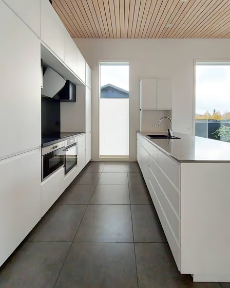
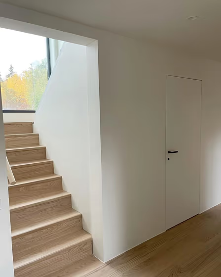
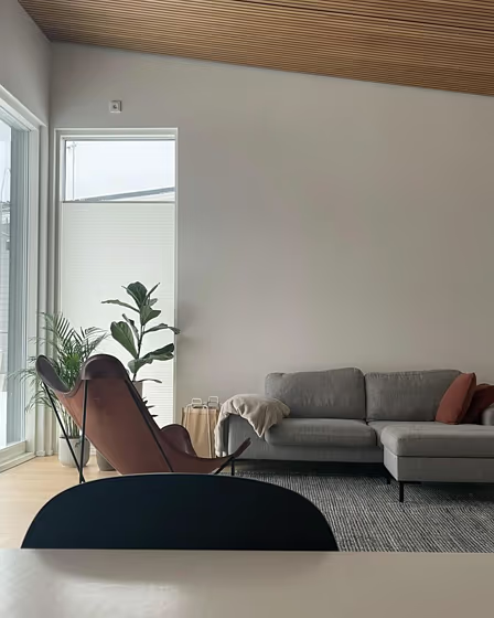
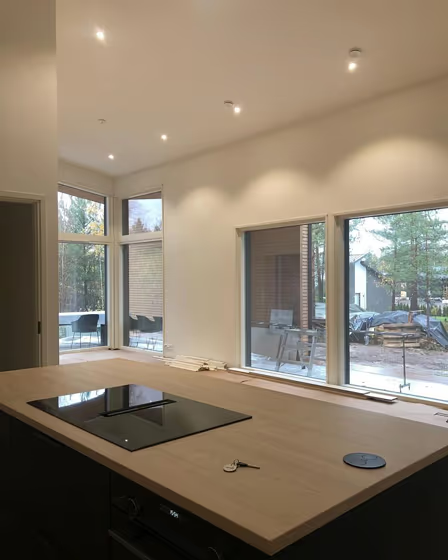
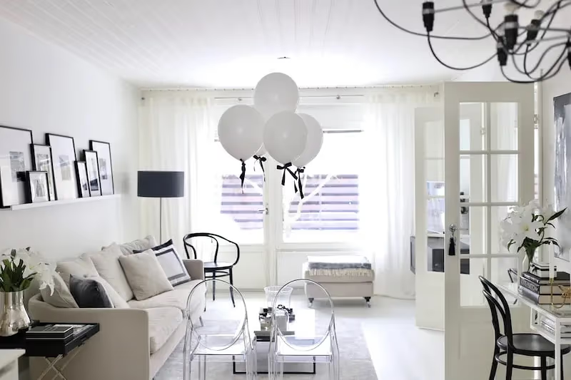
Transform your space with the versatile Tikkurila F497 Paper, a soft and sophisticated pale taupe color that exudes elegance and tranquility. This neutral hue pairs harmoniously with Tikkurila L480 Fresh Linen for a timeless and serene combination, or with Tikkurila G512 Sage Green for a subtle and refreshing contrast. Elevate the ambience of any room by incorporating accents in Tikkurila T350 Warm Stone or Tikkurila N739 Gentle Beige to create a cohesive and inviting atmosphere. Let Tikkurila F497 Paper be the foundation for your design palette, offering endless possibilities for a chic and modern space that is both calming and stylish.
LRV of Paper
Paper has an LRV of 88.39% and refers to White colors that reflect almost all light. Why LRV is important?

Light Reflectance Value measures the amount of visible and usable light that reflects from a painted surface.
Simply put, the higher the LRV of a paint color, the brighter the room you will get.
The scale goes from 0% (absolute black, absorbing all light) to 100% (pure white, reflecting all light).
Act like a pro: When choosing paint with an LRV of 88.39%, pay attention to your bulbs' brightness. Light brightness is measured in lumens. The lower the paint's LRV, the higher lumen level you need. Every square foot of room needs at least 40 lumens. That means for a 200 ft2 living room you'll need about 8000 lumens of light – e.g., eight 1000 lm bulbs.
Color codes
We have collected almost every possible color code you could ever need.
| Format | Code |
|---|---|
| HEX | #F2F2ED |
| RGB Decimal | 242, 242, 237 |
| RGB Percent | 94.90%, 94.90%, 92.94% |
| HSV | Hue: 60° Saturation: 2.07% Value: 94.9% |
| HSL | hsl(60, 16, 94) |
| CMYK | Cyan: 0.0 Magenta: 0.0 Yellow: 2.07 Key: 5.1 |
| YIQ | Y: 241.43 I: 1.607 Q: -1.556 |
| XYZ | X: 83.653 Y: 88.496 Z: 92.772 |
| CIE Lab | L:95.369 a:-0.877 b:2.411 |
| CIE Luv | L:95.369 u:0.277 v:3.855 |
| Decimal | 15921901 |
| Hunter Lab | 94.072, -5.898, 7.38 |


