Sherwin Williams Pearly White SW 7009
Contentsshow +hide -
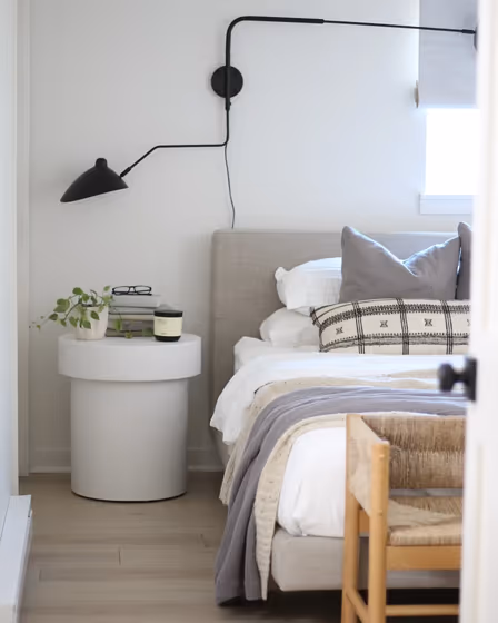
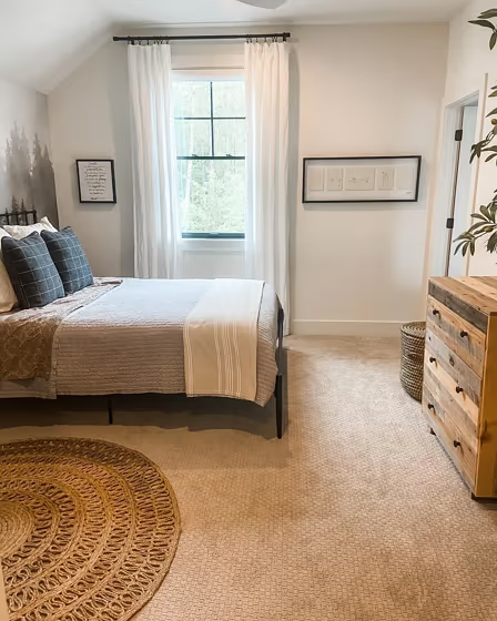
- Pearly White for bedroom (2 photos)
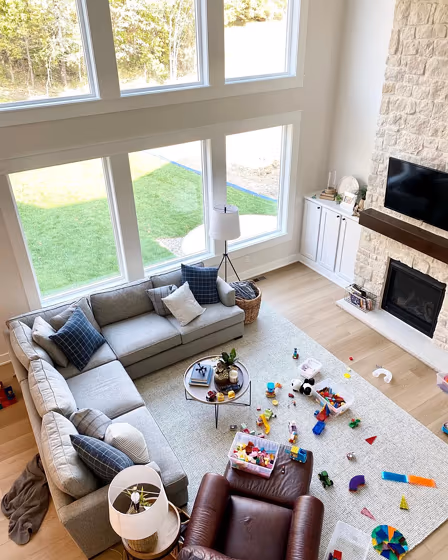
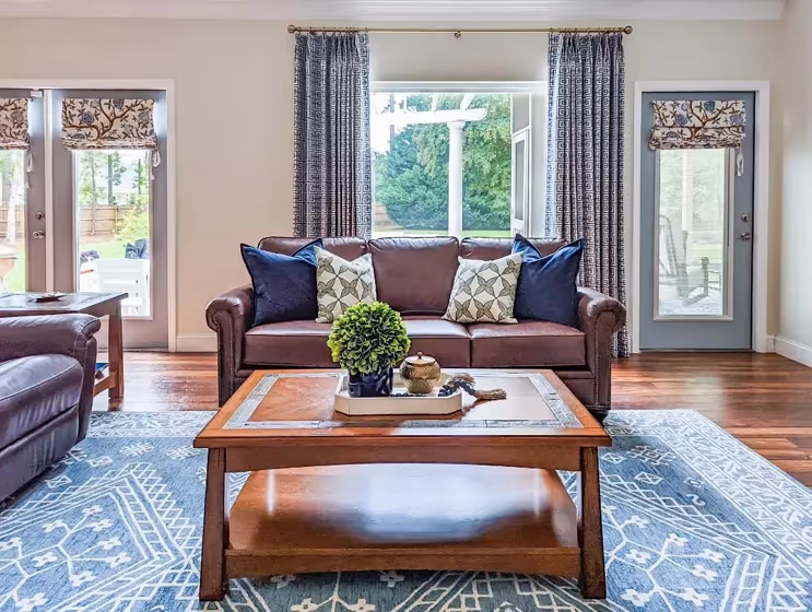
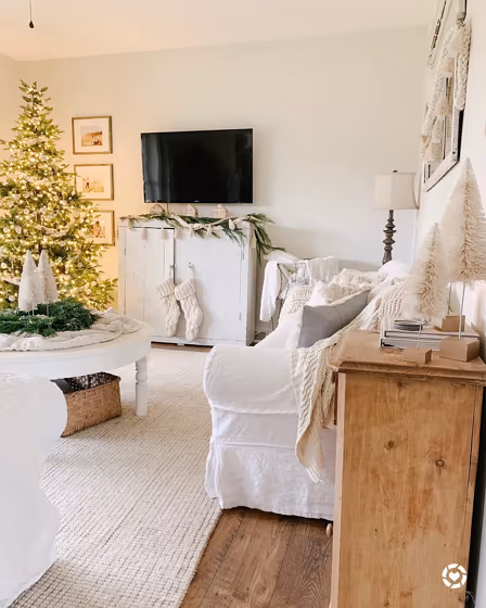
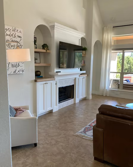
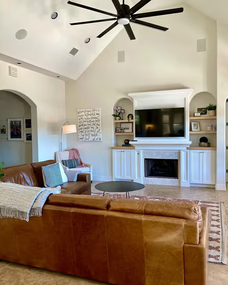
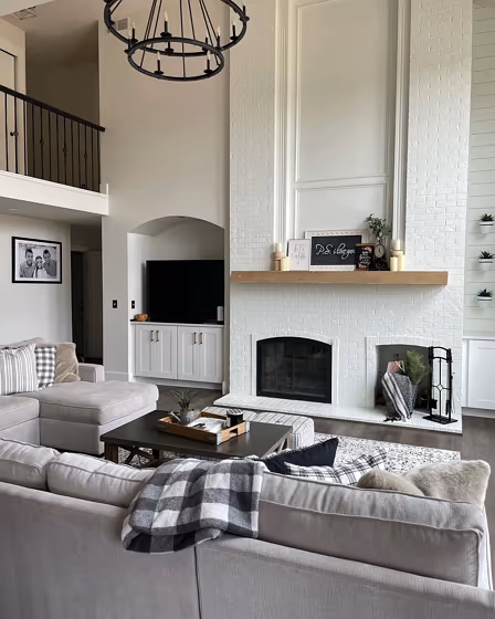
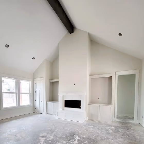
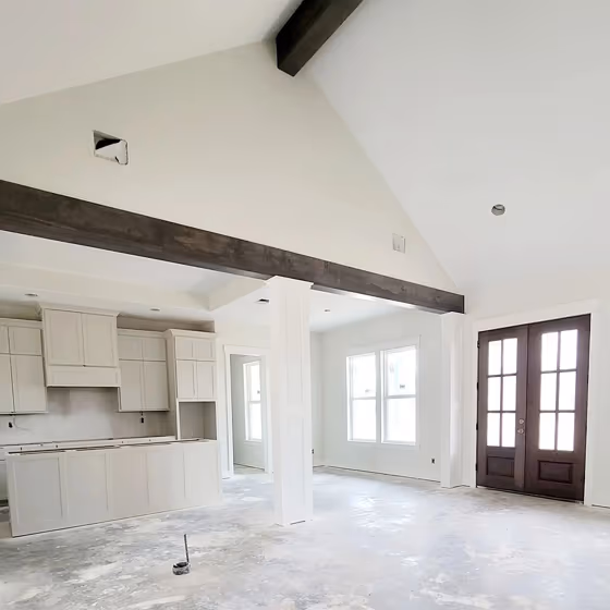
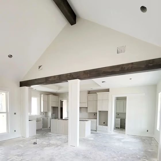
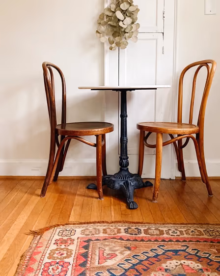
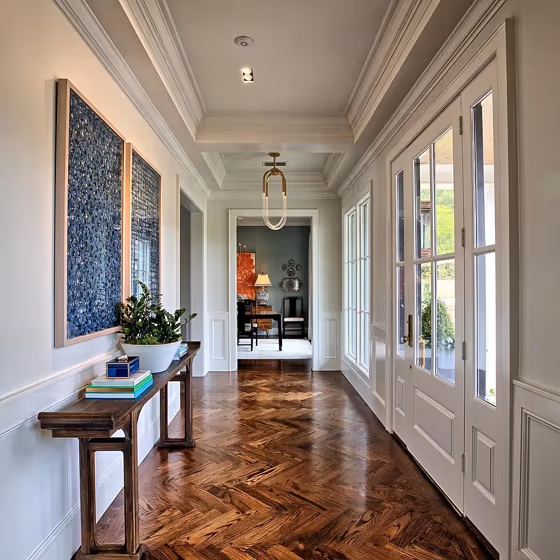
- Pearly White for living room (10 photos)
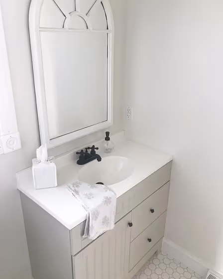
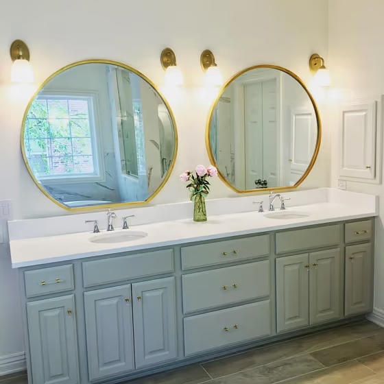
- Sherwin Williams Pearly White for bathroom (2 photos)
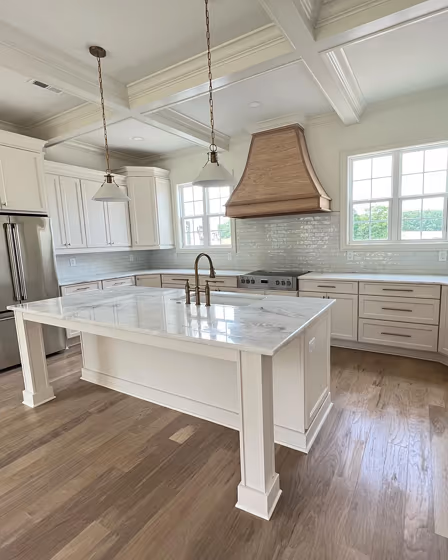
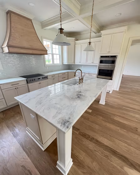
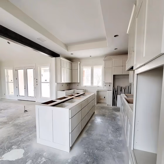
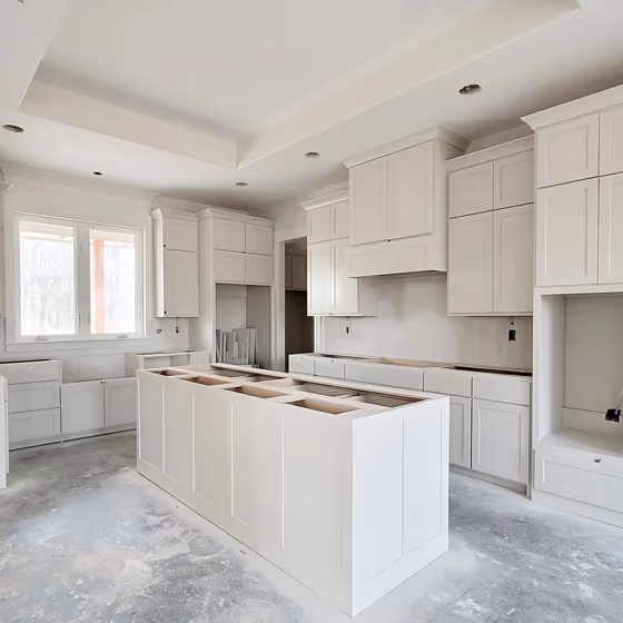
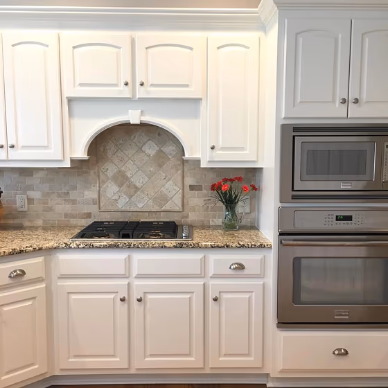
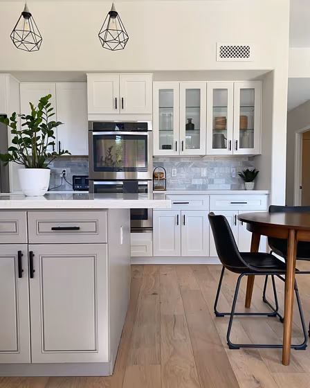
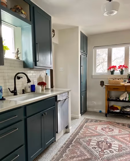
- Sherwin Williams SW 7009 on kitchen cabinets (6 photos)
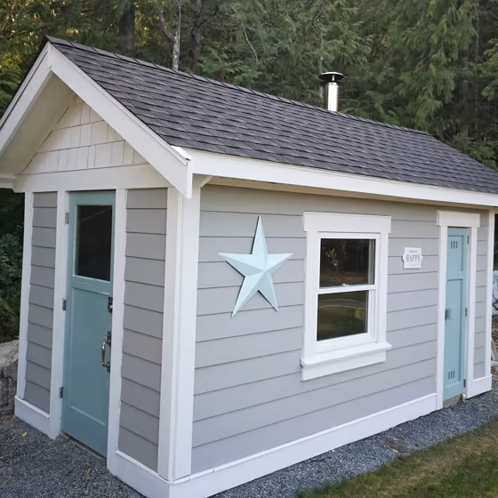
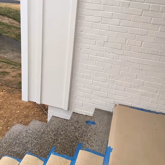
- Pearly White for exterior (2 photos)
- Sherwin Williams Pearly White reviews (6 photos)
- What are Sherwin Williams Pearly White undertones?
- Is Pearly White SW 7009 cool or warm?
- How light temperature affects on Pearly White
- Monochromatic color scheme
- Complementary color scheme
- Color comparison and matching
- LRV of Pearly White SW 7009
- Color codes
- Color equivalents
| Official page: | Pearly White SW 7009 |
| Code: | SW 7009 |
| Name: | Pearly White |
| Brand: | Sherwin Williams |
| Collections: | Top 50 Colors, Living Well, Cool White, Finest Whites |
What color is Sherwin Williams Pearly White?
Sherwin Williams Pearly White SW 7009 is a soft off-white with gentle creamy-beige warmth rather than a sharp, bright-white look. It has a lightly muted quality that keeps walls from feeling stark, especially alongside natural oak, linen upholstery, honed stone, and aged brass. In north-facing rooms, the warmth helps counter cooler daylight, while evening lamps can bring out its faint buttery cast. Pearly White suits living rooms, bedrooms, and hallways where you want a pale backdrop with more softness than a crisp gallery white. Pair it with walnut furniture, dusty blue textiles, dark green accents, or terracotta pottery for contrast that still feels grounded.
Loading...
LRV of Pearly White
Pearly White has an LRV of 77.33% and refers to Off‑White colors that reflect a lot of light. Why LRV is important?

Light Reflectance Value measures the amount of visible and usable light that reflects from a painted surface.
Simply put, the higher the LRV of a paint color, the brighter the room you will get.
The scale goes from 0% (absolute black, absorbing all light) to 100% (pure white, reflecting all light).
Act like a pro: When choosing paint with an LRV of 77.33%, pay attention to your bulbs' brightness. Light brightness is measured in lumens. The lower the paint's LRV, the higher lumen level you need. Every square foot of room needs at least 40 lumens. That means for a 200 ft2 living room you'll need about 8000 lumens of light – e.g., eight 1000 lm bulbs.
Color codes
We have collected almost every possible color code you could ever need.
Not sure what the difference between HEX and RGB is? We break down color models in plain language. Understanding color models
| Format | Code |
|---|---|
| HEX | #e8e3d9 |
| RGB Decimal | 232, 227, 217 |
| RGB Percent | 90.98%, 89.02%, 85.10% |
| HSV | Hue: 40° Saturation: 6.47% Value: 90.98% |
| HSL | hsl(40, 25, 88) |
| CMYK | Cyan: 0.0 Magenta: 2.16 Yellow: 6.47 Key: 9.02 |
| YIQ | Y: 227.355 I: 6.193 Q: -2.054 |
| XYZ | X: 73.27 Y: 77.104 Z: 76.65 |
| CIE Lab | L:90.37 a:-0.033 b:5.481 |
| CIE Luv | L:90.37 u:3.441 v:8.265 |
| Decimal | 15262681 |
| Hunter Lab | 87.809, -4.722, 9.711 |