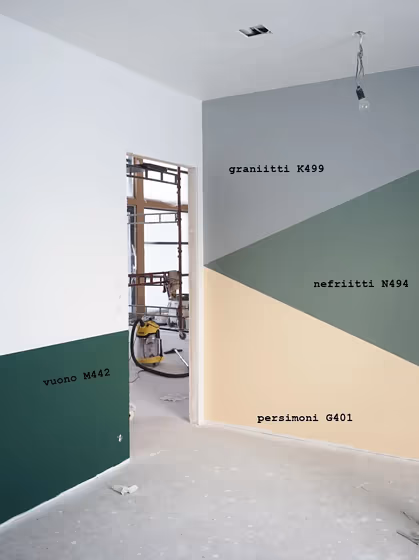
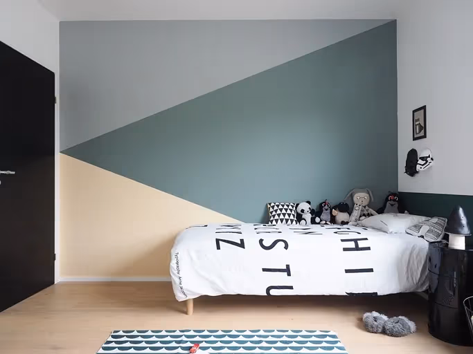
Tikkurila Persimmon G401
Contentsshow +hide -
| Code: | G401 |
| Name: | Persimmon |
| Brand: | Tikkurila |
What color is Tikkurila Persimmon?
Introduce a warm and inviting hue to your space with Tikkurila G401 Persimmon. This rich and vibrant shade, reminiscent of a ripe juicy persimmon, adds a pop of color and charm to any room. Pair Persimmon with complementary tones such as G496 Lemongrass, G580 Teal, or G853 Terracotta for a harmonious and stylish color palette. Whether used as an accent wall or incorporated into decor accents, this versatile color is sure to make a bold statement in your home. Embrace the warmth and energy of Persimmon to create a cozy and welcoming atmosphere that is both on-trend and timeless.
Loading...
LRV of Persimmon
Persimmon has an LRV of 70.36% and refers to Light colors that reflect most of the incident light. Why LRV is important?

Light Reflectance Value measures the amount of visible and usable light that reflects from a painted surface.
Simply put, the higher the LRV of a paint color, the brighter the room you will get.
The scale goes from 0% (absolute black, absorbing all light) to 100% (pure white, reflecting all light).
Act like a pro: When choosing paint with an LRV of 70.36%, pay attention to your bulbs' brightness. Light brightness is measured in lumens. The lower the paint's LRV, the higher lumen level you need. Every square foot of room needs at least 40 lumens. That means for a 200 ft2 living room you'll need about 8000 lumens of light – e.g., eight 1000 lm bulbs.
Color codes
We have collected almost every possible color code you could ever need.
Not sure what the difference between HEX and RGB is? We break down color models in plain language. Understanding color models
| Format | Code |
|---|---|
| HEX | #F6D4B4 |
| RGB Decimal | 246, 212, 180 |
| RGB Percent | 96.47%, 83.14%, 70.59% |
| HSV | Hue: 29° Saturation: 26.83% Value: 96.47% |
| HSL | hsl(29, 79, 84) |
| CMYK | Cyan: 0.0 Magenta: 13.82 Yellow: 26.83 Key: 3.53 |
| YIQ | Y: 218.518 I: 30.544 Q: -2.766 |
| XYZ | X: 69.788 Y: 69.978 Z: 52.999 |
| CIE Lab | L:86.986 a:7.172 b:20.237 |
| CIE Luv | L:86.986 u:23.195 v:27.469 |
| Decimal | 16176308 |
| Hunter Lab | 83.653, 2.523, 20.993 |