Dulux Potters Clay 2 50RR 54/018
Contentsshow +hide -
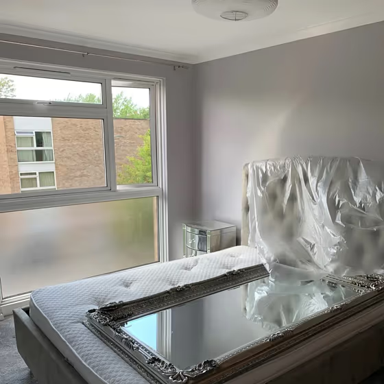
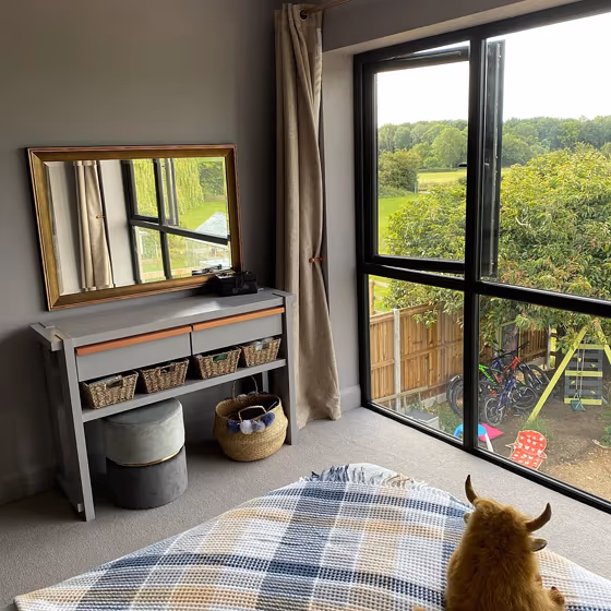
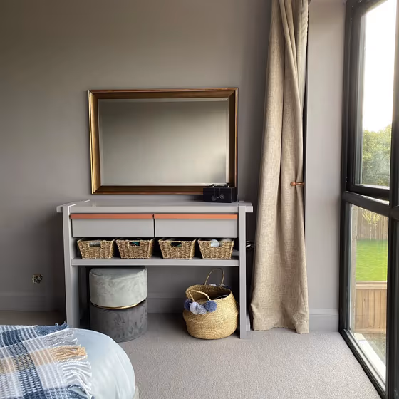
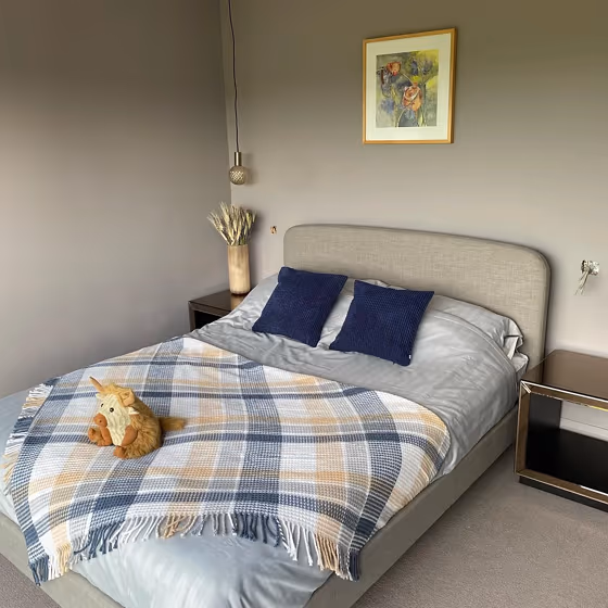
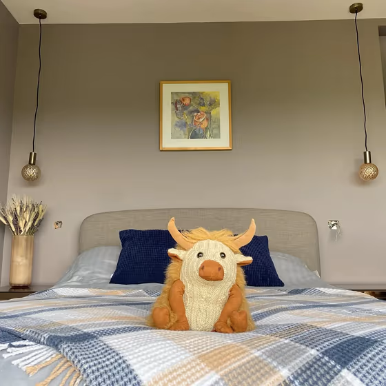
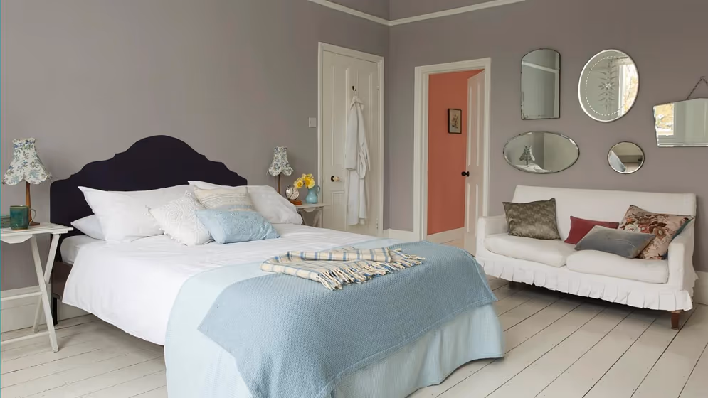
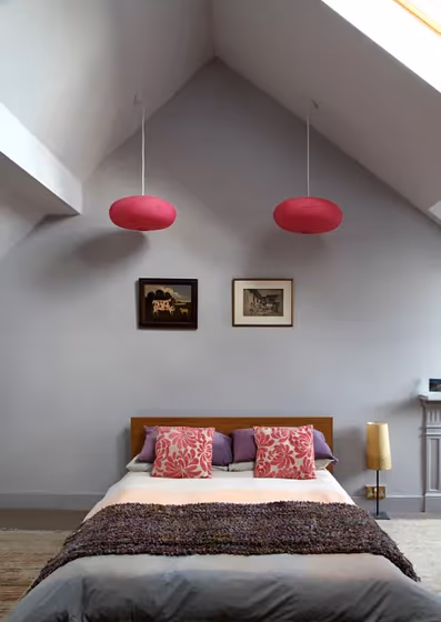
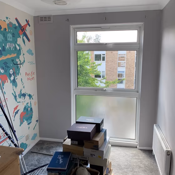
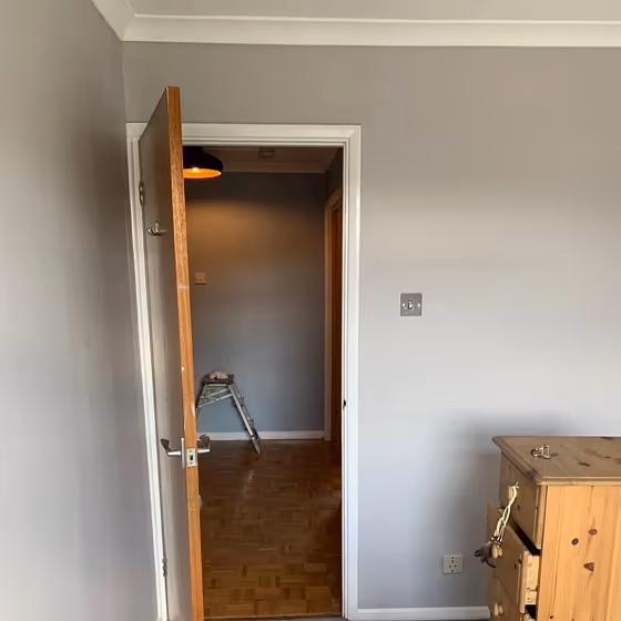
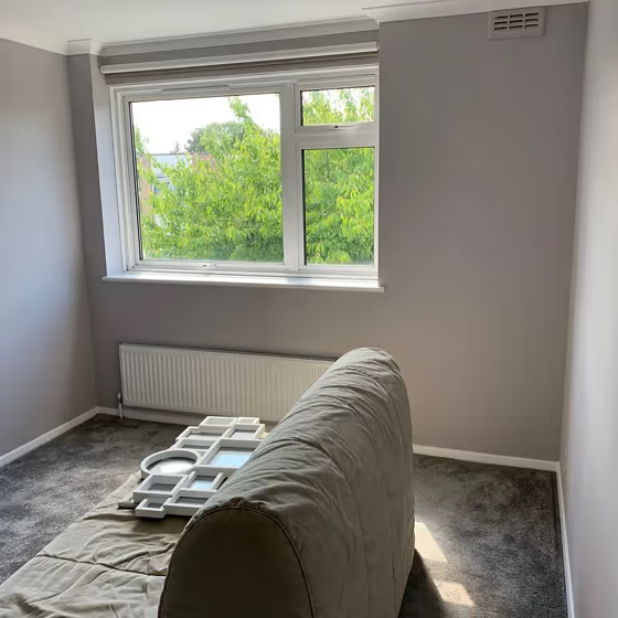
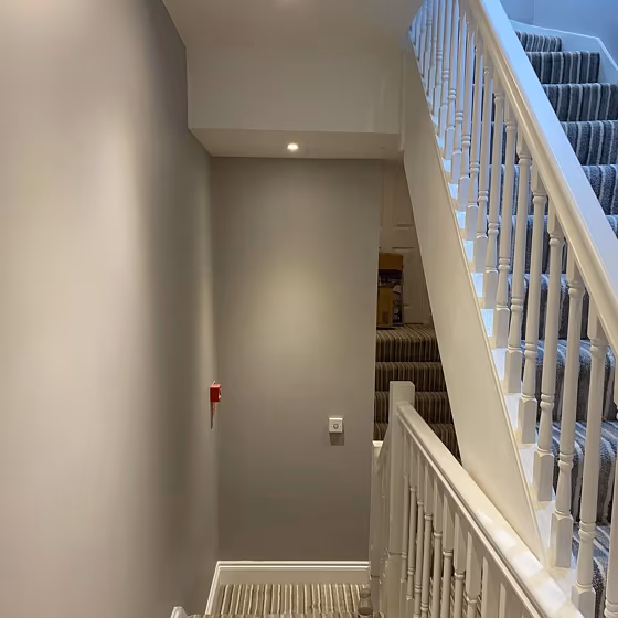
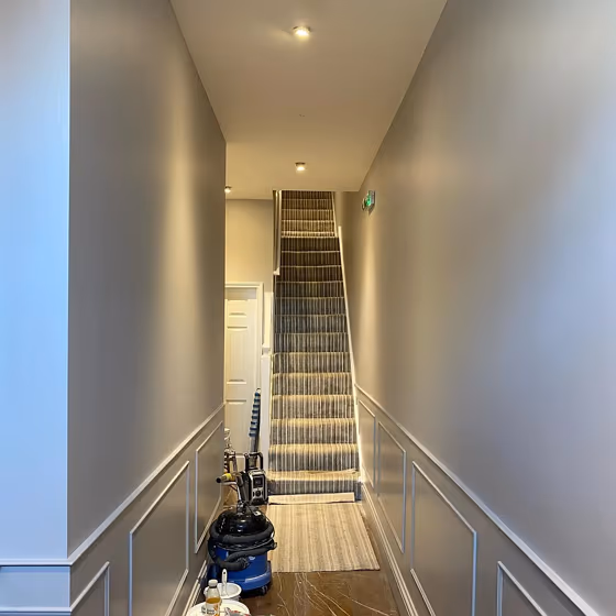
- Potters Clay 2 for bedroom (7 photos)
- Dulux Potters Clay 2 reviews (5 photos)
- What are Dulux Potters Clay 2 undertones?
- Is Potters Clay 2 50RR 54/018 cool or warm?
- How light temperature affects on Potters Clay 2
- Monochromatic color scheme
- Complementary color scheme
- Color comparison and matching
- LRV of Potters Clay 2 50RR 54/018
- Color codes
- Color equivalents
| Code: | 50RR 54/018 |
| Name: | Potters Clay 2 |
| Brand: | Dulux |
What color is Dulux Potters Clay 2?
Transform your space with the warm and earthy tones of Dulux 50RR 54/018, also known as Potters Clay 2. This rich terracotta hue adds depth and character to any room, creating a cozy and inviting atmosphere. Pair Potters Clay 2 with soft neutrals like beige or cream for a harmonious look, or contrast it with bold accents in deep navy or olive green for a striking effect. Embrace the trend of natural colors and bring a touch of warmth to your space with Potters Clay 2 as the perfect backdrop for your interior design vision.
Loading...
LRV of Potters Clay 2
Potters Clay 2 has an LRV of 53.42% and refers to Light Medium colors that reflect half of the incident light. Why LRV is important?

Light Reflectance Value measures the amount of visible and usable light that reflects from a painted surface.
Simply put, the higher the LRV of a paint color, the brighter the room you will get.
The scale goes from 0% (absolute black, absorbing all light) to 100% (pure white, reflecting all light).
Act like a pro: When choosing paint with an LRV of 53.42%, pay attention to your bulbs' brightness. Light brightness is measured in lumens. The lower the paint's LRV, the higher lumen level you need. Every square foot of room needs at least 40 lumens. That means for a 200 ft2 living room you'll need about 8000 lumens of light – e.g., eight 1000 lm bulbs.
Color codes
We have collected almost every possible color code you could ever need.
Not sure what the difference between HEX and RGB is? We break down color models in plain language. Understanding color models
| Format | Code |
|---|---|
| HEX | #c4c0c0 |
| RGB Decimal | 196, 192, 192 |
| RGB Percent | 76.86%, 75.29%, 75.29% |
| HSV | Hue: 0° Saturation: 2.04% Value: 76.86% |
| HSL | hsl(0, 3, 76) |
| CMYK | Cyan: 0.0 Magenta: 2.04 Yellow: 2.04 Key: 23.14 |
| YIQ | Y: 193.196 I: 2.384 Q: 0.846 |
| XYZ | X: 51.127 Y: 53.241 Z: 57.438 |
| CIE Lab | L:78.017 a:1.391 b:0.498 |
| CIE Luv | L:78.017 u:2.286 v:0.499 |
| Decimal | 12894400 |
| Hunter Lab | 72.966, -2.618, 4.404 |