Tikkurila Shantung V481
Contentsshow +hide -
| Code: | V481 |
| Name: | Shantung |
| Brand: | Tikkurila |
What color is Tikkurila Shantung?
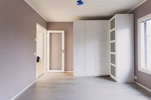
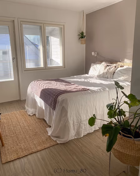
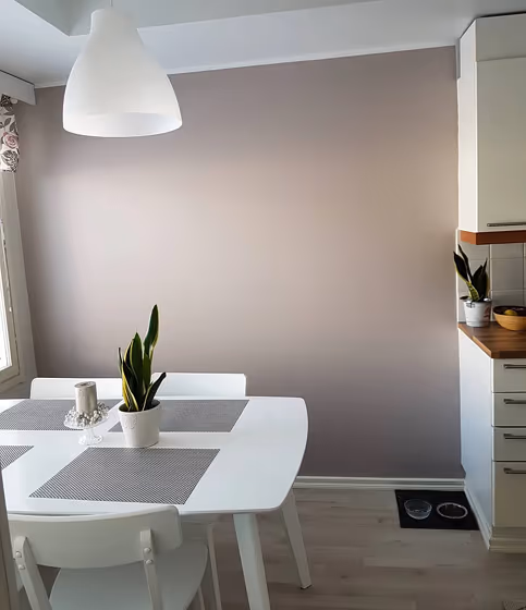
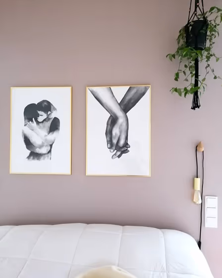
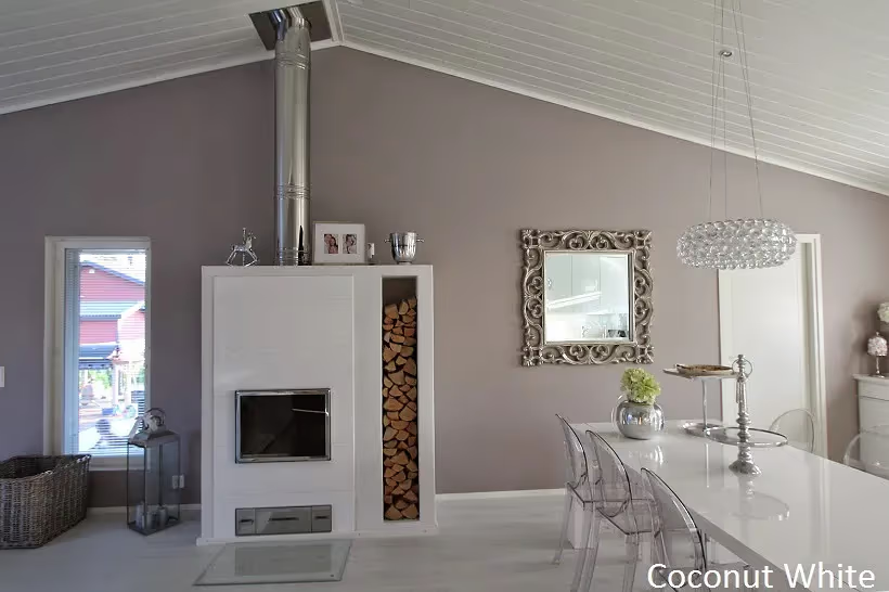
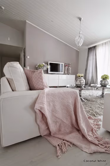
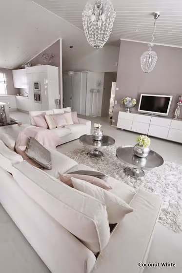
Shantung V481 is a pale pink color. Shantung can be used to create a sleek and modern aesthetic. The warm gray undertones give this muted pink color a cozy, pensive vibe. It is possible to pair with a green-based white for a timeless finish.
The nearest colors to V481 are RAL Effect RAL 860-M and Tikkurila H481, which are also muted pink colors.
Loading...
LRV of Shantung
Shantung has an LRV of 45% and refers to Light Medium colors that reflect half of the incident light. Why LRV is important?

Light Reflectance Value measures the amount of visible and usable light that reflects from a painted surface.
Simply put, the higher the LRV of a paint color, the brighter the room you will get.
The scale goes from 0% (absolute black, absorbing all light) to 100% (pure white, reflecting all light).
Act like a pro: When choosing paint with an LRV of 45%, pay attention to your bulbs' brightness. Light brightness is measured in lumens. The lower the paint's LRV, the higher lumen level you need. Every square foot of room needs at least 40 lumens. That means for a 200 ft2 living room you'll need about 8000 lumens of light – e.g., eight 1000 lm bulbs.
Color codes
We have collected almost every possible color code you could ever need.
Not sure what the difference between HEX and RGB is? We break down color models in plain language. Understanding color models
| Format | Code |
|---|---|
| HEX | #B7ABA9 |
| RGB Decimal | 183, 171, 169 |
| RGB Percent | 71.76%, 67.06%, 66.27% |
| HSV | Hue: 9° Saturation: 7.65% Value: 71.76% |
| HSL | hsl(9, 9, 69) |
| CMYK | Cyan: 0.0 Magenta: 6.56 Yellow: 7.65 Key: 28.24 |
| YIQ | Y: 174.36 I: 7.793 Q: 1.916 |
| XYZ | X: 41.251 Y: 42.058 Z: 43.47 |
| CIE Lab | L:70.911 a:3.945 b:2.579 |
| CIE Luv | L:70.911 u:7.159 v:3.064 |
| Decimal | 12037033 |
| Hunter Lab | 64.852, 0.049, 5.655 |