Tikkurila Tamarix K480
Contentsshow +hide -
| Code: | K480 |
| Name: | Tamarix |
| Brand: | Tikkurila |
What color is Tikkurila Tamarix?
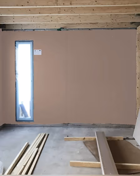
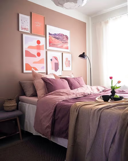
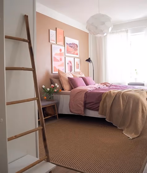
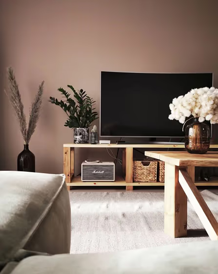
Introducing the captivating hue of Tikkurila Tamarix (K480) - a warm and inviting shade that effortlessly infuses any space with a sense of sophistication and tranquility. This elegant blend of mauve and gray undertones creates a versatile backdrop that complements both modern and traditional decor styles. Ideal for bringing a touch of luxury to bedrooms, living rooms, and home offices, Tamarix (K480) adds a refined pop of color while promoting a serene and calming ambiance. Embrace the timeless appeal of this color to transform your interiors into a sanctuary of style and grace.
Loading...
LRV of Tamarix
Tamarix has an LRV of 37.78% and refers to Medium colors that reflect a lot of light. Why LRV is important?

Light Reflectance Value measures the amount of visible and usable light that reflects from a painted surface.
Simply put, the higher the LRV of a paint color, the brighter the room you will get.
The scale goes from 0% (absolute black, absorbing all light) to 100% (pure white, reflecting all light).
Act like a pro: When choosing paint with an LRV of 37.78%, pay attention to your bulbs' brightness. Light brightness is measured in lumens. The lower the paint's LRV, the higher lumen level you need. Every square foot of room needs at least 40 lumens. That means for a 200 ft2 living room you'll need about 8000 lumens of light – e.g., eight 1000 lm bulbs.
Color codes
We have collected almost every possible color code you could ever need.
Not sure what the difference between HEX and RGB is? We break down color models in plain language. Understanding color models
| Format | Code |
|---|---|
| HEX | #B7A090 |
| RGB Decimal | 183, 160, 144 |
| RGB Percent | 71.76%, 62.75%, 56.47% |
| HSV | Hue: 25° Saturation: 21.31% Value: 71.76% |
| HSL | hsl(25, 21, 64) |
| CMYK | Cyan: 0.0 Magenta: 12.57 Yellow: 21.31 Key: 28.24 |
| YIQ | Y: 165.053 I: 18.847 Q: -0.114 |
| XYZ | X: 37.133 Y: 37.224 Z: 31.607 |
| CIE Lab | L:67.444 a:5.845 b:11.445 |
| CIE Luv | L:67.444 u:15.193 v:14.881 |
| Decimal | 12034192 |
| Hunter Lab | 61.011, 1.87, 11.993 |