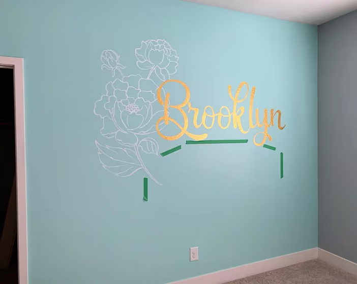
Sherwin Williams Waterfall SW 6750
Contentsshow +hide -
- Sherwin Williams Waterfall reviews (1 photo)
- What are Sherwin Williams Waterfall undertones?
- Is Waterfall SW 6750 cool or warm?
- How light temperature affects on Waterfall
- Monochromatic color scheme
- Complementary color scheme
- Color comparison and matching
- LRV of Waterfall SW 6750
- Color codes
- Color equivalents
| Official page: | Waterfall SW 6750 |
| Code: | SW 6750 |
| Name: | Waterfall |
| Brand: | Sherwin Williams |
| Collections: | Living Well |
What color is Sherwin Williams Waterfall?
Immerse yourself in the tranquil beauty of Sherwin Williams Waterfall, code SW 6750. This refreshing hue brings a sense of serenity and calm to any space it graces. Waterfall is perfect for bedrooms, bathrooms, or home offices, creating a peaceful and soothing atmosphere. Its soft blue-green tones evoke a feeling of restfulness and harmony, making it an ideal choice for those seeking a sanctuary within their home. Let Waterfall cascade through your interiors, bringing a touch of nature-inspired elegance to your living spaces.
LRV of Waterfall
Waterfall has an LRV of 70.91% and refers to Light colors that reflect most of the incident light. Why LRV is important?

Light Reflectance Value measures the amount of visible and usable light that reflects from a painted surface.
Simply put, the higher the LRV of a paint color, the brighter the room you will get.
The scale goes from 0% (absolute black, absorbing all light) to 100% (pure white, reflecting all light).
Act like a pro: When choosing paint with an LRV of 70.91%, pay attention to your bulbs' brightness. Light brightness is measured in lumens. The lower the paint's LRV, the higher lumen level you need. Every square foot of room needs at least 40 lumens. That means for a 200 ft2 living room you'll need about 8000 lumens of light – e.g., eight 1000 lm bulbs.
Color codes
We have collected almost every possible color code you could ever need.
| Format | Code |
|---|---|
| HEX | #c0e3da |
| RGB Decimal | 192, 227, 218 |
| RGB Percent | 75.29%, 89.02%, 85.49% |
| HSV | Hue: 165° Saturation: 15.42% Value: 89.02% |
| HSL | hsl(165, 38, 82) |
| CMYK | Cyan: 15.42 Magenta: 0.0 Yellow: 3.96 Key: 10.98 |
| YIQ | Y: 215.509 I: -17.964 Q: -10.205 |
| XYZ | X: 61.858 Y: 71.205 Z: 76.796 |
| CIE Lab | L:87.585 a:-13.185 b:0.566 |
| CIE Luv | L:87.585 u:-18.158 v:3.146 |
| Decimal | 12641242 |
| Hunter Lab | 84.383, -16.819, 5.109 |


