Tikkurila Wave H440
Contentsshow +hide -
| Code: | H440 |
| Name: | Wave |
| Brand: | Tikkurila |
What color is Tikkurila Wave?
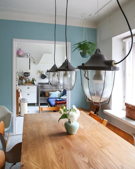
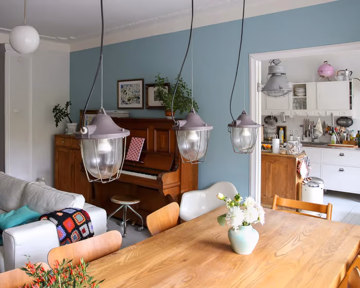
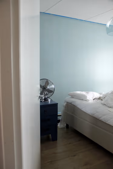
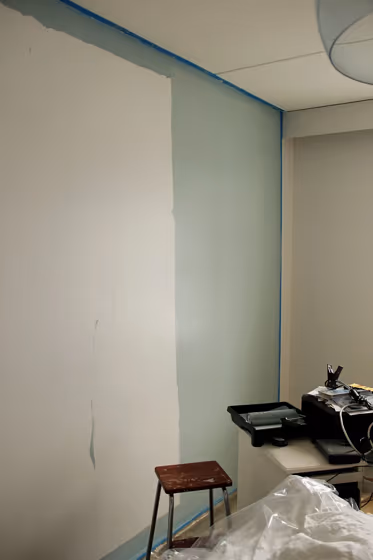
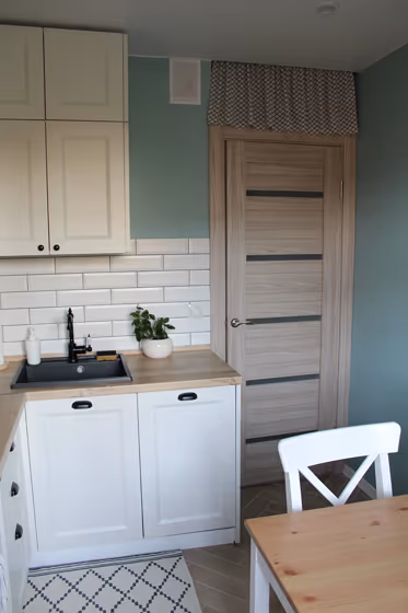
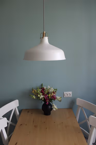
Tikkurila H440 Wave is a versatile and calming hue that effortlessly complements a variety of color palettes. This soft and inviting color pairs beautifully with crisp whites like Tikkurila Y018 Antique White for a serene and elegant look. You can also enhance the soothing vibe of Wave by combining it with warm neutrals like Tikkurila Y354 Long Shadow. For a more contemporary feel, consider combining Wave with pops of Tikkurila G460 Emerald Green for a dynamic and modern touch to your space.
Loading...
LRV of Wave
Wave has an LRV of 49.47% and refers to Light Medium colors that reflect half of the incident light. Why LRV is important?

Light Reflectance Value measures the amount of visible and usable light that reflects from a painted surface.
Simply put, the higher the LRV of a paint color, the brighter the room you will get.
The scale goes from 0% (absolute black, absorbing all light) to 100% (pure white, reflecting all light).
Act like a pro: When choosing paint with an LRV of 49.47%, pay attention to your bulbs' brightness. Light brightness is measured in lumens. The lower the paint's LRV, the higher lumen level you need. Every square foot of room needs at least 40 lumens. That means for a 200 ft2 living room you'll need about 8000 lumens of light – e.g., eight 1000 lm bulbs.
Color codes
We have collected almost every possible color code you could ever need.
Not sure what the difference between HEX and RGB is? We break down color models in plain language. Understanding color models
| Format | Code |
|---|---|
| HEX | #AAC2C0 |
| RGB Decimal | 170, 194, 192 |
| RGB Percent | 66.67%, 76.08%, 75.29% |
| HSV | Hue: 175° Saturation: 12.37% Value: 76.08% |
| HSL | hsl(175, 16, 71) |
| CMYK | Cyan: 12.37 Magenta: 0.0 Yellow: 1.03 Key: 23.92 |
| YIQ | Y: 186.596 I: -13.659 Q: -5.699 |
| XYZ | X: 45.381 Y: 50.934 Z: 57.295 |
| CIE Lab | L:76.639 a:-8.513 b:-1.744 |
| CIE Luv | L:76.639 u:-12.807 v:-1.178 |
| Decimal | 11190976 |
| Hunter Lab | 71.368, -11.392, 2.359 |