

Behr Peaceful Blue vs. Benjamin Moore Corinthian White
The colors, each unique in their hue and saturation, embody their own individual beauty and value. It's important to note that the colors have different hues. Behr S470-3 leans towards blue hues, while Benjamin Moore OC-111 is orange.
Benjamin Moore OC-111 is more saturated than Peaceful Blue
They differ in their values, with Behr S470-3 being darker.
Supported paint brands for comparison: Behr, Benjamin Moore, Farrow and Ball, Dulux, Jotun, Little Greene, NCS, Ral Classic, Ral Design, Ral Effect, Sherwin Williams, Valspar, Tikkurila
First color
Second color

| Behr Peaceful Blue | Benjamin Moore Corinthian White |
|---|---|
| Shared hue scale | |
12 | |
| Hue | |
| 196°blue | 44°orange |
| Saturation | |
| 23% | 71%more saturated |
| Lightness?Simple 0–100% measure derived from the minimum and maximum sRGB channels. Use CIE L* for perceptual lightness. | |
| 68% | 88%lighter |
| LRV?Light Reflectance Value measures the percentage of light reflected by a color, from 0 for absolute black to 100 for pure white. | |
| 44.00 | 79.45looks lighter |
| CIE L?Perceptual lightness. CIE Lab lightness ranges from 0 for black to 100 for diffuse white. | |
| 72.316 | 92.885looks lighter |
| Color difference ΔE*₀₀?CIE color difference. Smaller is closer: about 0–1 is imperceptible, 1–2 just noticeable, 2–5 a small difference, 5–10 clear, and more than 10 very different. | |
| 24.804 | |
| Temperature | |
| Cool | Warm |
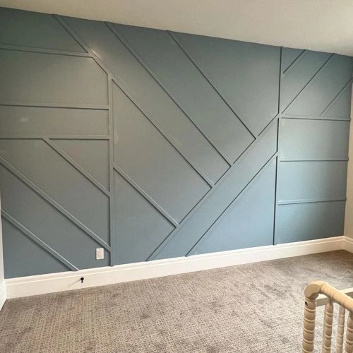

Please note that the color shown on this page is a representation and might not exactly match the real shade of the cards, fan decks, or color collections. Your monitor, browser, and screen angle can all affect how the paint looks, so it may not be the same as what you see here. All information on this page is based on RGB and HEX values provided by manufacturers.
It's important to keep in mind that the same color may appear differently on various surfaces due to the nature of those surfaces. For example, the same shade will look different on a rough wall compared to the smooth surface of cabinets.
Color comparisons featuring Behr Peaceful Blue

S470-3 Peaceful Blue vs SW9633 Silver Lake


S470-3 Peaceful Blue vs SW6806 Rhythmic Blue

S470-3 Peaceful Blue vs M440-7 Rainforest

S470-3 Peaceful Blue vs M490-2 Carefree Sky

S470-3 Peaceful Blue vs P480-3 Cool Water Lake

S470-3 Peaceful Blue vs 720C-3 Wheat Bread

S470-3 Peaceful Blue vs SW6240 Windy Blue

S470-3 Peaceful Blue vs M540-4 Hopeful Dream

S470-3 Peaceful Blue vs S540-3 Meadow Phlox

S470-3 Peaceful Blue vs SW9144 Moonmist

S470-3 Peaceful Blue vs N440-2 Urban Raincoat

S470-3 Peaceful Blue vs N490-1 Absolute Zero

S470-3 Peaceful Blue vs 469 Backwoods

S470-3 Peaceful Blue vs M520-1A Soft Cloud

S470-3 Peaceful Blue vs S460-2 Drip

S470-3 Peaceful Blue vs S460-5 Blue Square

S470-3 Peaceful Blue vs 1662 Mediterranean Sky

S470-3 Peaceful Blue vs MQ1-41 Autumn Ashes

S470-3 Peaceful Blue vs 1647 Silvery Blue

S470-3 Peaceful Blue vs AF-555 Montpelier

S470-3 Peaceful Blue vs N410-4 Nature'S Gift

S470-3 Peaceful Blue vs PPU11-15 Green Balsam

S470-3 Peaceful Blue vs S430-4 Green Meets Blue

S470-3 Peaceful Blue vs PPU13-08 Venus Teal

S470-3 Peaceful Blue vs HC-172 Revere Pewter

S470-3 Peaceful Blue vs PPU13-10 Ocean Boulevard

S470-3 Peaceful Blue vs 2131-50 Nimbus Gray

S470-3 Peaceful Blue vs SW6232 Misty

S470-3 Peaceful Blue vs S470-6 Shipwreck

S470-3 Peaceful Blue vs 291 School House White

S470-3 Peaceful Blue vs MQ6-51 Fern Leaf

S470-3 Peaceful Blue vs AF-575 Instinct

S470-3 Peaceful Blue vs 1667 Blue Haze

S470-3 Peaceful Blue vs N490-3 Shaved Ice

S470-3 Peaceful Blue vs N240-2 Adobe Sand