

Benjamin Moore Graceful Sea vs. Benjamin Moore Quiet Moments
The colors, each unique in their hue and saturation, embody their own individual beauty and value. It's important to note that the colors have different hues. Benjamin Moore 767 leans towards blue hues, while Benjamin Moore 1563 is green.
Benjamin Moore 767 and Benjamin Moore 1563 differ significantly in saturation. Benjamin Moore 767 is more saturated.
They differ in their values, with Benjamin Moore 767 being darker.
Supported paint brands for comparison: Behr, Benjamin Moore, Farrow and Ball, Dulux, Jotun, Little Greene, NCS, Ral Classic, Ral Design, Ral Effect, Sherwin Williams, Valspar, Tikkurila
First color
Second color

| Benjamin Moore Graceful Sea | Benjamin Moore Quiet Moments |
|---|---|
| Shared hue scale | |
12 | |
| Hue | |
| 193°blue | 127°green |
| Saturation | |
| 55% | 8%less saturated |
| Lightness?Simple 0–100% measure derived from the minimum and maximum sRGB channels. Use CIE L* for perceptual lightness. | |
| 65% | 80%lighter |
| LRV?Light Reflectance Value measures the percentage of light reflected by a color, from 0 for absolute black to 100 for pure white. | |
| 48.76 | 60.73looks lighter |
| CIE L?Perceptual lightness. CIE Lab lightness ranges from 0 for black to 100 for diffuse white. | |
| 74.406 | 82.345looks lighter |
| Color difference ΔE*₀₀?CIE color difference. Smaller is closer: about 0–1 is imperceptible, 1–2 just noticeable, 2–5 a small difference, 5–10 clear, and more than 10 very different. | |
| 18.222 | |
| Temperature | |
| Cool | Cool |

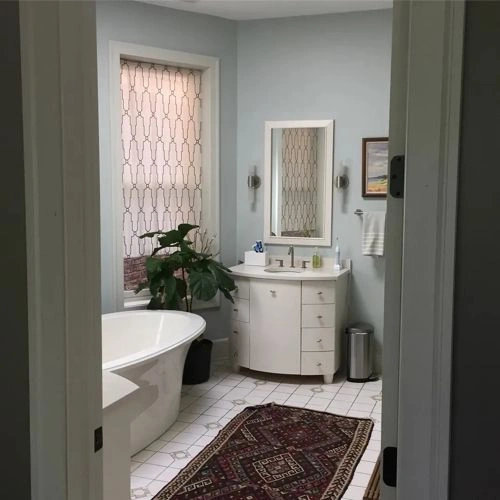
Please note that the color shown on this page is a representation and might not exactly match the real shade of the cards, fan decks, or color collections. Your monitor, browser, and screen angle can all affect how the paint looks, so it may not be the same as what you see here. All information on this page is based on RGB and HEX values provided by manufacturers.
It's important to keep in mind that the same color may appear differently on various surfaces due to the nature of those surfaces. For example, the same shade will look different on a rough wall compared to the smooth surface of cabinets.
Try before you buy

100% accurate
reusable paint samples
Peel, stick,
and repeat
Twice painted
with real paint

Next day
delivery
Color comparisons featuring Benjamin Moore Graceful Sea

767 Graceful Sea vs 2025-50 Lemon Freeze


767 Graceful Sea vs 733 Palm Coast Teal

767 Graceful Sea vs 732 Burbank Blue

767 Graceful Sea vs 731 Surf City

767 Graceful Sea vs SW6780 Nautilus

767 Graceful Sea vs SW9048 Surfin'

767 Graceful Sea vs 8281 Pale Linden

767 Graceful Sea vs 766 Delano Waters

767 Graceful Sea vs SW9045 Bora Bora Shore

767 Graceful Sea vs 727 Calypso Blue

767 Graceful Sea vs M460-5 Aqua Fresco

767 Graceful Sea vs 2048-60 Jamaican Aqua

767 Graceful Sea vs 2056-40 Cool Aqua

767 Graceful Sea vs 2055-40 Bahaman Sea Blue

767 Graceful Sea vs SW7022 Alpaca

767 Graceful Sea vs 756 Varsity Blues

767 Graceful Sea vs 661 Caribbean Cool

767 Graceful Sea vs 2055-30 Caribbean Blue Water

767 Graceful Sea vs 2054-60 Old Pickup Blue

767 Graceful Sea vs 1574 Rushing River

767 Graceful Sea vs 2065-50 Blue Wave

767 Graceful Sea vs 2063-40 Sailor's Sea Blue

767 Graceful Sea vs 2060-40 Toronto Blue

767 Graceful Sea vs 768 Atlantis Blue

767 Graceful Sea vs 759 Madison Avenue

767 Graceful Sea vs 758 Rhythm and Blues

767 Graceful Sea vs SW6187 Rosemary

767 Graceful Sea vs 2053-40 Blue Lake

767 Graceful Sea vs 770 Americana

767 Graceful Sea vs 2063-70 Cumulus Cotton

767 Graceful Sea vs 16BG 24/357 Teal Touch

767 Graceful Sea vs 2049-40 Peacock Blue

767 Graceful Sea vs RAL 670-1

767 Graceful Sea vs 662 Mexicali Turquoise

767 Graceful Sea vs 788 Aquarius