

Benjamin Moore Prentis Cream vs. Farrow and Ball James White
We understand how important it is to remember the details. The colors, each with their own unique beauty and value, are truly special. The hues of the colors are quite similar.
Benjamin Moore CW-100 and Farrow and Ball 2010 have pretty similar saturation.
Despite their differences, both colors share a similar value, with Benjamin Moore CW-100 being darker.
Supported paint brands for comparison: Behr, Benjamin Moore, Farrow and Ball, Dulux, Jotun, Little Greene, NCS, Ral Classic, Ral Design, Ral Effect, Sherwin Williams, Valspar, Tikkurila
First color
Second color

Lightness value from CIE Lab color space.
Values from 0 (black) to 100 (diffuse white)
Smaller is closer:
~0–1 (imperceptible),
1–2 (just noticeable),
2–5 (small difference),
5–10 (clear),
more than 10 (very different).
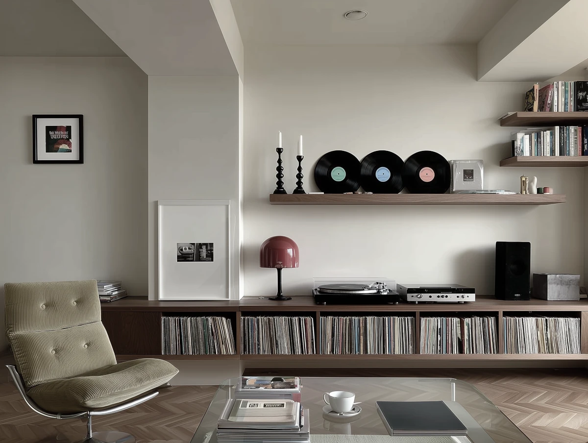
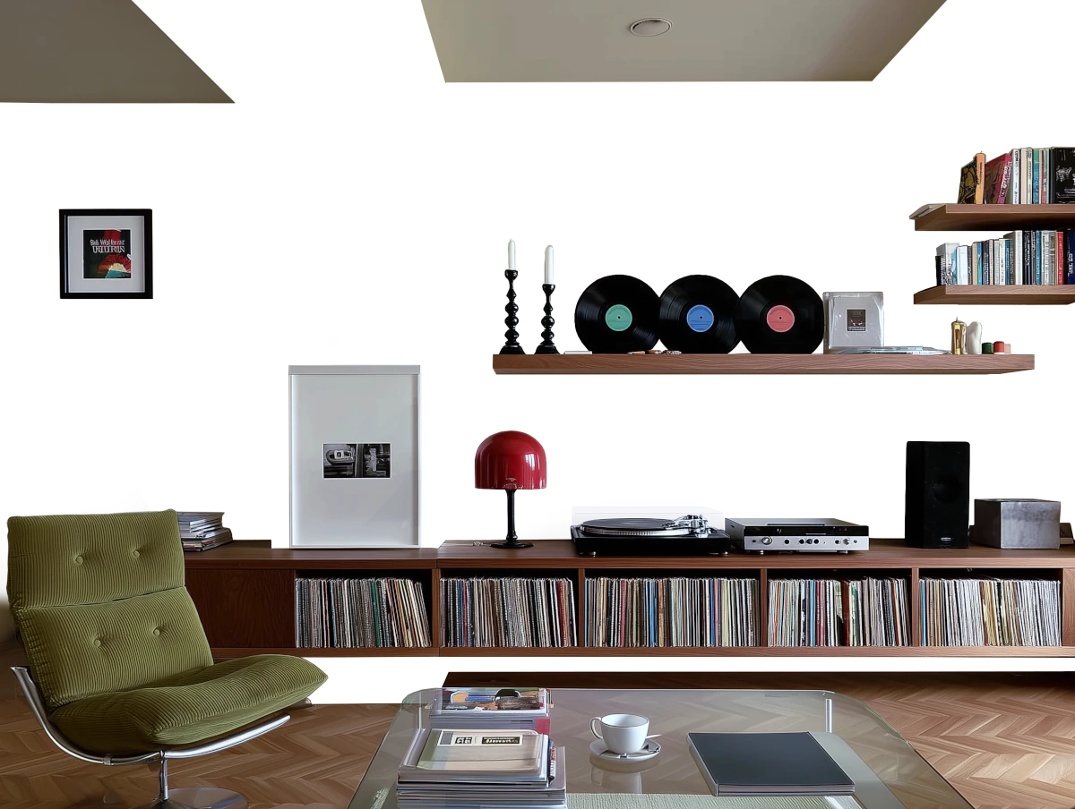

Please note that the color shown on this page is a representation and might not exactly match the real shade of the cards, fan decks, or color collections. Your monitor, browser, and screen angle can all affect how the paint looks, so it may not be the same as what you see here. All information on this page is based on RGB and HEX values provided by manufacturers.
It's important to keep in mind that the same color may appear differently on various surfaces due to the nature of those surfaces. For example, the same shade will look different on a rough wall compared to the smooth surface of cabinets.
Color comparisons featuring Benjamin Moore Prentis Cream

CW-100 Prentis Cream vs HC-66 Garrison Red


CW-100 Prentis Cream vs CSP-995 Butter Cookie

CW-100 Prentis Cream vs SW2822 Downing Sand

CW-100 Prentis Cream vs SW2813 Downing Straw

CW-100 Prentis Cream vs 8583 Earthy Yellow

CW-100 Prentis Cream vs CW-120 Bracken Biscuit

CW-100 Prentis Cream vs 12082 Refined Yellow

CW-100 Prentis Cream vs 0471 Antique White

CW-100 Prentis Cream vs 241 Jonesboro Cream

CW-100 Prentis Cream vs 924 San Mateo Beaches

CW-100 Prentis Cream vs S310-2 Journal White

CW-100 Prentis Cream vs SW0032 Needlepoint Navy

CW-100 Prentis Cream vs 16 Cord

CW-100 Prentis Cream vs 8 String

CW-100 Prentis Cream vs HC-191 Hamilton Blue

CW-100 Prentis Cream vs 2013 Matchstick

CW-100 Prentis Cream vs 59 New White

CW-100 Prentis Cream vs 1484 Ashwood Moss

CW-100 Prentis Cream vs 227 Marble Canyon

CW-100 Prentis Cream vs HC-146 Wedgewood Gray

CW-100 Prentis Cream vs CW-40 Tavern Gray

CW-100 Prentis Cream vs CW-590 Williamsburg Wythe Blue

CW-100 Prentis Cream vs HC-161 Templeton Gray

CW-100 Prentis Cream vs HC-166 Kendall Charcoal

CW-100 Prentis Cream vs 2093-10 Cimarron

CW-100 Prentis Cream vs 12123 Contemporary White

CW-100 Prentis Cream vs 2128-40 Oxford Gray

CW-100 Prentis Cream vs 1520 Hushed Hue

CW-100 Prentis Cream vs 1623 Britannia Blue

CW-100 Prentis Cream vs CW-440 Gloucester Green

CW-100 Prentis Cream vs AF-335 Safari

CW-100 Prentis Cream vs 1488 Sage Mountain

CW-100 Prentis Cream vs 3186 Pashmina

CW-100 Prentis Cream vs SW9119 Dirty Martini

CW-100 Prentis Cream vs 13 Cottage White

CW-100 Prentis Cream vs OC-97 Cream Froth