

Benjamin Moore Provence Crème vs. Benjamin Moore Serenity
The colors, each unique in their hue and saturation, embody their own individual beauty and value. It's important to note that the colors have different hues. Benjamin Moore 2021-60 leans towards hues, while Benjamin Moore 2055-60 is .
Benjamin Moore 2021-60 and Benjamin Moore 2055-60 differ significantly in saturation. Benjamin Moore 2021-60 is more saturated.
Despite their differences, both colors share a similar value, Benjamin Moore 2021-60 radiating a lighter essence compared to 2055-60.
Supported paint brands for comparison: Behr, Benjamin Moore, Farrow and Ball, Dulux, Jotun, Little Greene, NCS, Ral Classic, Ral Design, Ral Effect, Sherwin Williams, Valspar, Tikkurila
First color
Second color

Lightness value from CIE Lab color space.
Values from 0 (black) to 100 (diffuse white)
Smaller is closer:
~0–1 (imperceptible),
1–2 (just noticeable),
2–5 (small difference),
5–10 (clear),
more than 10 (very different).
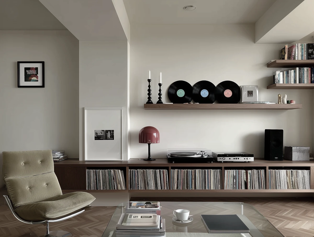

Please note that the color shown on this page is a representation and might not exactly match the real shade of the cards, fan decks, or color collections. Your monitor, browser, and screen angle can all affect how the paint looks, so it may not be the same as what you see here. All information on this page is based on RGB and HEX values provided by manufacturers.
It's important to keep in mind that the same color may appear differently on various surfaces due to the nature of those surfaces. For example, the same shade will look different on a rough wall compared to the smooth surface of cabinets.
Color comparisons featuring Benjamin Moore Provence Crème

2021-60 Provence Crème vs SW7036 Accessible Beige


2021-60 Provence Crème vs 2022-70 Crème Brulee

2021-60 Provence Crème vs 412 Springhill Green

2021-60 Provence Crème vs 1289 Marry Me

2021-60 Provence Crème vs 1332 Cat's Meow

2021-60 Provence Crème vs 1269 Unspoken Love

2021-60 Provence Crème vs Wild Primrose

2021-60 Provence Crème vs 59 New White

2021-60 Provence Crème vs S 0510-Y

2021-60 Provence Crème vs S 0520-Y

2021-60 Provence Crème vs 1636 Providence Blue

2021-60 Provence Crème vs 213 Harp Strings

2021-60 Provence Crème vs HC-129 Southfield Green

2021-60 Provence Crème vs 2055-20 Pacific Ocean Blue

2021-60 Provence Crème vs 2154-60 Filtered Sunlight

2021-60 Provence Crème vs SW6672 Morning Sun

2021-60 Provence Crème vs 283 Calla Lily

2021-60 Provence Crème vs SW6700 Daybreak

2021-60 Provence Crème vs 338 Early Dawn

2021-60 Provence Crème vs 351 Falling Star

2021-60 Provence Crème vs 358 Fun in the Sun

2021-60 Provence Crème vs 365 Light of the Moon

2021-60 Provence Crème vs SW6693 Lily

2021-60 Provence Crème vs CSP-910 Ray of Light

2021-60 Provence Crème vs 274 Santo Domingo Cream

2021-60 Provence Crème vs 366 San Pedro Morning

2021-60 Provence Crème vs 352 Sun City

2021-60 Provence Crème vs SW1666 Venetian Yellow

2021-60 Provence Crème vs 275 Banana Cream

2021-60 Provence Crème vs SW6680 Friendly Yellow

2021-60 Provence Crème vs 2055-70 Innocence

2021-60 Provence Crème vs 2066-50 True Blue

2021-60 Provence Crème vs 2055-50 Fairy Tale Blue

2021-60 Provence Crème vs 2054-50 Seaside Blue

2021-60 Provence Crème vs 2052-60 China Blue