

Benjamin Moore Venetian Portico vs. Benjamin Moore Almond Beige
We understand how important it is to remember the details. The colors, each with their own unique beauty and value, are truly special. It's important to note that the colors have different hues. Benjamin Moore AF-185 leans towards hues, while Benjamin Moore 2101-40 is .
Benjamin Moore AF-185 and Benjamin Moore 2101-40 differ significantly in saturation. Benjamin Moore AF-185 is more saturated.
They differ in their values, Benjamin Moore AF-185 radiating a lighter essence compared to 2101-40.
Supported paint brands for comparison: Behr, Benjamin Moore, Farrow and Ball, Dulux, Jotun, Little Greene, NCS, Ral Classic, Ral Design, Ral Effect, Sherwin Williams, Valspar, Tikkurila
First color
Second color

Lightness value from CIE Lab color space.
Values from 0 (black) to 100 (diffuse white)
Smaller is closer:
~0–1 (imperceptible),
1–2 (just noticeable),
2–5 (small difference),
5–10 (clear),
more than 10 (very different).
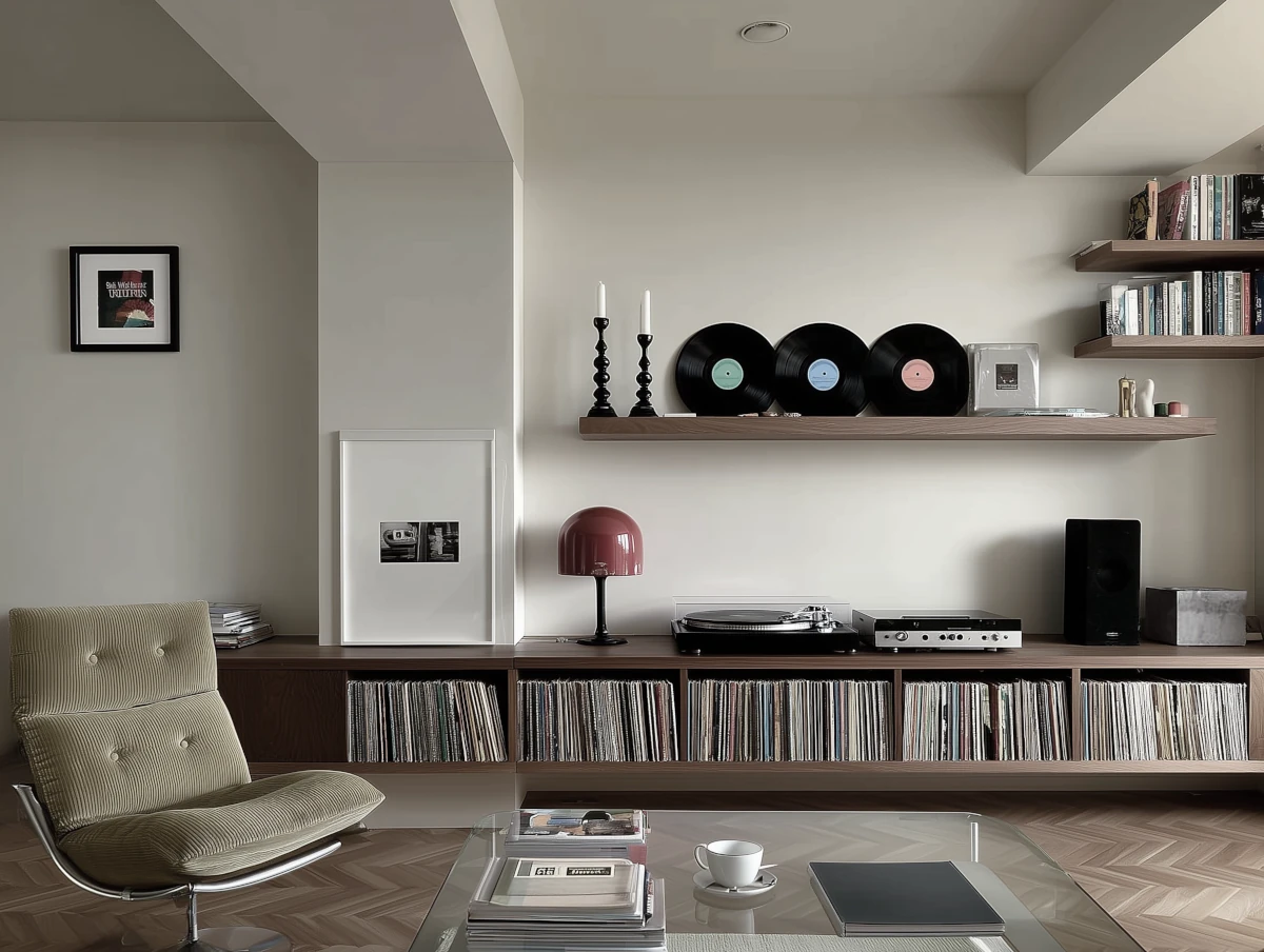
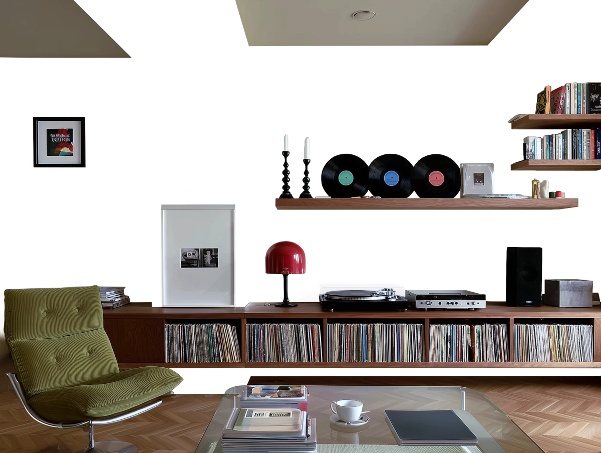


Please note that the color shown on this page is a representation and might not exactly match the real shade of the cards, fan decks, or color collections. Your monitor, browser, and screen angle can all affect how the paint looks, so it may not be the same as what you see here. All information on this page is based on RGB and HEX values provided by manufacturers.
It's important to keep in mind that the same color may appear differently on various surfaces due to the nature of those surfaces. For example, the same shade will look different on a rough wall compared to the smooth surface of cabinets.
Color comparisons featuring Benjamin Moore Venetian Portico

AF-185 Venetian Portico vs 22 Light Blue


AF-185 Venetian Portico vs 299 De Nimes

AF-185 Venetian Portico vs 838 Denim Wash

AF-185 Venetian Portico vs SW7011 Natural Choice

AF-185 Venetian Portico vs 285 Cromarty

AF-185 Venetian Portico vs HC-113 Louisburg Green

AF-185 Venetian Portico vs 1401 Nosegay

AF-185 Venetian Portico vs OC-69 White Opulence

AF-185 Venetian Portico vs SW6052 Sandbank

AF-185 Venetian Portico vs 80YR 30/187 Cappuccino Candy 2

AF-185 Venetian Portico vs HC-155 Newburyport Blue

AF-185 Venetian Portico vs AF-415 Grasshopper

AF-185 Venetian Portico vs 2115-30 Amazon Soil

AF-185 Venetian Portico vs SW7010 White Duck

AF-185 Venetian Portico vs 2094-10 Burnt Cinnamon

AF-185 Venetian Portico vs 2175-40 Adobe Dust

AF-185 Venetian Portico vs 1265 Deep Mauve

AF-185 Venetian Portico vs HC-48 Bradstreet Beige

AF-185 Venetian Portico vs AF-580 Luxe

AF-185 Venetian Portico vs AF-400 Elemental

AF-185 Venetian Portico vs OC-106 Man on the Moon

AF-185 Venetian Portico vs AF-200 Lingerie

AF-185 Venetian Portico vs OC-11 Clay Beige

AF-185 Venetian Portico vs 1018 Shabby Chic

AF-185 Venetian Portico vs N160-4 Sonora Rose

AF-185 Venetian Portico vs HC-58 Chippendale Rosetone

AF-185 Venetian Portico vs CSP-310 First Crush

AF-185 Venetian Portico vs N350-4 Jungle Camouflage

AF-185 Venetian Portico vs 462 Vintage Vogue

AF-185 Venetian Portico vs OC-28 Collingwood

AF-185 Venetian Portico vs 2121-20 Steel Wool

AF-185 Venetian Portico vs 2107-40 Driftwood

AF-185 Venetian Portico vs 1054 Sherwood Tan

AF-185 Venetian Portico vs OC-85 Mayonnaise

AF-185 Venetian Portico vs 508 Tree Moss