

Tikkurila Forget me not vs. Benjamin Moore Titanium
We understand how important it is to remember the details. The colors, each with their own unique beauty and value, are truly special. It's important to note that the colors have different hues. Tikkurila H353 leans towards blue hues, while Benjamin Moore OC-49 is yellow.
Tikkurila H353 and Benjamin Moore OC-49 differ significantly in saturation. Tikkurila H353 is more saturated.
Despite their differences, both colors share a similar value, with Tikkurila H353 being darker.
Supported paint brands for comparison: Behr, Benjamin Moore, Farrow and Ball, Dulux, Jotun, Little Greene, NCS, Ral Classic, Ral Design, Ral Effect, Sherwin Williams, Valspar, Tikkurila
First color
Second color

| Tikkurila Forget me not | Benjamin Moore Titanium |
|---|---|
| Shared hue scale | |
12 | |
| Hue | |
| 214°blue | 65°yellow |
| Saturation | |
| 42% | 14%less saturated |
| Lightness?Simple 0–100% measure derived from the minimum and maximum sRGB channels. Use CIE L* for perceptual lightness. | |
| 79% | 84%lighter |
| LRV?Light Reflectance Value measures the percentage of light reflected by a color, from 0 for absolute black to 100 for pure white. | |
| 55.26 | 68.41looks lighter |
| CIE L?Perceptual lightness. CIE Lab lightness ranges from 0 for black to 100 for diffuse white. | |
| 79.575 | 87.033looks lighter |
| Color difference ΔE*₀₀?CIE color difference. Smaller is closer: about 0–1 is imperceptible, 1–2 just noticeable, 2–5 a small difference, 5–10 clear, and more than 10 very different. | |
| 17.893 | |
| Temperature | |
| Cool | Warm |
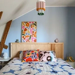

Please note that the color shown on this page is a representation and might not exactly match the real shade of the cards, fan decks, or color collections. Your monitor, browser, and screen angle can all affect how the paint looks, so it may not be the same as what you see here. All information on this page is based on RGB and HEX values provided by manufacturers.
It's important to keep in mind that the same color may appear differently on various surfaces due to the nature of those surfaces. For example, the same shade will look different on a rough wall compared to the smooth surface of cabinets.
Color comparisons featuring Tikkurila Forget me not

H353 Forget me not vs G370


H353 Forget me not vs S 3010-R90B

H353 Forget me not vs S 0520-Y

H353 Forget me not vs 1464 Light Pewter

H353 Forget me not vs 639 Let It Rain

H353 Forget me not vs SW7028 Incredible White

H353 Forget me not vs OC-23 Classic Gray

H353 Forget me not vs SW9165 Gossamer Veil

H353 Forget me not vs 822 Riviera Azure

H353 Forget me not vs 1431 Feather Soft

H353 Forget me not vs 2068-50 Victorian Trim

H353 Forget me not vs SW6979 Verve Violet

H353 Forget me not vs SW6513 Take Five

H353 Forget me not vs 2071-60 Lily Lavender

H353 Forget me not vs 1424 Blue Viola

H353 Forget me not vs 2138-70 Gray Lake

H353 Forget me not vs 2138-60 Gray Cashmere

H353 Forget me not vs OC-140 Morning Dew

H353 Forget me not vs SW9166 Drift of Mist

H353 Forget me not vs OC-20 Pale Oak

H353 Forget me not vs OC-22 Calm

H353 Forget me not vs 1562 Healing Aloe

H353 Forget me not vs SW6204 Sea Salt

H353 Forget me not vs SW6190 Filmy Green

H353 Forget me not vs 1494 Vale Mist

H353 Forget me not vs 2049-40 Peacock Blue

H353 Forget me not vs Y411 Milkshake

H353 Forget me not vs F466 Parchment

H353 Forget me not vs F458 Acropolis

H353 Forget me not vs 214 Arsenic

H353 Forget me not vs CC4 Palm

H353 Forget me not vs 220 Pitch Blue

H353 Forget me not vs CC6 Hazy

H353 Forget me not vs K491 Mistral

H353 Forget me not vs 827 Lake Placid