

Little Greene Light Peachblossom vs. Dulux Copper Blush
We understand how important it is to remember the details. The colors, each with their own unique beauty and value, are truly special. The hues of the colors are quite similar.
Dulux 50YR 36/263 is more saturated than Light Peachblossom
Despite their differences, both colors share a similar value, Little Greene 3 radiating a lighter essence compared to 50YR 36/263.
Supported paint brands for comparison: Behr, Benjamin Moore, Farrow and Ball, Dulux, Jotun, Little Greene, NCS, Ral Classic, Ral Design, Ral Effect, Sherwin Williams, Valspar, Tikkurila
First color
Second color

Lightness value from CIE Lab color space.
Values from 0 (black) to 100 (diffuse white)
Smaller is closer:
~0–1 (imperceptible),
1–2 (just noticeable),
2–5 (small difference),
5–10 (clear),
more than 10 (very different).
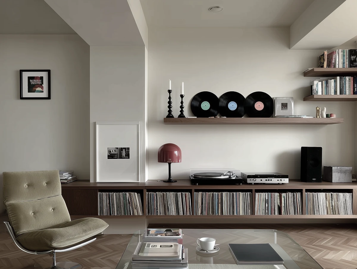
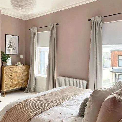

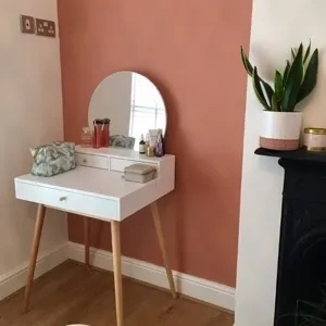
Please note that the color shown on this page is a representation and might not exactly match the real shade of the cards, fan decks, or color collections. Your monitor, browser, and screen angle can all affect how the paint looks, so it may not be the same as what you see here. All information on this page is based on RGB and HEX values provided by manufacturers.
It's important to keep in mind that the same color may appear differently on various surfaces due to the nature of those surfaces. For example, the same shade will look different on a rough wall compared to the smooth surface of cabinets.
Color comparisons featuring Little Greene Light Peachblossom

3 Light Peachblossom vs 296 Rangwali


3 Light Peachblossom vs 295 Boringdon Green

3 Light Peachblossom vs 1303 Smashing Pink

3 Light Peachblossom vs S 3010-Y70R

3 Light Peachblossom vs S 3010-Y

3 Light Peachblossom vs S 2010-Y70R

3 Light Peachblossom vs 90BB 50/086 Lavender Quartz

3 Light Peachblossom vs 70YY 43/113 Overtly Olive

3 Light Peachblossom vs 297 Preferenced Red

3 Light Peachblossom vs 2109-50 Elephant Gray

3 Light Peachblossom vs 18 French Gray

3 Light Peachblossom vs 189 Carmine

3 Light Peachblossom vs 2096-70 Early Sunset

3 Light Peachblossom vs 2004 Slipper Satin

3 Light Peachblossom vs 2113-40 Cinnamon Slate

3 Light Peachblossom vs 2103-40 Hickory Stick

3 Light Peachblossom vs 1233 Cedar Ridge

3 Light Peachblossom vs 284 Aquamarine - Mid

3 Light Peachblossom vs 283 Aquamarine - Light

3 Light Peachblossom vs 30GY 88/014 Chiffon White 4

3 Light Peachblossom vs 1006-10A Mauve Blush

3 Light Peachblossom vs 2094-60 Pleasant Pink

3 Light Peachblossom vs 135 Sunlight

3 Light Peachblossom vs 329 Silent White

3 Light Peachblossom vs 328 Silent White - Pale

3 Light Peachblossom vs 20217 Muted Coral

3 Light Peachblossom vs SW7635 Palisade

3 Light Peachblossom vs 762 Pacific Palisades

3 Light Peachblossom vs SW7035 Aesthetic White

3 Light Peachblossom vs 53 Light Gold

3 Light Peachblossom vs 143 Golden Light

3 Light Peachblossom vs 278 Nancy's Blushes

3 Light Peachblossom vs 331 Silent White - Deep

3 Light Peachblossom vs Wellbeing

3 Light Peachblossom vs 30YR 64/044 Love Note

3 Light Peachblossom vs 314 Castell Pink