

Sherwin Williams Moderate White vs. Valspar Romantic White
The colors, each unique in their hue and saturation, embody their own individual beauty and value. The hues of the colors are quite similar.
Sherwin Williams SW 6140 and Valspar V129-1 differ significantly in saturation. Sherwin Williams SW 6140 is more saturated.
Despite their differences, both colors share a similar value, Sherwin Williams SW 6140 radiating a lighter essence compared to V129-1.
Supported paint brands for comparison: Behr, Benjamin Moore, Farrow and Ball, Dulux, Jotun, Little Greene, NCS, Ral Classic, Ral Design, Ral Effect, Sherwin Williams, Valspar, Tikkurila
First color
Second color

Lightness value from CIE Lab color space.
Values from 0 (black) to 100 (diffuse white)
Smaller is closer:
~0–1 (imperceptible),
1–2 (just noticeable),
2–5 (small difference),
5–10 (clear),
more than 10 (very different).
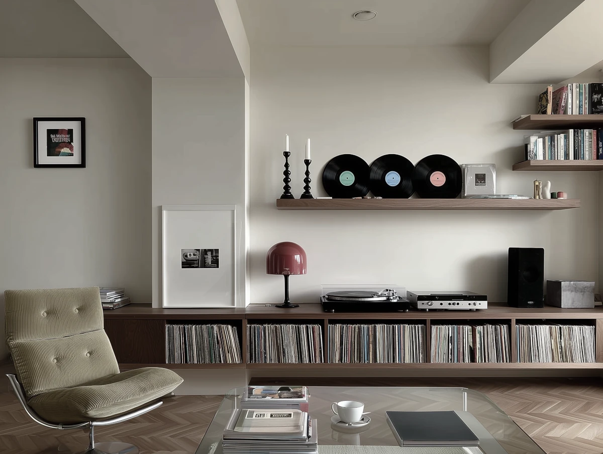
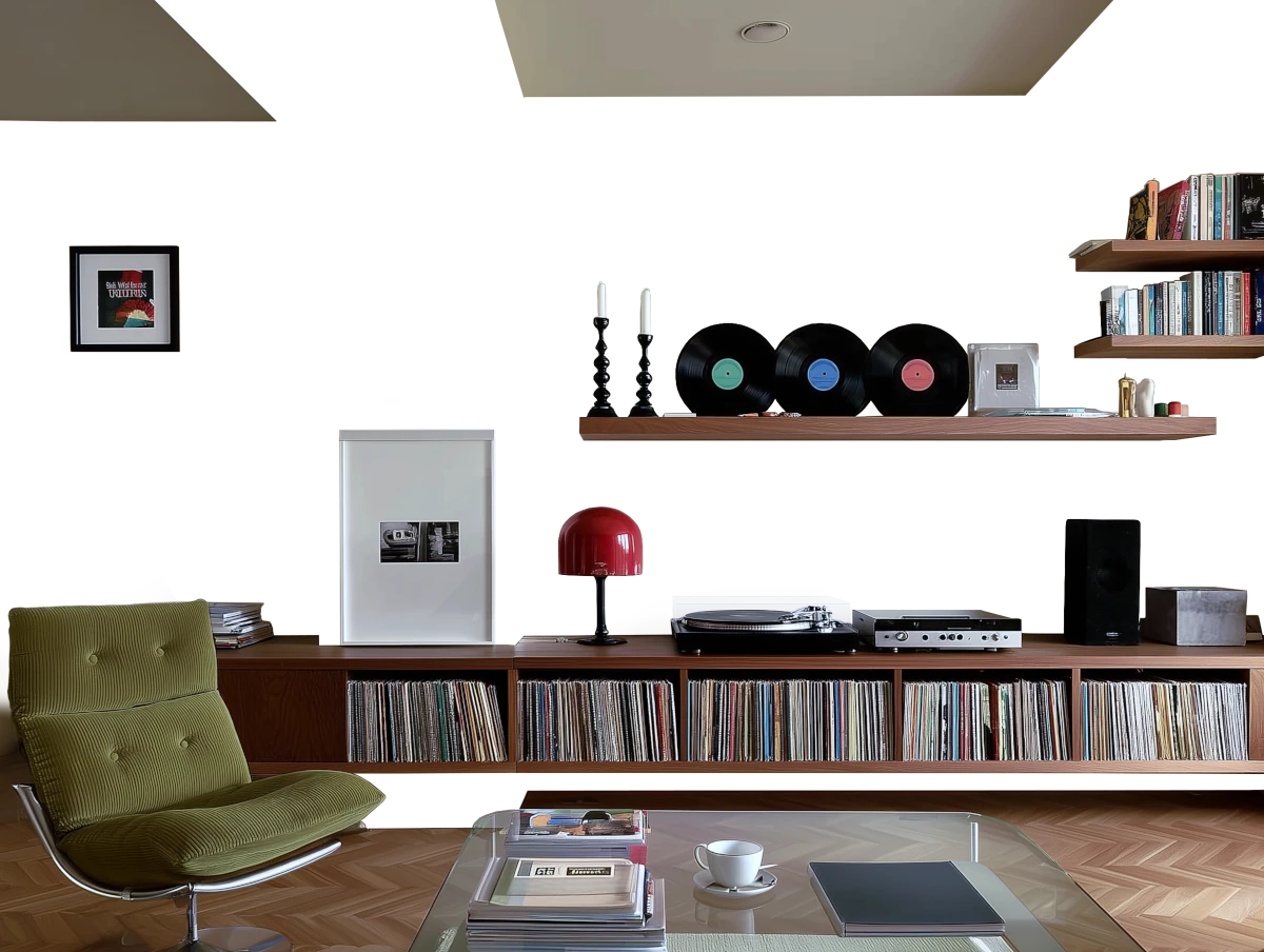


Please note that the color shown on this page is a representation and might not exactly match the real shade of the cards, fan decks, or color collections. Your monitor, browser, and screen angle can all affect how the paint looks, so it may not be the same as what you see here. All information on this page is based on RGB and HEX values provided by manufacturers.
It's important to keep in mind that the same color may appear differently on various surfaces due to the nature of those surfaces. For example, the same shade will look different on a rough wall compared to the smooth surface of cabinets.
Color comparisons featuring Sherwin Williams Moderate White

SW6140 Moderate White vs SW6000 Snowfall


SW6140 Moderate White vs RD-W10 New House White

SW6140 Moderate White vs 50RB 74/033 Purple Sage 6

SW6140 Moderate White vs 01YY 75/115 Abalone Sands

SW6140 Moderate White vs 365 Light of the Moon

SW6140 Moderate White vs SW6631 Naive Peach

SW6140 Moderate White vs SW6177 Softened Green

SW6140 Moderate White vs SW6420 Queen Anne's Lace

SW6140 Moderate White vs V085-2 Cinnamon Foam

SW6140 Moderate White vs SW7688 Sundew

SW6140 Moderate White vs SW6658 Welcome White

SW6140 Moderate White vs 73 Off White

SW6140 Moderate White vs SW7529 Sand Beach

SW6140 Moderate White vs SW7506 Loggia

SW6140 Moderate White vs P550-2 Artistic Violet

SW6140 Moderate White vs M570-1 In The Spotlight

SW6140 Moderate White vs P250-6 Splendor Gold

SW6140 Moderate White vs P250-2 Golden Nectar

SW6140 Moderate White vs SW1668 Pineapple Cream

SW6140 Moderate White vs 44YY 80/106 Twisted Bamboo 3

SW6140 Moderate White vs MQ3-53 Sky Light View

SW6140 Moderate White vs S470-3 Peaceful Blue

SW6140 Moderate White vs SW0014 Sheraton Sage

SW6140 Moderate White vs OC-150 Brilliant White

SW6140 Moderate White vs 204 Woodmont Cream

SW6140 Moderate White vs SW6157 Favorite Tan

SW6140 Moderate White vs SW6101 Sands of Time

SW6140 Moderate White vs SW9144 Moonmist

SW6140 Moderate White vs 1137 Sycamore

SW6140 Moderate White vs 2013 Matchstick

SW6140 Moderate White vs 11BB 64/135 Distant Shores

SW6140 Moderate White vs 2062-50 Blue Jean

SW6140 Moderate White vs 2066-60 Honolulu Blue

SW6140 Moderate White vs 2064-50 Costa Rica Blue

SW6140 Moderate White vs P510-7 Beacon Blue

SW6140 Moderate White vs 1001-4B Playful Petal