

Jotun Objective vs. Jotun Cool Ash
We understand how important it is to remember the details. The colors, each with their own unique beauty and value, are truly special. It's important to note that the colors have different hues. Jotun 1973 leans towards yellow hues, while Jotun 3037 is pink.
Jotun 1973 and Jotun 3037 differ significantly in saturation. Jotun 1973 is more saturated.
Despite their differences, both colors share a similar value, with Jotun 1973 being darker.
Supported paint brands for comparison: Behr, Benjamin Moore, Farrow and Ball, Dulux, Jotun, Little Greene, NCS, Ral Classic, Ral Design, Ral Effect, Sherwin Williams, Valspar, Tikkurila
First color
Second color

| Jotun Objective | Jotun Cool Ash |
|---|---|
| Shared hue scale | |
12 | |
| Hue | |
| 50°yellow | 320°pink |
| Saturation | |
| 8% | 3%less saturated |
| Lightness?Simple 0–100% measure derived from the minimum and maximum sRGB channels. Use CIE L* for perceptual lightness. | |
| 72% | 77%lighter |
| LRV?Light Reflectance Value measures the percentage of light reflected by a color, from 0 for absolute black to 100 for pure white. | |
| 49.97 | 55.23looks lighter |
| CIE L?Perceptual lightness. CIE Lab lightness ranges from 0 for black to 100 for diffuse white. | |
| 76.148 | 79.08looks lighter |
| Color difference ΔE*₀₀?CIE color difference. Smaller is closer: about 0–1 is imperceptible, 1–2 just noticeable, 2–5 a small difference, 5–10 clear, and more than 10 very different. | |
| 6.906 | |
| Temperature | |
| Warm | Neutral |
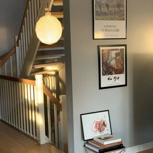

Please note that the color shown on this page is a representation and might not exactly match the real shade of the cards, fan decks, or color collections. Your monitor, browser, and screen angle can all affect how the paint looks, so it may not be the same as what you see here. All information on this page is based on RGB and HEX values provided by manufacturers.
It's important to keep in mind that the same color may appear differently on various surfaces due to the nature of those surfaces. For example, the same shade will look different on a rough wall compared to the smooth surface of cabinets.
Color comparisons featuring Jotun Objective

1973 Objective vs S 1030-R50B


1973 Objective vs 0568 Wood Smoke

1973 Objective vs 8575 Natural Green

1973 Objective vs 10580 Soft Skin

1973 Objective vs 10430 Soft Savanna

1973 Objective vs 8281 Pale Linden

1973 Objective vs 5006-5A Minty Delight

1973 Objective vs V487 Cloister

1973 Objective vs 3 Off-White

1973 Objective vs S 0804-Y70R

1973 Objective vs 20119 Transparent Pink

1973 Objective vs 10966 Almond Beige

1973 Objective vs S 2010-Y60R

1973 Objective vs 6350 Soft Teal

1973 Objective vs 4624 Warm Blue

1973 Objective vs 8302 Laurel

1973 Objective vs 20055 Dusty Rose

1973 Objective vs 1929 Nutmeg

1973 Objective vs 20192 Purple Ivory

1973 Objective vs 4177 Heath Violet

1973 Objective vs 1876 Wild Earl

1973 Objective vs 8240 Celery Stick

1973 Objective vs 5262 Svalbard Sea

1973 Objective vs 6351 Tender Green

1973 Objective vs 5225 Lake View

1973 Objective vs 7386 Pistachio

1973 Objective vs 7627 Refresh

1973 Objective vs 12119 Vintage Brown

1973 Objective vs 5504 Coastal Blue

1973 Objective vs 4072 Moon Reflection

1973 Objective vs 4062 Classic Blue

1973 Objective vs 6383 Imagine

1973 Objective vs SW6199 Rare Gray

1973 Objective vs 513 Limestone

1973 Objective vs 2100-50 Pebble Stone