
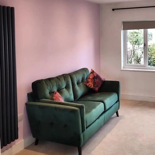
Dulux Pretty Pink vs. Dulux Grey Tabby
We understand how important it is to remember the details. The colors, each with their own unique beauty and value, are truly special. It's important to note that the colors have different hues. Dulux 69RB 70/114 leans towards hues, while Dulux 00NN 16/000 is .
Dulux 69RB 70/114 and Dulux 00NN 16/000 differ significantly in saturation. Dulux 69RB 70/114 is more saturated.
They differ in their values, Dulux 69RB 70/114 radiating a lighter essence compared to 00NN 16/000.
Supported paint brands for comparison: Behr, Benjamin Moore, Farrow and Ball, Dulux, Jotun, Little Greene, NCS, Ral Classic, Ral Design, Ral Effect, Sherwin Williams, Valspar, Tikkurila
First color
Second color

Lightness value from CIE Lab color space.
Values from 0 (black) to 100 (diffuse white)
Smaller is closer:
~0–1 (imperceptible),
1–2 (just noticeable),
2–5 (small difference),
5–10 (clear),
more than 10 (very different).


Please note that the color shown on this page is a representation and might not exactly match the real shade of the cards, fan decks, or color collections. Your monitor, browser, and screen angle can all affect how the paint looks, so it may not be the same as what you see here. All information on this page is based on RGB and HEX values provided by manufacturers.
It's important to keep in mind that the same color may appear differently on various surfaces due to the nature of those surfaces. For example, the same shade will look different on a rough wall compared to the smooth surface of cabinets.
Color comparisons featuring Dulux Pretty Pink

69RB 70/114 Pretty Pink vs Soft Coral

69RB 70/114 Pretty Pink vs 03RB 63/122 Amethyst Showers 4

69RB 70/114 Pretty Pink vs Cornflower White

69RB 70/114 Pretty Pink vs Popping Pink

69RB 70/114 Pretty Pink vs 30YR 49/097 Pink Parchment

69RB 70/114 Pretty Pink vs Willow Tree

69RB 70/114 Pretty Pink vs 2067-30 Twilight Blue

69RB 70/114 Pretty Pink vs Wild Primrose

69RB 70/114 Pretty Pink vs Timeless

69RB 70/114 Pretty Pink vs 30YY 56/060 Shaded Stone

69RB 70/114 Pretty Pink vs 245 Middleton Pink

69RB 70/114 Pretty Pink vs 10YR 67/100 Ballerina Dance

69RB 70/114 Pretty Pink vs 231 Setting Plaster

69RB 70/114 Pretty Pink vs Absolute White

69RB 70/114 Pretty Pink vs 30BB 72/040 Frosted Steel

69RB 70/114 Pretty Pink vs 00NN 53/000 Chic Shadow

69RB 70/114 Pretty Pink vs 30GG 57/094 Soft Fauna 4

69RB 70/114 Pretty Pink vs 30GG 73/048 Soft Fauna 5

69RB 70/114 Pretty Pink vs 30YY 79/053 Summer Linnen

69RB 70/114 Pretty Pink vs Daffodil White

69RB 70/114 Pretty Pink vs 308 Wine Dark

69RB 70/114 Pretty Pink vs 1001-2B Pink Odyssey

69RB 70/114 Pretty Pink vs M120-2 Kiss Good Night

69RB 70/114 Pretty Pink vs Lilac Skies

69RB 70/114 Pretty Pink vs Sorbet

69RB 70/114 Pretty Pink vs RAL 6029 Mint green

69RB 70/114 Pretty Pink vs RAL 6003 Olive green

69RB 70/114 Pretty Pink vs 278 Nancy's Blushes

69RB 70/114 Pretty Pink vs 10GY 83/150 Soft Apple

69RB 70/114 Pretty Pink vs 53RB 76/067 Patisserie Pink

69RB 70/114 Pretty Pink vs 50BG 12/219 Teal Tension

69RB 70/114 Pretty Pink vs 10YR 37/143 Pressed Petal

69RB 70/114 Pretty Pink vs Spring Rose

69RB 70/114 Pretty Pink vs 01BB 69/098 Mineral Mist
