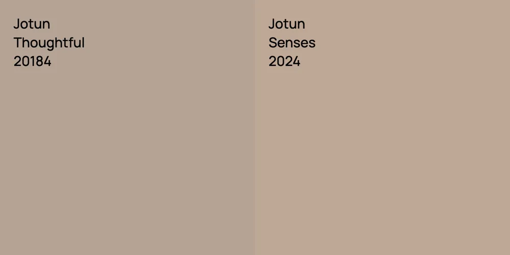
Jotun Thoughtful vs. Jotun Senses
We understand how important it is to remember the details. The colors, each with their own unique beauty and value, are truly special. The hues of the colors are quite similar.
Jotun 20184 is more saturated than 20184
Despite their differences, both colors share a similar value, with Jotun 20184 is being darker.
Supported paint brands for comparison: Behr, Benjamin Moore, Farrow and Ball, Dulux, Jotun, Little Greene, NCS, Ral Classic, Ral Design, Ral Effect, Sherwin Williams, Tikkurila
First color
Second color

Please note that the color shown on this page is a representation and might not exactly match the real shade of the cards, fan decks, or color collections. Your monitor, browser, and screen angle can all affect how the paint looks, so it may not be the same as what you see here. All information on this page is based on RGB and HEX values provided by manufacturers.
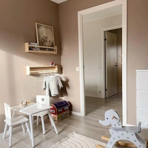
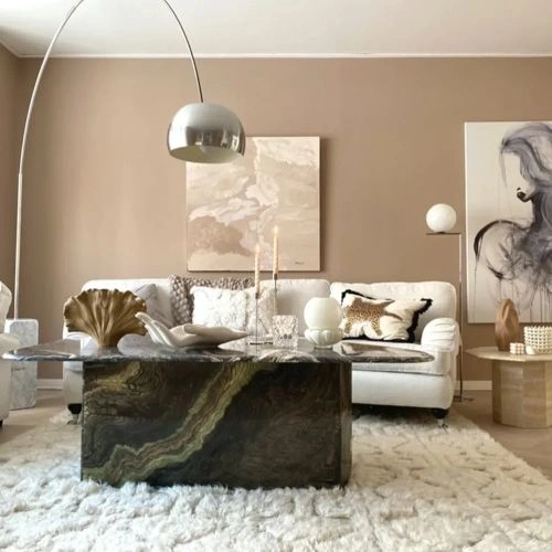
It's important to keep in mind that the same color may appear differently on various surfaces due to the nature of those surfaces. For example, the same shade will look different on a rough wall compared to the smooth surface of cabinets.


