

Jotun Timeless vs. Dulux Pearl Grey
We understand how important it is to remember the details. The colors, each with their own unique beauty and value, are truly special. Both colors belong to the yellow hue family, although their hue angles differ.
Jotun 1024 and Dulux Pearl Grey differ significantly in saturation. Jotun 1024 is more saturated.
Despite their differences, both colors share a similar value, with Jotun 1024 being darker.
Supported paint brands for comparison: Behr, Benjamin Moore, Farrow and Ball, Dulux, Jotun, Little Greene, NCS, Ral Classic, Ral Design, Ral Effect, Sherwin Williams, Valspar, Tikkurila
First color
Second color

| Jotun Timeless | Dulux Pearl Grey |
|---|---|
| Shared hue scale | |
12 | |
| Hue | |
| 47°yellow | 90°yellow |
| Saturation | |
| 18% | 3%less saturated |
| Lightness?Simple 0–100% measure derived from the minimum and maximum sRGB channels. Use CIE L* for perceptual lightness. | |
| 85% | 86%lighter |
| LRV?Light Reflectance Value measures the percentage of light reflected by a color, from 0 for absolute black to 100 for pure white. | |
| 71.92 | - |
| CIE L?Perceptual lightness. CIE Lab lightness ranges from 0 for black to 100 for diffuse white. | |
| 88.071 | 87.635looks darker |
| Color difference ΔE*₀₀?CIE color difference. Smaller is closer: about 0–1 is imperceptible, 1–2 just noticeable, 2–5 a small difference, 5–10 clear, and more than 10 very different. | |
| 4.282 | |
| Temperature | |
| Warm | Neutral |
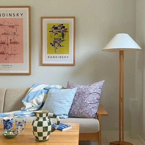


Please note that the color shown on this page is a representation and might not exactly match the real shade of the cards, fan decks, or color collections. Your monitor, browser, and screen angle can all affect how the paint looks, so it may not be the same as what you see here. All information on this page is based on RGB and HEX values provided by manufacturers.
It's important to keep in mind that the same color may appear differently on various surfaces due to the nature of those surfaces. For example, the same shade will look different on a rough wall compared to the smooth surface of cabinets.
Color comparisons featuring Jotun Timeless

1024 Timeless vs 90YR 83/044 Roman Stone 6


1024 Timeless vs 182 Bone China Blue - Pale

1024 Timeless vs 1010 Rose Dust

1024 Timeless vs W9 Ash Grey

1024 Timeless vs 1008-1A Blaze Orange

1024 Timeless vs 20218 Healing Lavender

1024 Timeless vs R77A Cappuccino Foam

1024 Timeless vs 3002-2C Creamy Oat

1024 Timeless vs 29RR 66/154 Sweet Sundae 4

1024 Timeless vs 823 Steel Blue

1024 Timeless vs 10BG 72/057 Peppermint Candy

1024 Timeless vs CSP-1030 Hidden Cove

1024 Timeless vs SW7572 Lotus Pod

1024 Timeless vs SW7554 Steamed Milk

1024 Timeless vs 2169-70 Sun Washed

1024 Timeless vs S 4502-Y

1024 Timeless vs L19AW37A Gauzy White

1024 Timeless vs 1406 Purple Heart

1024 Timeless vs SW7747 Recycled Glass

1024 Timeless vs 90RR 69/101 Party Surprise 4

1024 Timeless vs 99RR 42/216 Ash Rose

1024 Timeless vs AF-20 Mascarpone

1024 Timeless vs 33YY 65/106 Rolled Oats

1024 Timeless vs Mallorcan Wild

1024 Timeless vs 1235 Fox Hollow Brown

1024 Timeless vs 015 Soft Shell

1024 Timeless vs Soft Coral

1024 Timeless vs R260B Green Mantle

1024 Timeless vs OC-69 White Opulence

1024 Timeless vs S360-2 Breathe

1024 Timeless vs OC-101 Desolate

1024 Timeless vs AF-190 Boudoir

1024 Timeless vs 8575 Natural Green

1024 Timeless vs F480 Cameo

1024 Timeless vs F484 Chalk