

Closest paint matches and alternatives to Farrow and Ball Hague Blue 30
Find similar colors and alternatives to Farrow and Ball Hague Blue 30 . Compare Brush Blue, Viridian Tide, Night View and other matches by ΔE and LRV.
Select color
Select palette to match
Farrow and Ball 30 Hague Blue
h: 201, s: 30, v: 34
LRV: 7.00%
Benjamin Moore Brush Blue / CW-675
ΔE*₀₀ = 1.18
Smaller is closer:
~0–1 (imperceptible),
1–2 (just noticeable),
2–5 (small difference),
5–10 (clear),
more than 10 (very different).
h: 202, s: 25, v: 34
LRV: 9.76%
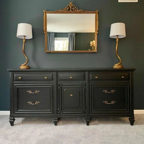

Dulux Viridian Tide / 90BG 08/075
ΔE*₀₀ = 1.35
Smaller is closer:
~0–1 (imperceptible),
1–2 (just noticeable),
2–5 (small difference),
5–10 (clear),
more than 10 (very different).
h: 201, s: 31, v: 33
Valspar US Night View / 4007-4C
ΔE*₀₀ = 1.48
Smaller is closer:
~0–1 (imperceptible),
1–2 (just noticeable),
2–5 (small difference),
5–10 (clear),
more than 10 (very different).
h: 203, s: 27, v: 33
LRV: 6.63%
Valspar UK Lone Splendor / L16CW31C
ΔE*₀₀ = 1.56
Smaller is closer:
~0–1 (imperceptible),
1–2 (just noticeable),
2–5 (small difference),
5–10 (clear),
more than 10 (very different).
h: 199, s: 36, v: 34
Sherwin Williams Sea Serpent / SW 7615
ΔE*₀₀ = 1.82
Smaller is closer:
~0–1 (imperceptible),
1–2 (just noticeable),
2–5 (small difference),
5–10 (clear),
more than 10 (very different).
h: 205, s: 26, v: 33
LRV: 7.00%

Dulux Ink Well / 89BG 09/087
ΔE*₀₀ = 1.86
Smaller is closer:
~0–1 (imperceptible),
1–2 (just noticeable),
2–5 (small difference),
5–10 (clear),
more than 10 (very different).
h: 201, s: 36, v: 33
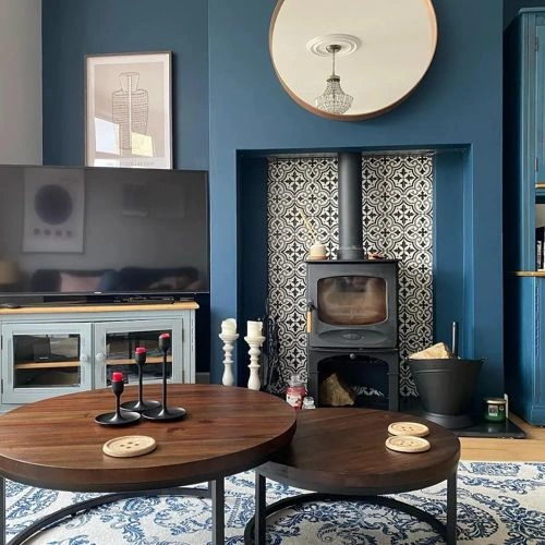
NCS S 7010-B10G
ΔE*₀₀ = 1.88
Smaller is closer:
~0–1 (imperceptible),
1–2 (just noticeable),
2–5 (small difference),
5–10 (clear),
more than 10 (very different).
h: 196, s: 30, v: 35
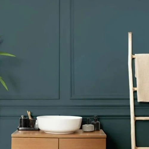
Sherwin Williams Tarragon / SW 9660
ΔE*₀₀ = 2.34
Smaller is closer:
~0–1 (imperceptible),
1–2 (just noticeable),
2–5 (small difference),
5–10 (clear),
more than 10 (very different).
h: 198, s: 20, v: 33
LRV: 7.29%
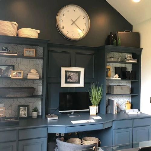
Dulux Raven Plume
ΔE*₀₀ = 2.47
Smaller is closer:
~0–1 (imperceptible),
1–2 (just noticeable),
2–5 (small difference),
5–10 (clear),
more than 10 (very different).
h: 202, s: 24, v: 36

Behr Restless Sea / PPU13-20
ΔE*₀₀ = 2.52
Smaller is closer:
~0–1 (imperceptible),
1–2 (just noticeable),
2–5 (small difference),
5–10 (clear),
more than 10 (very different).
h: 199, s: 40, v: 36
LRV: 7.37%
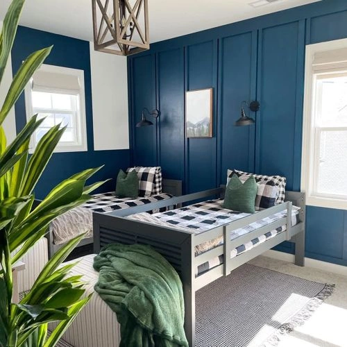
Behr Nocturne Blue / HDC-CL-28
ΔE*₀₀ = 2.55
Smaller is closer:
~0–1 (imperceptible),
1–2 (just noticeable),
2–5 (small difference),
5–10 (clear),
more than 10 (very different).
h: 198, s: 41, v: 35
LRV: 6.70%
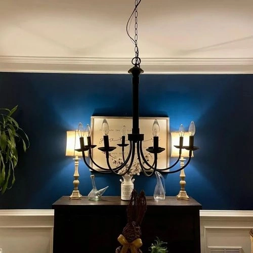
Benjamin Moore Blue Note / 2129-30
ΔE*₀₀ = 2.62
Smaller is closer:
~0–1 (imperceptible),
1–2 (just noticeable),
2–5 (small difference),
5–10 (clear),
more than 10 (very different).
h: 207, s: 24, v: 33
LRV: 9.02%
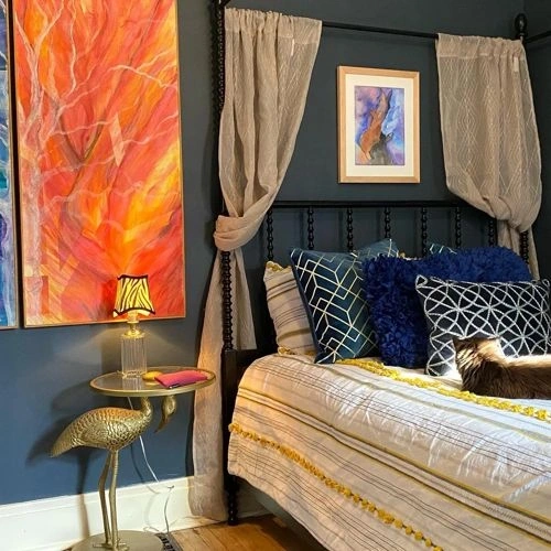
Valspar US Cadet Song / V138-6
ΔE*₀₀ = 2.66
Smaller is closer:
~0–1 (imperceptible),
1–2 (just noticeable),
2–5 (small difference),
5–10 (clear),
more than 10 (very different).
h: 198, s: 41, v: 34
LRV: 6.61%
Benjamin Moore Narragansett Green / HC-157
ΔE*₀₀ = 2.86
Smaller is closer:
~0–1 (imperceptible),
1–2 (just noticeable),
2–5 (small difference),
5–10 (clear),
more than 10 (very different).
h: 193, s: 21, v: 33
LRV: 9.14%

Benjamin Moore Lead Gray / 2131-30
ΔE*₀₀ = 2.93
Smaller is closer:
~0–1 (imperceptible),
1–2 (just noticeable),
2–5 (small difference),
5–10 (clear),
more than 10 (very different).
h: 196, s: 18, v: 32
LRV: 9.09%
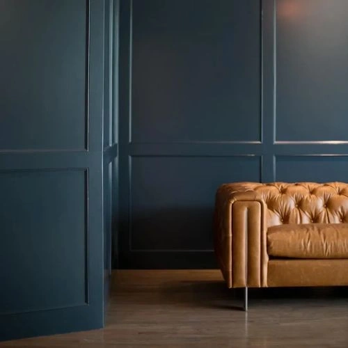
Please note that the color shown on this page is a representation and might not exactly match the real shade of the cards, fan decks, or color collections. Your monitor, browser, and screen angle can all affect how the paint looks, so it may not be the same as what you see here. All information on this page is based on HSV, LRV, RGB and HEX values provided by manufacturers.
It's important to keep in mind that the same color may appear differently on various surfaces due to the nature of those surfaces. For example, the same shade will look different on a rough wall compared to the smooth surface of cabinets.