
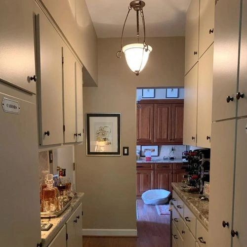
Paints matching Peace of Mind by Sherwin Williams
We found 15 closest paint color matches to Peace of Mind SW 9510
Select color
Select palette to match
Sherwin Williams SW 9510 Peace of Mind
h: 40, s: 17, v: 77
LRV: 49.01%
Valspar Seine and Sensibility / V146-3
ΔE*₀₀ = 0.81
Smaller is closer:
~0–1 (imperceptible),
1–2 (just noticeable),
2–5 (small difference),
5–10 (clear),
more than 10 (very different).
h: 42, s: 17, v: 76
LRV: 48.48%
Valspar Kiln Clay / T579
ΔE*₀₀ = 0.99
Smaller is closer:
~0–1 (imperceptible),
1–2 (just noticeable),
2–5 (small difference),
5–10 (clear),
more than 10 (very different).
h: 41, s: 17, v: 75
LRV: 47.14%
Sherwin Williams Relaxed Khaki / SW 6149
ΔE*₀₀ = 1.13
Smaller is closer:
~0–1 (imperceptible),
1–2 (just noticeable),
2–5 (small difference),
5–10 (clear),
more than 10 (very different).
h: 39, s: 19, v: 78
LRV: 50.48%

Benjamin Moore Brick House Tan / CW-145
ΔE*₀₀ = 1.14
Smaller is closer:
~0–1 (imperceptible),
1–2 (just noticeable),
2–5 (small difference),
5–10 (clear),
more than 10 (very different).
h: 38, s: 16, v: 78
LRV: 50.21%
Behr Basic Khaki / HDC-NT-09
ΔE*₀₀ = 1.15
Smaller is closer:
~0–1 (imperceptible),
1–2 (just noticeable),
2–5 (small difference),
5–10 (clear),
more than 10 (very different).
h: 38, s: 18, v: 76
LRV: 47.54%
Little Greene Rolling Fog / 143
ΔE*₀₀ = 1.23
Smaller is closer:
~0–1 (imperceptible),
1–2 (just noticeable),
2–5 (small difference),
5–10 (clear),
more than 10 (very different).
h: 39, s: 15, v: 77
LRV: 50.19%

Valspar Sea Grape / V147-2
ΔE*₀₀ = 1.27
Smaller is closer:
~0–1 (imperceptible),
1–2 (just noticeable),
2–5 (small difference),
5–10 (clear),
more than 10 (very different).
h: 37, s: 17, v: 77
LRV: 48.39%
Valspar Soft Stones / 6008-1C
ΔE*₀₀ = 1.27
Smaller is closer:
~0–1 (imperceptible),
1–2 (just noticeable),
2–5 (small difference),
5–10 (clear),
more than 10 (very different).
h: 37, s: 17, v: 77
LRV: 48.13%
Benjamin Moore Glacial Till / AF-390
ΔE*₀₀ = 1.50
Smaller is closer:
~0–1 (imperceptible),
1–2 (just noticeable),
2–5 (small difference),
5–10 (clear),
more than 10 (very different).
h: 41, s: 19, v: 76
LRV: 47.20%

Behr Pasha Brown / MQ2-51
ΔE*₀₀ = 1.53
Smaller is closer:
~0–1 (imperceptible),
1–2 (just noticeable),
2–5 (small difference),
5–10 (clear),
more than 10 (very different).
h: 37, s: 16, v: 76
LRV: 48.20%

Jotun Silhouette / 12126
ΔE*₀₀ = 1.59
Smaller is closer:
~0–1 (imperceptible),
1–2 (just noticeable),
2–5 (small difference),
5–10 (clear),
more than 10 (very different).
h: 41, s: 18, v: 75
LRV: 46.00%

Tikkurila Rope / V459
ΔE*₀₀ = 1.61
Smaller is closer:
~0–1 (imperceptible),
1–2 (just noticeable),
2–5 (small difference),
5–10 (clear),
more than 10 (very different).
h: 38, s: 20, v: 77
LRV: 47.58%
Benjamin Moore Gallery Buff / CSP-225
ΔE*₀₀ = 1.81
Smaller is closer:
~0–1 (imperceptible),
1–2 (just noticeable),
2–5 (small difference),
5–10 (clear),
more than 10 (very different).
h: 39, s: 15, v: 75
LRV: 46.22%
Farrow and Ball Drop Cloth / 283
ΔE*₀₀ = 1.83
Smaller is closer:
~0–1 (imperceptible),
1–2 (just noticeable),
2–5 (small difference),
5–10 (clear),
more than 10 (very different).
h: 38, s: 15, v: 79
LRV: 51.53%
Dulux Rope Swing
ΔE*₀₀ = 1.93
Smaller is closer:
~0–1 (imperceptible),
1–2 (just noticeable),
2–5 (small difference),
5–10 (clear),
more than 10 (very different).
h: 36, s: 15, v: 78
Please note that the color shown on this page is a representation and might not exactly match the real shade of the cards, fan decks, or color collections. Your monitor, browser, and screen angle can all affect how the paint looks, so it may not be the same as what you see here. All information on this page is based on HSV, LRV, RGB and HEX values provided by manufacturers.
It's important to keep in mind that the same color may appear differently on various surfaces due to the nature of those surfaces. For example, the same shade will look different on a rough wall compared to the smooth surface of cabinets.