
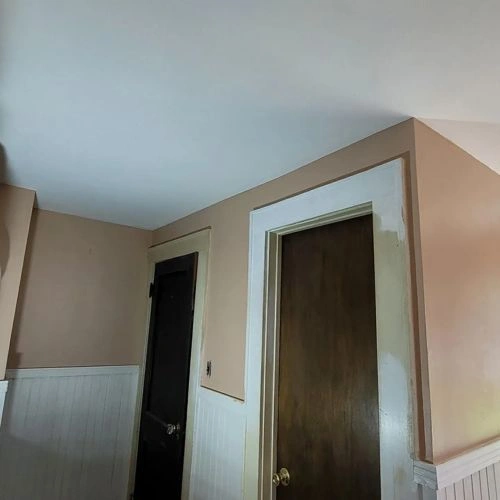
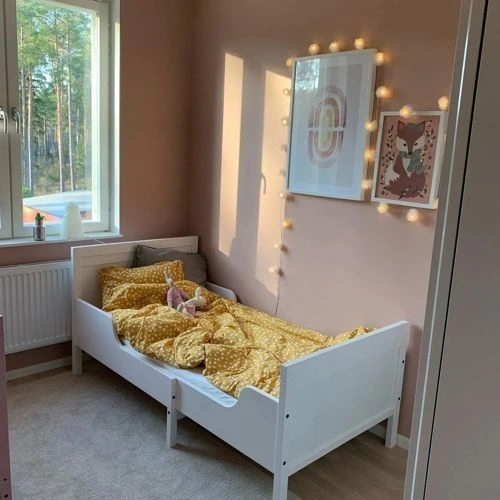
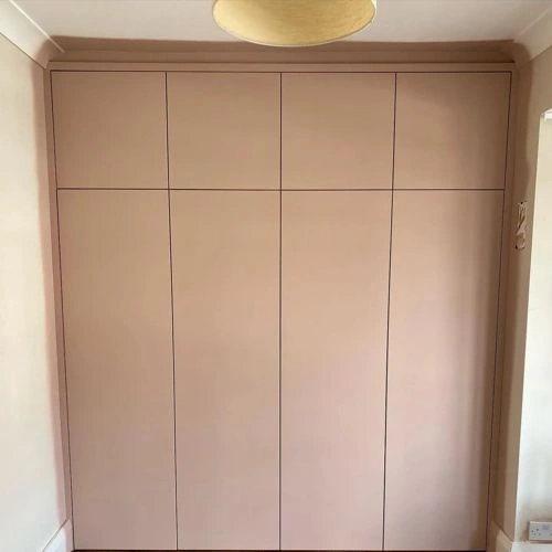
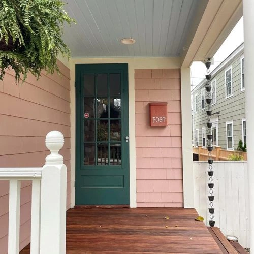
Paints matching Pinky Beige by Sherwin Williams
We found 15 closest paint color matches to Pinky Beige SW 0079
Select color
Select palette to match
Sherwin Williams SW 0079 Pinky Beige
h: 22, s: 24, v: 79
LRV: 43.37%
Dulux Caramel Fudge / 70YR 45/133
ΔE*₀₀ = 1.53
Smaller is closer:
~0–1 (imperceptible),
1–2 (just noticeable),
2–5 (small difference),
5–10 (clear),
more than 10 (very different).
h: 21, s: 21, v: 77
Behr Iced Copper / S200-3
ΔE*₀₀ = 1.61
Smaller is closer:
~0–1 (imperceptible),
1–2 (just noticeable),
2–5 (small difference),
5–10 (clear),
more than 10 (very different).
h: 22, s: 26, v: 82
LRV: 46.75%
Behr Sanderling / S220-3
ΔE*₀₀ = 1.79
Smaller is closer:
~0–1 (imperceptible),
1–2 (just noticeable),
2–5 (small difference),
5–10 (clear),
more than 10 (very different).
h: 25, s: 25, v: 78
LRV: 44.19%
Sherwin Williams Trek Tan / SW 7597
ΔE*₀₀ = 1.82
Smaller is closer:
~0–1 (imperceptible),
1–2 (just noticeable),
2–5 (small difference),
5–10 (clear),
more than 10 (very different).
h: 22, s: 26, v: 82
LRV: 46.17%
Valspar Adirondack Path / 2004-10A
ΔE*₀₀ = 1.82
Smaller is closer:
~0–1 (imperceptible),
1–2 (just noticeable),
2–5 (small difference),
5–10 (clear),
more than 10 (very different).
h: 21, s: 22, v: 76
LRV: 41.34%
Benjamin Moore Venetian Portico / AF-185
ΔE*₀₀ = 1.86
Smaller is closer:
~0–1 (imperceptible),
1–2 (just noticeable),
2–5 (small difference),
5–10 (clear),
more than 10 (very different).
h: 25, s: 23, v: 77
LRV: 41.94%

Jotun Delightful Pink / 2992
ΔE*₀₀ = 2.02
Smaller is closer:
~0–1 (imperceptible),
1–2 (just noticeable),
2–5 (small difference),
5–10 (clear),
more than 10 (very different).
h: 18, s: 23, v: 80
LRV: 45.12%
Sherwin Williams Interface Tan / SW 6059
ΔE*₀₀ = 2.08
Smaller is closer:
~0–1 (imperceptible),
1–2 (just noticeable),
2–5 (small difference),
5–10 (clear),
more than 10 (very different).
h: 22, s: 24, v: 76
LRV: 39.63%
Jotun Blushing Peach / 20047
ΔE*₀₀ = 2.15
Smaller is closer:
~0–1 (imperceptible),
1–2 (just noticeable),
2–5 (small difference),
5–10 (clear),
more than 10 (very different).
h: 25, s: 26, v: 76
LRV: 41.13%

Benjamin Moore Cappuccino / 2096-50
ΔE*₀₀ = 2.17
Smaller is closer:
~0–1 (imperceptible),
1–2 (just noticeable),
2–5 (small difference),
5–10 (clear),
more than 10 (very different).
h: 20, s: 20, v: 79
LRV: 44.81%
Benjamin Moore Monticello Rose / HC-63
ΔE*₀₀ = 2.42
Smaller is closer:
~0–1 (imperceptible),
1–2 (just noticeable),
2–5 (small difference),
5–10 (clear),
more than 10 (very different).
h: 18, s: 24, v: 82
LRV: 46.07%
Farrow and Ball Templeton Pink / 303
ΔE*₀₀ = 2.44
Smaller is closer:
~0–1 (imperceptible),
1–2 (just noticeable),
2–5 (small difference),
5–10 (clear),
more than 10 (very different).
h: 25, s: 23, v: 80
LRV: 47.44%

Little Greene China Clay - Dark / 178
ΔE*₀₀ = 2.46
Smaller is closer:
~0–1 (imperceptible),
1–2 (just noticeable),
2–5 (small difference),
5–10 (clear),
more than 10 (very different).
h: 22, s: 20, v: 80
LRV: 47.42%

Benjamin Moore Deer Field / 1159
ΔE*₀₀ = 2.52
Smaller is closer:
~0–1 (imperceptible),
1–2 (just noticeable),
2–5 (small difference),
5–10 (clear),
more than 10 (very different).
h: 25, s: 25, v: 82
LRV: 46.54%
Benjamin Moore Soul Mate / 1179
ΔE*₀₀ = 2.54
Smaller is closer:
~0–1 (imperceptible),
1–2 (just noticeable),
2–5 (small difference),
5–10 (clear),
more than 10 (very different).
h: 18, s: 23, v: 81
LRV: 44.57%
Please note that the color shown on this page is a representation and might not exactly match the real shade of the cards, fan decks, or color collections. Your monitor, browser, and screen angle can all affect how the paint looks, so it may not be the same as what you see here. All information on this page is based on HSV, LRV, RGB and HEX values provided by manufacturers.
It's important to keep in mind that the same color may appear differently on various surfaces due to the nature of those surfaces. For example, the same shade will look different on a rough wall compared to the smooth surface of cabinets.