
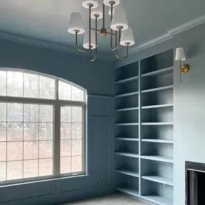
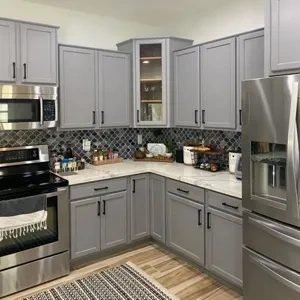
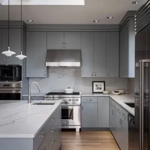
Alternative colors to Steely Gray from Sherwin Williams paint colors
We found 11 closest paint color matches to Steely Gray from Sherwin Williams colors
Select color
Select palette to match
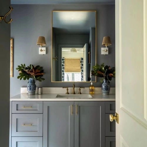
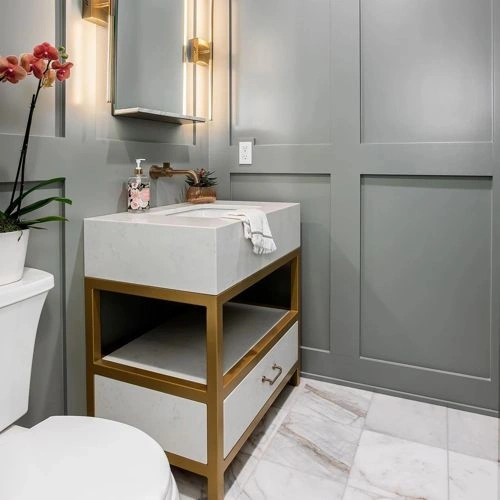
Sherwin Williams SW 7664 Steely Gray
h: 202, s: 7, v: 61
LRV: 30.36%
Sherwin Williams Cadet / SW 9143
ΔE*₀₀ = 1.01
Smaller is closer:
~0–1 (imperceptible),
1–2 (just noticeable),
2–5 (small difference),
5–10 (clear),
more than 10 (very different).
h: 196, s: 7, v: 61
LRV: 31.22%

Sherwin Williams Dustblu / SW 9161
ΔE*₀₀ = 1.62
Smaller is closer:
~0–1 (imperceptible),
1–2 (just noticeable),
2–5 (small difference),
5–10 (clear),
more than 10 (very different).
h: 207, s: 7, v: 63
LRV: 32.33%
Sherwin Williams African Gray / SW 9162
ΔE*₀₀ = 1.70
Smaller is closer:
~0–1 (imperceptible),
1–2 (just noticeable),
2–5 (small difference),
5–10 (clear),
more than 10 (very different).
h: 190, s: 4, v: 60
LRV: 30.98%

Sherwin Williams Let it Rain / SW 9152
ΔE*₀₀ = 2.71
Smaller is closer:
~0–1 (imperceptible),
1–2 (just noticeable),
2–5 (small difference),
5–10 (clear),
more than 10 (very different).
h: 206, s: 8, v: 65
LRV: 34.29%

Sherwin Williams Debonair / SW 9139
ΔE*₀₀ = 4.26
Smaller is closer:
~0–1 (imperceptible),
1–2 (just noticeable),
2–5 (small difference),
5–10 (clear),
more than 10 (very different).
h: 196, s: 13, v: 65
LRV: 35.95%
Sherwin Williams Gray Shingle / SW 7670
ΔE*₀₀ = 4.37
Smaller is closer:
~0–1 (imperceptible),
1–2 (just noticeable),
2–5 (small difference),
5–10 (clear),
more than 10 (very different).
h: 30, s: 1, v: 58
LRV: 29.27%
Sherwin Williams Earl Grey / SW 7660
ΔE*₀₀ = 4.50
Smaller is closer:
~0–1 (imperceptible),
1–2 (just noticeable),
2–5 (small difference),
5–10 (clear),
more than 10 (very different).
h: 120, s: 3, v: 60
LRV: 31.82%
Sherwin Williams Network Gray / SW 7073
ΔE*₀₀ = 4.62
Smaller is closer:
~0–1 (imperceptible),
1–2 (just noticeable),
2–5 (small difference),
5–10 (clear),
more than 10 (very different).
h: 197, s: 4, v: 65
LRV: 37.27%

Sherwin Williams Tin Lizzie / SW 9163
ΔE*₀₀ = 4.62
Smaller is closer:
~0–1 (imperceptible),
1–2 (just noticeable),
2–5 (small difference),
5–10 (clear),
more than 10 (very different).
h: 90, s: 3, v: 58
LRV: 29.76%
Sherwin Williams Castlegate / SW 9558
ΔE*₀₀ = 4.91
Smaller is closer:
~0–1 (imperceptible),
1–2 (just noticeable),
2–5 (small difference),
5–10 (clear),
more than 10 (very different).
h: 180, s: 3, v: 65
LRV: 37.02%
Sherwin Williams Summit Gray / SW 7669
ΔE*₀₀ = 4.92
Smaller is closer:
~0–1 (imperceptible),
1–2 (just noticeable),
2–5 (small difference),
5–10 (clear),
more than 10 (very different).
h: 45, s: 3, v: 58
LRV: 29.56%
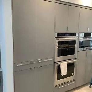
Please note that the color shown on this page is a representation and might not exactly match the real shade of the cards, fan decks, or color collections. Your monitor, browser, and screen angle can all affect how the paint looks, so it may not be the same as what you see here. All information on this page is based on HSV, LRV, RGB and HEX values provided by manufacturers.
It's important to keep in mind that the same color may appear differently on various surfaces due to the nature of those surfaces. For example, the same shade will look different on a rough wall compared to the smooth surface of cabinets.