
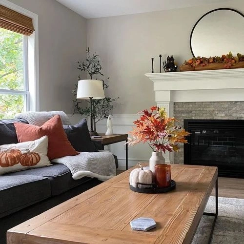
Paints matching Heritage Gray by Valspar
We found 15 closest paint color matches to Heritage Gray 7007-24
Select color
Select palette to match
Valspar 7007-24 Heritage Gray
h: 37, s: 8, v: 82
LRV: 60.00%
Sherwin Williams Agreeable Gray / SW 7029
ΔE*₀₀ = 0.00
Smaller is closer:
~0–1 (imperceptible),
1–2 (just noticeable),
2–5 (small difference),
5–10 (clear),
more than 10 (very different).
h: 37, s: 8, v: 82
LRV: 60.00%
Valspar Wet Concrete / 8006-2C
ΔE*₀₀ = 0.54
Smaller is closer:
~0–1 (imperceptible),
1–2 (just noticeable),
2–5 (small difference),
5–10 (clear),
more than 10 (very different).
h: 39, s: 8, v: 82
LRV: 60.00%
Behr Cotton Grey / HDC-NT-20
ΔE*₀₀ = 0.60
Smaller is closer:
~0–1 (imperceptible),
1–2 (just noticeable),
2–5 (small difference),
5–10 (clear),
more than 10 (very different).
h: 39, s: 7, v: 82
LRV: 60.60%
Jotun White Linen / 10182
ΔE*₀₀ = 0.62
Smaller is closer:
~0–1 (imperceptible),
1–2 (just noticeable),
2–5 (small difference),
5–10 (clear),
more than 10 (very different).
h: 39, s: 7, v: 81
LRV: 59.29%

Benjamin Moore Collingwood / OC-28
ΔE*₀₀ = 0.85
Smaller is closer:
~0–1 (imperceptible),
1–2 (just noticeable),
2–5 (small difference),
5–10 (clear),
more than 10 (very different).
h: 40, s: 7, v: 83
LRV: 61.52%

Sherwin Williams Gossamer Veil / SW 9165
ΔE*₀₀ = 0.85
Smaller is closer:
~0–1 (imperceptible),
1–2 (just noticeable),
2–5 (small difference),
5–10 (clear),
more than 10 (very different).
h: 40, s: 7, v: 83
LRV: 61.83%

Jotun Gentle Whisper / 12182
ΔE*₀₀ = 0.88
Smaller is closer:
~0–1 (imperceptible),
1–2 (just noticeable),
2–5 (small difference),
5–10 (clear),
more than 10 (very different).
h: 38, s: 9, v: 82
LRV: 60.11%
Benjamin Moore Wish / AF-680
ΔE*₀₀ = 0.95
Smaller is closer:
~0–1 (imperceptible),
1–2 (just noticeable),
2–5 (small difference),
5–10 (clear),
more than 10 (very different).
h: 37, s: 6, v: 81
LRV: 58.58%
Sherwin Williams Vessel / SW 9547
ΔE*₀₀ = 0.95
Smaller is closer:
~0–1 (imperceptible),
1–2 (just noticeable),
2–5 (small difference),
5–10 (clear),
more than 10 (very different).
h: 39, s: 7, v: 80
LRV: 57.88%

Farrow and Ball Cornforth White / 228
ΔE*₀₀ = 0.97
Smaller is closer:
~0–1 (imperceptible),
1–2 (just noticeable),
2–5 (small difference),
5–10 (clear),
more than 10 (very different).
h: 34, s: 7, v: 82
LRV: 60.21%

Behr Burnished Clay / PPU18-09
ΔE*₀₀ = 1.01
Smaller is closer:
~0–1 (imperceptible),
1–2 (just noticeable),
2–5 (small difference),
5–10 (clear),
more than 10 (very different).
h: 34, s: 7, v: 82
LRV: 60.88%
Benjamin Moore London Fog / 1541
ΔE*₀₀ = 1.16
Smaller is closer:
~0–1 (imperceptible),
1–2 (just noticeable),
2–5 (small difference),
5–10 (clear),
more than 10 (very different).
h: 40, s: 7, v: 80
LRV: 56.44%
Jotun Sheer Grey / 12077
ΔE*₀₀ = 1.16
Smaller is closer:
~0–1 (imperceptible),
1–2 (just noticeable),
2–5 (small difference),
5–10 (clear),
more than 10 (very different).
h: 40, s: 7, v: 80
LRV: 57.27%

Tikkurila Median / X486
ΔE*₀₀ = 1.16
Smaller is closer:
~0–1 (imperceptible),
1–2 (just noticeable),
2–5 (small difference),
5–10 (clear),
more than 10 (very different).
h: 37, s: 6, v: 83
LRV: 62.01%

Behr Toasty Gray / N320-2
ΔE*₀₀ = 1.20
Smaller is closer:
~0–1 (imperceptible),
1–2 (just noticeable),
2–5 (small difference),
5–10 (clear),
more than 10 (very different).
h: 42, s: 8, v: 82
LRV: 61.00%
Please note that the color shown on this page is a representation and might not exactly match the real shade of the cards, fan decks, or color collections. Your monitor, browser, and screen angle can all affect how the paint looks, so it may not be the same as what you see here. All information on this page is based on HSV, LRV, RGB and HEX values provided by manufacturers.
It's important to keep in mind that the same color may appear differently on various surfaces due to the nature of those surfaces. For example, the same shade will look different on a rough wall compared to the smooth surface of cabinets.